
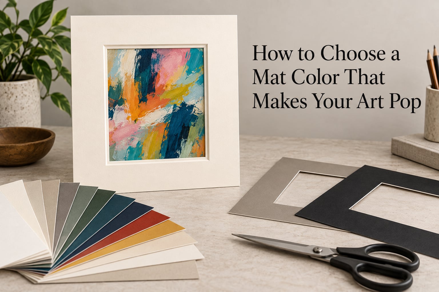
If you want the short version: how to choose a mat color comes down to a neutral default. Start with an off-white or warm gray mat for most artwork, then pull a color from the piece itself when you want more character. Everything below is the reasoning behind that answer, plus the mistakes that make a good print look cheap.
A mat is the thick paperboard border sitting between your artwork and the frame’s glass. It decides how much attention the art commands and how much the frame gets. Getting the color right gives the eye breathing room, pushes a small print to look larger, and focuses attention on the focal point.
If you are new to framing, the questions that brought you here are normal ones. Framers answer them every week, and the rules are much simpler than the number of matboard colors in the catalog suggests. We walk through a five-step method, the color families that reliably work, and the situations where a neutral mat is the wrong call. This guide is updated for 2026 and reflects what professional framers and experienced hobbyists repeat most often.
Table of Contents
- The Short Answer: Start With an Off-White or Warm Gray Mat
- How to Choose a Mat Color: A 5-Step Method
- Mat Color Families That Always Work
- Mat Color by Artwork Type
- Double Matting: Adding an Accent Color That Makes Art Pop
- How Lighting Changes Which White You Pick
- Archival vs. Standard Matboard: Why Grade Changes Your Color Choice
- Matching the Mat to the Frame, the Wall, and a Gallery Wall
- Common Mistakes to Avoid
- Frequently Asked Questions
- Conclusion: Make One Decision and Stop
The Short Answer: Start With an Off-White or Warm Gray Mat
For most artwork, choose an off-white or warm gray matboard. These neutrals carry no color of their own, so they let the artwork supply every vivid tone in the frame. Deviate from neutral only in two situations: when the piece is monochrome and needs a lift, or when the artwork already has a strong dominant color you want to echo in the border.
The one choice to avoid by default is pure bright white. Under warm indoor bulbs it reads slightly yellow and dull next to the print, and its brightness competes with light-toned artwork for attention. Bright white works when the art is dark, high-contrast, and you want a crisp graphic edge, so it is a tool rather than a default.
Two more rules carry most of the weight. A mat should never be brighter or more saturated than the focal point of the piece. And when you build a wall of several pieces, use the same mat color across all of them, because identical mats visually link frames that otherwise have nothing in common.
How to Choose a Mat Color: A 5-Step Method
Competitor guides tend to list color options without giving you a process. This is the process. Work through it in order, because each step eliminates options the next one would have you re-open.
Step 1: Read the dominant colors in the artwork
Look at the piece for fifteen seconds from across the room, then squint until the details blur. Whatever color survives the blur is your dominant color, and it is the only one worth pulling into a mat. Detail colors are noise at mat scale.
To sample it, use a phone camera. Take one photo in indirect daylight with no flash, then open it in a color picker app and read the RGB or hex value off the largest area of that color. Multiply each channel by 0.75 to knock the value down, because a mat should sit slightly below the artwork in brightness, never match it exactly. Match the hue you read, not the exact shade, since paper and screen render color differently.
If the artwork is neutral or tonal with no obvious color, there is no color to pull. Choose a mat one step lighter than the lightest area of the piece. Framers describe this as a subtle and gentle connection, and it works on foggy seascapes, grayscale portraits, and minimal abstracts.
Step 2: Decide whether the mat should recede or echo
A receding mat gives your eye no color to process, so all of the attention lands on the artwork. This is the right move for portraits, most photography, anything with fine detail, and any piece you plan to resell.
An echoing mat repeats a color from the artwork in the border. Used well, it makes that color read more vividly because the eye compares the two and finds them related. Used badly, it competes. If the artwork already has three or four strong colors, an echoing mat has no obvious candidate and you should stay neutral.
Step 3: Check the frame, the wall, and the neighbors
Hold the matboard or color chip up against the frame moulding, then against the wall paint. If the frame is dark, a light mat gives the frame a clean inner edge. If the frame is light, a mat one value darker prevents the whole assembly from washing into a single pale rectangle.
The wall matters more than most guides admit. A cool gray or blue-gray wall makes warm off-white and cream mats look dingy by comparison, and a warm beige or terracotta wall makes cool whites look stark. When in doubt, pick a mat whose undertone matches the room, not the art.
On a gallery wall, treat all the pieces as one composition. Repeat the same mat color and, ideally, the same border width across every frame. Reviewers on r/framing and r/HomeDecorating describe matching mats as the single fastest way to make thrifted and mismatched frames look like a set.
Step 4: Look at the mat under your own light
Never choose a mat color from a store aisle or from a screen. Store lighting is typically a strong cool fluorescent, and it will make warm neutrals look flat and yellowed. Take a chip home, tape it to the wall, and view it in the evening under the bulbs you actually use.
Give it twenty-four hours rather than twenty minutes, because your eyes adapt to a room’s light level and a quick look flatters everything. Warm incandescent and warm-white bulbs push mat colors toward yellow; cool white and daylight bulbs push them toward blue. A single chip that looks perfect in the morning can look muddy at night in the same room.
Step 5: Lock the grade before you lock the color
Archival or conservation-grade matboard is acid-free and pH-neutral, with a buffered core that slows the migration of acids from the artwork into the board. Standard matboard is wood pulp and paper, sometimes lightly buffered, and it yellows.
Choose conservation grade for anything original, anything vintage, anything on paper that you want to last decades, and anything with meaningful sentimental or resale value. This matters for color specifically because a white that was crisp when you framed it will turn cream within a few years on acidic board, and no amount of good color choice saves it.
Bonus step: Check the border width
Color is only half the framing decision. A mat border roughly twice the width of the frame moulding is the most widely repeated rule of thumb among hobbyists, and it reliably makes small work look larger. Border width also affects perceived color, because a wide mat gives your chosen tone more surface area to assert itself.
Mat Color Families That Always Work
Frameries sell hundreds of matboard colors, but almost every good choice sits in one of six families. Learn these six and you can specify a color in plain language at any shop.
Off-white, cream, and ivory
The safest default, and the community consensus choice on r/framing. These have a hint of yellow or beige in the base, which makes them forgiving under warm light and forgiving next to off-white paper. Choose off-white for vintage posters, botanical prints, watercolors, and anything with warm tones in it.
Warm gray and taupe
The most sophisticated neutral. Warm grays and taupes have a creamy or greige base that flatters skin tones, black and white photography, and earthy palettes simultaneously. They read as quiet and expensive, and they never compete with color the way a true white can.
Bright white and the brightness trap
Bright white is crisp, modern, and high contrast. It looks excellent behind dark, graphic, or minimalist art on white paper, and it is the right mat for a busy room where you want the frame to read cleanly.
It also has a well-documented failure mode. Beginners on r/HomeDecorating describe bright white mats looking dingy or yellowed over time, and a pure white under warm bulbs competes with light-toned artwork for attention. The most common cause is not the color but the board underneath it, which is usually cheap and acidic.
Black and charcoal
Black mats suit dramatic photography, high-contrast abstract work, and graphic prints on dark paper. They add weight and make artwork read as more expensive. The risk is that they close in on the image, so give a black mat a wider border than a light mat of the same color, and pair it with artwork that has real contrast in it.
Charcoal is the safer version of the same idea. It does everything black does with less weight and less drama, and it pairs more easily with mixed gallery walls.
Earth tones
Deep olive, sienna, terracotta, and slate green are the classic accent colors. Because they come from nature’s palette, they rarely clash with anything, which makes them a good choice for a single accent layer inside a double mat.
Bold and saturated colors
Strong reds, deep blues, and saturated yellows are legitimate choices, and a professional framer will use them deliberately. They work when the artwork is monochrome or nearly monochrome, because the mat supplies the only color in the frame. They fail when the artwork is already colorful, because now two things are shouting.
If you want a colored mat and your art already has color, put the color in the inner layer of a double mat instead. That way the accent shows as a thin line and reads as a detail rather than a statement.
Mat Color by Artwork Type
Here is the shortcut most guides skip. Match your medium to the recommendation and you are done.
- Black and white photography: off-white or warm gray for a classic, gallery look. Pure black for a dramatic, high-contrast presentation.
- Color photography: warm gray or light taupe. Both are neutral enough that skies, skin, and foliage all stay accurate.
- Watercolor: off-white, cream, or ivory. Watercolors have soft edges and light paper, and a crisp white mat makes them look pasted on.
- Oil paintings on canvas: a mat is usually not used at all. When the work is on paper, use the lightest value found in the painting itself.
- Abstract art: this is where a colored mat earns its place. Pull a muted version of the dominant color from the composition rather than a bright one.
- Botanical and bird prints: antique white, ivory, or a soft warm gray. Historical illustration work is usually printed on toned paper, and a matching mat makes the tone look deliberate.
- Vintage posters and travel prints: off-white, or black if the poster is bold and graphic. A neutral mat also disguises a poster’s uneven printed edges.
- Children’s art and fan art: skip the color matching. A wide bright white or off-white mat gives the piece room to look finished, which is usually what the artist wanted.
Double Matting: Adding an Accent Color That Makes Art Pop
Double matting means two layers: a wider outer mat with a large window, and a narrower inner mat on top with a smaller window. The strip of inner mat left visible around the artwork is called the reveal. It is the most widely recommended technique on r/framing for making a color pop without risking competition.
The rule of thumb is a neutral outer mat with a narrow colored inner reveal of about a quarter inch to a half inch. If you want the accent louder, widen the reveal before you widen the mat.
Pairings that work reliably:
- Black outer with a warm gray or ivory inner reveal
- Warm gray outer with a thin deep navy or charcoal inner
- Off-white outer with a thin antique gold or olive inner
- Bright white outer with a soft light gray inner for a cool, clean look
- Deep charcoal outer with an ivory inner, which is a classic gallery combination
Double matting costs more than a single mat because it uses two sheets and more cutting time. It also means two window openings that both have to be cut accurately, so if you are cutting it yourself, measure the inner window first and cut from a scrap template.
How Lighting Changes Which White You Pick
Mat colors are judged against the light in the room, and no two rooms are lit the same. Warm incandescent and warm-white bulbs shift everything toward yellow, so a neutral white mat will look cream and a cream mat will look richer. Cool white and daylight bulbs shift toward blue, making the same cream mat look almost gray.
Natural light is the most honest, but it is also the least controlled. A wall that faces south in the morning and is lit by a warm floor lamp at night can show you two different mat colors from the same board.
Test at the time of day you actually look at the art most. Tape your top two candidates to the wall for a full day and view both in morning, afternoon, and evening. The one that holds up in the worst light is your answer, and this ten-minute habit prevents most of the disappointment described in framing forums.
Archival vs. Standard Matboard: Why Grade Changes Your Color Choice
Archival matboard, also called conservation matboard, is made from either cotton fiber rag or alpha cellulose, is acid-free, and has a pH-neutral core that resists yellowing. Conservation-grade board is additionally buffered, meaning its core absorbs acidity from the artwork and the surrounding air for decades.
Standard matboard is made from wood pulp. It can be thin, 2-ply, and it is often unbuffered. It is fine for short-term display of inexpensive prints and it is not fine for originals, heirlooms, or anything you intend to keep past ten years.
The connection to color is simple: a white mat only stays white on a board that does not yellow. Pick conservation grade, pay a little more per sheet, and your color decision holds for the life of the piece. The difference in cost between standard and conservation board is usually modest compared with the frame, so it is rarely the place to economize.
Matching the Mat to the Frame, the Wall, and a Gallery Wall
On a single piece, the mat and the frame should not be the same color at the same brightness, or the two merge into one block with no separation. Either the mat is lighter than the frame, or darker. Contrast at that junction is what makes the frame read as a frame.
A widely repeated piece of advice is to pair darker artwork with darker frames, and to avoid light frames with dark art, because the contrast clashes. Softer versions of the same rule work well: a mid-gray frame wants a mat one value lighter, and a white frame wants a mat slightly deeper or with more color in it.
For a gallery wall, three decisions give you consistency across many pieces:
- One mat color for everything. Pick a single neutral and repeat it. This is the single biggest factor in a wall looking unified.
- One border width for everything. Constant width creates a rhythm the eye follows across separate frames.
- Repeat the same material and grade. Mixing 2-ply and 8-ply boards on one wall creates visible shadow lines that break the effect.
Also consider sight lines. A mat that matches the wall color can make a piece seem to float, which works nicely in a hallway. A mat that matches the wall too closely in a busy room can disappear entirely, so keep a small value difference even when the hue matches.
Common Mistakes to Avoid
Every one of these comes from the same place: a well-chosen artwork undone at the last step by the mat.
Picking bright white by default
It is the most common neutral and the most commonly regretted. Unless your art is dark, high-contrast, and graphic, choose off-white or warm gray instead. And if you do want a white, pay for conservation-grade board so it stays white.
Choosing a color that competes with the art
If your eye goes to the mat first, the mat is too saturated or too dark. Look at the finished frame from six feet away, the way a guest sees it. The artwork should be the first thing you land on.
Pulling a color from a detail instead of a dominant
A tiny spot of red in the corner of a landscape is not a mat color. Read the dominant tone first, and remember to knock the sampled value down so the mat sits below the artwork in brightness.
Matching the mat exactly to the frame moulding
Identical color and identical brightness at the same junction make the two read as one shape. Shift the mat one value lighter or darker and the frame edge appears.
Going too dark too tight
A black mat with a narrow window makes small work feel boxed in. Widen the border and the piece gains room to breathe.
Deciding in the store
Store lighting will mislead you more often than not. Take a chip home, tape it up, and check it under your own bulbs before committing.
Leaving a print’s white border exposed
Many posters and prints come with an uneven white margin. A mat cannot hide it, but a window cut slightly off-center, or a mat in a color close to the print’s own paper, makes the edge read as intentional.
Worrying too much
Beginners frequently ask whether their question is too basic. It is not. Every rule in this guide reduces to one idea: the mat is the stage, the artwork is the performer, and a neutral stage is almost always the right call.
Frequently Asked Questions
How do I choose the right color mat for my art?
Start with a neutral: off-white or warm gray works for most artwork. Then check the dominant color in the piece, and only echo it when the artwork is monochrome or nearly so. Sample that dominant color with a phone photo in indirect daylight, knock the brightness down about 25 percent, and match the hue rather than the exact shade. Always check the mat against your frame moulding, your wall paint, and your own room lighting before cutting.
What are some good matte colors?
The reliable choices are off-white, cream, and ivory for warm work and vintage paper; warm gray and taupe for photography and anything you want to look refined; bright white for dark, high-contrast, graphic art; black and charcoal for drama; and earth tones such as olive, sienna, and slate green as accent layers. If you only remember one, use off-white or warm gray.
What are the rules of picture matting?
Four rules cover most cases. The mat should never compete with the artwork, so the artwork is what your eye hits first. The mat and the frame should not match exactly in both color and brightness, or they merge into one block. The border should be roughly twice the width of the frame moulding, which also makes small work look larger. And the matboard should be acid-free conservation grade, because a white that yellows in five years undoes the whole decision.
How do I choose the right colors for my art?
Read the artwork before you touch any matboard. Look from across the room, squint until detail disappears, and whatever color survives is your dominant color. If there is none, the piece is neutral and the mat should be one value lighter than the lightest area of the work. Then match the mat to the room temperature: warm gray and cream suit warm walls, cool grays suit cool walls, and the mat should never be brighter than the focal point.
Should a mat color match the room, the frame, or the artwork?
The artwork comes first, the frame second, the room third. A neutral mat satisfies all three because it carries no color of its own. A colored mat is worth it when the art is monochrome, when you are using a double mat with a thin inner accent reveal, or when the room itself needs a color anchor. A mat that matches the wall closely can make a piece float, which is a valid look, but keep a small value difference so it does not disappear in a busy room.
Will a dark mat hide the white border around a poster?
Not exactly. A mat window masks most of a print’s white margin, but it cannot change the white that remains inside the opening. Two tricks help. Cut the window a fraction smaller so less of the margin shows, or shift the window slightly off-center so the remaining edge reads as a deliberate design choice rather than a printing flaw. Choosing a mat color close to the print’s own paper tone also makes the margin recede.
Conclusion: Make One Decision and Stop
Knowing how to choose a mat color takes less effort than most guides imply. Choose off-white or warm gray unless your artwork is monochrome, already busy with color, or needs a deliberate accent. Sample the dominant color when you do deviate, keep the mat one value below the artwork, and check it under your own light before cutting.
Pick conservation-grade board so your decision still holds years from now, cut a border roughly twice the frame width, and repeat the same mat color if you are building a gallery wall. Then stop second-guessing it. The best mat is the one that keeps your eye on the art.