
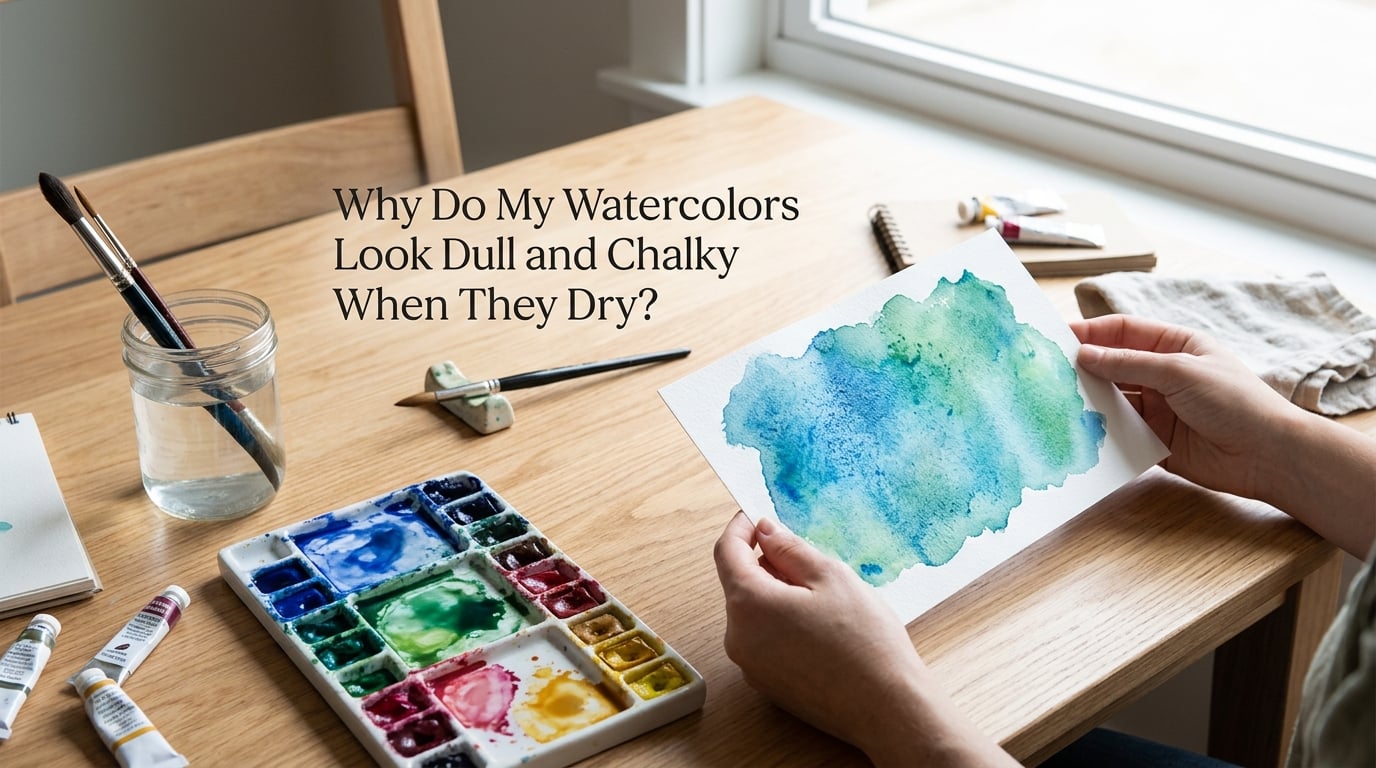
I have painted with watercolors for years, and I still remember the sting of peeling a finished wash off the easel only to find it had dried into something flat, dusty, and pale. If you are asking why do my watercolors look dull and chalky when they dry, you are not alone, and the answer is almost always one of three things: your paint, your paper, or how you are moving the brush.
The good news is that chalky watercolors are usually fixable without years of extra practice. In this guide I will walk you through the five main causes of a dull, chalky finish, then show you a simple three-step diagnostic you can run today to figure out which culprit is yours. By the end, you will know exactly what to change to get vibrant, glowing washes again.
Table of Contents
Quick Answer: Why Your Watercolors Look Dull and Chalky
Watercolors look dull and chalky when they dry because pigment cannot settle cleanly into the paper fibers. That usually happens for one of these reasons:
- Low pigment load in the paint, with too much filler like dextrin, chalk, or glycerin sitting on the surface.
- Wrong paper, especially wood-pulp cellulose paper that resists pigment and reflects light back dull.
- Overworking the wash, which lifts dried pigment back into the water and creates a muddy, opaque film.
- Bad water-to-pigment ratio, either too much water or too little, that breaks the binder and ruins transparency.
- Drying conditions like a hot hair dryer or low humidity that flash-dries pigment before it can settle.
If your colors go from vivid and glassy while wet to flat and dusty when dry, the culprit is almost always on this list. The diagnostic further down will help you figure out which one.
What Makes Watercolor Look Chalky? The 5 Main Causes
Watercolor is meant to glow because light enters the paint layer, bounces off the white paper beneath, and travels back to your eye. Anything that blocks that path, whether it is a film of filler, a paper that resists pigment, or a wash that has been scrubbed too hard, will make the result look chalky instead of luminous. Let us go through each cause in detail so you can recognize which one is stealing your color.
Cause 1: Low Pigment Load and Too Much Filler
Professional watercolor paint is mostly pigment, with a small amount of binder, usually gum arabic, holding it together. Student-grade paint, by contrast, is mostly filler, with dextrin, chalk, glycerin, and optical brighteners making up the bulk of every pan and tube.
When a wash dries, the water evaporates and the pigment settles into the paper. If there is very little pigment and a lot of filler, the filler stays on top of the paper fibers as a thin, pale film. Light hits that film and scatters, which is exactly what your eye reads as chalky. This is why two identical swatches, one in artist grade and one in student grade, can look like they came from different mediums.
Beginners on Reddit’s r/Watercolor often describe this exact problem: their dark colors come out chalky and streaky even on good paper, and switching to a higher-pigment set fixes it overnight. The paper was not the problem. The paint was.
Cause 2: Paper Type Matters More Than Most Painters Think
If pigment load is the engine of vibrancy, paper is the road it drives on. Cheap cellulose paper made from wood pulp has short, stiff fibers and a tight surface sizing that repels pigment. Pigment sits on top rather than soaking in, so light reflects off the paint layer instead of bouncing back from the paper underneath. The result is dull, streaky washes, even with expensive paint.
Cotton paper, especially 100 percent cotton with a cold press finish, behaves the opposite way. The longer cotton fibers create a softer surface with deeper sizing, and pigment drops down into the paper instead of riding on top. That is why the same paint that looks chalky on a student-grade pad suddenly glows on a 300gsm cotton block.
A 140lb cotton cold press pad is the single biggest upgrade most beginners can make. It costs a little more than a wood-pulp sketch pad, but it is the difference between fighting your materials and having them work with you.
Cause 3: Overworking the Paint While It Dries
Technique causes more chalky paintings than most people realize. When you go back into a wash that is starting to dry, you lift partially dried pigment back into the water. That pigment re-distributes unevenly and, when it finally dries, leaves a streaky, patchy film that looks dull and chalky.
Overworking shows up in three classic ways: hard edges where you wanted soft blooms, streaky bands across a wash that should have been smooth, and a general dusty appearance once the water is gone. Beginners blame their paint, but it is usually their brush doing too much work.
The fix is mostly restraint. Decide where your wash needs to go, lay it in once with a confident stroke, and let it dry before touching it again. If you need to adjust, lift with a clean damp brush rather than scrubbing more color in.
Cause 4: Water Control Problems
Watercolor is a balance between pigment, water, and binder. Too much water and the pigment spreads thin and pale, then dries to a chalky haze. Too little water and the paint goes on so dry it skips and streaks, leaving visible brush marks.
The sweet spot is a ratio that looks like heavy cream on the brush: enough water to flow freely, enough pigment to read clearly as color. Test it on the back of your hand or on a scrap sheet before you commit to the painting.
Bad water control is sneaky because the wash can look fine while you are painting, then go dull as it dries. If you keep getting that surprise, the answer is usually to mix a slightly stronger puddle and use less water on the brush.
Cause 5: Environmental Drying Conditions
How a wash dries affects how it looks. A hair dryer held close can flash-dry pigment before it has time to settle into the paper, which leaves a chalky, uneven surface. The same wash left to air dry often looks more luminous because the pigment has time to migrate into the fibers.
Humidity and temperature matter too. In dry rooms, paint on the palette dries out mid-session, so the pigment-to-water ratio shifts and later washes come out flat. In humid rooms, paint stays workable but takes much longer to dry on the paper, which can cause bleeding and blooming if you are not careful.
The Reddit watercolor community and several beginner groups report the same thing: a hair dryer is one of the most common causes of unexpectedly chalky results. If you use one, keep it on a low setting, hold it at least a foot away, and let the final dry happen on its own.
How to Fix Dull or Chalky Watercolors (Solutions by Cause)
Now that you know the five causes, here is how to fix each one. I have ordered these by impact, starting with the change that will help the most painters the fastest.
Upgrade Priority: Paper First, Then Paint, Then Brushes
If you have to choose where to spend your budget, spend it on paper first. A 140lb cotton cold press pad will improve student-grade paint dramatically. Then upgrade paint, ideally a small set of artist-grade tubes in your most-used colors. Brushes come last, because even a good synthetic brush will not save bad paper or weak pigment.
For most beginners, this priority order feels backward. We assume the brush does the work. In reality, paper holds the color, paint carries the color, and the brush just moves them around. Fix the foundation first.
Step-by-Step: A 3-Step Diagnostic Process
Before you buy anything, run this three-step test. It takes about twenty minutes and tells you exactly where your problem lives.
Step 1: Test your paper. Paint a single dark swatch, like a deep ultramarine, on a scrap of your current paper and on a scrap of cotton paper if you have access. Let both dry. If the cotton swatch glows and your current paper looks dusty, your paper is the issue.
Step 2: Test your paint. Mix a strong puddle of one of your darker colors and lay it on good paper. If it still goes chalky when dry, your paint is the issue. If it glows, your paint is fine.
Step 3: Test your technique. Lay a smooth wash on good paper with good paint and leave it alone while it dries. If it stays vibrant, your technique just needs more confidence and less reworking. If it still dulls, revisit your water ratio.
This diagnostic is the most useful habit I ever built. It turns vague frustration into a clear, fixable problem.
Technique Fixes You Can Try Today
Three small technique changes will brighten most paintings immediately.
- Use a cream consistency, not tea or milk. Mix your puddle until it is opaque on the bottom of the well, then test on scrap.
- Glaze with confidence. Let each layer dry fully before adding the next. Rushing layers is the most common cause of muddy, chalky results.
- Lift, do not scrub. If a wash goes wrong, use a clean damp brush to lift color. Scrubbing just embeds more pigment into the surface and dulls the final result.
None of these require new supplies. You can try all three tonight.
Comparison Table: Paper Types and Their Effect on Vibrancy
This table gives a quick way to compare how each paper type affects the vibrancy of your washes. It is a useful reference when you are deciding what to buy.
| Paper Type | Fiber | Typical Weight | Effect on Vibrancy |
|---|---|---|---|
| Wood-pulp cellulose | Short cellulose fibers | 90lb to 140lb | Pigment sits on top, washes go chalky and streaky |
| Cotton and cellulose blend | Mixed fibers | 140lb | Better than pure cellulose, still less luminous than cotton |
| 100 percent cotton cold press | Long cotton fibers | 140lb to 300lb | Pigment settles in, washes glow, soft blooms |
| 100 percent cotton hot press | Long cotton fibers, pressed smooth | 140lb to 300lb | Very smooth surface, good for detail, slightly less texture |
Prevention: 7 Habits That Keep Your Watercolors Vibrant
Once you know what causes chalky watercolors, prevention is mostly about building small habits. Here are seven that I lean on every time I sit down to paint.
- Start with cotton paper. Even a small pad of 140lb cotton cold press changes everything.
- Mix strong puddles. Tea-colored washes go chalky. Cream-colored washes glow.
- Lay washes in once. Resist the urge to keep adjusting while the paint is wet.
- Let layers dry fully before glazing the next one.
- Keep your palette moist. A spray bottle of water keeps paint workable in dry rooms.
- Skip the hair dryer for the final dry. Let the air do it.
- Clean your brush between colors so muddy mixes do not contaminate your next wash.
None of these are expensive. Together, they eliminate most of the chalky finishes that frustrate beginners and intermediates alike.
Frequently Asked Questions
Why does my watercolor look chalky?
Your watercolor looks chalky because pigment cannot settle cleanly into the paper, usually due to low pigment load in the paint, the wrong paper type, overworking the wash, bad water-to-pigment ratio, or fast drying conditions. Each of these leaves a dull film on top of the paper instead of a luminous layer of pigment.
How to brighten up a watercolor?
Brighten a watercolor by switching to a higher-pigment paint, painting on 100 percent cotton paper, mixing cream-consistency puddles instead of tea-colored washes, and resisting the urge to rework wet areas. Letting each layer dry before glazing also keeps colors luminous.
What are three common mistakes that people make when using watercolor?
Three common watercolor mistakes are using wood-pulp paper that resists pigment, overworking wet washes so they lift and streak, and mixing too many colors in one puddle so the result turns muddy. Each of these produces dull, chalky results even with good supplies.
How long should you let watercolor dry?
Let watercolor dry for at least five to ten minutes between layers under normal room conditions, and longer in humid rooms. A wash is fully dry when the paper returns to its original color and stiffness, with no darker damp patches visible.
Final Thoughts
If you have been asking why do my watercolors look dull and chalky when they dry, the most important thing to take away is this: it is almost never a talent problem. It is a materials or technique problem, and those are fixable in a weekend.
Start by running the three-step diagnostic on a scrap sheet. If the answer is paper, buy a small cotton pad. If the answer is paint, upgrade one or two colors you use the most. If the answer is technique, slow down and trust your first stroke. Whichever it is, your next painting will be more vibrant than your last.