
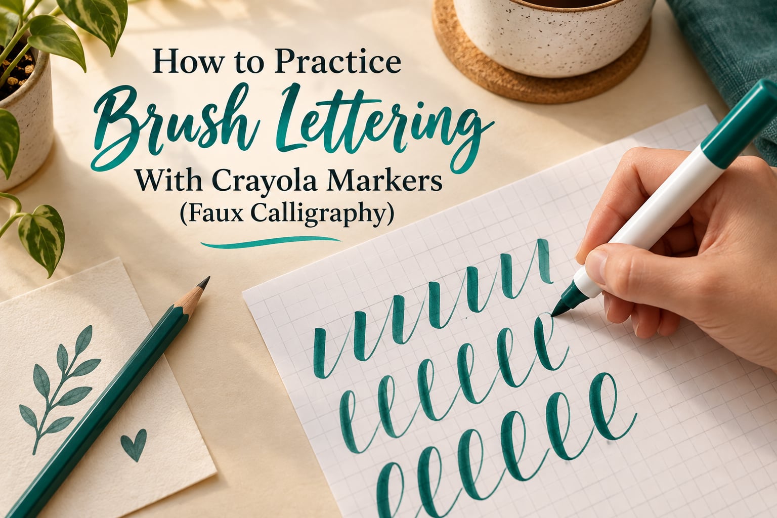
Faux calligraphy with Crayola markers is a four-step process: hold the marker at roughly a 40-55 degree angle, drill basic strokes, draw the letter skeleton in thin monoline, then fill in only the down strokes. You get the thick-and-thin look of brush calligraphy without a pressure-sensitive pen.
That matters because pressure control is the single thing that stops most beginners. A brush pen thins when you lift, and beginners squeeze. A Crayola marker writes the same width no matter how hard you press, which means you can learn the down-stroke pattern without fighting your hand, and without spending anything on a specialty pen first.
On this site we treat the Crayola marker as a training wheel rather than a dead end. Once the down-stroke rhythm is in your hand, moving to a real brush pen takes an afternoon rather than a year. This guide covers the full curriculum: what the technique is, what to put on the desk, the grip, the strokes, the letter building, a four-week practice schedule, and the mistakes that make lettering look wrong.
Ten focused minutes a day for four weeks is the whole commitment. That is roughly the time investment beginners report seeing the biggest jump in consistency, and it costs nothing beyond the markers already in the junk drawer.
Table of Contents
- What Is Faux Calligraphy (and How It Differs From Brush Calligraphy)
- What You Need: Crayola Marker, Paper, and Two Extras
- The One Rule – Down = Thick, Up = Thin
- Step 1 – How to Hold the Crayola Marker (Grip and Angle)
- Step 2 – Basic Strokes and Warm-Up Drills
- Step 3 – Faux Lettering: Draw, Outline, Fill In
- Step 4 – Connect Letters Into Words
- A 4-Week Practice Plan (Day-by-Day Drills)
- Common Mistakes and How to Fix Them
- When to Move to a Real Brush Pen
- Project Ideas to Keep Practicing
- Frequently Asked Questions
- How do I learn faux calligraphy?
- Can you really do calligraphy with Crayola markers?
- What is the difference between faux calligraphy and brush calligraphy?
- How do you make a Crayola marker write thick?
- Which Crayola marker is best for brush lettering?
- What angle should I hold a marker for lettering?
- How do I stop my lettering from looking uneven?
- How long does it take to get good at faux calligraphy?
- Conclusion
What Is Faux Calligraphy (and How It Differs From Brush Calligraphy)
Faux calligraphy is hand lettering that imitates the thick-and-thin contrast of brush calligraphy without a brush. You draw every letter in one even line, then go back over selected strokes with the same marker to fill them in solid, leaving the rest thin.
The result reads as calligraphy because of contrast, not because of the pen. Real brush calligraphy varies width continuously, mid-stroke, from pressure alone. Faux calligraphy fakes that contrast in two flat tones, and the eye accepts the imitation at card and journal scale.
| Type | How the thick and thin happens | What it costs to learn | Hardest part |
|---|---|---|---|
| Faux calligraphy | You fill in the down strokes by hand | A marker you already own | Keeping the fill inside the outline |
| Brush calligraphy | The nib flexes and thins as you lift pressure | A brush pen, then practice | Light pressure on up strokes |
| Modern calligraphy | Mix of bounce lettering, brush pens, and highlights | Several pen types plus practice | Style variety before consistency |
Two words worth defining now. Monoline means every line the same width, which is what the Crayola marker gives you for free. Baseline is the imaginary line the letters sit on, and x-height is the height of a lowercase letter such as a or n. Most of the drills below exist to keep your x-height steady while your letters sit on the baseline.
What You Need: Crayola Marker, Paper, and Two Extras
The whole supply list is four items: a Crayola marker, smooth paper, a pencil, and a scrap sheet to protect your desk. Everything else people buy for lettering can wait.
Choosing the right Crayola marker type
Crayola makes several marker bodies, and only some of them give you a usable line for lettering. The nib width matters more than the colour, because a wider line makes the fill-in step faster and the mistakes more visible.
| Marker | Nib | Ink flow | Best use for lettering |
|---|---|---|---|
| Super Tip | Narrow, pointed | Steady and low | Alphabet practice and thinner scripts, the default choice |
| Pip-Squeak | Broad, squeeze-activated | Heavier, more pooling | Bold lettering where you want visible thick strokes quickly |
| Twist ‘n Slick | Brush-style tip | Variable at the tip | A taste of real brush behaviour, though pressure response is limited |
Start with a Super Tip. If your lines feel too thin to see as calligraphy from across a table, move up to the Pip-Squeak rather than pressing harder, because pressing harder on a Crayola marker only makes the same line blot.
Paper matters more than you would expect
Printer paper is thin enough that ink bleeds through to the back, and the smearing that happens while you fill in letters ruins the down stroke. Use smooth card stock or heavier drawing paper, and place a scrap sheet underneath as a barrier.
Grid paper is genuinely useful for practice. The lines give your baseline and x-height for free, so you can check whether a letter is sitting too high before you commit ink to it.
One warning before you start: Crayola ink stains. It marks hands, desks, sleeves, and the backs of pages, and it does not come out. Wear something you do not mind marking, and keep a paper towel nearby for the moments you catch a blot mid-letter.
The One Rule – Down = Thick, Up = Thin
This is the whole technique, and every drill in this guide is a variation on it.
Down strokes = thick. Up strokes = thin.
Letters are built almost entirely from vertical and diagonal downward moves. Every one of those gets filled in solid. The return moves that connect one letter to the next stay as a single thin line.
Here is the honest constraint that makes faux calligraphy different from brush calligraphy: a Crayola marker cannot vary its line width. The nib is the same width whatever you do. The thick-and-thin effect is drawn, not produced, and that is precisely why beginners can practise it at all.
It also means you should never try to make a stroke thicker by pressing. Pressure adds no width on a Crayola marker, only blot and ink pooling. The width comes from going over the line again.
Step 1 – How to Hold the Crayola Marker (Grip and Angle)
Most uneven lettering starts with the grip, not the drawing. Two things matter: the angle of the marker and the anchor point of your hand.
The angle
Hold the marker at roughly 40-55 degrees to the paper. Straight up at 90 degrees, the nib drags and wobbles. Flat against the paper at zero degrees, the tip catches and the line breaks up. Somewhere in between, the nib glides and you can pull a clean stroke without forcing it.
A simple check: lay the marker on the table, note the angle, and copy it. Or film your hand from the side for ten seconds. Most beginners holding too upright are surprised how far over they are leaning.
The anchor
Rest the side of your hand, or your ring finger, on the paper. This stops your hand drifting as you move across the page, which is what produces those wobbly lines that look worse than plain print lettering.
Move from the shoulder and arm rather than the wrist for long strokes. Your wrist handles short connecting movements; it should not be responsible for the full width of a letter.
Loosen up
Grip lightly. Tension travels down the arm and into the marker, and a tight grip shows up as hesitation at the start of strokes. Let the marker rest in the hand rather than being held between thumb and forefinger like a pencil.
If your letters look uneven, change one variable at a time: angle first, then anchor, then grip. Changing all three at once makes it impossible to know what fixed it.
Step 2 – Basic Strokes and Warm-Up Drills
Before letters, you practise the seven strokes that all letters are built from. Ten minutes of this per day, in this order, is the single highest-value thing in the whole guide.
The seven strokes
- Vertical down stroke – the base unit. Straight down, thick when filled.
- Compound curve – a tall up stroke that curves over the top into a thick down stroke. The backbone of a, c, d, g, and q.
- Underhand loop – a small loop that curves up and to the left, sitting under the baseline. The entrance and exit of most letters.
- Upstroke curve – a shallow curve rising left to right, the u in m, n, and h.
- Compound curve with a loop – the same as the compound curve with a turn at the top, used in b, f, h, and k.
- Oval – a narrow upright oval, the counter of o and a.
- Zig zag – alternating thick down and thin up, the classic warm-up.
Do each one twenty times before moving on. Repetition is what builds muscle memory here, and beginners who rush past strokes are the ones whose letters stay uneven months later.
A ten-minute daily warm-up
- Two minutes of zig zags across the full width of the page
- Two minutes of compound curves, tall and narrow
- Two minutes of underhand loops, both directions
- Two minutes of ovals, closed slowly
- Two minutes of thick down strokes with light up strokes between them
Watch a video demonstration alongside this stage. The SERP for this topic is dominated by video, and seeing actual stroke direction and grip removes most of the guesswork that written instruction leaves behind. Search for a Crayola calligraphy tutorial with a chaptered stroke section, and pause on the grip chapter before the alphabet chapter.
Step 3 – Faux Lettering: Draw, Outline, Fill In
This is the method that makes faux calligraphy work. Every letter, every time, in three passes.
Pass one: draw the skeleton
Draw the whole letter in one even line with the marker, at x-height, sitting on the baseline. Every line the same width at this stage. Do not think about thick or thin yet, because the letter’s shape is all that matters right now.
Pass two: trace the down strokes
Go back with the pencil and outline the down strokes you want thick. The up strokes and entry loops stay alone. This is the step beginners skip, and skipping it is the reason letters look wrong and they cannot tell why.
Outlining the up strokes is the number one beginner mistake. If your letter looks bloated and lumpy rather than flowing, this is almost always the cause.
Pass three: fill in
Go over each pencil-outlined down stroke with the marker until it is solid. Work in the same direction you drew, and overlap the two edges slightly so no white seam shows in the middle of the stroke.
Erase the pencil guide only after the ink is dry. Rubbing a graphite line under a wet Crayola fill drags ink into the outline.
The two-pencil trick for self-checking
When you have no teacher to tell you what is wrong, this is the most widely shared self-correction method in the community. Draw the letter twice in pencil, one correct and one your attempt. Then look at them side by side and ask one question at a time:
- Do the down strokes land on the same baseline?
- Is the x-height the same across all letters?
- Is every thick stroke on a downward move?
If any answer is no, you know exactly which thing to fix, rather than staring at a page that simply looks wrong.
The letters that trip beginners
m, n, h, k, and w cause most of the frustration because they combine the two hardest ideas at once, an arch and an underhand loop. Practise the compound curve and the underhand loop separately for a week before expecting these to look clean.
Step 4 – Connect Letters Into Words
Single letters are where most people stop. Words are a spacing problem, not a drawing problem.
Two habits do most of the work. First, keep every letter’s x-height identical, because letters of different heights in one word are the most obvious beginner tell. Second, use an underhand loop to leave a down stroke and re-enter the next letter, so letters join rather than sitting apart like separate stamps.
Write your first word as a drill: pick a short word, letter it, and check the baseline line by line before moving on. Then write the same word ten times and watch the spacing tighten as your hand learns where to start each letter.
A realistic expectation from community reports: with short daily practice, most beginners letter the full alphabet comfortably within a few weeks. The first few sessions are slow and deliberate, and that is the process working, not failing.
A 4-Week Practice Plan (Day-by-Day Drills)
No ranking text page for this topic gives a concrete schedule, and it is the most requested thing in the comments. This is the one that works. Ten minutes a day, five or six days a week.
| Week | Focus | Daily drill | Minutes |
|---|---|---|---|
| 1 | Grip and basic shapes | Zig zags, ovals, and vertical down strokes on grid paper | 10 |
| 2 | Curves | Compound curves and underhand loops, 20 of each, then connect the pairs | 10 |
| 3 | Individual letters | Five letters a day, drawn, pencil-outlined, and filled in | 12 |
| 4 | Words and consistency | One word a day, then repeat the same word to smooth out spacing | 12 |
Progress in this skill is not linear and it is not visible in a single session. Look at your week one page and your week four page side by side, which is the only comparison that reliably shows you have improved.
Keep every page you write. Practising on grid paper and keeping a stack of finished sheets is the cheapest feedback loop available, and it costs nothing but a folder.
Common Mistakes and How to Fix Them
Almost every uneven letter traces back to one of these. Diagnose the cause before you practise more, because practising a mistake is what makes it permanent.
| Mistake | Why it happens | The fix |
|---|---|---|
| Patchy, uneven down strokes | Pressure is changing mid-stroke as you concentrate | Anchor your hand and slow the stroke down instead of pressing harder |
| Letters look lumpy and bloated | The up strokes were outlined and filled instead of the down strokes | Erase and redo, filling only downward moves |
| Thin marker still looks thin | You are pressing instead of going over the line again | Fill the stroke twice, in the same direction, until solid |
| Ink smears while filling | Too much ink, or filling before the first layer dries | Let each layer dry before the next, or switch to lighter pressure |
| Marker rolls out of your hand | The Crayola barrel is slick and the grip is too tight | Loosen the grip and rest your hand on the paper |
| Ink bleeds through the page | The paper is too thin for a wet fill | Move to card stock and place a scrap sheet underneath |
| Marker stops writing mid-letter | The tip is drying out faster than the reservoir | Cap it tightly between sessions and store it tip-down |
On that last one, a Crayola marker that has been uncapped for a few hours often needs a moment to get going again. Nudging the tip on scrap paper for a few seconds restores flow without flooding the page.
When to Move to a Real Brush Pen
The Crayola stage is a training wheel, and there is a clear point where you are ready to leave it behind. You are ready when your down strokes are consistently even on the first attempt without the marker dragging, and when you can letter a full word without slowing down to check the baseline.
You do not need a perfect alphabet first. Partial readiness is enough, because a brush pen teaches the one thing a Crayola cannot, which is pressure control.
| Tier | What it adds | When to move up |
|---|---|---|
| Crayola marker | Shape, spacing, and the down-stroke pattern | Your first stage, for a month or more |
| Tombow Dual Brush Pen | A real flexible nib that thins on up strokes | When you want the whole word done in one pass |
| Professional brush pen | Finer tips, more colour range, better ink flow | When lettering is something you do weekly rather than occasionally |
Most people upgrade on their own once muscle memory forms, and the marker stage is never wasted. The spacing and the stroke direction you learned carry straight over to a real brush pen.
Project Ideas to Keep Practicing
Deadlines teach spacing faster than drills do, because a word with a deadline gets finished. Good first projects: handwritten thank-you cards, addresses on envelopes, and gift tags.
For surfaces rather than paper, mason jars are a classic beginner project, and the same technique works on a chalkboard. In a bullet journal or planner, start with headers and month titles, where the repetition of the alphabet is an advantage rather than a problem.
Frequently Asked Questions
How do I learn faux calligraphy?
Learn it in four stages: grip the marker at 40-55 degrees, drill basic strokes, draw letters in one even line, then fill in only the down strokes. Ten minutes a day for four weeks is enough to letter the alphabet comfortably, and the practice costs nothing beyond a marker you already own.
Can you really do calligraphy with Crayola markers?
Yes, and it is a genuine training step rather than a compromise. A Crayola marker writes the same width whatever pressure you apply, so you learn the down-stroke pattern without the pressure control that stops most beginners. You are drawing the thick-and-thin effect rather than producing it with a nib.
What is the difference between faux calligraphy and brush calligraphy?
Brush calligraphy varies line width continuously as you lift and press a flexible nib. Faux calligraphy draws every line the same width, then fills in the down strokes by hand to create contrast. The filled strokes are flat rather than tapered, which is the visible difference at close range.
How do you make a Crayola marker write thick?
You cannot make it wider by pressing, because the nib width does not change. You draw the stroke once thin, then go over it again in the same direction until the ink is solid. Keep the nib flat and overlap the two passes slightly so no white seam shows in the middle.
Which Crayola marker is best for brush lettering?
The Super Tip is the best default for beginners, because its narrow tip gives a consistent line for drawing letter skeletons. The Pip-Squeak suits bolder lettering where you want visible thick strokes quickly. The Twist ‘n Slick has a brush-style tip and gives a partial taste of real brush behaviour.
What angle should I hold a marker for lettering?
Roughly 40-55 degrees to the paper. Straight up at 90 degrees the nib drags and wobbles, while flat against the paper it catches and breaks the line up. Rest the side of your hand on the paper as an anchor, because drift is what makes lines wobble.
How do I stop my lettering from looking uneven?
Anchor your hand, hold the marker at the same angle every time, and slow the stroke instead of pressing harder. If letters look lumpy rather than wobbly, you are probably filling in the up strokes as well as the down strokes, which is the most common beginner error.
How long does it take to get good at faux calligraphy?
Beginners who practise basic strokes daily for a couple of weeks report the biggest jump in consistency, and most can letter the full alphabet within a few weeks of short daily practice. Progress is not linear, so judge improvement by comparing your week one page with your week four page rather than by any single session.
Conclusion
How to practice brush lettering with Crayola markers comes down to one rule, repeated until your hand knows it: down strokes thick, up strokes thin. Everything else, the grip, the drills, the pencil outlining, the four-week schedule, is a way of drilling that rule until it stops being a decision.
Start with a Super Tip, a piece of card stock, a pencil, and ten minutes a day. Drill the seven strokes before you attempt the alphabet, and when a letter looks wrong, check whether you filled in the up strokes before you practise any harder.
Update for 2026: when the down strokes are even on the first pass and you can letter a word without checking the baseline, that is your signal to pick up a real brush pen. The marker was never the destination, it was the training wheels.