
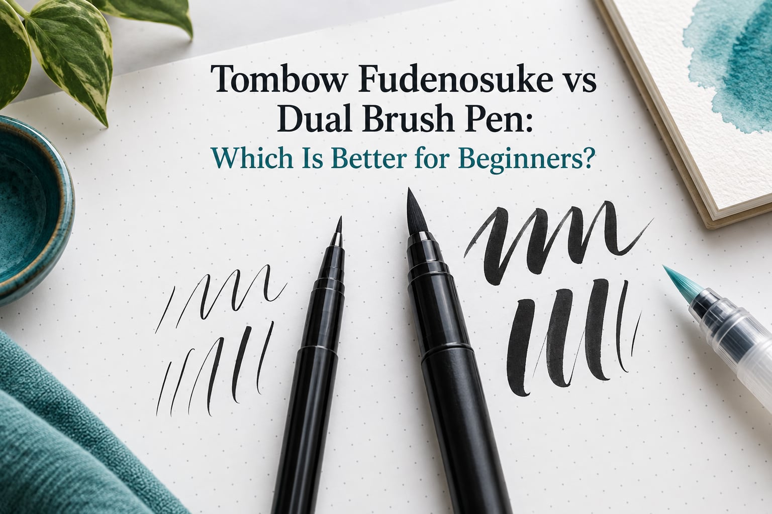
Almost every beginner who quits brush lettering in month one quits for the same reason: they opened a Tombow Dual Brush first. The tool felt huge, the strokes wobbled, and a normal amount of hand tremor got amplified into letters that looked like a mistake. The fix is a sequencing decision, not a talent test. Here is the short version: buy the Tombow Fudenosuke 2-pack and start on the hard tip, then add a Tombow Dual Brush once your strokes are consistent. Everything below explains why that order works, what each pen does that the other cannot, and the point in your practice where the second purchase actually pays for itself.
Table of Contents
- The Short Answer: Start With the Fudenosuke, Add the Dual Brush in Month Two
- Tombow Fudenosuke vs Dual Brush Pen: What Each One Actually Is
- Side-by-Side Spec Comparison: Tip, Ink, Control and Cost of Learning
- Control: Why the Big Tip Amplifies Every Mistake
- Paper Compatibility: Why the Same Sheet Ruins Both Pens Differently
- Fudenosuke Hard Tip vs Soft Tip: A Two-Stage Learning Ladder
- What the Tombow Dual Brush Pen Is Actually For
- Your First 30 Days of Hand Lettering
- How to Test a Brush Pen Before You Rely On It
- Where Both Pens Sit Among the Best Brush Lettering Pens for Beginners
- Frequently Asked Questions
- Which brush pen is best for beginners?
- Are Tombow Dual Brush pens worth it?
- What is the difference between the Tombow Fudenosuke hard and soft pens?
- What are Tombow Dual Brush pens used for?
- What are the best brush lettering pens for beginners?
- How do I start hand lettering as a beginner?
- Why does my brush pen ink bleed and feather on cheap paper?
- Should I start hand lettering with the Fudenosuke hard tip or soft tip?
- Conclusion: The Beginner Decision in One Sentence
The Short Answer: Start With the Fudenosuke, Add the Dual Brush in Month Two
Start with the Tombow Fudenosuke hard tip and add a Tombow Dual Brush in month two. That single sentence is the whole verdict, and it is the same sentence I will repeat at the end of this guide.
The reasoning is mechanical. The Fudenosuke pairs a small barrel with a small felt tip, so a small change in finger pressure produces a small, clean change in line width. The Dual Brush pairs a large barrel with a large flexible felt tip and a fine bullet tip on the other end, which gives you dramatic thick-and-thin contrast, twenty-odd water-based colours and blendable ink, but only once your hand is steady enough to hold that contrast on purpose.
If your goal in the first eight weeks is learning to make a consistent downstroke and a consistent upstroke, the Fudenosuke is the lower-friction tool. If your goal is colouring, large lettering, fills and gradients on card, the Dual Brush is the right pen and buying it early does you no harm as long as you still practise lettering in something smaller.
One more framing helps. This is a two-pen path, not a single purchase. A commenter in the PrettyPrintsAndPaper beginner thread put it plainly: they own the Dual Brush but it is good only for bigger letters, not for the tiny ones they can comfortably manage with the Fudenosuke. Both pens are good pens. They simply fail and succeed at different scales.
Tombow Fudenosuke vs Dual Brush Pen: What Each One Actually Is
The two pens share a brand and a tip material, and almost nothing else. Once the physical differences are clear, the control argument writes itself.
The Tombow Fudenosuke is a small pen built around a small felt tip
The Fudenosuke is a slim black-bodied pen with a small synthetic felt tip at one end, and it is sold most often as a 2-pack containing a hard tip version and a soft tip version. Fude is the Japanese word for a brush tip, and that word is the whole design brief: a pocket-sized brush that fits in normal handwriting grip.
The ink is water-based dye ink. It flows smoothly, blends when wet with a clean water brush, and gives up on paper tooth. It is not waterproof once dry and it does not smudge like a pigment marker, which is why people in the r/bulletjournal community reach for it when they plan to layer water or another colour over marker work.
Because the tip is small, the thick downstroke and thin upstroke contrast available to you is modest. A r/Calligraphy thread described the trade-off accurately: the tip of the Fudenosuke is more firm, easier to control, and produces cleaner, sharper results than a large soft tip, but it can be harder to control for a true beginner simply because the line is thinner and the wobbles are still visible.
The Tombow Dual Brush is a large marker with a brush tip and a bullet tip
The Dual Brush is a chisel-capped marker roughly the size of a permanent marker. One end is a large flexible felt brush tip, the other is a fine bullet tip meant for detail lines, dots, and lettering small enough that a brush tip could never render it. The cap colour codes the ink, and the range covers a couple of dozen water-based colours including a colourless blender marker.
This is the pen for large-scale work. Thick strokes arrive without extreme pressure, the fine tip handles outlines and small accents, and the water-based ink spreads and blends into washes and gradients with a separate water brush. It is genuinely a colour tool, not a bad lettering pen.
The stroke contrast it produces is much wider than the Fudenosuke can give you. That wider range is also the source of the difficulty: a large soft tip responds to pressure with a large change in width, so any instability in your hand shows up as a visibly uneven stroke.
Side-by-Side Spec Comparison: Tip, Ink, Control and Cost of Learning
Here is the spec-level comparison, row by row, so you can see exactly where the two pens diverge. Nothing in this table relies on a single price snapshot; the last row is the one that actually matters for a beginner.
| Attribute | Tombow Fudenosuke | Tombow Dual Brush |
|---|---|---|
| Tip type | Small synthetic felt, firm or soft version | Large flexible synthetic felt brush tip plus a fine bullet tip |
| Barrel size | Slim, normal pen grip | Large marker barrel |
| Ink | Water-based dye ink, blendable | Water-based dye ink, blendable |
| Colour range | Black, plus a separate 10-pack colour version | Around twenty-odd colours, including a colourless blender |
| Line variation | Moderate, controlled thick and thin | Wide, dramatic thick and thin |
| Control at small letter sizes | Good with practice | Difficult until hand control develops |
| Best at | Small lettering practice, drills, journal headers | Large lettering, colouring, fills, washes, cards |
| Waterproof once dry | No | No |
| Refillable | No, replacement is a new pen | No, replacement is a new pen |
| Learning cost of a wrong first choice | Low, mistakes stay legible | High, mistakes are large and obvious |
Tip size and line control
Tip size is the single variable that decides everything else. On the Fudenosuke, a full-lettering-height downstroke is maybe a few millimetres wide, so a shaky hand produces a slightly wobbly thin line. On the Dual Brush, the same shaky hand produces a stroke that visibly swells and thins, and beginners read that as bad technique when it is really just scale.
The fine bullet tip on the Dual Brush is the underrated part for lettering. It lets you add hairlines, dots, and monoline details that a brush tip alone would turn into blobs, and in experienced hands the pairing gives you two distinct textures in one pen.
Ink, colours and blending
Both pens use water-based ink that responds to water while still wet. That shared trait is what makes them more alike than their barrels suggest, and it is also what makes cheap paper punishing: the ink sits on a rough surface with nowhere to settle, so it beads and feathers.
The difference is quantity of colour. If your practice goal is black on white for the first month, colour is irrelevant. If your goal is a decorated spread, a planner page, or a set of place cards, the Dual Brush colour set earns its place immediately because no amount of Fudenosuke technique will produce a coral wash.
Tip wear, longevity and refills
Both bodies are consumables. Neither is refillable, so when a tip frays you replace the pen rather than refill it, and that is worth budgeting for mentally before you start.
Hard tip Fudenosukes fray faster than people expect, and the most common cause is not the pen. It is friction. A hard tip dragged repeatedly over printer paper tooth wears the felt down visibly in weeks, and beginners assume the pen arrived defective. On smooth paper the same pen keeps going for months. A Foxsy hand lettering forum discussion captured the same trade-off from the other direction: one member recommended the Dual Brush for newbies to get used to the feel of a brush pen, while another replied that the Fudenosuke is the easiest to learn with and use for small size letters.
Control: Why the Big Tip Amplifies Every Mistake
The big felt tip does not create mistakes. It magnifies them, which is why beginners mistake a tool mismatch for a talent problem.
Both pens make thick-and-thin contrast the same way in principle: press for the downstroke, ease off for the upstroke. The difference is the gain. A small firm tip turns a small pressure change into a small width change, so it forgives. A large soft tip turns the same small pressure wobble into a large width change, so it broadcasts every tremor you have.
Three practical consequences follow from that:
- Letter size sets the difficulty. The same stroke at a large headline size is far more forgiving than at journal scale. If you must use a Dual Brush, make your letters big.
- Posture matters more. Rest your forearm or your heel of the hand lightly on the page so the pen hand moves from the shoulder rather than the wrist. A supported hand stabilises the large tip far more than it stabilises a small one.
- Anchor the start and the end. The thickest moments in a stroke are its beginning and its end. Practise pressing in, holding briefly, and easing out, rather than dragging pressure through the whole downstroke.
If you drag your hand across the page as you write, use an underhand grip with the pen rolling under the thumb-side of the hand. That keeps the tip clear of the part of your hand that the paper will smear, and it works with either pen.
There is a version of this problem that shows up constantly in beginner threads: someone buys the most visible pen on the shelf, produces wobbly letters, and concludes they are bad at lettering. In r/bulletjournal, the recurring recommendation is unambiguous: definitely the Fudenosuke hard tip, because it gives you more control while you are learning pressure, and the Dual Brush is the hardest of the three options mentioned in the same breath.
Paper Compatibility: Why the Same Sheet Ruins Both Pens Differently
Paper decides how both pens behave, and it ruins them in two completely different ways. The Fudenosuke fails by fraying. The Dual Brush fails by bleeding.
| Paper | Fudenosuke | Dual Brush |
|---|---|---|
| Standard printer paper | Works, but the hard tip wears down quickly and strokes feather slightly | Bleeds and bleeds through on anything but the lightest marks |
| HP Premium 32lb | Good, noticeably longer tip life than printer paper | Holds most small strokes, bleeds on full-coverage fills |
| Rhodia DotPad | Very good, smooth surface protects the tip and keeps edges crisp | Very good, the standard pairing for large lettering and washes |
| Card and mixed media | Fine for practice drills | Ideal, the intended surface for lettering, fills and blending |
Bleed-through and ghosting are different problems. Bleed-through means ink pushes through to the other side. Ghosting means a faint mirror image shows on the back without full penetration. With a large soft tip loaded with water-based ink, both become likely on thin stock, which is why Dual Brush users often work on a scrap layer beneath their page.
One beginner blog made a deliberate call in the other direction, recommending plain printer paper for the earliest drills on the grounds that you will waste a lot of sheets before the strokes improve. That is defensible for week one with a Fudenosuke, and indefensible the moment you open a Dual Brush. Start cheap while you are drilling pressure, then move to a smooth 32lb pad before you make anything you want to keep.
Feathering looks like tiny fibres pulling ink outward, and it means the paper is drinking the ink faster than it can dry. A smoother sheet fixes it. A thinner sheet makes it worse.
Fudenosuke Hard Tip vs Soft Tip: A Two-Stage Learning Ladder
Within the 2-pack, the hard tip teaches control and the soft tip teaches pressure. Use them in that order, and you get a staged curriculum for the cost of one purchase.
| Stage | Hard tip | Soft tip |
|---|---|---|
| Pressure response | Almost none, line width barely changes | Strong, the tip visibly compresses and fans |
| Line consistency | Very consistent | Consistent only with steady hand pressure |
| Thick and thin contrast | Subtle | Dramatic |
| Main risk | Boredom, learners over-pressing for contrast that is not there | Over-pressing, blunting and fraying the tip |
| Best stage of learning | Week one onwards, foundational drills | Once strokes are repeatable under pressure |
Almost all beginners should begin on the hard tip. It rewards you with clean, even strokes while your motor pattern is forming, and it removes the temptation to squeeze. Squeezing is the habit that frays soft tips and that makes beginners believe they have no control.
Move to the soft tip when you can draw a downstroke and an upstroke that look alike on ten consecutive attempts without watching your hand the whole way. At that point the soft tip becomes a genuine upgrade rather than a source of noise, and the same 2-pack has taught you the entire pressure range without a second purchase.
What the Tombow Dual Brush Pen Is Actually For
The Dual Brush earns its place the moment your project is bigger than a line of text. Its four real jobs are:
- Large lettering and display words. Headline-size words on card, poster, or a journal cover, where the wide stroke range is the point rather than a problem.
- Colouring and fills. Filling shapes, borders, frames, and small illustrations with a marker that lays down even coverage.
- Blends and gradients. Lay a light colour down, add clean water with a separate water brush, then drop a second colour into the damp edge.
- Large-scale backgrounds and washes. Broad areas of colour where a small tip would take ten passes.
Blending in three steps: lay down the light colour first and let it sit damp, load a clean water brush with plain water and sweep into the wet edge to create a gradient, then touch a second colour into the damp boundary and let it travel. The marker ink is water-based and not waterproof, so this works while wet and will not work once the page dries.
There is one thing beginners rarely expect: you need the water brush. Blending technique requires a separate water brush that most new owners do not know they need, and without it the colourless blender marker is the tool that does the job instead.
When should you skip the Dual Brush entirely? Tiny journal lettering, dot work on a bujo spread, and any lettering smaller than about a cap height that you cannot comfortably draw at postcard size. Those are Fudenosuke jobs, and forcing a large tip into them produces exactly the frustration that makes people quit.
Your First 30 Days of Hand Lettering
Hand lettering for beginners is a motor exercise before it is a creative one. The plan below assumes a Fudenosuke 2-pack and about fifteen minutes a day.
- Days 1 to 3, pressure only. On the hard tip, draw a single downstroke and a single upstroke twenty times each. Aim for identical width every time. Resist pressing harder for the downstroke, because the hard tip will not give you much.
- Days 4 to 7, basic strokes. Add the underturn, overturn, and compound curve. Basic strokes are the entire alphabet of modern calligraphy, and every letterform is a combination of them.
- Days 8 to 14, letterforms. Write a single letter twenty times in a row rather than writing a word twenty times. Consistency at the letter level is what makes words look even later.
- Days 15 to 21, the soft tip test. Repeat the same letters on the soft tip with deliberate pressure. Keep the downstroke thick and the upstroke thin, and count how many of twenty feel even. This is the week the 2-pack earns its keep.
- Days 22 to 30, first project. Make something you want to keep, on a smooth 32lb sheet. Colour is fine to add at this point only through a separate colour pen or pencil, not through the Dual Brush.
The rule for adding the Dual Brush: wait until you can produce twenty consistent strokes without watching your hand. For most people doing fifteen minutes a day, that lands somewhere in week five or six, which matches the general consensus that the Fudenosuke is the universal first pen and the Dual Brush is the month-two colour upgrade.
The buy-both decision rule, stated plainly: if what you want to make in the next thirty days is written words in a small-to-medium size, stay with the Fudenosuke alone. If it is a decorated card, a heading with colour, a filled illustration, or anything with a wash in it, buy the Dual Brush now and keep the Fudenosuke for drills.
How to Test a Brush Pen Before You Rely On It
Test any brush pen for five minutes before you commit a project to it. Three quick checks tell you what you need to know.
- Pressure ladder. Draw six parallel lines with gradually increasing pressure from finger to full hand weight. A responsive tip shows a visible width ladder. If all six look identical, that is a hard tip behaving correctly, not a faulty pen.
- Blend test. Scribble a patch, then run a wet water brush across the middle of it. The ink should feather and move. If the patch stays rigid, you have a pen that is not going to blend regardless of what the packaging suggests.
- Bleed check. Turn the sheet over and hold it to the light. Light ghosting is normal on thin paper. A full mirror image means move to heavier paper or smaller pressure before you start a real project.
If a soft tip frays or separates, stop using it immediately and dry the nib fully before capping. Continued use in a splayed state is what turns a recoverable tip into a ruined one.
Where Both Pens Sit Among the Best Brush Lettering Pens for Beginners
The beginner brush pen market splits into three genuinely different tools, and choosing between the Tombow pair means knowing what the other category does instead.
- Firm felt pens. Small, consistent, forgiving. The Fudenosuke hard tip sits here, and this category is the safest first purchase for line work.
- Real bristle brush pens. Traditional dip-pen behaviour with the most authentic thick-and-thin response, and the least forgiving setup. Not a first-month choice.
- Large blendable felt markers. Colour, fills and display lettering. The Dual Brush sits here, and it is the strongest colour tool of the three rather than a weak lettering pen.
Within that spread, the Fudenosuke hard tip is the safest single first pen for pressure and control, and the soft tip is the gentlest first upgrade. A small firm bristle pen and a basic felt pen set cover similar ground if you want alternatives to compare. What none of them replace is the Dual Brush’s colour range and blendability, which is why buying it second is an expansion rather than a duplicate.
If your goal is genuinely modern calligraphy with thick downstrokes and thin upstrokes as a permanent habit, a calligraphy nib pen is a different discipline with a different learning curve, and worth pairing later rather than instead.
Frequently Asked Questions
Which brush pen is best for beginners?
The Tombow Fudenosuke hard tip is the best brush pen for most beginners because the small felt tip forgives hand tremor and produces clean, repeatable strokes while you build pressure control. Move to the Fudenosuke soft tip in month two, then add a Tombow Dual Brush when you want colour and large lettering.
Are Tombow Dual Brush pens worth it?
Yes, as a month-two tool rather than a first-day one. The Dual Brush gives you a wide thick-and-thin range, a fine bullet tip for detail, water-based blendable ink and a broad colour range. Most beginners who struggle with it are trying to use it at small letter sizes, where the large soft tip magnifies every wobble.
What is the difference between the Tombow Fudenosuke hard and soft pens?
The hard tip is firm and barely changes width with pressure, which makes lines consistent and the tip long-lasting. The soft tip compresses under pressure and gives a much wider range of line widths, which looks more like traditional brush lettering but frays faster if you press too hard. The 2-pack contains one of each.
What are Tombow Dual Brush pens used for?
The Tombow Dual Brush pen is used for large-scale lettering, colouring, fills, gradients and washes, plus detail work using the fine bullet tip on the other end. Its water-based ink blends with a separate water brush while still wet, and it is not waterproof once dry.
What are the best brush lettering pens for beginners?
For beginners the firm felt tip category wins, and the Tombow Fudenosuke is the standard pick. Real bristle dip-style pens offer the most authentic thick-and-thin response but demand the most control. Large blendable felt markers like the Tombow Dual Brush excel at colour and display lettering rather than small controlled text.
How do I start hand lettering as a beginner?
Start with one pen, usually the Fudenosuke hard tip, and practise twenty identical downstrokes a day for the first three days. Add the underturn, overturn and compound curve in week two, then write single letters repeatedly rather than whole words. Add the soft tip around week three and a colour pen only once your strokes are repeatable.
Why does my brush pen ink bleed and feather on cheap paper?
Water-based brush ink sits on rough paper tooth with nowhere to settle, so it beads and spreads into fibres. A hard tip also wears down faster on a rough surface, which beginners often mistake for a defective pen. Moving to a smooth 32lb pad or a Rhodia DotPad fixes both the feathering and the tip wear.
Should I start hand lettering with the Fudenosuke hard tip or soft tip?
Start with the hard tip. It gives consistent, repeatable lines while your motor pattern forms and it removes the temptation to squeeze the pen, which is the habit that frays soft tips. Move to the soft tip once you can produce twenty even strokes without watching your hand.
Conclusion: The Beginner Decision in One Sentence
Start with the Tombow Fudenosuke hard tip, move to the soft tip when your strokes are repeatable, and add a Tombow Dual Brush in month two for colour, blending and large lettering. That is the whole decision, and the timeline matters more than the choice.
Your next step is small. Buy the 2-pack, sit down for fifteen minutes, and draw twenty identical downstrokes before you do anything else with it. If the strokes look even, you are ready for letterforms. If they do not, no amount of colour will fix that yet, and that is a good problem to have.