
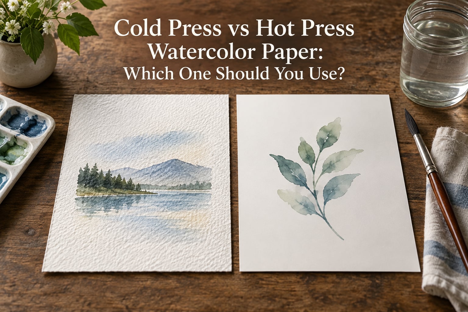
Cold press watercolor paper is pressed through unheated, felt-covered rollers, which leaves a gentle pebbled texture called tooth. Hot press paper is run through heated metal rollers, which flatten the fibres into a smooth, almost non-porous surface. That one manufacturing difference changes your drying time, your blend window and whether your pencil line survives.
If you have ever finished a wash, stepped back and watched a hard edge form where you wanted a soft sky, the surface was probably part of the reason. This guide breaks down cold press versus hot press paper so you can stop fighting the sheet and start painting on it.
We spent weeks painting the same subjects on both surfaces in the studio, side by side, at the same weight. What follows is what actually changed on the sheet.
Quick answer: cold press paper is the forgiving all-rounder and the right default for beginners, landscapes, loose washes and any painting where you blend, lift or correct often. Hot press paper is the detail specialist, chosen for botanical illustration, ink and wash, calligraphy, mixed media and for reproduction where a clean scan matters.
| Attribute | Cold Press | Hot Press |
|---|---|---|
| Absorbency | Higher. Water sinks into the valleys of the tooth and pigment settles into the texture. | Lower. Paint sits nearer the surface, so colour stays brighter and water runs faster. |
| Best for | Landscapes, seascapes, loose expressive work, natural granulation, soft edges, beginners. | Botanical illustration, fine detail, ink and wash, calligraphy, gouache, coloured pencil, scanning. |
| Pros | Long blending window, easy lifting, forgiving of mistakes, holds a wet brush without pilling. | Crisp linework, clean flat washes, bright colour, no texture shadows when scanned. |
| Cons | Fine ink and pencil lines break up, gouache sits on the tooth, hard to shade smoothly with graphite. | Very unforgiving, short blending window, washes dry with hard edges and streaks. |
The rest of this guide explains why each of those rows behaves that way, and how to decide for your own work.
Table of Contents
- What Cold Press and Hot Press Actually Are
- Cold Press Paper: Texture, Tooth and How Paint Behaves
- Hot Press Paper: Texture, Tooth and How Paint Behaves
- Cold Press vs Hot Press: Side-by-Side Comparison
- Painting Techniques That Change Between the Two Surfaces
- Where Rough Paper Fits In
- How to Choose: Weight, Cotton Content and Sizing
- Testing Paper Before You Buy
- Which One Should You Use?
- Frequently Asked Questions
- Should I use cold press or hot press watercolor paper?
- When should I use cold press and when should I use hot press?
- Is hot press smoother than cold press?
- Is cold pressed watercolor paper smooth?
- Can you do washes on hot press paper?
- Does cold press paper break up ink and pencil lines?
- Why does my hot press watercolor paper feel thinner than the cold press version?
- What is the best watercolor paper for a beginner?
- Conclusion
What Cold Press and Hot Press Actually Are
Both finishes are the same thing at different temperatures. Watercolour paper comes off the press as a smooth sheet, then goes through rollers that either are or are not heated, and that choice is the entire difference between the two surfaces you buy.
Cold press sheets travel through felt-covered rollers with no heat applied. The felt is textured, so it presses a shallow, irregular pattern into the wet pulp and then leaves it there. Hot press sheets go through heated metal rollers instead. The heat and the hard, flat surface squash the fibres down and burnish the sheet, so almost nothing of that pattern survives.
A terminology note that trips people up: in the UK trade, cold press is often labelled NOT, short for not hot pressed. If you are looking at a British range and you cannot find cold press, you are probably holding it.
Three terms do most of the explaining, and they are worth knowing before you buy anything.
Tooth is the texture you can see and feel. It is not a defect and it is not unevenness; it is the surface pattern left by the pressing process, and it is what catches pigment.
Sizing is the coating that controls how much the sheet drinks. A well-sized sheet holds water on the surface long enough for you to move it around. A poorly sized sheet grabs the water and dries almost as fast as you can apply it.
Granulation is pigment settling unevenly into the texture. Ultramarine and raw sienna are classic granulating pigments. On cold press they settle into the valleys and give you a mottled, natural look. On hot press there is nowhere to settle, so the same pigment reads flatter and cleaner.
Cold Press Paper: Texture, Tooth and How Paint Behaves
Cold press is the middle surface of the three, and that middle position is exactly why it works for so many people. The tooth is clearly visible under raking light, but shallow enough that a brush still moves across it smoothly.
Because the sheet is more absorbent, water travels into the texture rather than sitting on top of it. You get a longer blending window, which in practice means you have more time before the edge of a wash sets. Wet-on-wet passages stay open longer, and soft transitions in a sky or a cheek are far easier to place.
Paint settles into the tooth, so pigment breaks around the peaks of the texture. This is what gives cold press its reputation for natural, broken colour and visible granulation. It is also why colours look slightly softer and less saturated than they do on hot press.
The other thing you will notice is how forgiving it is. Lifting is easy: damp brush, circular motion, and pigment comes out of the valleys. Experienced painters overwhelmingly use 300lb cold press as their default, and the reason in forum threads is consistent. It is the surface that lets you correct a mistake instead of restarting the sheet.
The honest downside is linework. Fine ink and pencil lines catch on the peaks of the tooth and break into a fuzzy, interrupted line. Graphite shading is rough to work across, and gouache sits on the texture rather than bonding to it. If your practice is drawing rather than painting, this is where cold press costs you.
Hot Press Paper: Texture, Tooth and How Paint Behaves
Hot press is the smooth end of the range. Under raking light it shows almost nothing, and the surface is often described as vellum-like. Paint sits on top rather than sinking in, which is the source of both its strengths and its reputation for being difficult.
With less absorbency, water moves fast and edges harden quickly. The blending window on hot press is very short. Painters moving over from cold press regularly describe the same thing: the smooth results look beautiful, and they lost the ability to blend freely. Washes pool and dry with hard edges and streaks, which is why hot press asks more of you on a large sky.
What you gain is control over edges and detail. A fine brush loaded once leaves a clean line instead of a broken one. Flat washes stay flat. Colours read brighter because the pigment is not sinking away from the eye. If you paint botanical subjects, architectural detail, calligraphy, or anything that depends on an unbroken edge, hot press is the surface built for it.
There is a second, quieter advantage that only matters if you reproduce your work. Because there is no texture, there are no texture shadows when you scan or photograph the page. A cold press sheet photographed at a low angle shows every dimple casting a shadow, and those shadows do not scan away. Hot press reproduces cleanly.
Hot press is also not always the same thickness as its cold press sibling. Painters on Reddit ask why a hot press sheet of the same nominal weight feels thinner in the hand, and it is a real observation. The heat and pressure that smooth the surface also compress the sheet. Judge weight by gsm, not by the feel of a single sheet.
Cold Press vs Hot Press: Side-by-Side Comparison
This is the comparison most people are looking for, with the rows competitors usually leave out.
| Factor | Cold Press | Hot Press |
|---|---|---|
| Surface texture | Visible pebbled tooth, shallow and even | Very smooth, almost textureless, vellum-like |
| Absorbency | Higher, water enters the tooth | Lower, paint sits on the surface |
| Pigment behaviour | Settles into the valleys, natural granulation | Stays on the surface, brighter flat colour |
| Drying time | Slower, damp patches linger | Fast, edges set quickly |
| Blending | Long window, soft transitions are easy | Short window, edges harden fast |
| Lifting and correcting | Easy to lift and adjust | Difficult once the colour has dried |
| Fine linework | Lines catch and break up on the peaks | Lines stay crisp and continuous |
| Mixed media | Graphite and pen struggle on the tooth | Ink, coloured pencil, gouache and fineliner all sit cleanly |
| Scanning and reproduction | Texture casts shadows under raking light | Scans clean with no texture shadows |
Read the drying time row twice. Most of what people dislike about hot press is one row in this table, and most of what people love about cold press is the row above it.
Painting Techniques That Change Between the Two Surfaces
Four techniques behave differently enough to be worth planning around. We tested each one on both surfaces with the same brush, the same pigment and the same water load.
1. Flat washes. Cold press gives you time. You can lay a sky, turn the board, and come back to it still damp. Hot press sets while you are still working the far corner, which is where streaky, hard-edged skies come from.
2. Wet-on-wet. This is cold press territory. The tooth holds water in the valleys and keeps the passage open. On hot press you are racing the surface, and a passage that should have diffused into a soft passage dries as a shape with a defined rim.
3. Dry brush. Cold press is where dry brush earns its keep. Dragging a nearly dry brush across the peaks skips the valleys and gives you broken texture and foliage for free. On hot press the same stroke lays down evenly and reads as a flat line, because there is no texture to catch.
4. Lifting and corrections. Cold press lifts readily, which makes it forgiving of a dropped sky or a misplaced branch. On hot press, dried colour is stubborn. Plan the painting more carefully before you commit, because a hot press sheet gives you very little second chance.
One technique deserves its own note: pencil underdrawing. Cold press tooth makes a light HB sketch grainy and hard to erase, and shading with graphite across it is a genuine chore. If you draw first and paint over, do the underdrawing on hot press, or sketch on a separate sheet and transfer. This comes up repeatedly as a beginner problem, and the usual response is a smoother, more absorbent surface than cold press.
A common test among painters is simply to paint the same subject on both surfaces and compare. Descriptions only go so far, because two mills label their sheets cold press and behave quite differently.
Where Rough Paper Fits In
Rough paper is the third surface, and it is the one most comparison guides leave out. It is pressed even less than cold press, leaving a deep, pronounced texture with no rollers flattening it at all.
Rough is not a middle ground between the two. It is a different set of problems: water pools in the pits, edges are ragged by default, and fine detail is close to impossible. In return you get the strongest natural granulation and the most dramatic broken colour of any surface.
Rough earns its place in specific work. Dramatic skies, crashing surf, rocks, scrub and loose expressive painting benefit from texture that exaggerates what you are painting. Experienced painters who work this way often carry rough on their supply list, and one painter on Reddit described attending a workshop where rough was specified because the whole approach depended on it.
Skip it for botanical illustration, portraits, anything with a clean horizon, and anything you plan to reproduce. And if you are choosing your first surface, rough is a poor default. It hides less of your mistakes than cold press and forgives less than either.
How to Choose: Weight, Cotton Content and Sizing
Surface is only one of three decisions, and beginners who get the other two wrong blame the surface. Paint on a light smooth pad and complain that cold press is difficult, when the pad is the real problem.
Weight. Watercolour paper is sold in pounds and grams, roughly 140lb to 300gsm for a mid-weight sheet. Heavier paper absorbs more water before it cockles, and cockling is the rippling you get when one side of the sheet swells more than the other. A 300gsm cold press sheet can take a full wash flat on the table. A 90lb sheet of either surface will ripple under the same wash, and beginners often read that buckling as a texture problem rather than a weight problem.
Fibre. Cellulose from wood pulp is cheaper and fine for practice. 100% cotton rag takes far more water, rewets without disintegrating, and stays stable over decades. If your work is going anywhere near a wall, cotton is the difference between a sheet that ages and a sheet that browns.
Sizing. Good sizing gives you the blending window. It is the least visible of the three and the one most often compromised in student grade paper, which is another reason a low-cost pad feels harder to work with than a cotton sheet at the same surface.
Judging brands is less useful than judging criteria. The forum consensus is that two sheets labelled cold press from different mills can behave quite differently, and that brand loyalty matters far less than the surface and weight you prefer. Buy the criteria, not the label.
Testing Paper Before You Buy
You can evaluate a sheet in about two minutes. Four checks, in order.
1. Feel the tooth. Run a fingertip across the surface, then across the back. On cold press you should feel a fine, even texture on the face and something smoother on the back. If both sides feel identical, you are probably looking at the felt side and the smoother side is the one you want to paint on.
2. Wet a corner. Put a small wash in the corner of the sheet. Cold press keeps the water moving and the edge stays soft for a while. Hot press takes it almost immediately and the rim sets. This single test tells you more than any description on the packet.
3. Hold it to the light. Look for thin spots and cloudiness. Thin areas cockle first and buckle first under a wash, so unevenness in the sheet will cost you later.
4. Check both sides. Most sheets are made on a mould where one side picks up the texture. Painting on the textured side when a smoother side exists is a common and frustrating beginner mistake, and it explains a lot of the complaints that people post about cold press being too rough.
If a shop sells single sheets, ask whether you can test one. If it sells pads, buy the smallest pad of the weight you want and put it through a full wash before committing to a block.
Which One Should You Use?
Pick cold press if any of these describe how you work.
- You are learning, and you want a surface that hides a small mistake rather than magnifying it.
- You paint landscapes, seascapes, skies or anything built on soft transitions.
- You blend wet into wet often, or you work in a loose, expressive style.
- You like visible granulation and broken colour from dry brush.
- You lift and adjust constantly, or you paint in a warm, dry room where things dry fast.
Pick hot press if any of these apply instead.
- You paint botanical illustration, insects, feathers or anything with fine line and edge definition.
- You work in ink and wash, calligraphy, or with fineliners and dip pens.
- You use gouache, coloured pencil or graphite alongside paint.
- You work small, in a sketchbook, or on the move in an urban sketching journal.
- You need to scan or photograph your work and cannot tolerate texture shadows.
| If you mainly paint | Start with |
|---|---|
| Landscapes, skies, loose watercolour | Cold press, 300gsm |
| Botanical and scientific illustration | Hot press, 300gsm |
| Ink, pen, calligraphy, journal work | Hot press |
| Beginner practice and studies | Cold press, 140lb |
| Reproduction for print or online | Hot press |
| Expressive texture and dramatic skies | Rough |
My advice for a first sheet is 300gsm cotton cold press. It is the surface experienced painters reach for by default, it forgives the most, and the extra weight removes the buckling distraction that makes new paper feel difficult. Once you know whether your work leans toward soft passages or clean edges, move deliberately to the surface that matches.
You do not have to replace what you own. Working on both surfaces for a month will teach you more about your own technique than any amount of reading, because you will finally feel where your hand needs the tooth and where it needs the glass.
Frequently Asked Questions
Should I use cold press or hot press watercolor paper?
Start with cold press. It has a longer blending window, forgives mistakes and handles loose washes and soft edges better than any other surface. Move to hot press once you know your style leans toward fine detail, ink work, or reproduction. Most experienced painters use 300gsm cold press as their everyday default.
When should I use cold press and when should I use hot press?
Use cold press for landscapes, seascapes, skies, wet-on-wet work, dry brush texture and any subject built on soft transitions. Use hot press for botanical illustration, fine detail, ink and wash, calligraphy, gouache, coloured pencil, urban sketching and anything you intend to scan or photograph.
Is hot press smoother than cold press?
Yes. Hot press paper is run through heated metal rollers that flatten the fibres and burnish the surface, leaving almost no texture. Cold press goes through unheated felt-covered rollers, which leaves a shallow, pebbled texture called tooth. That is the whole difference between the two surfaces.
Is cold pressed watercolor paper smooth?
Cold press is smooth compared with rough paper, but it is not smooth compared with hot press. The tooth is clearly visible under raking light and shallow enough to move a brush across. Beginners who think it feels too rough are often painting on the felt side; the opposite side of the sheet is usually noticeably smoother.
Can you do washes on hot press paper?
Yes, but you need to work faster and use more water. Hot press is less absorbent, so a wash sets quickly and the rim can harden before you have blended the edges. For large washes, damp the area first and keep the sheet flat and level. Very large skies are the one case where cold press is easier.
Does cold press paper break up ink and pencil lines?
It can. Fine lines catch on the peaks of the tooth and print as faint, broken or slightly fuzzy lines, especially with a fine fineliner or a hard pencil. For ink work, line art or pencil underdrawing, hot press is the better surface. If you prefer cold press, sketch lightly with a soft pencil and avoid pressing hard on the upstrokes.
Why does my hot press watercolor paper feel thinner than the cold press version?
The heat and pressure that smooth a sheet also compress it, so a hot press sheet can feel thinner in the hand than a cold press sheet at the same nominal weight. This is normal. Judge paper by gsm rather than by the feel of a single sheet, and compare weights in the same brand where you can.
What is the best watercolor paper for a beginner?
A 300gsm cotton cold press sheet is the best starting point for most beginners. The heavier weight resists buckling under big washes, the tooth forgives early mistakes, and cotton holds up if you keep painting. If your goal is drawing rather than painting, start on hot press instead, because ink and pencil behave better there.
Conclusion
Cold press versus hot press is not a quality contest. Cold press gives you tooth, a long blending window and the easiest corrections on the sheet, which is why it is the sensible first choice for most people. Hot press gives you a clean surface, crisp lines and faithful reproduction, which is why it is the right choice for detail work, ink and mixed media.
Start on 300gsm cotton cold press and paint one subject on both surfaces before you buy anything else. Whichever one you reach for first is the answer, and it is more reliable than any guide, including this one.