
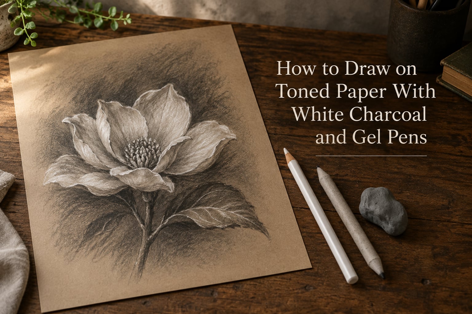
To draw on toned paper with white charcoal and gel pens, treat the paper itself as your mid tone, build the darks with graphite or black charcoal, then lay your whites on top. Draw the white charcoal lights in before the darks, and save the gel pen for the final sharp accents.
That single rule is the difference between a drawing where highlights pop off the surface and one that looks muddy. White media dragged across charcoal picks the charcoal up with it, and the highlight turns grey before you finish the page.
Toned paper is not a shortcut. It is a value you cannot get back once you cover it, which is exactly why so many finished toned drawings read as flat. Understanding the order of operations matters more here than on white paper, because the paper has already given you half the value scale.
I have drawn on toned paper for years, and the mistakes repeat the same way every time: whites applied too early, too heavy, or over darks that were not quite dark enough. Almost every muddy highlight traces back to one of those three.
Table of Contents
- What Toned Paper Is and Why the Mid Tone Changes Everything
- What You Need to Get Started
- How to Choose Toned Paper for Your Subject
- How to Draw on Toned Paper With White Charcoal and Gel Pens: Step by Step
- White Charcoal vs White Gel Pen: Which to Use When
- Using Both White Media in One Drawing
- How to Make White Read as Truly White
- Fixing, Sealing, and Stopping Smudging
- Common Mistakes and How to Fix Them
- Frequently Asked Questions
- What type of paper works best with charcoal?
- What GSM paper is best for charcoal?
- What fixative is best for charcoal drawings?
- How to make charcoal drawings not smudge?
- How to seal a charcoal drawing on paper?
- How to fix charcoal drawings on paper?
- When to use a white charcoal pencil?
- Is white charcoal just chalk?
- What are some techniques I can use to draw with charcoal?
- How to make charcoal stay on paper?
- What is the 50% rule in art?
- What type of paper is best for charcoal and graphite drawings?
- Conclusion
What Toned Paper Is and Why the Mid Tone Changes Everything
Toned paper is any sheet that already carries a colour or a grey value, usually a tan, grey, buff, or blue-grey. That colour is the mid tone, and it is where most of a realistic drawing actually lives.
On white paper you have to build the entire value scale yourself, from paper white down to dense black. On toned paper the mid value is already there, permanently, so you are only asked to add two things: the darks below it and the lights above it. Everything you draw is a deviation from a value that will not budge.
Here is the arithmetic that makes it click. If your paper is a middle grey and your whites only reach a light grey, the gap between the two is too small for the eye to read as a highlight. The eye measures a highlight by contrast against its surroundings, not by how white the pigment actually is.
That is the whole logic behind the 50% rule in art: if your highlights only reach about 50% of the way from the paper tone toward pure white, the paper tone is competing with your highlight and winning. You either push the lights brighter or you push the surrounding darks darker so the light has somewhere to pop against.
Value relationships matter more than any single mark. A scratchy-looking drawing often has perfectly placed highlights and muddy darks, and it is the darks that are wrong.
What You Need to Get Started
You do not need a large kit. The materials below are the ones that actually get used on a toned paper drawing, and each entry lists the specification that matters rather than a brand pitch.
| Material | What matters | Notes |
|---|---|---|
| Toned paper | Tooth, weight in gsm, tone | Rough or textured surfaces grab charcoal and white pencil; smooth surfaces suit gel pen line work |
| White charcoal pencil | Hardness grade and binder | Harder pencils hold a sharp line, softer ones blend and fill; water-based charcoal lifts more cleanly than oil-based |
| White gel pen | Opaque vs semi-opaque, nib width | Fine nibs for hairlines and catchlights, thicker nibs for filling and graphic marks |
| Black charcoal or graphite | Grade, sticks vs pencils | You need the darkest darks your setup allows; vine charcoal is soft, charcoal pencils are controllable |
| Kneaded eraser | Firmness | For lifting darks back to paper tone and softening edges without touching the surface |
| Vinyl or plastic eraser | Cut shape | For precise highlights and shapes; use lightly on toned paper so you do not chew the tooth |
| Blending stump and paper stump | Size variety | Stumps blend both the white and the darks; the plastic-wrapped tips stay sharp for small areas |
| Fixative | Matte vs gloss | Matte keeps the tooth visible; gloss deepens darks and darkens paper white over time |
One note on the charcoal box, because beginners ask this constantly. Charcoal comes as sticks, stick-pencils wrapped in wood like a pencil, and rectangular pastels. Sticks give broad soft marks, pencils give control, pastels sit between the two and are excellent for filling large dark areas fast.
Named papers come up constantly in drawing groups, and that is fair. Strathmore 400 series is a mid-weight toothy surface, Canson Mi-Teintes is a lighter rag paper in many tones, and Clairefontaine Pastelmat is a heavy, very smooth pastel surface. Artists working from life also mention Rives BFK and Daler-Rowney Canford grey. The sensible move is to buy a few sheets of two or three and test them yourself, because tooth preference is personal.
How to Choose Toned Paper for Your Subject
Match the paper tone to the subject and you remove a decision from every later step. Warm tan paper flatters skin, wood, hair, and earth tones. Cool grey paper suits animals, metal, mist, and any scene where you want the whites to look neutral rather than creamy.
Weight is the second decision. Anything around 160 gsm or heavier holds charcoal without buckling, and heavier papers tolerate more blending, more rubbing, and more eraser work. Below that, repeated blending can cockle the sheet and a stump dragged too hard will tear the surface.
Tooth is the third. A textured tooth grabs pigment and gives dry media something to hold, which makes white charcoal read brighter. A smooth surface is easier for gel pen lines, but the pen sits on top rather than biting in, so very fine nibs can skip.
| Surface | Best for | Watch out for |
|---|---|---|
| Textured tooth | White charcoal, soft blending, dry brush | Very fine gel pen lines may skip on the high points |
| Medium tooth | Charcoal pencils, mixed media portraits | None that block the process |
| Smooth surface | Gel pen line work, ink and fineliner detail | White media sits on top and looks thinner than expected |
Whatever you pick, test the sheet before you commit. Rub a soft charcoal patch, lay white charcoal over it, and add a gel pen line across both. That thirty-second swatch tells you more than any product description.
How to Draw on Toned Paper With White Charcoal and Gel Pens: Step by Step
This is the full process. Follow it in order on your first piece and the order will start to feel automatic.
Test your paper. Before anything else, make a small swatch on a scrap of the same sheet: a patch of black charcoal, a patch of white charcoal, a gel pen line over each, and a few smudged areas. You are checking how much tooth you have, how bright your whites can get, and whether your pen skips.
Choose your darkest value first. Decide what the darkest shadow in your subject will be and make that test patch on the corner of the sheet. If it is not convincingly dark, your drawing has no room for a highlight later. A lot of flat-looking toned drawings are built on shadows that never got dark enough.
Map the big shapes lightly. Draw with a soft graphite pencil or a diluted charcoal stick, keeping pressure light enough that the lines read as slightly darker than the paper rather than as drawing. On toned paper the faint marks disappear on their own within a few minutes, which is one of the surface’s quiet advantages.
Build the shadow masses. Lay in the darks with vine charcoal, charcoal pencil, or graphite. Hatch and cross-hatch first, then soften with a stump where you want an edge to turn. Keep the shadow shapes big and simple; detail belongs later.
Lay the white charcoal lights in now. This is the step people get wrong. White charcoal goes on before the dark charcoal is built up further, because dragging a waxy white stick across charcoal picks the dark pigment up and smears it into a grey cloud. Fill the largest lit areas, blend them with a soft stump, and use a vinyl eraser to cut the crispest edges back in.
Refine the darks around the lights. Now go back over the shadow masses and deepen them where they border a light. The contrast jump is what makes the highlight read as white. Watch your edges here: a hard edge where the light meets the dark belongs on a form, a soft edge belongs where a form turns away.
Add the gel pen accents. The pen is for the smallest and sharpest things: catchlights in the eyes, hair strands against a dark mass, the rim of a lip, a spark on glass. Draw these last, on top of everything, and keep the pressure even so the line width stays consistent.
Check the value relationships from a distance. Squint, or hold the page at arm’s length, and turn it upside down if that helps. If a light shape vanishes when you blur your vision, the contrast around it is too weak and needs a darker neighbour rather than more white pigment.
Sign, then let it rest. Wait before you fix it. Give the charcoal a few hours or overnight so you can catch any smudging that was going to happen, and only then decide on a sealer.
White Charcoal vs White Gel Pen: Which to Use When
These two media solve different problems. White charcoal is a drawing tool that moves with blending and smudging; a white gel pen is a precision tool that sits on the surface and does not budge.
| Property | White charcoal pencil | White gel pen |
|---|---|---|
| Opacity | High, and buildable to a full opaque layer | High and immediate, but each layer sits on the last |
| Blendability | Excellent, blends with a stump and smudges by finger pressure | None, ink dries and does not blend |
| Line control | Soft and forgiving, smudges easily | Precise and consistent, unforgiving of a shaky hand |
| Handles mid tone | Yes, it can be blended back down to the paper tone | No, it only goes lighter |
| Permanence | Friable until fixed, can be lifted or damaged by contact | Permanent once dry, cannot be erased or corrected |
| Best use | Volume of light, blended gradients, soft form modelling | Sharp accents, catchlights, fine line, final highlights |
The practical rule: use white charcoal to build the light, and use white gel pen to finish it. If you try to draw a large blended highlight with a gel pen you will burn through the nib and end up with a flat white shape with no gradient in it.
One more difference worth knowing. Opaque white gel ink tends to yellow very slowly over decades, while toned paper yellows noticeably with light exposure and age. An artist working in pencil and white charcoal once described deliberately avoiding white gel pen in pencil drawings for exactly that reason, since pristine ink next to a slowly darkening sheet eventually stops matching.
Using Both White Media in One Drawing
Combining white charcoal and white gel pen is a standard practice, and the order is the entire technique.
First the white charcoal, applied over the bare toned paper and over any soft darks you have already placed. Then the darks, built up around the lights rather than across them. Then the gel pen, last, for accents no soft medium can produce.
What you are avoiding is white charcoal crossing over finished charcoal darks. The wax and clay in the white stick pick up the dark pigment and drag it along, and the result is a highlight that looks like it was rubbed with a dirty thumb.
If you have already made that mistake, you cannot fully recover, but you can improve it. Lift the muddy area with a kneaded eraser to bring it back toward the paper tone, re-lay a cleaner white charcoal layer, and then secure the sharpest edge with gel pen. Community members working this way call it lifting, and it works better than adding more white on top.
How to Make White Read as Truly White
White that looks grey on toned paper is the single most common complaint in drawing groups, and the most-replied-to question in one of them was specifically about making white read whiter on Strathmore toned tan. The answer is not more white pigment. It is contrast, tooth, and timing.
Darken the neighbours first. This is the biggest lever you have. A light shape surrounded by paper-toned shadow reads as paper tone, however bright the pigment is.
Work into the tooth. A white charcoal pencil that is only dragged across the high points of a rough surface never grabs, and a thin skim of pigment in the valleys looks transparent. Press harder on the first layer, let it catch, and then blend the second.
Build two layers instead of one. A single pass over tone reads as a tint. Two or three layers with a light blend between them reach an opacity that actually separates from the paper.
Lift with an eraser where you can. A kneaded eraser pressed into charcoal raises the value back toward the paper tone and creates a light that matches the surface perfectly, because it is the surface. A vinyl eraser cut to a sharp edge gives you crisp shapes that white pigment alone tends to round off.
Keep the gel pen for the smallest light. A single bright pen line against a properly dark field is the sharpest highlight you can put on the page, and it costs you one pass.
Fixing, Sealing, and Stopping Smudging
Unfixed charcoal and white pencil rub off onto hands, paper, and other work. Fixative solves that, but the choice and the timing both matter.
Hairspray-type fixatives are cheap, easy to find, and genuinely effective at holding pigment. Workable fixatives penetrate the layer and let you keep drawing and erasing afterwards, which is the one to use while you are still refining. Matte fixative keeps the paper tooth visible and the colours true to how they looked wet. Gloss fixative deepens the darks and adds a shine that makes paper white look darker over time, so it is the wrong choice if the white in your drawing matters to you.
Spray from about 30 cm away in thin, even passes, in a ventilated space, and never touch the nozzle to the paper. Test on a scrap sheet first; some fixatives shift waxy white media into a faint blue cast, which happens because the solvent is pulling the wax forward. A light spray of workable fixative before the final coat reduces that.
To stop smudging while you work, keep a clean sheet of scrap paper under your hand, avoid resting your palm on the drawing, and store finished work flat with acid-free interleaving. Charcoal hates a tight plastic sleeve because it traps moisture against the surface.
Fix the work only when you have stopped drawing on it. Fixing mid-process makes the next layer sit on a sealed surface, and the layering you rely on stops behaving normally.
Common Mistakes and How to Fix Them
| Problem | Why it happens | Fix |
|---|---|---|
| Highlights look grey | Contrast between light and surround is too small | Darken the shadows next to the light instead of adding more white |
| White turns muddy where it crosses darks | Waxy white was dragged over charcoal | Draw lights in first; lift the mess with a kneaded eraser and relight |
| Everything smudges into mush | Blending was carried too far or too long | Stop one step short; leave some texture and hard edges for contrast |
| Drawing looks flat overall | Darks were never pushed past the paper tone enough | Test a deepest-black patch on the corner first, then match it |
| Pen lines skip on the surface | Tooth is too coarse for a fine nib | Use a slightly wider nib or work over a light layer of white charcoal |
| Eraser has chewed the paper | Too much pressure with a hard eraser on a thin sheet | Switch to a kneaded eraser for soft lifts and save the vinyl for one clean pass |
| Drawing curls after heavy blending | Paper is light and has been over-worked | Use heavier paper, and tape the edges down while you work |
Frequently Asked Questions
What type of paper works best with charcoal?
A medium-to-heavy paper with a slight tooth, around 160 gsm or more, holds charcoal best. The tooth gives dry pigment something to grip so the powder does not just fall off, and the weight stops the sheet cockling under repeated blending. Toned versions such as Strathmore 400 series or Canson Mi-Teintes suit portrait work, while a heavier smooth pastel surface suits fine gel pen line.
What GSM paper is best for charcoal?
Anything from about 160 gsm upward. Below that, blending and stump work can cockle or tear the sheet. If you work wet media or erase aggressively, go heavier. A heavier surface also accepts more fixative without the paper absorbing it unevenly.
What fixative is best for charcoal drawings?
A matte fixative is the safest choice, because it holds the pigment without adding a shine that darkens the paper and makes whites look duller over time. Workable fixatives applied mid-process let you keep drawing afterwards. Gloss fixatives give richer darks but can yellow a drawing, so they suit charcoal-heavy work more than white-heavy work.
How to make charcoal drawings not smudge?
Let the work rest before you seal it, then spray a thin fixative from about 30 cm away in even passes. While you work, keep a clean scrap sheet under your hand so the oils and charcoal on your palm never touch the drawing, and store the finished piece flat with acid-free interleaving rather than pressed tightly against another surface.
How to seal a charcoal drawing on paper?
Work in a ventilated space, test the fixative on a scrap sheet first, and spray light passes rather than one soaking coat. If your drawing uses waxy white media, apply a light coat of workable fixative first and let it dry, because a solvent-based spray can pull the wax forward and leave a faint blue cast.
How to fix charcoal drawings on paper?
A lifting method works well for small areas: press a kneaded eraser into the charcoal to raise the value back toward the paper tone, then re-lay your whites and darken the surrounding shadow so the light reads. A vinyl eraser cut to a shape gives a crisp highlight that pigment alone tends to soften.
When to use a white charcoal pencil?
Use it wherever the light needs volume, gradient, or blending, such as a lit cheek, a lit rim of a form, or a large lit area with a soft edge. It moves and smudges, which makes it the right tool for modelling light but the wrong one for a tiny catchlight you need to stay razor sharp.
Is white charcoal just chalk?
Not quite. White charcoal is a compressed pigment stick made from chalk, clay, and wax or oil binder, produced to hold a drawn line rather than a dusty mark. It comes as sticks, wood-wrapped pencils, and rectangular pastels, and it is denser and more permanent than school chalk, though still friable until it is fixed.
What are some techniques I can use to draw with charcoal?
Hatching and cross-hatching build shadow without blending, a stump softens and blends tones, smudging with a finger or a cloth gives a broad soft gradient, and lifting with a kneaded eraser creates highlights. On toned paper, drawing highlights first and darkening around them afterwards is the technique that makes white read as white.
How to make charcoal stay on paper?
Give the charcoal something to grip by using a paper with tooth rather than a very smooth sheet, and press the first layer on firmly so it catches in the surface. Building two or three lighter layers with a blend between them holds far better than one heavy pass, and sealing the finished work with a matte fixative locks it down permanently.
What is the 50% rule in art?
It is a check on whether your highlight is bright enough. If the lightest area in your drawing only reaches about half the distance from the paper tone toward true white, the paper is competing with the highlight and it reads as grey. The fix is to push the lights brighter, or more often to push the surrounding darks darker so the light has contrast to sit against.
What type of paper is best for charcoal and graphite drawings?
A medium tooth with some weight, roughly 160 gsm, gives graphite something to catch while still accepting an eraser without chewing. Toned papers in the same weight range work for graphite too, since the mid tone does the work of a whole middle value range. If you need a smooth surface for a very fine nib, keep it for ink stages and switch to toothy paper for the dry media.
Conclusion
To draw on toned paper with white charcoal and gel pens, give the paper the job of the mid tone, decide your darkest value before you start, lay the white charcoal lights in before the darks are built up, and use the gel pen last for the sharpest accents. Everything else is blending, edges, and patience.
For your first piece, keep the subject simple: a single-lit sphere, a still life with one strong light source, or an eye study. Finish it in one sitting, and you will learn the order of operations faster than any supply list can teach it.