
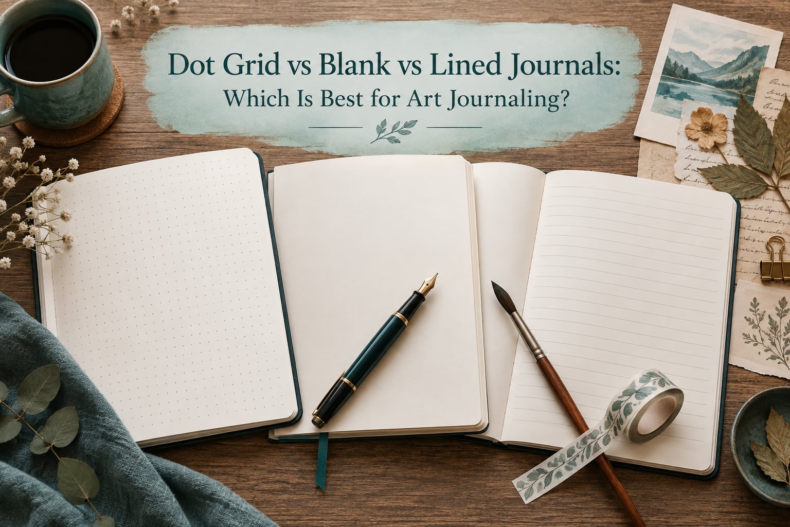
Dot grid wins for most art journalers. It gives you alignment and proportion help while staying quiet enough to draw edge to edge. Blank pages are the better choice when wet media, collage or heavy pressure is the centre of your work. Lined pages earn their place only in writing-led journals, and even there they suit narrow handwriting more than broad layout. That is the honest short version of the dot grid vs blank vs lined journal question, and the rest of this guide explains exactly where each format holds up and where it fights you.
I have filled more journals than I would care to admit, across roughly five formats at a time, and I have switched back and forth more than once. The format debate looks trivial from the outside. It is not, because the page decides what you are able to make on it before you have picked up a pen.
Below I break down all three formats for art journaling: what each one is, where it wins, the complaints nobody warns you about, and how to match paper weight to whatever media you actually use. I also cover grid paper as a fourth option, because a lot of readers arrive already asking about it.
Table of Contents
- Which Is Best for Art Journaling? The Quick Verdict
- Blank vs Lined vs Dot Grid: Head-to-Head Comparison
- What Is Dot Grid Paper, and Why Do Some Journals Have Dots Instead of Lines?
- What Is Blank (Plain) Paper?
- What Is Lined (Ruled) Paper?
- What About Grid Paper? The Fourth Option
- Dot Grid for Art Journaling: Where It Wins
- Blank Paper for Art Journaling: Where It Wins
- Lined Paper for Art Journaling: Where It Wins
- The Dot Grid Problem Nobody Warns You About
- Why Lined Pages Break Full Spreads
- How to Get Straight Lines on Blank Paper
- Paper Weight (gsm) Matched to Your Media
- Collage, Washi Tape, Ephemera and Stickers on Each Format
- How to Test Paper Before You Commit to a Full Journal
- Choosing by Art-Journaling Style: A Quick Decision Path
- Size and Binding: The Secondary Decisions
- Frequently Asked Questions
- Are dotted or lined journals better?
- What is the best journal for art journaling?
- What type of paper is best for art journaling?
- Why do some journals have dots instead of lines?
- Do dot grid pages show through pencil drawings?
- Is dot grid better than blank paper for sketching?
- What kind of paper is used in journals?
- What is the best lined paper?
- Conclusion: Dot Grid vs Blank vs Lined Journal
Which Is Best for Art Journaling? The Quick Verdict
If you read nothing else, use this. Dot grid for most art journalers, blank for wet and mixed media, lined for writing-first pages. There is no universally best option, because the format that makes drawing easy makes writing hard, and the format that makes writing easy makes drawing hard.
- Pick dot grid if you mix lettering, illustration, layout and writing, or if you want help with proportion and spacing without a visible cage around your work.
- Pick blank if you paint, use markers heavily, glue things down, or work edge to edge across a two-page spread.
- Pick lined if you write most of what you make, keep a daily record, or hand-letter with a consistent baseline rather than freehand placement.
- Pick grid if your work is built on strict alignment, such as architecture sketches, geometric abstracts or a structured weekly layout.
My own habit, after years of going back and forth, is to keep two journals. One dot grid for daily pages and lettering, one blank for anything wet or glued. Nothing is wrong with that. The people who get the most out of art journaling are rarely the ones with the single perfect book, they are the ones who stopped hesitating over the choice and made something.
Blank vs Lined vs Dot Grid: Head-to-Head Comparison
Here is the full comparison. Read across a row to see how the four paper formats behave on the same task, or read down a column to see everything one format does well and badly.
| Factor | Dot Grid | Blank | Lined | Grid |
|---|---|---|---|---|
| Amount of structure | Subtle, optional | None | Strong, horizontal only | Strong, both axes |
| Best for | Mixed writing and drawing | Wet media and collage | Writing-led pages | Strict alignment work |
| Writing comfort | Good, with light guidance | Depends on your handwriting | Highest, lines steady you | Fair, lines are distracting |
| Drawing precision | High, dots mark proportion | Free, no reference points | Low, lines interrupt strokes | High, but visually busy |
| Full two-page spreads | Works, spreads evenly | Works best | Poor, lines split the spread | Works, centre line divides it |
| Collage, washi and ephemera | Good | Best, nothing to clash with | Fair, tape over lines is fine | Fair, grid shows through gaps |
| Media tolerance | Dry media and light ink | Handles the widest range | Dry media only | Dry media only |
| Paper weight needed | 160 gsm suits most people | 250 gsm and up for wet work | 100 to 160 gsm | 120 to 160 gsm |
| Risk of show-through | Dots can show under soft pencil | Depends purely on weight | Ruled lines can ghost with ink | Grid ghosts easily |
| General cost profile | Similar to lined | Similar, heavy stock costs more | Usually the lowest | Similar to lined |
One row deserves emphasis. Every format in this table can do every job, the difference is how much friction you hit. Friction is what makes you quit a page halfway, and a page left half finished teaches you less than a page you never started.
What Is Dot Grid Paper, and Why Do Some Journals Have Dots Instead of Lines?
Dot grid paper is printed with a light, evenly spaced grid of dots, most commonly 5 mm apart. You write and draw on it as if the dots were not there, then use them when you need alignment or spacing. The dots are a suggestion, not a rule.
Journals use dots instead of lines for a simple reason: dots give you a reference point without giving you a direction. Lines tell your hand where to go, which helps handwriting and constrains drawing. Dots only tell you where things are, so you can still draw a diagonal, a curve or a shape at any angle and use the dots purely for spacing.
- Spacing and proportion: count dots to keep letter sizes, margins and element sizes consistent across a layout.
- Alignment: line up blocks of text, sticker rows or collage edges without drawing a template first.
- Symmetry: mirror one half of a design onto the other by counting the same number of dots.
- Structure with no visual weight: the dots stay out of the way of the finished piece, which is why dot grid is the most common art journal format.
- Calm: a page that is not completely empty can feel more inviting to start on than a blank one, which is a real psychological effect even for people who claim structure bothers them.
In the wider community, dot grid has become the default choice, and 160 gsm dot grid is the weight most people benchmark against when they judge whether a book feels good.
What Is Blank (Plain) Paper?
Blank or plain paper has no printed marks at all. It is the closest thing an art journaler gets to a fresh sheet of drawing paper, and for most people that is exactly why they want it.
Nothing competes with your marks on blank paper. No dots to line up against, no lines to cross, no grid to break out of. That makes it the best surface for large illustration, anything that bleeds, and anything that has to be cut, glued or taped down.
The trade-off is on the writing side. Without a guide, long paragraphs rely entirely on your hand, and for a lot of people that means uneven lines, drifting margins and pages that subtly discourage writing. Writers on r/fountainpens described putting a lined pad behind a blank page purely to steady their writing, which tells you how real that problem is.
What Is Lined (Ruled) Paper?
Lined or ruled paper is printed with evenly spaced horizontal lines, usually with a margin rule down one side. It exists to make handwriting consistent, and it does that job better than any other format.
For art journaling, the question is what the lines do to your drawing. Horizontal lines run straight through any shape you try to draw, so an illustration either has to sit between them or fight them. A lettered heading has the same problem unless it is written on the baseline and kept strictly horizontal.
Lined is still the right call for a journal that is mostly words, such as a gratitude record, a travel log or a reading journal with small sketches in the margin. One writer on r/Journaling described a switch from lined to grid and said grid feels more uniform, dotted looks more open, and lined makes them feel like they are back in school. That reaction is extremely common, and it is not a dislike of paper quality, it is a reaction to being told where to put every line of text.
What About Grid Paper? The Fourth Option
Grid or squared paper is a fourth format, and it is the most structured of the four. Both horizontal and vertical lines are printed, usually 5 mm or 1/4 inch squares.
Grid is excellent when your work depends on rectangles, architecture, geometric abstraction, floor plans, weaving or structured weekly layouts. The lines are precise and they hold to the edge of the page.
It is the least forgiving of free drawing. Every curved stroke runs into a lattice of straight lines, and the grid is visually loud enough that you struggle to see a finished piece rather than the scaffolding underneath it. For art journaling, grid is a specialist tool rather than a general-purpose page.
Dot Grid for Art Journaling: Where It Wins
Dot grid is the format I return to most, and it wins in situations that come up constantly in an art journal: layouts with several elements, lettering next to illustration, and pages that need to look tidy without looking ruled.
Specifically, dot grid is strongest for hand lettering and word art, because you can count dots to keep letter heights identical across a phrase. It is strong for mood boards and layout planning, where you need consistent spacing between blocks. It works for mind maps and reference pages, because branching lines can start from any dot instead of a line.
It also handles proportion work better than blank. If you are drawing a simple figure or an object, counting dots gives you repeatable units, so the head to body ratio stays the same across several drawings. On blank paper every drawing is a fresh negotiation.
Collage and ephemera are comfortable on dot grid too. Tape, stickers and ticket fragments sit over a faint pattern that does not fight them, and when you pull a piece off later the dots are still there underneath.
Blank Paper for Art Journaling: Where It Wins
Blank wins whenever the media is the point. If your art journal involves watercolour, gouache, ink, acrylic, markers, paint pens or anything that carries water, blank is the safest surface and the most freeing one.
It wins for edge-to-edge work. A drawing that bleeds off the page or crosses the centre fold of a spread has no lines to stop it, and no dots to make the margin look uneven. For large illustration, blank is simply the correct answer.
It wins for collage-heavy journals. Cutting paper, layering tickets, dry brushing over old pages, painting over gesso, stamping, rubbing, transfer techniques: all of these are simpler when the paper is not printing anything behind them.
Blank also solves the graphite problem entirely. Several people on r/Journaling said they moved away from formats with printed guides specifically because they draw in pencil, and one writer journals on plain because they draw and attach ephemera and are not comfortable drawing on lined paper. If soft pencil is your main tool, blank removes a whole category of complaint.
Lined Paper for Art Journaling: Where It Wins
Lined wins in one situation: when the page is mostly sentences. If your art journaling practice is daily reflection, long entries, a food or gratitude log, or notes you will actually reread, ruled pages remove a decision every time you sit down.
It also works for small margin work. A lined journal handles short annotations, dates, headers and labels beautifully, because the lines give you a natural rhythm and a consistent place to put them. A book of lined pages with a small sketch window per spread is a genuinely effective art journal.
Lined pages can be rescued for larger work with a few techniques. Use the space between two lines for a band of colour, treat the lines as a baseline for lettering, or cover part of the page with a piece of your own paper and collage onto that. Some artists deliberately use the lines as a compositional element and incorporate the gaps into their design.
If you are shopping for lined specifically, the two things that matter are line spacing and paper weight. Wider spacing suits larger handwriting and small sketches, and 120 gsm and up keeps ink on the surface instead of sinking through to the other side.
The Dot Grid Problem Nobody Warns You About
Dot grid dots show through soft pencil work, and it is the single most repeated complaint about the format. In a Reddit thread about choosing between plain paper and a bullet journal, the top-voted comment said bullet dots help with writing but can sometimes be seen through pencil drawings, and that they wanted to stay with pencil for drawing.
The reason is physical. Printed dots sit on or near the surface of the sheet. Soft graphite also sits near the surface, and light pressure presses it into the same layer. When the drawing is finished, the dots are still there, sitting in the middle of light shading where nothing else interrupts them.
Four things reduce it:
- Hard pencil grades. HB, H and 2H hold their line above the printed surface. 4B and softer pencils press harder and reveal the grid far more.
- Layer the shading. a second light pass over the first builds tone while keeping the pressure per pass gentle.
- Work over the dots. if a shape lands badly on a dot, extend it slightly so the dot sits inside a line rather than in open space.
- Reverse the page. if you draw on the back of a page, the dots on that side are less likely to telegraph under your work. A book with a few blank pages at the end gives you somewhere to do this.
There is no perfect fix, and anyone who tells you otherwise is not working in graphite. The honest summary is that dot grid and soft pencil are a slightly awkward pairing, and blank paper is the cleanest answer if shaded pencil is central to your art journal.
Why Lined Pages Break Full Spreads
A full spread is a design that crosses the centre fold, using two facing pages as one canvas. Lined pages break this in three specific ways, and it is worth understanding all three because they apply to any printed guide, just with different results.
- The line stops at the fold. Each page has its own ruling, and the two halves do not line up, so any horizontal element crossing the centre visibly kinks.
- The fold eats your margin. The centre crease hides roughly a centimetre of page on each side, which is exactly the area a spread composition treats as the focal centre.
- Lines restrict where shapes can go. In a spread you need a shape to flow from one page across to the other, and horizontal rules make that awkward at every level.
Dot grid has a milder version of the same problem, because the dot spacing restarts at the fold and the two halves will not always align across it. Blank has no such problem at all.
Three ways to make spreads work on printed paper:
- Plan the spread as two independent pages that echo each other rather than one continuous image.
- Use the fold deliberately, as a hard edge or a border between two halves.
- Work on separate sheets and glue them in as a single spread, which is standard practice in collage journals and saves you fighting the page.
Also check whether the book lies flat. A lay-flat or spiral binding opens fully on a table, which matters enormously for painting across a spread. A stiff bound book forces you to hold the page at an angle, and that is where buckled paper and accidental smudging come from.
How to Get Straight Lines on Blank Paper
Writing paragraphs on blank paper and keeping them level is a solved problem, not a talent. Five techniques, roughly in order of how often they come up:
- Guide underneath. Put a lined or dot grid pad behind the page and let the light through, or rest the open book on top of a grid sheet. This is the trick a fountain pen user on r/fountainpens described, and it works every time.
- Ruler under the page. A ruler or a straightedge laid beneath the sheet shows through thin paper and gives you a hard line to write along. You are not drawing on the visible page, you are writing over a guide that sits underneath.
- Faint pencil guidelines. Lightly rule a margin and a few baselines with a hard pencil, write over them, then erase. Keep pressure light enough that the marks disappear under a normal eraser.
- Paper with a printed border only. Some journals give you blank pages with a ruled margin and nothing else. You keep the margin consistency and lose the prison of full-page lines.
- Index card or sticky notes. For short entries, a small card is easier to keep straight than a full page, and it gives you room to move the block around the spread.
The combination most people land on is a dotted page plus a guide underneath for writing days, and plain blank for the days you are drawing. That single habit solves most of the argument.
Paper Weight (gsm) Matched to Your Media
Format tells you what you can draw. Paper weight tells you what you can put on it. Get the format wrong and a page is mildly awkward. Get the weight wrong and a page is ruined.
| Media you use | Weight to look for | Best format | What happens if it is too light |
|---|---|---|---|
| Pencil, fineliner, gel pen, gel ink | 90 to 120 gsm | Dot grid or blank | Ink feathers and spreads; pencil presses through |
| Markers and coloured pens, layered | 160 to 200 gsm | Blank preferred, dot grid works | Ghosting from the page behind, marker tip frays on texture |
| Watercolour, gouache, ink wash | 200 to 300 gsm | Blank | Bleed-through, buckling, cockling as it dries |
| Mixed media with collage and glue | 250 gsm and up | Blank | Glue soaks through, pages tear, taped areas lift |
| Acrylic paint, heavy layering | 300 gsm and above | Blank | Paint dries into the sheet and the page tears when you turn it |
| Writing only, high volume | 80 to 100 gsm | Lined | Nothing much, which is why it is the standard |
Two more paper characteristics matter for art journaling. Colour: bright white paper makes colours look crisper, while ivory or cream paper is easier on the eyes for daily writing and gives warm palettes a natural home. Acid-free stock matters if you want the journal to survive decades in a box, and it is worth asking about for anything you glue photographs into.
Smooth versus textured is the other choice. Smooth surfaces suit fineliners, gel pens and crisp lettering. Textured tooth grabs dry media and pigment, which gives you more control with coloured pencil and dry brush, but it will fray a marker tip and make flat colour look uneven. For most art journalers who work in ink, smooth is the safer starting point.
Collage, Washi Tape, Ephemera and Stickers on Each Format
If your journal is more than half glued-on material, format matters less than you would think, and paper weight plus binding matters more. That said, the formats do behave differently under tape and collage.
Blank is the best surface for collage. Nothing printed shows through the gaps when a piece lifts, and torn edges read as intentional rather than as damage. The main risk is heavy glue and wet medium soaking into a thin sheet.
Dot grid handles collage well and quietly. Tape reads clearly against a light pattern, stickers can be aligned to the dots, and if you later peel something off you still have a usable page. The dots are faint enough that they rarely compete with a busy layout.
Lined is workable but slightly awkward. Tape across a line is fine, but vertical washi strips have to cross horizontal lines and the crossing pattern gets busy fast. Ephemera placed in the margin works well, because the margin is already defined.
Grid is the worst of the four for collage, because the lines show through every gap in your layout and the whole page ends up looking ruled even when covered.
One practical tip across all formats: use a page as a test for your adhesive before committing a full layout. Some glues and some papers never get along, and finding out on a single page costs nothing.
How to Test Paper Before You Commit to a Full Journal
You cannot judge paper from a product photo. Three tests take about five minutes together and tell you most of what you need to know.
Test one: the ink and bleed test. On a scrap of the same paper, draw a fineliner line, a gel pen line, a marker swatch and a pencil block. Wait a few minutes, then turn the sheet over. Feathering on the back means ink soak, and feathering at the line edges means the paper is too rough for that pen.
Test two: the pressure and show-through test. Lean hard on a soft pencil and shade a small block, then hold the sheet up to the light. If you can read the marks from the other side, that page will ghost the next time something else is laid on it, which matters enormously in a collage journal.
Test three: the wet media test. Drop a bead of water on the corner, let it sit for thirty seconds, then blot. A tide line means the surface is sized against water and will behave unpredictably with a brush. A soft, even absorption with no edge means it will take watercolour well.
Test on paper from the same batch as the journal whenever you can, because weight and coating vary between models. If you cannot get a loose sheet, test in a shop with a pen and a small water bottle.
Choosing by Art-Journaling Style: A Quick Decision Path
Find the sentence that sounds most like you, then pick the format beside it.
- I write a few sentences, then draw. Dot grid. It handles both halves of the page without either one feeling cramped.
- I paint or use markers most days. Blank, at 200 gsm or higher. Choose a book that lies flat.
- I write long entries and sketch in the margins. Lined, with wide spacing and at least 120 gsm.
- I do lettering and hand-drawn titles. Dot grid, and count dots to keep letter heights consistent.
- I glue, tape and layer constantly. Blank, 250 gsm and up, ideally lay-flat.
- I draw mostly in soft pencil. Blank. This is the clearest case in the whole comparison.
- I plan elaborate two-page layouts. Blank, or dot grid if you want spacing help you can ignore.
- I am still deciding. Dot grid. It is the most forgiving of the three and the easiest to grow into.
A mixed-format book exists too, with blank pages and dot grid pages in the same volume. It solves the two-journal problem in one object, and it is a good choice if you travel with a single book. The downside is uneven page feel as you move between sections.
Size and Binding: The Secondary Decisions
Once the format is settled, two practical choices shape how the journal actually gets used. Neither is as important as the paper, and both are easier to get wrong than they look.
Size. A5 is the most common art journal size because it is large enough for a real layout and small enough to carry every day. A6 suits daily entries and quick sketches but gets tight the moment you want a collage. Larger formats are wonderful for spreads and punishing to carry. The rule of thumb: pick the size you will actually have on you when inspiration shows up, not the size that looks best on a shelf.
Binding. Lay-flat and spiral bindings open completely on a table, which makes painting, taping and spread work far easier. Hardcover gives durability and a flat surface for writing at a desk. Stitched or glued bindings can fight you when the book is new and the pages resist turning flat. For art journaling specifically, binding matters more than it does for writing, because you are pressing on the page rather than just moving across it.
Worth checking as well: page count, since thick paper and heavy binding can make a book uncomfortably large; a back pocket or envelope for loose ephemera; perforated pages if you like tearing things out; and an index or numbered pages if you plan to reference the journal later.
And if you are still torn, remember that many experienced art journalers keep two books rather than searching for a single page format that satisfies every purpose. Buying the dot grid and using it for the drawing you do today beats waiting for the perfect journal for the drawing you have not started.
Frequently Asked Questions
Are dotted or lined journals better?
Better for what matters. Dotted pages suit art journaling because the dots help with alignment and proportion while leaving the page visually open, so you can draw edge to edge. Lined pages are better for consistent handwriting and long written entries. Art journalers who draw and write on the same page usually prefer dotted; writing-only journalers usually prefer lined. Neither format is higher quality, they simply guide the hand differently.
What is the best journal for art journaling?
A dot grid journal in roughly 160 gsm paper is the best all-round choice for most art journalers, because it handles writing, lettering, layout and light drawing on the same page. Choose a blank journal at 200 gsm and above if you paint, use markers heavily or glue things down. Choose lined with wide spacing and 120 gsm or more if your pages are mostly words. The binding matters too: pick something that lies flat if you paint or work across spreads.
What type of paper is best for art journaling?
It depends on the media, not the format. Dry media such as pencil, fineliner and gel pen work well at 90 to 120 gsm. Markers and layered coloured pens are happier at 160 to 200 gsm. Watercolour, gouache and ink wash want 200 to 300 gsm, and mixed media with collage wants 250 gsm and above. Format is a separate decision: blank for wet media, dot grid for mixed writing and drawing, lined for writing-led pages.
Why do some journals have dots instead of lines?
Dots give you a reference point without giving you a direction. Lined paper tells your hand where to write, which steadies handwriting but constrains drawing. Dots only mark where things sit, so you can still draw at any angle and use the pattern purely for spacing, alignment and proportion. That is why dot grid has become the most common art journal format: the guidance is there when you want it and invisible when you do not.
Do dot grid pages show through pencil drawings?
They can, and it is the most common complaint about the format. Printed dots sit near the surface of the sheet, and soft graphite pressed lightly also sits near the surface, so the dots remain visible inside light shading. Harder pencils, lighter pressure per pass and shading in layers all reduce it. If shaded pencil is central to your work, blank paper removes the problem entirely rather than managing it.
Is dot grid better than blank paper for sketching?
For proportion and layout, yes. Counting dots gives you repeatable units, so letter heights, margins and element sizes stay consistent across a page or a whole journal. For expressive, edge-to-edge or heavy media work, blank is better, because nothing is printed behind your marks. Many art journalers use a dot grid as a drawing book and keep blank pages specifically for wet and glued work.
What kind of paper is used in journals?
Most journals use wood-based or recycled writing paper between 80 and 120 gsm, chosen to be smooth enough for fountain pen, gel pen and fineliner ink. Art journals use heavier, often 160 to 300 gsm stock, sometimes with a coating that slows water absorption. Two features worth checking are acid-free status, which protects work stored for years, and colour, where ivory reduces glare during long writing sessions and bright white makes marker colours look crisper.
What is the best lined paper?
For art journaling, lined paper quality comes down to line spacing and weight rather than brand. Wider spacing suits larger handwriting and small sketches. 120 gsm or more keeps ink on the surface and reduces ghosting from the page behind, while a surface that is smooth rather than textured keeps fineliners from catching. Lined paper is the right pick for writing-led pages, headings and margin annotations, and a poor pick for illustration, colour or collage.
Conclusion: Dot Grid vs Blank vs Lined Journal
So, dot grid vs blank vs lined journal, settled for most people. Dot grid is the best all-round art journal format, because it is the only one of the three that helps with spacing and proportion without visually boxing in a drawing. Blank is the correct answer for wet media, collage, soft pencil and full spreads, and it is the only format with nothing at all competing with your marks. Lined is a writing tool, and using it for art is a deliberate choice rather than a default one.
Pick one, fill thirty pages, and only then change your mind. The format debate matters far less than the pages you actually make, and every option on this list will hold up as long as the paper weight matches your media.