
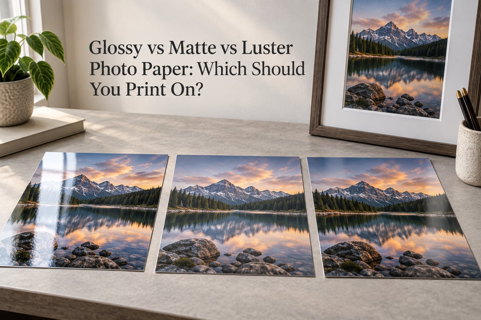
Choosing a photo paper finish sounds trivial until you print the same image three ways and put the results on a wall. Glossy, matte, and luster do not change the photograph itself — they change how light leaves the surface once the ink has dried, and that single difference alters contrast, colour intensity, glare, fingerprints, and how the print behaves inside a frame. This guide compares glossy vs matte vs luster photo paper finish by finish, then maps each one to the images and display situations it suits best.
Table of Contents
- The Quick Answer: Which Finish Should You Print On?
- Glossy vs Matte vs Luster: Full Comparison
- What Is Photo Paper Finish?
- Glossy Photo Paper: Pros and Cons
- Matte Photo Paper: Pros and Cons
- Luster Photo Paper: Pros and Cons
- Luster vs Semi-Gloss vs Satin: What Is the Difference?
- Which Photo Paper Finish Should You Choose?
- How Your Frame Changes the Finish You See
- Printing at Home: Choosing Inkjet Paper by Finish
- Other Photo Paper Finishes Worth Knowing
- Durability, Handling and Cleaning by Finish
- Frequently Asked Questions
- Is lustre or glossy better for photos?
- Do professional photographers use matte or glossy?
- Should passport photos be printed on matte or glossy paper?
- Should I print photos matte or glossy?
- What is the difference between luster and semi-gloss?
- Does matte or glossy print last longer?
- What photo paper do professional photographers use?
- Conclusion: Match the Finish to the Print
The Quick Answer: Which Finish Should You Print On?
Print luster for most images. Choose matte for black and white work and for prints that hang under glass, and choose glossy when you want maximum colour punch and the print will be handled or placed in an album rather than framed. Luster is the safest all-around answer because it sits between the other two and resists fingerprints, glare, and scratches at the same time.
- Printing a colour photo with no particular constraint? Luster. It is the professional default.
- Framing a print under glass, or printing black and white? Matte. No reflections, deep blacks, gallery look.
- Colour that needs to pop, a print going into an album, or a giveaway? Glossy. Highest saturation and contrast of the three.
Glossy vs Matte vs Luster: Full Comparison
The table below is the shortest honest summary of glossy vs matte vs luster photo paper. Read the glare and fingerprint rows first — those are the two properties that cause almost all the regret after a print is framed.
| Attribute | Glossy | Matte | Luster (satin) |
|---|---|---|---|
| Type of reflection | Sharp specular reflection | Diffuse, scattered | Low specular, slight texture |
| Colour saturation | Highest | Softest | Medium to high |
| Perceived contrast and black point | Very high, sometimes clipping | Lower apparent contrast | Balanced |
| Sharpness perception | Very crisp, high micro-contrast | Softens fine detail slightly | Crisp with a pebbled feel |
| Glare and reflections at an angle | Severe | Minimal | Low |
| Glare behind framing glass | Often problematic | Negligible | Light, manageable |
| Fingerprint resistance | Low | High | High |
| Scratch resistance | Moderate | Moderate to high | High |
| Wrinkle resistance when handled | Low | High | High |
| Risk of prints sticking together | Yes, in warmth or humidity | Very low | Very low |
| Black and white tonal range | Punchy, can go harsh | Soft, sometimes flat | Best balance |
| Best for | Vivid colour, albums, hand-held prints | Framed display, B&W, gallery walls | Everything else |
What Is Photo Paper Finish?
Photo paper finish is the surface coating applied over the base paper. The base is usually resin-coated (RC) paper, where a thin plastic layer is bonded to fibre, or fibre-based paper, where the image layer sits on the raw fibre. The finish is a separate layer on top of that, and its job is to control reflection rather than colour.
Gloss uses a very smooth coating that sends light straight back at the viewer. Matte uses a textured or absorbent coating that scatters light in every direction. Luster sits between the two, with just enough texture to break up reflections but not enough to soften the image. That texture is the pebbled surface you can feel with a fingertip, and it is the mechanical reason luster controls glare so well.
A useful side note: RC and fibre-based are not the same choice as glossy and matte. You can buy a glossy RC sheet and a matte fibre-based sheet, and the RC version will usually look denser and more contrasty because the plastic layer reflects less light back into the paper.
Glossy Photo Paper: Pros and Cons
Glossy paper reflects light the way a window does. That is the source of both its appeal and its reputation as difficult to live with. Colour saturation and micro-contrast both jump noticeably, which is why a glossy print of a market scene or a sunset looks vivid in a way the same file on matte does not.
On the other side, the reflection is unforgiving. A framed glossy print photographed near a window can show the window back to you instead of the picture, and print labs and photographers on photography forums repeatedly describe gloss behind glass as problematic. Gloss also shows fingerprints almost immediately, attracts dust, and creases more easily during handling.
There is one physical risk specific to gloss that few guides mention. Glossy prints that touch each other in a humid or warm room can bond to the point where peeling them apart damages the surface. Users in tropical climates report choosing matte specifically because glossy prints kept sticking together.
That makes glossy a strong choice for albums, hand-held prints, and colour images that need punch, and a poor fit for a gallery wall, a hallway print opposite a window, or a large batch of prints that will be stacked in a box.
Matte Photo Paper: Pros and Cons
Matte paper scatters light instead of bouncing it, so you can read it from any angle without hunting for a position that avoids glare. It is the standard choice for framed and gallery work, and it is what most photographers reach for when the image is black and white or tonally restrained.
The persistent complaint is that matte looks washed out, and it is partly true. Scattered light reaches the eye from the whole surface rather than arriving directly, which reduces apparent contrast and makes saturated colour read softer. Matte blacks are typically not the deepest blacks available. Fine texture in faces and fabric can also lose a little crispness on a very smooth matte surface.
There is a myth worth retiring here. Some forum users argue that matte is more vivid and longer lasting than glossy. The permanence claim is backwards — it is the coating and the ink chemistry, not the finish, that drive lightfastness, and glossy papers are not inherently faster fading. The vividness claim is a comparison against a very glossy print, not against luster.
Luster Photo Paper: Pros and Cons
Luster — spelled lustre or satin depending on the lab — is the middle finish, and it is the one professional print labs default most orders to. The pebbled texture breaks up reflection without flattening the image, so colour saturation and contrast land close to gloss while glare stays close to matte.
On handling, luster is the clear winner. It resists fingerprint marks, scratches, and wrinkling better than gloss, and it does not bond to neighbouring prints the way gloss can. Users on photography forums consistently name luster as the safest all-around default, and specific luster papers get recommended often as inexpensive ways to get close to the look of more expensive studio papers.
The one real cost is the texture itself. Some people find the pebbled feel less pleasing than a perfectly smooth gloss, and in a very large enlargement the texture becomes visible if you stand close. For most prints at normal viewing distance, you will not notice it.
Luster vs Semi-Gloss vs Satin: What Is the Difference?
There is no universal standard here, which is the entire reason this question comes up so often. Different labs use these labels to describe slightly different surfaces, so the same word can mean different things between two print providers.
| Term | What it usually means | Where you will see it |
|---|---|---|
| Luster / lustre | Slightly textured semi-gloss | Professional and consumer photo papers |
| Satin | Usually the same surface as luster | Inkjet paper ranges, especially home printing |
| Semi-gloss | Glossier than luster, smoother than gloss | Print lab menus and paper brand naming |
| Soft gloss / pearl lustre | A mid point between luster and gloss | Certain brand-specific ranges |
When a lab menu offers both luster and semi-gloss, treat semi-gloss as the glossier of the two and luster as the more textured one. If you care about the difference, order a small size of each from the same lab rather than trusting the label.
Which Photo Paper Finish Should You Choose?
Match the finish to how the image behaves and how it will be displayed. The list below is the decision guide most print labs use in practice.
- Portrait of a person, skin tones matter: Luster. It holds colour saturation without the window reflection that spoils a face on gloss.
- Black and white image: Luster or matte. Luster gives more bite in the midtones; matte gives a quieter, more traditional presentation with no glare at all.
- Nature, scenery, or a cluttered frame-filling scene: Glossy or luster. Busy images benefit from the extra micro-contrast and saturation a smooth surface provides.
- Clean lines, architecture, minimal compositions: Matte. There is little colour to flatter, and the low glare keeps the geometry readable from every angle.
- Framed print going on a wall: Matte or luster. Never glossy unless the wall is well away from windows and direct light.
- Album, hand-held print, or a gift: Glossy or luster. Glossy survives handling visually, and matte or luster survives it physically.
- Vintage or restored family photograph: Matte. The flatter surface suits the softer tonality of an aged image and hides imperfections.
- Large-format enlargement for a gallery wall: Baryta, enhanced matte, or matte. Fibre-based papers hold detail and tone at large sizes better than most RC luster.
How Your Frame Changes the Finish You See
The glazing in front of a print changes the finish more than most people expect. Museum glass and regular glass both add a faint reflective layer, and that layer puts some of the punch back into a matte or luster print. A luster print that looks slightly flat on the bench often reads noticeably richer once it is under glass.
That is also the best argument for luster in a frame. You get the anti-reflection behaviour of a textured surface while the glass contributes the specular highlight that a matte print alone cannot. With a glossy print, you get that same highlight plus the paper’s own reflection, and the two together are what makes framing gloss behind glass difficult.
Acrylic or Plexiglas glazing behaves differently. It reflects less than glass, blocks more harmful light, and is lighter to hang, so it preserves colour and contrast better over time. If you are framing a colour print, use non-reflective acrylic and matte or luster paper, and leave a small gap between the print and the glazing so the surface never touches the acrylic.
Printing at Home: Choosing Inkjet Paper by Finish
Home printing adds a variable that lab work does not have: your ink. Most consumer inkjets use dye ink, which is liquid and spreads into the coating. A smooth glossy surface is the best barrier against that spreading, so dye ink on glossy RC paper produces the sharpest edges and the most vivid colour. Dye ink on a matte sheet often looks slightly soft or slightly dull because the ink spreads into the absorbent coating.
Pigment ink behaves the other way. It sits on the surface and is more water-resistant, and it suits matte and luster sheets very well. If your printer is dye-based, choose a glossy or luster RC paper. If it is pigment-based, matte and luster are both safe, and matte is the easier surface to clean.
Check your printer’s supported paper list before buying by finish alone. Some consumer printers drive their best results with a specific glossy or luster product, and feeding them an unlisted sheet usually means the colour profiles and drying times are wrong.
Other Photo Paper Finishes Worth Knowing
Three finishes outside the main three are worth knowing about, because they solve problems the main three do not.
| Finish | Character | Good for |
|---|---|---|
| Velvet | Deep, soft, almost no reflection | Portraits and wedding prints with a classic look |
| Pearl / metallic | Shimmering undertones | Decorative and fantasy work |
| Baryta / enhanced matte | Fibre-based, very dense blacks | Large enlargements and portfolio work |
| Canvas | Texture plus weave | Statement art pieces at large sizes |
Baryta deserves particular attention because forum users rate it as an excellent middle ground. Fibre-based baryta is a matte-looking paper with the density and depth of a semi-gloss, and several users describe it as glossy in surface with results closer to luster. It is a fibre-based paper, so it also tends to hold tone better on large prints.
Durability, Handling and Cleaning by Finish
Care instructions differ by finish because the surfaces behave differently under fingers, cloth, and light. A short routine covers all three.
- Handle glossy by the edges only. The centre of a gloss print picks up fingerprints instantly, and the oils are hard to lift without a cleaning product.
- Clean matte with a dry, soft cloth. Because matte scatters light rather than reflecting it, smudges are far less visible and a dry cloth is usually enough.
- Clean luster the same way as matte. Its texture hides minor handling marks, which is part of why it stays presentable longest.
- Keep prints out of direct sunlight and away from radiators. Heat and UV affect the ink, not the finish, and no finish protects against them.
- Do not let two glossy prints touch in storage. Interleave with glassine or tissue and keep them in a dry room, especially in warm or humid conditions.
- Leave a gap between the print and its glazing. Especially important for gloss, which can bond to glass over time.
One more myth to clear up: matte does not fade faster than glossy. Lightfastness depends on the ink system and the total light exposure, not on whether the surface scatters or reflects. Choose permanence by paper and ink type, and choose finish by appearance and handling.
Frequently Asked Questions
Is lustre or glossy better for photos?
Luster is better for most photos. It keeps nearly all of the colour saturation and contrast that glossy delivers, while the pebbled texture kills the window reflections, fingerprint marks, and scratching that make gloss hard to live with. Glossy wins only when the print is handled rather than framed, or when maximum colour punch matters more than glare control.
Do professional photographers use matte or glossy?
Most professional photographers and print labs default to luster, with matte chosen for framed and gallery work and glossy for albums and hand-held prints. The default is a business and handling decision rather than an aesthetic one: luster is the only finish that resists fingerprints, glare, and wrinkling while keeping colour rich. Glossy remains common for colour and commercial work.
Should passport photos be printed on matte or glossy paper?
Matte is the safer choice for passport photos, because many countries now require or strongly prefer a matte surface with no glare. Requirements vary by country, so check the issuing authority specification before printing. Where a glossy photo is still accepted, print it slightly smaller than the required size so any trimming does not create a white border.
Should I print photos matte or glossy?
Print matte if the photo will be framed or displayed under strong light, and print glossy if it will be held, gifted, or placed in an album. If you are undecided, luster handles both situations well and is the finish most print labs default to. The deciding factor is glare and handling, not image quality.
What is the difference between luster and semi-gloss?
Luster has a slight pebbled texture and semi-gloss is smoother and more reflective. There is no universal standard, so the same label can describe different surfaces at different labs. When a print lab offers both, assume semi-gloss is the glossier option. Order a small test size from the same lab to see the real difference.
Does matte or glossy print last longer?
Neither fades faster because of its finish. Lightfastness depends on the ink system, the dyes or pigments used, and total light exposure, not on whether the surface scatters or reflects light. Where matte does have a practical advantage is handling: it hides scuffs and smudges better, so a well-kept matte print can look newer for longer.
What photo paper do professional photographers use?
Professionals mostly order luster, with matte for framed and gallery prints, black and white work, and large fibre-based enlargements. Luster papers such as Kodak Professional Lustre and other branded luster ranges are frequently recommended as affordable ways to get close to studio paper results. Baryta is the standard choice when the image needs deep tone at large sizes.
Conclusion: Match the Finish to the Print
If you take one thing from this comparison of glossy vs matte vs luster photo paper, take the default. Order luster unless something specific argues against it, choose matte for framed and black and white work, and reach for glossy only when colour punch or heavy handling is the priority. Match the finish to where the print will live and to what the image needs, and the rest is preference.