
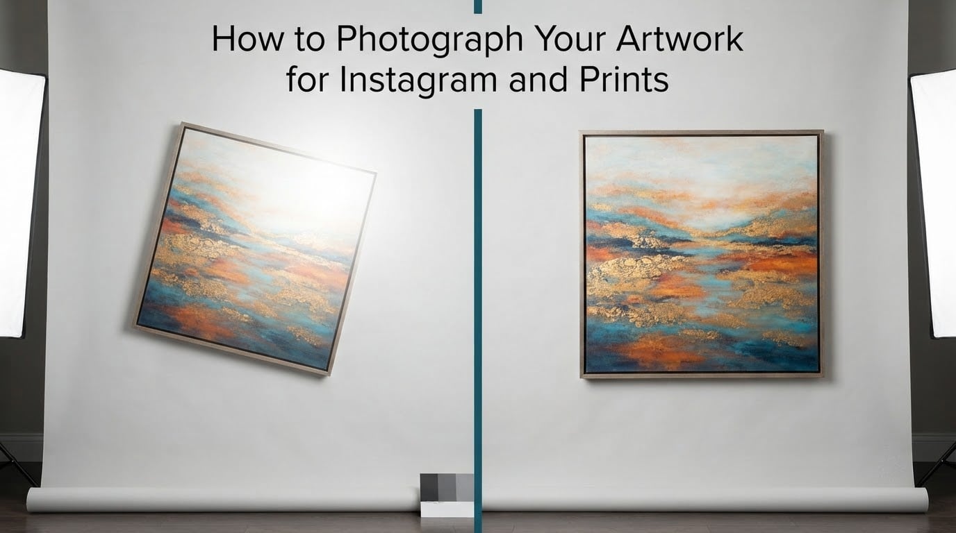
If you have ever watched a painting you spent six weeks on look flat and slightly green in a phone photo, the problem is almost never your camera. It is lighting, angle, and the fact that one photo is being asked to do two very different jobs. This guide covers how to photograph your artwork for Instagram and for prints, step by step, with settings you can copy today and no gear list you have to buy first.
Most artists shoot a piece once, post the compressed feed crop, and hope the same file will print well months later when somebody wants a giclée edition. It never does. By then the work may be sold, framed behind glass, or gone from the wall you photographed it on.
We pulled apart what the top results in this space actually say, where they contradict each other, and what working artists complain about in the forums. The useful part is that almost none of the advice requires a professional studio. It requires even light, a square-on camera, and a file you do not throw away.
Table of Contents
- What Is the Best Way to Photograph Artwork for Prints?
- Why One Good Photo Has to Do Two Jobs
- What You Need Before You Shoot
- What Is the Best Lighting for Photographing Artwork?
- What Camera Settings Should I Use When Photographing Artwork?
- How to Photograph Your Art Step by Step
- Is It Better to Photograph or Scan Artwork?
- Medium-Specific Fixes That Change the Setup
- Editing and Color Correction Without Ruining the Color
- Exporting for Instagram and for Your Print Shop
- Common Mistakes That Ruin an Artwork Photo
- Storing and Backing Up Your Artwork Files
- Photographing Art at a Gallery, Art Fair, or That You Do Not Own
- When to Hire a Professional
- Frequently Asked Questions
- What is the best way to photograph artwork for prints?
- How do you photograph your artwork for Instagram?
- Is it better to photograph or scan artwork?
- What are the best camera settings for photographing artwork?
- What is the best lighting for photographing artwork?
- How do I get rid of glare when photographing art?
- Do I photograph artwork straight on or at an angle?
- How much resolution do I need to print my artwork?
- Conclusion
What Is the Best Way to Photograph Artwork for Prints?
Shoot the piece square-on with the camera on a tripod, light it evenly with two soft sources placed about 45 degrees to the surface, set manual exposure at ISO 100 and f/8, include a gray or color card in one test frame, and capture in RAW. That single shoot produces both a color-corrected print master and a separate Instagram crop.
- Even, diffused light from two sides, never one bare lamp
- Camera parallel to the artwork, on a tripod, never handheld
- Manual exposure and a fixed white balance around 5000K to 5500K
- One test frame with a color reference, then color correct once in an editor
- Two exports from the master: full-resolution TIFF for the printer, sRGB JPEG for the feed
Why One Good Photo Has to Do Two Jobs
Artwork photography, sometimes called art documentation, is the practice of capturing a finished piece as a clean, color-accurate, high-resolution digital file. That file then becomes a print master for a print shop and a web derivative for your feed, and the two want opposite things.
A print shop needs a large, color-managed master at 300 DPI with every brushstroke and paper texture intact. Instagram wants a punchy, compressed square or 4:5 image that reads well on a small screen. A photo tuned for the feed is usually too low-resolution, too warm, and too contrasty to print. A photo tuned for print often looks flat and dull on a phone.
So the workflow is not one export. It is one shoot, one master, and two careful exports from that master. Editing the feed version should never touch the print master.
There is a second reason to keep the master. If the piece sells, you may never be able to photograph it again. Frames come off only for shipping, art fairs empty out, studios get reorganized. Forum threads on r/ArtistLounge and r/ContemporaryArt are full of people who only have a compressed phone crop of a finished piece and no way to recapture it.
What You Need Before You Shoot
Start here: do not buy a camera until the lighting problem is solved. A better sensor under one bad lamp produces a sharper version of the same wrong image. Fix the light first with anything you already own, then decide whether the file you get is good enough for your sales.
Phone only
A modern phone with a 12-megapixel main camera and a native-camera app that exposes RAW or ProRAW is genuinely enough for Instagram and for small prints. ProRAW on Apple phones and Pro mode on many Android models give you manual exposure and a color reference frame. Clean the lens, use the main lens rather than the ultrawide, and turn off every automatic HDR and automatic color enhancement.
A mirrorless or DSLR setup
Any camera with manual exposure, a tripod thread, and a 50mm-equivalent or normal lens covers almost everything. A short focal length is what you want, because it lets you stand back far enough to keep the camera parallel to a large canvas without the lens distorting the edges. A copy stand, a wall, or a stack of books with a small spirit level works as a support.
Scanners, light boxes and copy stands
A flatbed scanner is unbeatable for flat paper work under about letter size, and an overhead copy stand with a diffused panel handles larger sheets. A scanning light box is a reasonable middle ground. None of these capture impasto, and a flatbed glass platen will flatten or reflect textured paper.
The professional route
Museum-grade digitization with cross-polarized lighting and color targets is the standard for archives and high-value editions. It is a decision you make after you know what a good DIY capture looks like, not before. More on that later.
What Is the Best Lighting for Photographing Artwork?
Even, glare-free, shadow-free light is the single biggest factor. Nothing you do in software can reconstruct surface detail that a hard lamp flattened, and no lens fixes the color cast from a mixed-temperature room. Shoot at the same time of day, in the same spot, every time, and use a light source with a high color rendering index of 95 or better at around 5000K to 6500K.
Natural light: the overcast-day and north-window method
Overcast daylight is the most reliable free light source there is, because cloud cover acts as a giant softbox and the color temperature stays stable. Direct sun is the worst option: it creates a hot spot and an orange cast.
- Hang the artwork on a wall opposite a window, not against the window, so the light grazes the surface evenly.
- If there is an overhang or a tree outside that window, use it, because it blocks direct sun and softens the light further. This trick comes up constantly on dpreview forum threads for bouncing direct sun off a wall.
- Stand the camera at the opposite wall or use a tripod to get the whole piece in frame.
- Shoot between 10am and 2pm on a bright overcast day, and repeat the same window and time for every piece in a series.
A popular line that circulates in these communities is worth repeating: you do not need a camera to photograph your paintings for prints, you need a cloudy day, a window and ten minutes.
Two-light studio setup at 45 degrees
Place two identical soft sources at roughly 45 degrees to the picture plane, equidistant from the center, at the same height as the center of the artwork. Softboxes, large LED panels with diffusion, or two bounced flashes all work. Symmetry is what matters, and the shadows from the frame should be equal on both sides.
- Both lights on manual power, not auto, so their output does not drift
- Both lights the same distance from the center of the piece
- Diffusion or a scrim between each source and the artwork
- Walk a hand in front of each light in turn to check the falloff before shooting
Killing glare on glossy, varnished and glass-covered work
Glare comes from a specular reflection: a single bright source bouncing off varnish, acrylic glazing or glass. Three fixes, in order of how much they cost you.
- Move the light. A source placed above and to the side at 45 degrees puts its reflection out of the camera’s line of sight.
- Kill the reflection with cross-polarization: a polarizing filter on the lens plus a polarizing filter over each light source, rotated 90 degrees from each other. Cross-polarized lighting is the standard technique in fine art reproduction for exactly this reason.
- Accept some loss of surface sparkle. Polarizers also cut glare from impasto texture, which some painters prefer to keep visible. Shoot both ways if texture matters to the work.
Framed work under museum glass is the hardest case. Photograph the piece unframed or with the glazing removed if you legally can, and if not, cross-polarization plus a dark room will get you most of the way there.
What Camera Settings Should I Use When Photographing Artwork?
These are copy-pasteable starting values. Copy them, take a test frame, check the histogram, adjust, and keep the settings identical for every frame in a series. Shoot in RAW when the camera allows it, and turn off all in-camera corrections except lens distortion and vignetting.
| Setting | Camera value | Phone-only equivalent | Why |
|---|---|---|---|
| File format | RAW plus JPEG backup | RAW or ProRAW, never HEIC if avoidable | RAW keeps the color data you need to correct later |
| Aperture | f/8 to f/11 | Leave auto or use the widest aperture marked for macro | Deep depth of field keeps edges and corners sharp |
| Shutter speed | 2 seconds or use a 2-second timer / remote release | Timer of 2 to 10 seconds | A tripod makes long exposures free, and long exposures cut noise |
| ISO | 100 | ISO 50 to 200 | Lowest noise and the widest color latitude |
| Focus | Manual focus, focus on the center of the piece, and confirm all four corners are sharp at 100 percent | Tap to focus on center, then step back and check the corners | Autofocus hunts on flat, low-contrast surfaces |
| White balance | Fixed custom Kelvin, 5000K to 5500K for daylight-balanced bulbs | Custom or daylight, not auto | Auto white balance shifts between frames and breaks a series |
| Metering | Evaluative, then check the histogram and watch for clipping | Evaluative plus exposure compensation if needed | Protects highlight detail in white areas of the paper |
| Stabilization | Off if the camera is locked to a tripod | On if handheld | Stabilization can add slight blur against a fixed subject |
Never shoot artwork at a wide-open aperture. A shallow depth of field is beautiful for a detail shot and useless for the frame that has to become a print.
How to Photograph Your Art Step by Step
- Prepare the piece. Let oil paintings cure properly, remove dust with a soft brush, and flatten a bowed canvas face-down under a clean board with something heavy and even on top for a few days. Warped canvas is a leading cause of keystone distortion.
- Choose the wall. A plain, matte, mid-gray or white wall with no window, no pattern and no overhead fixture directly in frame. Tape the piece up and step back to check for anything distracting.
- Set the light. Two sources at 45 degrees, equidistant, manual power, diffused. Give each lamp two or three minutes to warm up and stabilize before you shoot.
- Position the camera. Mount it on a tripod exactly parallel to the picture surface. Aim the center of the sensor at the center of the artwork and put a spirit level on top of the camera.
- Frame with breathing room. Leave a small even margin on all four sides. Cropping later in software is free, but a margin you did not shoot cannot be recovered.
- Lock the settings. Manual exposure, ISO 100, f/8, a 2-second timer, fixed white balance, RAW.
- Check focus at the corners. Zoom to 100 percent on each corner. If any corner is soft, move the camera back a few inches rather than using a wider aperture.
- Shoot a reference frame. Put a gray card or color chart in the artwork, take one frame, then remove it. This is your baseline for color correction, and it is the single habit that separates a good capture from a guess.
- Shoot the master frame. Take three or four identical exposures. You are picking the one with the most even lighting, not the most dramatic one.
- Export twice. From the corrected master, save a 16-bit TIFF at full resolution as your archival file, then a separate sRGB JPEG sized for the platform you are posting to.
Take detail shots and one angled in-situ frame while the setup is still standing. A close crop of a brushstroke edge or a signature sells a texture-led image in a carousel, and the angled shot with the piece on a wall gives you the context shot Instagram feeds are built for.
Is It Better to Photograph or Scan Artwork?
Photograph anything textured, framed, three-dimensional, larger than your scanner bed, or destined for a print. Scan anything flat, matte, small and paper-based that you need to turn into a pattern or a book page. For a painted canvas, photography wins, because a flatbed platen cannot capture impasto.
| Method | Color accuracy | Texture rendering | Max size | Best for |
|---|---|---|---|---|
| Camera and lights | High with a reference frame and cross-polarization | Excellent, including impasto and canvas weave | Whatever your wall and lens allow | Painted work, mixed media, editions, anything sold |
| Phone and lights | Good with a fixed white balance and a reference frame | Good for surface texture, weak for fine line detail | Limited by wall space | Beginners, Instagram, small prints |
| Flatbed scanner | Very high, calibration is routine | Flattened; glass platen reflects on textured paper | Letter size or larger on a two-pass setting | Watercolor, ink, pencil, pattern design |
| Art or overhead scanner | Very high | Good, avoids a platen | Up to full sheet or larger | Flat paper work, editions, print runs |
| Professional studio | Archival, with color targets and measured output | Excellent | Any | High-value editions, archives, insurance records |
One scanner workflow note that saves a lot of trouble: if you stitch multiple scanner passes across a large sheet, overlap the passes substantially, because the light changes as the artwork lifts off the scanner bed and stops overlapping cleanly. Keeping the capture window smaller than the work is the safer version of the same idea.
No scan or photo is perfectly true to color. Correction in an editor is part of the process, not an optional extra, and the reference frame from step 8 is what makes that correction evidence-based instead of guesswork.
Medium-Specific Fixes That Change the Setup
The same three settings do not apply to a glossy oil and a matte pencil drawing. Surface finish changes the light you need more than any other single factor.
Oil and acrylic on canvas, including impasto
Side light at 45 degrees is what makes thick paint read as thick paint. Flat frontal light turns impasto into a flat field of the same color as the paint underneath, which is why a heavily textured piece photographed straight on looks lifeless. Cross-polarization gives you clean color but flattens the sparkle, so shoot one polarized frame for reproduction and one non-polarized frame for the detail shots.
Watch the weave. A coarse linen texture moires badly if you fill the frame with it, so shoot the full piece square-on and crop the detail separately.
Watercolor, ink and paper works
These are the easiest to photograph and the easiest to damage. Lay the sheet flat under a sheet of clean polyester or glass, use even overhead light, and never bend the paper to force it flat. A flatbed scanner at 300 to 600 DPI gives excellent results here, and paper texture survives a scan better than you would expect if you use the platen carefully and clean it first.
Graphite, charcoal and line art
Graphite has a sheen that produces a broad specular glare across the whole sheet, and charcoal has a dusty surface that scatters light back at you. For line art, use light that is slightly off-axis and low in contrast, and never cross-polarize a drawing you want to show off, because the polarizer removes the metallic sheen that makes graphite look like graphite.
Mixed media and works on panel
Assembled, glued, stitched and collaged work is the hardest category. Photograph it from straight on for reproduction, then add three to five detail frames under raking light for the carousel. If a piece is genuinely three-dimensional, a single flat file will always understate it, and no camera angle fully fixes that.
Editing and Color Correction Without Ruining the Color
Work on a copy, never on the only file. A light, non-destructive edit beats a heavy global one, because saturated oranges and blues are the first thing to break in a print and the last thing a feed viewer notices.
- Correct geometry first. Straighten and correct perspective using the artwork’s own edges as guides before any color work. Crop to the outer edge of the piece, not inside it.
- Set the white point. The lightest neutral area in the painting should land near white without clipping, and the darkest neutrals should stay open, not crushed to black.
- Remove the color cast. Pull from the gray card frame until the neutral strip reads neutral. This one frame usually fixes the yellow-green cast most artists complain about.
- Match the reference chart. If you shot a color card, use its patches as the target rather than your eyes.
- Boost contrast last and gently. A few points, not fifty. Feed contrast belongs only in the web derivative.
Free tools that do all of this well: GIMP for full non-destructive editing on desktop, Snapseed for selective control on a phone, and the Lightroom mobile app for a raw-to-feed workflow. Topaz Studio and Photoshop are paid upgrades, not requirements.
Exporting for Instagram and for Your Print Shop
Exporting is where the two jobs finally split. Make your Instagram files from a copy of the master, and never let a platform compression step touch the file that goes to a printer.
Instagram export sizes
| Placement | Aspect ratio | Pixel dimensions | Notes |
|---|---|---|---|
| Feed portrait | 4:5 | 1080 x 1350 | Tallest feed image, takes the most screen space |
| Feed square | 1:1 | 1080 x 1080 | Safe when the piece is square or heavily cropped |
| Carousel | 1:1 or 4:5 | 1080 x 1080 or 1080 x 1350 | Keep the same ratio across all frames or it crops badly |
| Stories and Reels | 9:16 | 1080 x 1920 | Leave empty space at the top and bottom for the interface |
| Website and shop | Free | Longest edge 1600 to 2000 px | Fast loading, sRGB, quality set to high |
Post the process and the detail shots, not only the flat master. A three to five image carousel with one full piece, one detail, one in-situ shot and one process photo performs better than a single flat image, and it costs you nothing extra because you already have those frames from the shoot.
How much resolution do you need to print?
Print size is resolution multiplied by DPI. At 300 DPI, which is the standard for fine art and giclée work, a 12-megapixel source file prints to about 11 by 16 inches before you see softness, and a 45-megapixel source handles roughly 17 by 23 inches.
| Source | At 300 DPI | At 150 DPI (larger, softer) |
|---|---|---|
| Phone, 12 MP | About 11 x 16 in | About 16 x 23 in |
| Camera, 24 MP | About 14 x 20 in | About 20 x 29 in |
| Camera, 45 MP | About 17 x 23 in | About 24 x 34 in |
| Camera, 100 MP medium format | About 25 x 36 in | About 36 x 50 in |
What to hand a print shop
- The highest-resolution file you have, ideally a 16-bit TIFF at full pixel dimensions. A high-quality JPEG is usually acceptable if the shop asks for one.
- The color space, embedded in the file: sRGB for most consumer printers, Adobe RGB or ProPhoto RGB for wide-gamut professional labs. Embed the profile rather than describing it in an email.
- The finished printed dimensions you want, and the number of editions you are printing.
- A note on the surface: is it matte or gloss, and should canvas texture and impasto remain visible? This is where printers guess wrong most often.
- Whether the piece is framed under glass in the finished product, because that affects their choice of print surface.
- Contact details of the artist, and a reference photo of the original in a neutral daylight setting, so they can match it.
Ask the shop two questions before you send anything: what file format and color space do you want, and do you want the texture visible. Those two answers remove most of the back and forth later.
Common Mistakes That Ruin an Artwork Photo
- Keystone distortion. Shooting from below or from an angle makes a rectangle into a trapezoid. Fix it with a tripod, not with software.
- One light, one side. A single source creates a gradient across the piece. Every reader can see it, even if they cannot name it.
- Mixed color temperatures. Mixing daylight and household bulbs gives you a different cast in every frame of a series.
- Hot spots. A bare lamp close to a glossy surface leaves a blown highlight that no amount of editing recovers cleanly.
- Relying on phone HDR and auto color. Automatic processing shifts the whites, crushes the blacks and differs frame to frame, which is fatal for a set of prints from the same series.
- Over-saturating for the feed. Colors that look great on a phone can print muddy.
- Deleting the master after posting. The compressed upload is not a backup, and the piece may not be available to shoot again.
Storing and Backing Up Your Artwork Files
Treat the master as a physical artwork, because it is the only reproduction you may ever get. Keep three copies on two different kinds of storage, with one copy away from where you work.
Name files so they sort correctly: YYYY-MM-DD_title_medium_size_master.tif. Include the date so the archival order is obvious, and never overwrite a master with a corrected version. Save corrections as a new file with a version number.
Once your archive is in place, the loop is simple: shoot, correct, export twice, back up three times, and keep the master indefinitely.
Photographing Art at a Gallery, Art Fair, or That You Do Not Own
Art fairs are the easiest good lighting you will ever get, because the halls are lit evenly for exactly this purpose. Ask the booth holder before you photograph their work, respect any no-photography sign, and never use flash. Flash is banned at most fairs, it bounces off glazing, and it will blind the person next to you.
Photographing other people’s art for your own reference, portfolio study or blog is a narrower question. A photo of a finished artwork for commentary, criticism or teaching usually falls inside fair use. Using that same image to sell prints, put it on merchandise, or use it as a print is reproducing the work, and that is not yours to license. Copyright in artwork sits with the artist, and the sale of a physical original does not transfer reproduction rights.
For your own pieces, a neutral daylight record on file is your insurance documentation and your provenance record. Take one flat master and two details, store them with the work, and you have a complete record if anything happens to the piece.
When to Hire a Professional
Hire a professional when the outcome depends on the file rather than on your time. That means high-value editions, museum or gallery submissions, pattern licensing where the company will scan at a very high resolution, insurance documentation of a valuable work, and any edition you intend to produce in large numbers where a color shift would cost you the run.
Before you book anyone, ask for a full-resolution sample frame, not a preview. Then check four things on it: are the corners sharp, is the lighting symmetric, is there a single visible hot spot anywhere, and does the color of a neutral area read neutral. A studio that shoots with cross-polarized lighting, a color target and a tethered capture will show you all four in a sample.
Ask what you get back: the RAW or TIFF master, the embedded profile, the color target frame, and a full-resolution file rather than a web export. If they will only hand over a compressed file, that is a marketing shoot, not digitization.
Worth noting: the real hidden cost of a DIY-only file is not the shoot, it is re-shooting. Once a piece is sold, a reshoot can be impossible, and the alternative is a print that does not match the original.
Frequently Asked Questions
What is the best way to photograph artwork for prints?
Shoot square-on with the camera on a tripod, light the piece evenly with two soft sources at about 45 degrees, set manual exposure at ISO 100 and f/8, include a gray or color card in one test frame, and capture in RAW. Export twice from that master: a full-resolution TIFF for the print shop and an sRGB JPEG for Instagram.
How do you photograph your artwork for Instagram?
Use one flat, square-on master frame with even light and no glare, then crop copies for each placement. Export a 1080 x 1350 file for the 4:5 feed, 1080 x 1080 for square and carousel frames, and 1080 x 1920 for Stories. Add detail and in-situ frames from the same shoot, keep the aspect ratio consistent across a carousel, and keep sharpening and saturation low so the colors survive a print later.
Is it better to photograph or scan artwork?
Photograph anything textured, framed, three-dimensional, larger than your scanner bed, or being sold as a print. Scan flat, matte, paper-based work such as watercolor, ink or pencil. A flatbed platen cannot capture impasto and reflects on textured paper, while a camera with two soft sources at 45 degrees handles painted and mixed-media surfaces far better.
What are the best camera settings for photographing artwork?
Shoot in RAW, manual exposure, ISO 100, f/8 to f/11, a 2-second timer or remote release, and a fixed custom white balance around 5000K to 5500K. Focus manually and confirm all four corners are sharp at 100 percent. Meter evaluatively, check the histogram for clipping in the whites, and turn off automatic HDR and in-camera color corrections.
What is the best lighting for photographing artwork?
Even, diffused light from two identical soft sources placed at roughly 45 degrees to the surface, equidistant from the center, is the most reliable setup. Overcast daylight through a window is the best free option because clouds act as a giant softbox with a stable color temperature. Direct sun is the worst option because it creates a hot spot and an orange cast.
How do I get rid of glare when photographing art?
First, move the light above and to the side at 45 degrees so its reflection falls outside the camera’s line of sight. Second, use cross-polarization: a polarizing filter on the lens plus a filter on each light source, rotated 90 degrees from each other. Third, accept that polarizing filters also remove the sparkle from impasto, so shoot one polarized frame for reproduction and one without for detail shots.
Do I photograph artwork straight on or at an angle?
Straight on for the master frame that becomes a print, because any angle introduces keystone distortion that has to be corrected and still leaves the edges slightly soft. Use an angled in-situ shot only as a secondary image for Instagram, where it gives context. Lock the camera on a tripod with a spirit level so the sensor is parallel to the picture surface.
How much resolution do I need to print my artwork?
Multiply the pixel dimensions by DPI. At 300 DPI, a 12-megapixel phone file prints to roughly 11 by 16 inches, a 24-megapixel file to about 14 by 20 inches, and a 45-megapixel file to about 17 by 23 inches. Halving the DPI doubles the print size but shows softness, so shoot the largest file you can and print at 300 DPI for fine art and giclée editions.
Conclusion
Knowing how to photograph your artwork for Instagram and prints comes down to three habits: light the piece evenly from two sides, keep the camera square on a tripod, and keep the full-resolution master forever. The settings, the export sizes and the print-shop checklist above are all copy-pasteable starting points, and none of them require new gear.
Next step: pick one finished piece, set up two soft lights on a cloudy day, shoot a reference frame and a master frame, and export both a TIFF and a feed JPEG. Once you see the difference between those two files, you will never post a single compressed crop again.
This guide was updated for 2026 and will be reviewed as new camera and platform specifications change.