
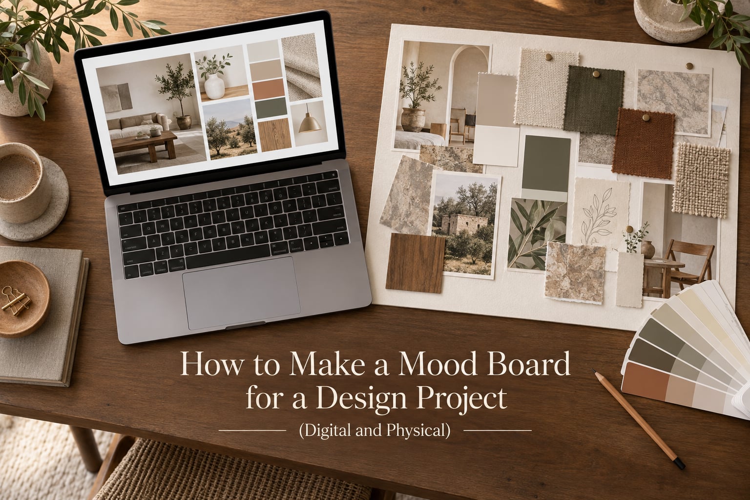
If you have ever tried to explain a design idea to a client, a tutor or a teammate and watched their face drift toward a different idea entirely, this is the process that fixes it. Learning how to make a mood board for a design project turns a vague feeling into a shared reference everyone can point at, argue with and build from. Below I break the process into ten steps that work whether you build digitally or by hand, plus the tool, sourcing and presentation decisions that most guides skip.
I have assembled boards for branding pitches, class assignments and shoot planning, and the pattern is always the same: the time you spend gathering is not the time that matters. The time that matters is the twenty minutes at the end where you cut half of it away. That cutting step is what separates a mood board from a folder of saved images, and it is the part most beginners skip.
Designers still argue about whether mood boards are worth the effort in an age of shared drives and cloud folders. Practitioners on r/IndustrialDesign raise exactly that point, and the honest answer is that a board is worth it whenever you need other people to agree on a direction. A folder is a private archive. A board is a decision you can show.
Table of Contents
- What Is a Mood Board and Why Does It Matter?
- Digital vs Physical Mood Boards: Which One Should You Use?
- How to Make a Mood Board for a Design Project: 10 Steps
- What to Put on a Mood Board
- Where to Find Mood Board Images and Materials
- Can AI Make a Mood Board? What ChatGPT Can and Cannot Do
- Common Mood Board Mistakes and How to Avoid Them
- How to Present a Mood Board and Get Useful Feedback
- Frequently Asked Questions
- Can ChatGPT make mood boards?
- Is there an AI tool that can create moodboards?
- What is the best program to create a moodboard?
- What are the three main components of a mood board?
- How do I create a digital mood board?
- What are common mood board mistakes?
- What is a good moodboard for graphic design?
- How to create a graphic design mood board?
- Conclusion
What Is a Mood Board and Why Does It Matter?
A mood board is a collage of images, colors, textures, typography, and text assembled to define the visual direction of a design project before you start designing. It gathers references, extracts a color palette, and arranges them so the whole communicates one clear mood in a few seconds.
That is the whole job. A mood board is not a mood, and it is not a finished design. It is an agreement about a direction, made visual.
Other names for the same artifact show up constantly in coursework and client briefs. An inspiration board or concept board is usually less refined and more about gathering. A style board leans harder into aesthetics and mood. A vision board is usually personal rather than professional, built around goals and affirmations rather than a client brief. If a tutor hands you any of these labels, the build process is the same one covered below.
So why bother? Because subjective words fail. Ask five people for a modern, friendly, premium brand and you will get five different screens. Show them a board and the disagreement moves from the abstract to the specific, which is a conversation you can actually have.
Digital vs Physical Mood Boards: Which One Should You Use?
Both approaches work. The honest difference is that a physical board shows texture and scale truthfully while a digital board is faster, shareable and free to revise. Most professional work starts digital and becomes physical at the moment someone has to approve it.
| Factor | Digital mood board | Physical mood board |
|---|---|---|
| Setup cost | Free or low cost, most tools run in a browser | Materials cost per board, swatches are often free |
| Time to build | Fast, drag and drop, easy duplication | Slow, cutting and pinning take real time |
| Portability | Anywhere on any device, shareable link | Heavy, needs to be carried or shipped |
| Collaboration | Multiple editors, version history, comments | One person at a time, notes need pen and paper |
| Colour accuracy | Screen-dependent, varies by display | True to the actual paint, fabric or material |
| Texture and scale | Simulated, easy to over-trust | Real, which is why interior and fashion work favours it |
| Revising | Cheap and instant | Expensive, sometimes easier to start again |
| Best for | Branding, graphic design, web, student assignments, iteration | Interior, fashion, product, anything where material matters |
The hybrid route is the one almost nobody writes about. Print a digital board at A3, tape it to a wall, and pin real swatches, paint cards and paper offcuts directly onto it. You keep the layout speed of the digital version and add the material truth a screen cannot give you. The reverse also works: photograph your physical board, drop the image into Figma or Canva, and add type and captions digitally.
Art journaling communities still favour the tactile version as a personal ritual, separate from professional workflows, and that is a fair reason on its own.
How to Make a Mood Board for a Design Project: 10 Steps
These steps work for either medium. The digital versions use drag and drop and free templates; the physical versions use cutting, swatches and a cork or foam core surface.
- Write the brief in one sentence. Before any searching, finish this: a mood board for a design project that makes a person feel X. If you cannot write that sentence, the board will sprawl.
- Set the canvas before you collect. On a digital board, fix your aspect ratio first and work inside it. A 16:9 landscape canvas suits a pitch slide, a portrait canvas suits a print wall and a storyboard. On a physical board, choose the surface, usually foam core for structure or cork board for a looser look.
- Gather wide, then filter hard. Save far more than you need, thirty to sixty candidates, then filter immediately. Over-collecting is the most common failure mode reported by working designers, so set a rough limit before you start.
- Pull out a colour palette. Use an eyedropper tool or a colour picker app to sample colours from your strongest images. Keep the palette to five or six. Anything beyond that stops reading as a palette.
- Choose one hero image. Give the strongest single visual the most space and the best position. Every other element supports it rather than competing with it.
- Pair typography samples. Show one heading face and one body face, both real type set in real words, not just font names. A serif next to a geometric sans reads very differently from two sans faces.
- Build the layout with a grid and negative space. On a digital board, use the grid and alignment tools. On a physical board, use a pencil and a ruler to mark positions before you pin anything. Empty space is doing work, so leave it.
- Cut ruthlessly. Remove anything that does not reinforce the one sentence from step one. Aim to lose roughly half of what you gathered.
- Present it early and revise. Show the board while it is still slightly rough. An in-progress board invites useful notes, while a polished one invites people to compliment it.
- Export and archive. Save a flattened PDF and a high resolution PNG, then file the sources so you can rebuild the board later. A board you cannot edit in six months is a dead end.
What to Put on a Mood Board
The three main components of a mood board are colour, imagery and typography. Everything else on the board supports those three. If an element does not work in at least one of those three lanes, it is decoration, and decoration dilutes the direction.
Colour. A palette of five or six swatches pulled from your imagery, plus the neutral the design will lean on. A mood board for graphic design usually reads best when the palette is visible in blocks rather than scattered through photographs.
Imagery. Photographs, textures and pattern references that show light, material and scale. Mix wide shots with tight details so the board reads as a world rather than a single picture.
Typography. Two faces at most, shown in use, plus one line of tone words such as warm, editorial, industrial or playful. Those words are the part your client can argue with, and arguing early is cheaper than arguing at the final review.
Beyond the three, useful supporting elements include fabric swatches and paint cards for physical boards, UI details for digital work, a short written concept paragraph, and references to competitor or adjacent work that set the bar.
Use colour theory to keep the palette honest
Three schemes cover most projects. A monochromatic palette uses one hue with varied lightness and saturation, which reads calm and controlled. Analogous colours sit next to each other on the colour wheel and feel cohesive but need a contrast accent to avoid going flat. Complementary colours sit opposite each other and give you energy, which works for youth or sports brands and can feel aggressive for a law firm or a hospital.
Whichever scheme you pick, check it in greyscale. If the palette still has contrast when you desaturate it, your value structure is doing the work rather than your hues alone.
Where to Find Mood Board Images and Materials
Source images from more than one place, because every source has a blind spot. Pinterest is the fastest for volume and the worst for palette discipline, since boards drift off-brief as the algorithm pushes adjacent content. Save into a private board and re-check the palette every few saves.
Behance and Dribbble give you finished, high resolution work in your own field. Free and paid image libraries such as Unsplash, Pexels and Adobe Stock cover textures and environments. Design blogs and magazines supply editorial framing. Your own camera roll often holds the most honest material, since it is specific to your subject. For print, old magazines remain the fastest way to find type and composition references no stock library has.
For physical boards you need a short materials list. Foam core or mount board for structure, cork board for a softer surface, fabric swatches from a textile shop or a discarded garment, paper offcuts and magazine pages, a paint card fan deck for colour, and a full set of archival tape or removable mounting dots so you can still move things tomorrow.
Which program should you use?
There is no single best program, and anyone telling you otherwise is selling something. The right answer depends on what else you already know and what you need the board to do next.
| Tool | Cost | Best for | Learning curve | Export options |
|---|---|---|---|---|
| Canva | Free tier, paid tier optional | Beginners, students, quick client decks | Very low | PNG, JPG, PDF, presentation mode |
| Miro | Free tier, paid tier for teams | Remote teams and workshops | Low | PNG, PDF, shareable link |
| Figma | Free | Web and product design, frames and components | Medium | PNG, JPG, PDF, SVG |
| Milanote | Free tier, paid tier optional | Loose, project-based research walls | Very low | PDF, image export, shareable link |
| Photopea | Free | Photopea-based compositing when Photoshop is not available | Medium to high | PNG, JPG, PSD |
| Adobe Photoshop | Paid subscription | Fine control, masks, custom retouching, final artwork | High | Everything, including layered files |
Start with the free tier of whatever tool you already use. Moving between tools is the most common frustration reported by designers, because the muscle memory does not transfer, so learning one properly beats sampling six.
Can AI Make a Mood Board? What ChatGPT Can and Cannot Do
Yes, AI can help, and no, it should not make your board for you. ChatGPT can expand your brief into tone words, suggest search terms, sanity check a colour palette against a stated mood and write captions, which makes it a useful sounding board before you collect anything.
Image generation tools are where the caution belongs. Generated images are visually coherent but tonally anonymous. They pull toward a generic polished look, which is exactly the risk noted by designers who worry about over-polishing a board until it reads as a final design rather than an exploratory one. A board made of generated images also proves nothing about your research.
Our recommendation: let AI handle the words and the search terms, and let a human handle the visuals. A mood board is evidence of how you think, which is why instructors ask for one.
Common Mood Board Mistakes and How to Avoid Them
- Collecting far more than you need. Set a rough limit before you start, around forty candidates, and treat it as a hard stop.
- Never cutting anything. If you feel something when you remove an image, it was not supporting the brief.
- No dominant element. Without a hero image the eye has nowhere to land and the board reads as noise.
- Too many colours. Cap the palette at six and sample the shades rather than guessing them.
- Ignoring negative space. Crowding every gap makes a board look careless rather than considered.
- Letting your source board drift. A Pinterest board that goes unchecked for weeks will pull your palette somewhere you never intended.
- Over-polishing too early. A finished-looking board stops generating feedback because people assume the decisions are already made.
- Building a board for the project you wish you had. Use the actual brief, the actual audience, the actual constraints.
How to Present a Mood Board and Get Useful Feedback
Export for the medium you will present in. For a screen, export a PDF at around 1920 by 1080 pixels for a landscape pitch slide, and a PNG if you need to paste into a deck. For print, build at the real size, A3 or A2, and check that the file will print at 300 DPI before you send it to a printer.
On a physical board, photograph it in flat, even light for a digital copy, and keep the original for the meeting. Set it down before the conversation starts so nobody is watching you arrange it while you talk.
Then ask three questions instead of asking what people think. What do you feel when you look at it? What does it remind you of? What is missing? Those three produce specific, actionable notes, whereas an open question produces polite nodding and a comment about how nice the colours are.
Close with the decision you made and the one you are still holding open. Saying out loud that the typography is unresolved invites help on the one thing that actually needs it.
Frequently Asked Questions
Can ChatGPT make mood boards?
It can help you build one, but it should not make the board. ChatGPT is genuinely useful for turning a one-sentence brief into tone words, generating search terms for each lane of the board, and checking whether a proposed colour palette matches the mood you described. What it cannot do is supply researched, sourceable images or material swatches, and images generated by AI tend toward a generic polished look that reads as a finished design rather than an exploratory one. Use AI for the words and let human research drive the visuals.
Is there an AI tool that can create moodboards?
There are AI image generators and AI features inside tools like Canva that will assemble a set of images for you. They are useful for filling a placeholder frame or generating a texture you cannot source, and they are a poor substitute for a research board. Because the output is generated rather than collected, it does not show a client or a tutor how you think about references, and the tone skews generic. A stronger use is to generate a few mood images, then treat them the same way you would treat any Pinterest save, with a limit and a filter.
What is the best program to create a moodboard?
The best program is the one you already know how to use, because tool switching costs more time than the tools do. Canva and Milanote are the lowest barriers, Miro is the best fit for remote workshops, Figma is strong for web and product work, Photopea is a free option for compositing, and Photoshop is worth paying for when you need fine control and layered files. A free tier covers a student project entirely. Whatever you pick, fix your canvas size before you start collecting so nothing has to be rebuilt at the end.
What are the three main components of a mood board?
The three main components are colour, imagery and typography. Colour means a limited palette of about five or six swatches plus the neutral the design will rest on. Imagery means photographs, textures and pattern references that show light, material and scale, mixing wide shots with tight details. Typography means one heading face and one body face set in real words, not just font names, usually with a short line of tone words such as warm, editorial or industrial. Anything that serves none of these three dilutes the board rather than strengthening it.
How do I create a digital mood board?
Set your canvas and aspect ratio first, then gather more candidates than you need from Pinterest, Behance, stock libraries and your own photos. Pull a colour palette from the strongest images with an eyedropper, choose one hero image and give it the most space, and set your two typefaces in real words. Build the layout on a grid using alignment and negative space, then cut roughly half of what you collected. Present it while it is still slightly rough so people give you notes rather than compliments, and export both a flattened PDF and a high resolution PNG.
What are common mood board mistakes?
The most common mistakes are over-collecting and never cutting, having no dominant element so the eye has nowhere to land, using too many colours, crowding out negative space, and letting a source board like Pinterest drift off your palette over time. Two more catch people out: over-polishing the board so early that it reads as a finished design and stops generating feedback, and building toward the project you wish you had instead of the one in the brief. The fix for most of them is a limit set before you begin collecting.
What is a good moodboard for graphic design?
A good moodboard for graphic design leads with a legible colour palette, a single dominant image that sets the visual world, and two typefaces shown in use. Mix wide shots with tight texture details so the board reads as a coherent world, and include a short written concept line so a reader can follow the reasoning. Keep the palette to about six colours and leave real negative space around the hero element. Judges and clients are checking whether the direction is specific and defensible, not whether the collage is busy.
How to create a graphic design mood board?
Write the mood in one sentence, set your canvas, and gather from several sources so no single algorithm dictates your palette. Extract five or six colours, pick one hero image, and set your two typefaces in real sentences rather than as font names. Lay it out on a grid with deliberate negative space, then cut half of it. Show the board early in its rough state and ask what people feel, what it reminds them of and what is missing. Finally, export at the size you will present, roughly 1920 by 1080 for a screen and 300 DPI at A3 for print.
Conclusion
Knowing how to make a mood board for a design project is less about collecting beautiful images than about editing them down to one honest direction. Write the mood in a sentence, gather wide, cut hard, and let a single hero image carry the weight.
Three things carry the most weight. Build the palette before you build the layout, give one element the space and position it deserves, and show the board while it is still rough enough to be argued with.
Pick your medium today. If the material matters, print a digital draft and pin real swatches onto it. If the deadline matters, open the free tier of the tool you already use, set your canvas size, and start with forty candidates.