
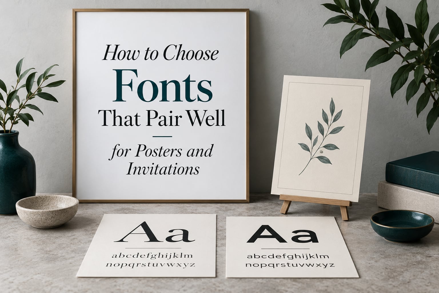
Two typefaces sitting on the same piece of paper can agree with each other or argue in front of everyone who looks at it. The difference is almost never the fonts themselves. It is whether the pair was chosen on purpose. Learning how to choose fonts that pair well for posters and invitations is less about memorising names and more about judging contrast, proportion and reading distance.
That matters more here than on a screen. A poster is read from across a room, then from two metres away, then from arm’s length. An invitation is read once, slowly, often in imperfect light, sometimes by someone holding a phone in a dim hallway. The same pair that shouts beautifully at poster scale can turn into grey mush on a 5 inch card, and a delicate pairing that flatters an invitation will vanish completely across a room.
I design and review printed event work regularly, and the same failure shows up every time: a good headline face bolted onto a body face that happens to be sitting one dropdown menu away. People on design forums describe the search as a spiral. One described spending days lost in font selection and pairing, and a lifetime if they started browsing free font archives. The fix is not more font names. It is a decision process that ends.
This guide builds that process. You will get the core pairing rules, a working glossary of the terms that actually change a decision, twenty ready-made pairings split between posters and invitations, a step-by-step framework you can run in about fifteen minutes, and the mistakes that ruin finished work.
Everything here applies to Canva, Adobe Express, Figma, InDesign, Affinity Publisher or a free Google Docs template. The tools change. The reasoning does not.
Table of Contents
- The 3 Font Rule and the Core Rules of Font Pairing
- Typography Terms Worth Knowing Before You Pair Anything
- Quick Picks: 10 Font Pairs for Posters
- Quick Picks: 10 Font Pairs for Invitations
- How to Choose Fonts for Posters
- How to Choose Fonts for Invitations
- Step-by-Step: How to Pick a Font Pairing
- Common Font Pairing Mistakes and How to Fix Them
- Accessibility: Fonts Your Reader Can Actually Read
- How Color and Font Pairing Work Together
- Free Tools for Testing Font Pairs
- Frequently Asked Questions
- What is the 3 font rule?
- How do I pick font pairings that actually work?
- What font looks best on a poster?
- What is the best font to use for invitations?
- What are the best rules for pairing fonts?
- Can you pair two serif fonts together?
- What fonts go well with Playfair Display?
- What fonts pair with Montserrat?
- Wrapping Up
The 3 Font Rule and the Core Rules of Font Pairing
A font pairing works when two typefaces share some underlying proportions while differing in something clearly visible. Match them on scale and rhythm, and differ them on category, weight or style. That is the whole idea, and the rules below are just ways of keeping it honest.
What is the 3 font rule?
The 3 font rule is the guideline that a single design should use no more than three typefaces. A typical poster or invitation uses one display face for the headline, one supporting face for names and details, and occasionally a third for a small label or a script accent. Many designers work with two, which is usually safer. The rule exists to protect clarity, not to license a font shop.
Three fonts only reads as three fonts when their proportions agree. Set a heavy geometric headline above a delicate old-style serif and a casual script, and you get three unrelated voices. Set three faces that share an x-height and a similar stroke weight, and the eye reads them as one family with accents.
Rule 1: create contrast, but only one kind at a time
Contrast is what makes a pairing legible as a hierarchy rather than a muddle, and the classic move is a serif display face above a sans-serif body face. The serif brings stroke and calligraphic history, the sans-serif brings neutrality and even texture, and the two separate cleanly at any size.
The mistake is stacking three kinds of contrast in one pairing. A condensed geometric bold headline, an ornate italic serif subtitle and a monospaced label are all fighting for the same attention. Pick one axis of difference and let the rest agree.
Useful contrast axes, from strongest to subtlest:
- Category: serif with sans-serif, or sans-serif with script
- Weight: black weight against regular or light
- Structure: condensed against extended, or high-stroke against low-stroke
- Style: upright against italic, roman against oblique
- Scale: a very large headline against small body copy, which is contrast too
Rule 2: build a hierarchy the eye can follow in one second
Visual hierarchy means the reader knows where to look first, second and third without reading a single word. On a poster, that order is usually headline, event or product name, date and venue, then supporting detail. On an invitation, it is the names of the hosts, then the date, then the venue, then the practical details such as RSVP.
You build that order with three levers, and you should use at least two of them. Size is the loudest. Weight is the second loudest, since a bold weight of the same family reads as more important than a light one. Space is the quietest and most underrated, because extra space around a name does more work than making it any larger.
If everything on your layout is the same size, the same weight and the same colour, you have not made a hierarchy. You have made a list.
Rule 3: match proportion before you match style
This is the rule most beginners skip and the one that separates good pairings from lucky ones. Two fonts sit comfortably together when their x-heights are close, so a lowercase letter occupies a similar share of the line in both. When one face has a small x-height and the other a large one, text set in the first looks tiny next to text in the second, and no amount of size adjustment fixes it cleanly.
Stroke weight is the second proportion check. A thin hairline serif beside a heavy sans-serif will look damaged rather than delicate. Either lighten the sans-serif or pick a sturdier serif.
Proportion first, style second. Get the scale relationship right and the pair has a chance. Ignore it and you are decorating.
Rule 4: readability beats beauty every time
A pairing that photographs beautifully and cannot be read across a room is a failure. Test every line at its final size, on the final surface, under the lighting it will actually get. That means a phone screen in dim light for an invitation, and a hallway at ten metres for a poster taped to a wall.
Legibility is not a matter of taste. It is a property of stroke contrast, letter spacing, size against viewing distance, and contrast against whatever sits behind the text.
Rule 5: the same family can be enough
Two weights of one family, or one family plus its small caps, often looks more considered than two unrelated faces. It is the safest option for corporate events, academic posters and anything that has to feel consistent across a series of print pieces.
Superfamilies are the formal version of this. A superfamily is a large related set, often several typefaces plus matching italics and small caps, designed so the members share proportions. Choosing a display cut and a text cut from the same superfamily gives you contrast with none of the risk. Typefaces from Colophon Foundry, Klim, Commercial Type and other independent foundries ship in these families for exactly this reason.
Rule 6: space is a pairing decision
Letter spacing, line height and margin do more to the harmony of a pair than a third font ever will. Display faces with wide internal spacing, including most scripts and high-contrast serifs, need negative tracking at large sizes and positive tracking at small sizes. Text faces need generous leading and almost no tracking.
If a pairing looks wrong and you cannot name why, adjust the space before you swap a font. Designers on critique forums say the same thing about finished layouts: spacing and balance matter as much as the typefaces themselves.
Typography Terms Worth Knowing Before You Pair Anything
You do not need a type design degree to pair fonts well, and you do not need one to fix a bad pairing. You do need about eight terms, because they let you describe what is actually wrong instead of hunting through menus.
| Term | What it means | Why it changes your pairing decision |
|---|---|---|
| x-height | The height of a lowercase letter such as x, measured from the baseline | Pair faces with similar x-heights so text at one size looks equal to text at the same size in the other |
| Stroke contrast | The difference in thickness between thick and thin parts of a letter | High contrast disappears at small sizes, so it belongs in display work only |
| Serif | A typeface with small finishing strokes, or serifs, at the ends of letters | Reads as traditional, editorial or formal. Old style, transitional, modern and slab each signal something different |
| Sans-serif | A typeface with no finishing strokes | Reads as neutral and contemporary. Humanist feels warm, geometric feels engineered |
| Display font | A face designed for large sizes, often with tighter spacing and more character | Use for headlines and names, never for a paragraph of small copy |
| Body font | A face designed to be read for several lines at a time | Needs a large x-height, open counters and sturdy strokes at small sizes |
| Superfamily | A related set of typefaces sharing proportions, often with matching italics and small caps | Lets you add a third voice without adding a third design language |
| Kerning | Manual adjustment of the space between specific letter pairs | Big display faces and scripts almost always need it before they need a different font |
| Leading | The vertical space between lines of text, also called line height | Text faces need more leading than display faces. Tight leading on body copy is the fastest way to make a clean pair look cheap |
| Counter | The enclosed space inside a letter such as the bowl of an a or e | Small closed counters fill in when printed, so avoid tight faces for small print |
Two category terms cause more confusion than the rest, so they are worth separating properly. Serifs split into old style, with angled stress and a soft, calligraphic feel; transitional, with vertical stress and sharper joins, the classic newspaper look; modern, with extreme thick-thin contrast and a vertical stress, which is elegant and very fragile at small sizes; and slab, with thick unbracketed serifs, which is sturdy and reads as confident. Sans-serifs split into humanist, drawn from the motion of a pen and usually with stroke modulation; and geometric, built from circles and straight lines, which is confident and slightly cold.
| Serif sub-category | Best matched with | Effect on a poster or invitation |
|---|---|---|
| Old style | Geometric sans-serif | Warm and crafted against something precise, good for lifestyle events |
| Transitional | Humanist sans-serif | Editorial and considered, a safe choice for academic and corporate work |
| Modern | Humanist sans-serif | Elegant and formal, best used on the largest text only |
| Slab | Neutral or geometric sans-serif | Confident and solid, reliable on busy backgrounds |
Modern is the one to watch. A high-contrast modern serif at 12 point on a wedding invitation is a legibility problem waiting to happen, because the hairlines disappear in print. Use it for names at 40 point and above, and pair it with something sturdy underneath.
Quick Picks: 10 Font Pairs for Posters
These ten pairings are all free, all available on Google Fonts, and all tested at real poster sizes. Each entry gives the display face, the supporting face, and the situation it suits. Try them at the scale you will actually print before committing.
- Anton + Montserrat. Best for: loud gig posters and street promotions. A very heavy condensed grotesque over a clean geometric sans gives you shouting headline with readable detail.
- Bebas Neue + Source Sans Pro. Best for: film posters, festivals and event announcements. Both are tall and narrow, so they stack tightly without competing.
- Oswald + Merriweather. Best for: academic and institutional posters where a lot of text has to be read at two metres.
- Archivo Black + Work Sans. Best for: corporate conferences and product launches. Neutral, modern, and it flatters photography.
- Playfair Display + Lato. Best for: fashion, food and editorial promotions. High contrast elegance over a friendly, round body face.
- Abril Fatface + Karla. Best for: theatre, dance and vintage-themed posters. The display face does the drama, the supporting face stays quiet.
- Space Grotesk + Inter. Best for: technology conferences and modern product launches. Technical character with excellent small-size legibility.
- Cinzel + Raleway. Best for: classical music, theatre and heritage events. Roman capitals above a clean sans reads as formal without a script.
- Syne + Inter. Best for: art shows, gallery openings and design week posters. Awkward and characterful above, invisible below.
- Bungee + Nunito Sans. Best for: street food, nightlife and youth events where the poster needs to be read while people are moving.
| Display face | Supporting face | Contrast type | Best for |
|---|---|---|---|
| Anton | Montserrat | Weight and width | Concerts, street promotions |
| Bebas Neue | Source Sans Pro | Scale within one family set | Film and festivals |
| Oswald | Merriweather | Structure, serif against sans | Academic posters |
| Archivo Black | Work Sans | Weight | Corporate events |
| Playfair Display | Lato | Stroke contrast, serif against sans | Fashion and food |
| Abril Fatface | Karla | Style | Theatre and dance |
| Space Grotesk | Inter | Weight and character | Technology |
| Cinzel | Raleway | Historical versus modern | Classical events |
| Syne | Inter | Style | Gallery and art shows |
| Bungee | Nunito Sans | Weight | Nightlife |
All ten sit in the same rough family of contrast strategies, which is deliberate. Once you know two or three contrast approaches, you can build pairs yourself instead of searching a list forever. That is the difference between choosing fonts and being chosen by them.
Quick Picks: 10 Font Pairs for Invitations
Invitation pairings answer a different question. Instead of impact at distance, you need formality, warmth and enough quiet space for a name to breathe. Formality is the organising principle below, running from the most casual to the most traditional.
Most casual, for birthdays, baby showers and relaxed celebrations:
- Josefin Sans + Lora. Best for: garden parties and afternoon events. Geometric caps over a soft old-style serif feels cheerful without shouting.
- Marcellus + Karla. Best for: modern invitations with classical touches. Roman capitals with generous tracking, set above a friendly grotesque.
- Italiana + Lato. Best for: boutique, fashion-forward invitations. Very fine display caps that need generous letter spacing.
Middle ground, for engagement parties, milestone birthdays and semi-formal dinners:
- Playfair Display + Source Sans Pro. Best for: the widest range of events. Elegant above, invisible below, impossible to get wrong.
- Libre Baskerville + Lato. Best for: bookish and academic hosts. A traditional text serif above a rounded sans that keeps it approachable.
- Great Vibes + Raleway. Best for: romantic and handwritten-feeling invitations. The script carries the names, the sans carries every practical detail.
- Sacramento + Karla. Best for: informal weddings and save-the-dates. A light script that stays readable at small sizes better than most.
Most traditional, for weddings, formal dinners and black-tie events:
- Cinzel + Jost. Best for: classical weddings and heritage invitations. Roman capitals with no script at all, which reads as dignified rather than themed.
- Bodoni Moda + Jost. Best for: luxury and couture invitations. Fashion-magazine contrast, used sparingly and set large.
- Cormorant Garamond + Montserrat. Best for: refined, editorial weddings. An old-style serif with a tall x-height and a small amount of tracking underneath.
| Display or script face | Supporting face | Formality | Best for |
|---|---|---|---|
| Josefin Sans | Lora | Casual | Garden parties |
| Marcellus | Karla | Casual to mid | Modern invitations |
| Italiana | Lato | Casual | Boutique events |
| Playfair Display | Source Sans Pro | Mid | All-purpose |
| Libre Baskerville | Lato | Mid | Bookish hosts |
| Great Vibes | Raleway | Mid to formal | Romantic weddings |
| Sacramento | Karla | Casual | Informal weddings |
| Cinzel | Jost | Formal | Classical weddings |
| Bodoni Moda | Jost | Formal | Luxury events |
| Cormorant Garamond | Montserrat | Formal | Editorial weddings |
One rule runs through all ten: the script or decorative face does the names, and the plain face does everything with a date, an address or a website on it. Beginners often reverse this, which produces invitations where nobody can find the venue.
How to Choose Fonts for Posters
A poster is judged at a distance first and up close second, and that order changes everything about your font choice. Design the small text last, and design it knowing that the headline has to work from across a room.
Start from the viewing distance, not the canvas
Decide the farthest distance the poster will be read from, then set your headline to a size that stays legible at that distance. A general rule for print is roughly one inch of capital letter height per ten feet of viewing distance. If your poster hangs in a corridor, the headline you judge on your laptop screen is not the headline anyone will see.
Measure it rather than guess. Stand ten feet back from your screen and squint. If the headline blurs into a grey band, it is too light, too small, or too low in contrast.
Choose a display face that survives scale
Not every characterful font works large. A face designed for a website headline can fall apart at poster scale, where every flaw is magnified and any weak junction becomes a visible hole. Heavy weights, open counters and confident shapes are what survive enlargement.
What works well: condensed faces, which give you more characters per line; heavy weights, which hold up across a room; and faces with wide, open counters, which do not clog when ink spreads on large-format print.
What fails: hairline weights, high stroke contrast in light weights, and any face with tight counters at your chosen size.
Give supporting text enough contrast against imagery
The most common poster failure is not a bad pairing, it is unreadable type over a busy photograph. The fix is not always a different font. It is a solid colour field, a translucent panel, a gradient scrim or a change of placement so the text sits over a quieter part of the image.
Where you genuinely must place type over a photograph, use a heavier weight and a larger size than feels necessary. A bold condensed face survives texture; a light face never will.
Build scale contrast, not just weight contrast
Posters have room for dramatic size jumps, and you should use them. Set the headline at a size the supporting text could never reach, and the hierarchy does most of the work before anyone reads. Three levels is enough: headline, name or event, detail.
On a poster, contrast is mostly measured in centimetres. If every line is roughly the same size, the layout has no focal point regardless of how good the typefaces are.
Set a minimum for small print
On an A2 poster, anything below about 18 point will be unreadable for most viewers, and body text should sit nearer 28 point. On a 5 by 7 inch flyer, body text rarely goes below 9 point. Below those thresholds, add weight, add leading, or cut the words. Cutting words is almost always the better answer.
How to Choose Fonts for Invitations
An invitation is read at a distance of about 40 centimetres, once, and usually in whatever light is available. It rewards intimacy and restraint rather than impact. The pairing is doing a different job than on a poster, and copying your poster pairing here is a common and expensive mistake.
Choose a formality level first
Decide how formal the event is before you open a font menu, because formality narrows your options immediately. A casual afternoon gathering wants humanist or geometric faces and generous spacing. A black-tie wedding wants old-style or modern serifs, often in capitals, with high contrast and a wide margin. A corporate conference wants something in the middle, legible and neutral.
Most invitation disasters come from picking the font first and letting it decide the tone. A slab serif headline on a garden party invitation says something very different from what the host intended.
Use a script with rules, or skip it
Script fonts add warmth and a handmade quality, and they fail in predictable ways. They have a narrow range of usable sizes, and the word shapes are similar enough that readers can stumble. Most scripts also lack a bold weight, so a script cannot be your main hierarchy anchor unless it is set very large.
Three rules keep scripts working:
- Use the script for names only, never for dates, addresses or instructions
- Set it at a size where every letter is individually legible, and add a small amount of tracking
- Pair it with a plain sans-serif so the reader has somewhere quiet to land
If you cannot find a size at which your chosen script stays readable, drop it. A confident sans-serif with wide tracking does the job of a fancy name better than a script nobody can decode.
Set an information hierarchy, not a text block
Every invitation carries the same handful of items: names, event, date, time, venue, and a practical line for RSVP or dress code. Decide the order, then give each item its own level. In practice, the names come first and largest, the date second, the venue third, and the practical details last and smallest.
Put each element in its own block with real space between them. When names, date, venue and RSVP are crammed together with equal spacing, they read as a single crowded paragraph, and readers scan it rather than read it. Space between blocks is doing more work here than any font decision.
Mind the print constraints
Wedding invitations are often printed on heavy cotton or textured stock. Texture fills in counters and softens hairlines, so a face that looks crisp on screen can look weak on the card. Choose a slightly heavier weight, or avoid high stroke contrast. Before a large print run, always proof on the actual stock if you can.
Metallic and dark inks also shift colour, so pairings that rely on light grey small print will disappear. Use a darker ink for anything the reader must act on.
Step-by-Step: How to Pick a Font Pairing
Run these six steps in order and you will land on a pairing in about fifteen minutes instead of three days. The order matters, because each step narrows the next one.
- Write the message in three words. Festive, authoritative, playful, refined, urgent. Those three words decide the formality level, the weight range and whether a script is appropriate. Everything downstream is easier once the tone is fixed.
- Pick the display face and nothing else. Set it large in the three-word mood you chose, on a real sample line rather than the word Lorem ipsum. Try five. Give yourself a hard stop.
- Check its x-height and stroke weight. Note the x-height on screen using a ruler overlay or a comparison tool. You will use this to judge the supporting face in the next step.
- Pick the supporting face to match, not to impress. Look for a face with a similar x-height and a contrasting structure. A serif display above a sans body, or a display above a quieter cut of the same family. Ignore anything flashier than your headline.
- Test at the real size, on the real surface. Print it or screenshot it at final dimensions. For a poster, view it from across the room. For an invitation, hold it at arm’s length in dim light. If you squint and lose information, go back to step 4.
- Add a third face only if the first two cannot do the job. It should have a specific job, such as a small label or an accent script. If you cannot name that job, you have finished.
The last step is the one people resist. If two faces are working, adding a third dilutes the hierarchy and the piece gets busier without getting better.
Common Font Pairing Mistakes and How to Fix Them
These are the failures I see most often in critique threads and in submitted work. Each one has a specific fix, which is more useful than a general warning.
- Using three unrelated fonts because three felt generous. Fix: cut to two, or pick a third from the same superfamily as the display face.
- Pairing two serifs with nothing to separate them. Fix: create separation with weight, scale and case. One serif in black weight capitals above another in light weight lowercase will read clearly. Two mid-weight transitional serifs at the same size will not.
- Using a display face for body copy. Fix: keep the characterful face for the headline and move everything longer to a body font. If a paragraph sits in a display face, it will look squeezed no matter how the pair is balanced.
- Ignoring x-height mismatch. Fix: measure both faces and adjust the smaller-x-height one upward until the lowercase heights align.
- Defaulting to the same five overused fonts. Fix: when you reach for a default, check whether it appears in the last three projects you made. Popularity is not a design reason, and a distinctive face is more memorable.
- Setting light text over a busy photograph. Fix: add a colour field, darken the image behind the text, or move the type.
- Skipping tracking on wide display faces. Fix: add tracking to any serif or script above about 30 point, and reduce it slightly for heavy condensed sans below 24 point.
- Letting every element compete equally. Fix: force a hierarchy. Three levels, clear space between them, one focal point.
- Treating type as something to stretch and distort. Fix: never condense, stretch or outline a face to fit a box. Choose a face with the proportions you need. Beginners on poster assignments often reach for scaling first; it is almost always the wrong move.
- Forgetting the typeface you are fighting. Fix: if artwork or a fixed brand palette already exists, take your colours, the letterforms visible in any logo, and the overall formality from it before choosing anything. Type that fights the artwork looks borrowed.
Accessibility: Fonts Your Reader Can Actually Read
Good font pairing is partly an accessibility practice. Most readability problems in printed and digital typography are not dyslexia, they are simply too small, too light, too tightly set, or too close in value to the background behind them.
Traits that help low-vision readers
- Large x-height. Letters that occupy more of the line are easier to identify at a glance, which matters for anyone with reduced acuity.
- Generous letter spacing. Spacing gives each letter its own territory and reduces crowding, especially at small sizes.
- Open counters. The enclosed space in a, e and o fills in when printed small or displayed on a low-quality screen.
- Strong weight contrast between levels. If a reader cannot rely on size, they can still rely on weight.
- Underlined or off-black text colour. Pure black on pure white can glare, and pure white on pure black can bloom on screen. A near-black on white works better for long reading.
Traits that help dyslexic readers
No font cures dyslexia, and claims to that effect should be treated carefully. What does help is a design with less confusion. Choose faces with distinct letterforms so that a, g and q do not look alike, avoid a single face carrying the whole piece, and keep letter spacing open with line spacing generous.
The pairing principle applies here too. A clear structural difference between heading and body text means readers can tell the two apart before they finish processing either, which removes a layer of decoding effort.
Contrast against the background
Text sitting on an image or a coloured field needs enough value difference to stay readable. A useful test: screenshot the design, convert it to greyscale, and check it. If a line disappears in greyscale, it will struggle in bright sunlight and on a cheap print. This single check catches more real-world legibility problems than any font choice.
How Color and Font Pairing Work Together
Colour and type reinforce each other, and when they disagree the reader feels it before they can name it. A light, airy typeface set in heavy saturated colour looks aggressive. A heavy condensed face in a pale tint looks weak and washed out.
Three rules keep colour and type aligned:
- Match colour weight to font weight. Dark ink wants a sturdy face. Pale ink wants a lighter face with more breathing room. Setting a hairline light face in black and a black weight in a 10 percent tint both look wrong, for opposite reasons.
- Use colour as a hierarchy tool, not decoration. One accent colour on the key line does more for hierarchy than making every line a different colour. Most strong invitation and poster designs use two colours at most.
- Keep the supporting face neutral. If your display face is the personality, let the supporting face take a plain colour. Two decorative faces in two competing colours read as noise.
Colour also interacts with format. Screen colours glow, so a colour that reads as soft on a monitor can look flat on matte print, and a rich saturated ink can look almost fluorescent on coated stock. Proof anything colour-critical before a full print run.
Free Tools for Testing Font Pairs
You do not need paid software to pair fonts properly. These free resources cover selection, pairing checks and proofing.
- Google Fonts pairs with the Google Fonts pairing feature that generates combinations from a chosen typeface. Every font named in this guide is available there and free for commercial use.
- fontpair generates hundreds of curated pairings and shows them at heading and body sizes together, which makes mismatched x-heights obvious immediately.
- TypeWolf documents typefaces with real-world examples in use, including editorial and brand work, so you can see how a face behaves at length rather than in a single word.
- Font Squirrel filters free display fonts by classification, weight and style, which is a faster route through a large library than browsing by name.
- Canva and Adobe Express both include a font pairing suggestion tool, and both make it easy to see a pair at poster and card scale without leaving the tool.
- Your own phone camera is the most useful proofing tool here. Photograph the printed piece at the distance a reader will stand from it, then look at the photo on a small screen.
For a print proof you can do at home, print at 100 percent on the paper you plan to use, hold it at arm’s length, and read it in a dim room. Everything that survives that test will survive a wedding reception or a corridor.
Frequently Asked Questions
What is the 3 font rule?
The 3 font rule is the guideline that a single design should use no more than three typefaces: one display face for the headline, one supporting face for names and details, and a third only for a specific accent or label. Most designers use two, which is usually safer. The rule exists to keep the hierarchy clear, and it only works when all the faces share similar proportions, such as a comparable x-height.
How do I pick font pairings that actually work?
Pick the display face first and set it large on a real sample line, then choose a supporting face with a similar x-height and a contrasting structure, such as a serif above a sans-serif. Test both at the real size on the real surface before you commit. Add a third face only when you can name the specific job it does.
What font looks best on a poster?
A heavy or condensed face with open counters works best on a poster, because those traits survive being enlarged and read from a distance. High contrast serifs, hairlines and tightly closed letters fail at scale. For a supporting text face, choose something with a large x-height, generous letter spacing and sturdy strokes so the small print still reads at two metres.
What is the best font to use for invitations?
There is no single best font, but invitations respond to a plain face with a tall x-height paired with one characterful face for the names. Playfair Display with Source Sans Pro covers most events, while Great Vibes with Raleway suits romantic weddings and Cinzel with Jost suits formal ones. Always set a script at a size where every letter is clearly legible.
What are the best rules for pairing fonts?
The core rules are: create one clear kind of contrast, build a hierarchy with size, weight and space, match proportions such as x-height and stroke weight before matching style, keep every line readable at its final size, and remember that spacing matters as much as the typefaces. Two well-proportioned fonts beat three unrelated ones every time.
Can you pair two serif fonts together?
Yes, and the results can be very elegant for invitations and editorial posters. Separate them with case, weight and scale rather than style alone: one old-style serif in black weight capitals above a transitional serif in light weight lowercase. Two mid-weight transitional serifs at the same size and weight will look like a mistake.
What fonts go well with Playfair Display?
Playfair Display has a high stroke contrast and a large x-height, so it pairs well with plain sans-serifs that stay out of its way: Source Sans Pro, Lato and Raleway all work. On a poster, pair it with a heavy grotesque for the support line. On an invitation, keep the supporting text at a regular weight so the display face does the styling.
What fonts pair with Montserrat?
Montserrat is a geometric sans-serif with a large x-height and even strokes, so it pairs best with serifs that bring contrast rather than more geometry. Good matches are Playfair Display, Cormorant Garamond and Libre Baskerville. If you want a sans-serif pairing, mix weights within a family, or add a humanist face such as Source Sans Pro for warmth.
Wrapping Up
Learning how to choose fonts that pair well for posters and invitations comes down to four judgements: match proportions before style, create one clear kind of contrast, build a hierarchy the eye follows in one second, and test everything at the distance and in the light it will actually be read.
Start with the three-word message, choose one display face deliberately, match a supporting face to its x-height, and stop at two fonts. Everything else in this guide is refinement on top of that simple sequence.
Your next step is small. Open a free font library, set ten candidates at poster scale, and photograph the screen from across the room. The pairing that survives that test is the one to build on.
Updated for October 2026.