
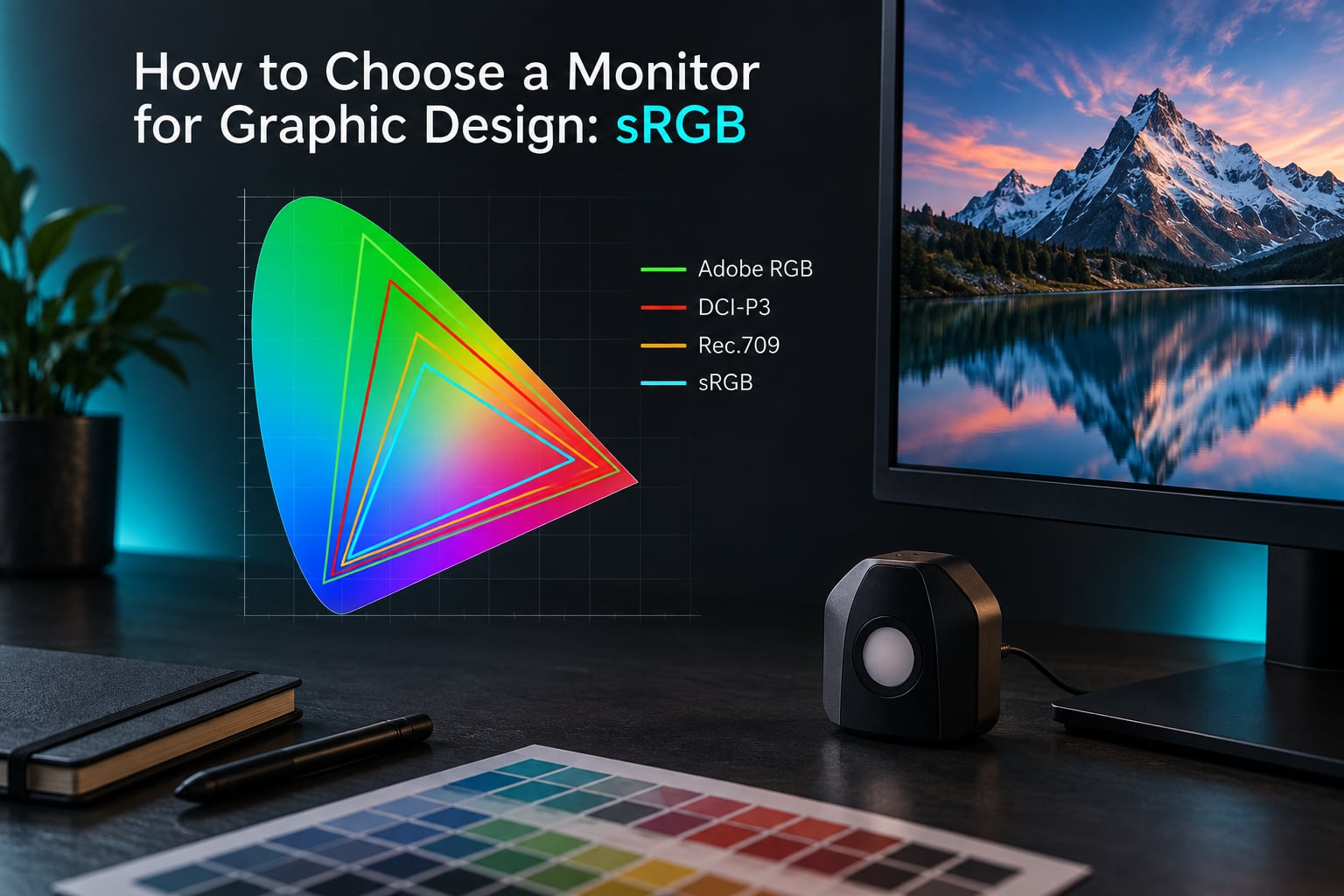
Short answer: buy a well-calibrated IPS panel that covers 100% of sRGB, and upgrade to 95% or better Adobe RGB coverage only if you regularly produce CMYK-embedded print, packaging, large-format, or product imagery. sRGB is the working space behind almost every screen deliverable, and a good sRGB monitor is enough to build an entire design career on.
That answer feels too simple for a spec sheet with fifteen rows, so this guide breaks the decision into the parts that actually change your work: color space, gamut coverage versus color accuracy, panel type, and the calibration habits that keep a display honest. Updated for October 2026.
Table of Contents
- How to choose a monitor for graphic design: start here
- What sRGB actually is and why it is the default
- sRGB vs Adobe RGB vs DCI-P3 vs Rec.709 side by side
- What Adobe RGB adds and when you genuinely need it
- Gamut coverage is not color accuracy
- The sRGB clamp problem
- Wide-gamut monitor with sRGB mode vs a dedicated sRGB monitor
- Panel types explained: IPS vs VA vs TN vs OLED
- Other specs that matter for design work
- Color space selection in Adobe apps and soft proofing
- Calibration basics and how often to do it
- Buying checklist by workflow
- Frequently Asked Questions
- Conclusion
How to choose a monitor for graphic design: start here
Match your primary output medium to the minimum gamut target. Buy below the line for your actual job and you will clip colors; buy far above it and you pay for a panel you never use.
| What you mostly deliver | Working space | Minimum coverage to buy | Nice to have |
|---|---|---|---|
| Web pages, UI, app design, social assets | sRGB | 100% sRGB IPS, factory calibrated, Delta E under 2 | 96% or better DCI-P3 with a hardware sRGB emulation mode |
| Brand identity, logos, type and illustration | sRGB, convert to CMYK at output | 100% sRGB IPS, matte coating, good uniformity | 95% or better Adobe RGB for Pantone-to-spectrum work |
| Print, packaging, editorial, prepress | Adobe RGB working, CMYK at soft proof | 95% or better Adobe RGB, 10-bit, hardware calibration | A built-in calibrator sensor and 3D LUT |
| Photo retouching, camera RAW, product photography | Adobe RGB for camera work, sRGB for web crops | 98% or better Adobe RGB or 99% or better DCI-P3 | 10-bit panel, 4:4:4 chroma, 1000 or higher nit peak |
| Video editing and color grading | Rec.709, DCI-P3 or Rec.2020 by pipeline | 99% or better Rec.709 at minimum | 98% or better DCI-P3 with 10-bit and 4:4:4 |
If you are still unsure, count the deliverables. Most designers can point at one client or project type that would justify wide gamut, and the rest of the work is screen work where sRGB is the target.
What sRGB actually is and why it is the default
sRGB is a color space: a specific list of numeric values assigned to red, green and blue primary light, plus a curve describing how brightness maps to those values. It was created for CRT displays and has been the web’s default ever since, which means it is encoded in the overwhelming majority of images, illustrations, exports and screens your work will ever touch.
In plain terms, sRGB covers roughly 35% of the colors a human can see. That sounds stingy until you notice what lives inside those 35%: every web palette, most brand guidelines, the majority of stock photography, and all of Instagram, X, TikTok and YouTube.
Three terms get mixed up constantly, so set them straight before anything else.
- Color space is the mathematical container: sRGB, Adobe RGB, DCI-P3, ProPhoto RGB.
- Color gamut is the slice of visible colors one of those spaces can describe.
- Color profile is the ICC file that tells your operating system how a specific device behaves, so it can convert colors correctly.
Your monitor physically emits light. It cannot show a color that is outside its gamut, so anything wider than the panel gets clipped. A narrow panel means your most saturated choices never make it to the screen, and you ship artwork that looks flat on a good display.
That is why sRGB is the default rather than a compromise. It is the space your deliverable lives in, and matching the deliverable is the entire job.
sRGB vs Adobe RGB vs DCI-P3 vs Rec.709 side by side
These four spaces nest inside each other, with sRGB and Rec.709 effectively sharing the same primaries today. DCI-P3 and Adobe RGB are both wider, but they lean in different directions.
| Color space | Approx. share of visible colors | Built for | Panel you need |
|---|---|---|---|
| sRGB | About 35% | Web, UI, social, general screen delivery | Any 100% sRGB panel |
| Rec.709 | About 35% (same primaries as sRGB) | HDTV and standard video deliverables | Any 100% sRGB panel, ideally 99% Rec.709 |
| DCI-P3 | About 90% | Cinema, streaming HDR, photography | 95% or better DCI-P3 |
| Adobe RGB | About 80% | Print, CMYK working space, packaging, product photography | 95% or better Adobe RGB |
| CMYK | Not a screen space | Print output, simulated on screen | Wide gamut plus a soft proofing workflow |
Think of the nesting as sRGB inside DCI-P3 inside Adobe RGB, with Rec.709 sitting on top of sRGB. Adobe RGB is wide on the cyan and green side, which is why it maps to the inks in a print job. DCI-P3 is wide on the red side, which is why it maps to cinema cameras and modern phone displays.
That difference decides the print question. If your work ends up on paper, Adobe RGB is the closer match to CMYK. Much of the advice you will read online treats DCI-P3 as a cinema-only space, then stops, which leaves print designers with the wrong reference.
What Adobe RGB adds and when you genuinely need it
Adobe RGB adds roughly 45 percentage points of visible color on top of sRGB, concentrated in the greens, cyans and blues that printers actually mix. It matters when the deliverable is ink: packaging, editorial layouts, signage, product shots for print, anything with a Pantone build built on saturated cyans and greens.
Three conditions justify the premium.
- You work in CMYK-embedded files regularly, so a saturated Adobe RGB source has to survive a conversion before it reaches paper.
- You shoot or retouch product and food photography where the camera raw file is wide and the ink gamut is the real constraint.
- You proof prepress and need to judge separations against something closer to the press gamut than a 35% sRGB triangle.
Now the part most guides leave out: working in Adobe RGB has a real running cost. Your asset library gets smaller because stock libraries, client-supplied files and web pipelines default to sRGB, and every file that crosses that boundary needs a conversion. InDesign, Illustrator and Photoshop can all convert an asset, but a converted asset is not the same file you were given, and clients occasionally notice.
Forum users on r/photoshop make the point from the other direction. Print-focused photographers in r/HiDPI_monitors explicitly prefer Adobe RGB over DCI-P3 for the same reason above, and their buying lists converge on 32-inch, 4K, IPS, 100% sRGB, 100% Adobe RGB, 10-bit and Delta E under 2.
Do you need a wide-gamut monitor if you only design for screens?
No, and this is the clearest verdict in the whole topic. If every file you deliver opens in a browser, a social app or a video call, then sRGB is the destination and a wide-gamut panel adds cost and workflow friction rather than accuracy.
The exception is mixed work. Plenty of designers have one screen-only day and one print day each week. In that case a wide-gamut panel with a trustworthy sRGB emulation mode handles both, which is the next section.
One warning from real buyers: wide gamut on the box does not guarantee Adobe RGB coverage. A buyer on TalkPhotography received a wide-gamut monitor that measured 100% sRGB and 89% Adobe RGB. Wide gamut can mean P3, not Adobe RGB, so read the number for the space your job actually needs.
Gamut coverage is not color accuracy
Coverage answers a volume question: how much of a space can the panel produce? Accuracy answers a position question: does each color land where it should? A monitor can hit 100% sRGB coverage and still be wildly inaccurate, because coverage is measured by area and accuracy is measured per color.
Accuracy gets expressed as Delta E, which is a single number describing the distance between the color the panel produced and the color it should have produced. The reference is usually a Delta E 2000 average across a patch set.
- Average Delta E under 2 is a reasonable buy threshold for professional work.
- Average Delta E under 1 is reference-grade and worth paying up for if accuracy is your product.
- Individual patches much higher than the average are the ones that will bite you, and averages hide them.
Independent reviewers point out that wide-gamut accuracy gaps are not spread evenly. A gregbenzphotography.com review notes the largest gaps cluster in green, cyan and blue, which is exactly the region Adobe RGB and DCI-P3 expand into.
So read three numbers together, never one: coverage percentage, average Delta E, and the calibration report or independent measurement behind it. Manufacturer coverage figures are claims until someone measures them, which is why forum buyers ask for the report.
Is 72% NTSC better than 99% sRGB?
No. NTSC is a legacy broadcast standard that pre-dates modern displays, and the 72% NTSC figure on old product listings described coverage of a smaller, older triangle. sRGB replaced it, so a 99% sRGB panel is showing you more of the colors that matter today. Treat any NTSC number on a modern listing as filler.
The sRGB clamp problem
Open an ordinary sRGB file on a wide-gamut monitor with no color management, and it looks wrong. Colors turn neon, skin goes orange, and an image that was fine on a laptop now looks like a mistake. This is the single most common question people ask after a wide-gamut purchase, and it has a specific name and a specific fix.
The file is tagged sRGB, so its colors are numeric values inside a triangle. The panel can display everything in that triangle plus far more, so those sRGB values now sit in the middle of a much larger screen space and read as undersaturated rather than correct. The file did not change. Your expectation did.
Three fixes, in order of how you should approach them.
- Turn on the monitor’s sRGB emulation or clamp mode. The panel restricts itself to sRGB and the file looks correct again. This is the cleanest fix and it lives in the monitor’s on-screen menu or OSD, not in your operating system.
- Keep color management switched on in the OS and in the app. Windows Color Management, macOS ColorSync and the color-managed workflow in Photoshop, Illustrator and InDesign should all be enabled, and every asset should carry its correct ICC profile.
- Set the app’s color space explicitly. In Photoshop, Edit then Color Settings, and match the working space to the deliverable: sRGB for web, Adobe RGB for print and wide-gamut photo work.
If you do nothing else, enable the hardware sRGB emulation mode. It costs you the panel’s wider gamut while it is on, and it gives you a display that behaves like the target, which is what most screen work needs.
Wide-gamut monitor with sRGB mode vs a dedicated sRGB monitor
Both approaches can produce trustworthy color, and the forum confusion is mostly about hardware versus software. A color space is not a display setting you toggle in a menu. Adobe RGB and sRGB are profiles your applications read; a panel that physically cannot emit a color will never show it, no matter what a dropdown says.
A dedicated sRGB monitor is simpler. Its gamut is clamped at the triangle, so every sRGB file looks right without emulation, and factory calibration is usually excellent. It is the right choice for web, UI and social work done at volume.
A wide-gamut monitor with a good emulation mode is more flexible. Switch to sRGB mode and screen work behaves the same; switch to the native gamut and you can judge print-saturated colors, camera raw output and video. The cost is money and one menu toggle to remember.
dpreview forum threads asking whether the sRGB mode on an Adobe RGB monitor is accurate enough to trust come down to three checks: is the mode implemented in hardware rather than in software, is it factory calibrated, and does the panel hold accuracy at the low end of the range. Hardware emulation on Eizo ColorEdge and BenQ ProArt class displays is the pattern to look for.
Panel types explained: IPS vs VA vs TN vs OLED
For design work, the panel type decides how much of the screen shows the same color as the part you are looking at. IPS is the default answer for a reason, and the reason is stability rather than headline contrast.
| Panel | Viewing angles and color shift | Contrast | Gamut ceiling | Design-work verdict |
|---|---|---|---|---|
| IPS | Wide and stable, minimal shift off-axis | Moderate, roughly 1000:1 | Widest of the LCD options, full sRGB and often Adobe RGB or DCI-P3 | The right default for graphic design |
| VA | Acceptable, some shift at steep angles | High, 2000:1 to 4000:1 | Usually good coverage | Usable, but the usual partner of curved panels |
| TN | Narrow, obvious color shift and gamma shift | Low, roughly 1000:1 | Often limited, 72% NTSC legacy figures | Avoid for color-critical work |
| OLED (WOLED) | Excellent, near-zero shift | Very high in dark scenes | Wide, typically sRGB and DCI-P3 | Excellent for photo and video, check text rendering |
| QD-OLED | Excellent | Very high in dark scenes | Wide, often close to Adobe RGB | Top-tier photo and mixed media |
Curved displays are usually VA panels, and the curve distorts geometry at the edges, so a logo placed against the left margin will not sit parallel to the display border. For layout and typography work, flat is the safer choice.
OLED panels hold blacks well and cover wide gamuts, but they can show text fringing on sub-pixel structures and they are sensitive to static elements in a design application. That is a real consideration when your canvas is open all day.
Other specs that matter for design work
Bit depth: 8-bit versus 10-bit. An 8-bit panel has roughly 256 steps per channel, and adjacent steps in a smooth gradient can be visible as banding. 10-bit raises that to about 1024 steps, which is why it appears on every serious print and photo monitor. It is a real improvement, not a spec-sheet trick, and it matters most in skies, skin gradients and large flat brand colors.
Chroma subsampling: 4:4:4 versus 4:2:2. This is the one most buying guides skip. 4:4:4 keeps full color detail on every pixel, which is what you want for fine type, thin vector lines and hard color edges. 4:2:2 shares color detail across neighbors and will soften saturated 1-pixel strokes and break some small colored text. If your monitor accepts USB-C or DisplayPort, make sure 4:4:4 is available at your target resolution and refresh rate.
| Configuration | Banding in gradients | Fine text and thin lines | Use it for |
|---|---|---|---|
| 8-bit 4:2:2 | Noticeable | Softened color edges | General office and screen-only work |
| 8-bit 4:4:4 | Noticeable in wide gradients | Acceptable | UI and web design on a tight budget |
| 10-bit 4:4:4 | Effectively invisible | Clean | Print, packaging, photo, video grading |
Resolution and pixel density. Aim for roughly 100 to 140 pixels per inch at your viewing distance. A 27-inch 5K panel gives about 163 PPI and makes fine type noticeably sharper, while a 32-inch 4K panel gives about 138 PPI with more workspace for artboards. Avoid 40-inch and 42-inch 4K monitors for design: at that size the pixel density drops sharply and the panels are often television panels with poor accuracy, despite how they look on a spec sheet.
Matte versus glossy coatings. Professional design monitors skew matte for a practical reason: a glossy surface reflects room light straight into the image you are judging, and reflections masquerade as contrast errors. Nano-matte coatings push further and cost you a little clarity. Glossy panels look superb in a darkened studio and are the wrong tool in a normal office.
Brightness. For print and photo proofing, target 100 to 250 nits calibrated to your ambient light, not the headline number. Higher peak brightness is useful for media work with an HDR mastering monitor, and it is not useful for judging print color. Watch for uniformity reports too, since backlight bleed and corner brightness differences are what you actually notice in a large flat layout.
Refresh rate and response time. Forum consensus in r/Monitors and r/photoshop is consistent here: these do nothing for design work. A 60 Hz panel is fine. Ignore response time figures entirely, because they describe motion transitions you will never see in a static document.
HDR. True HDR support is usually not worth paying extra for in digital design. It changes the tone curve, it is hard to calibrate, and it moves your work away from the SDR sRGB conditions your clients and the web actually use. Buy it if you also edit HDR video, not for design alone.
Connectivity and ergonomics. Check that the monitor runs 4K at 60 Hz or better over DisplayPort or USB-C with 4:4:4, and prefer USB-C power delivery if you use a laptop. A stand with height, tilt, swivel and pivot adjustment matters more for daily work than any single color spec, and portrait orientation is worth having for long layouts. A KVM switch is convenient if you switch between a desktop and a laptop several times a day.
Color space selection in Adobe apps and soft proofing
Working space is a per-project decision, not a per-monitor one. Set it to match where the file ends up.
- Web, UI and social: set the working space to sRGB. Export the same profile. Every browser and phone will honor it.
- Print and packaging: convert a copy to Adobe RGB for color decisions, keep Pantone solids and Spot colors untouched, and let the CMYK conversion happen only at output.
- Photo: use ProPhoto RGB or Adobe RGB for camera raw correction, then convert to sRGB for web delivery. Do not grade in sRGB if you want to recover clipped highlights.
- Video: set the timeline color space to match the delivery target, Rec.709 for standard delivery and DCI-P3 or Rec.2020 only when the destination asks for it.
Soft proofing simulates CMYK output on screen through an ICC profile. In Photoshop, open View then Proof Setup, choose the press condition and intent, then View then Proof Colors. InDesign and Illustrator use the same panel under Window then Separations Preview.
Soft proofing is a guide, not the ground truth. It depends on your display profile being current and your room light being controlled. For press-critical work, a contract proof or an on-screen proof viewed under certified viewing light is the standard, and a screen alone is not. The dpreview forum discussion of Adobe RGB versus sRGB is a good example of how often this distinction gets lost: no monitor setting substitutes for a proof.
Calibration basics and how often to do it
Factory calibration is a starting point, not a permanent state. Displays drift, and the environment changes around them.
A colorimeter uses filtered light to measure a screen and is the right tool for most designers working on LCD panels. A spectrophotometer measures spectral data and is the better choice for wide-gamut and OLED panels, where a colorimeter can misread saturated colors. Software options such as SpyderX and DisplayCAL cover the routine case; hardware calibration, available on ColorEdge and Calman Ready class displays, corrects the panel’s internal LUT and survives a computer or operating system change.
Run this routine and it stays honest.
- Let the display warm up for 20 to 30 minutes at a fixed brightness so the backlight and panel settle.
- Control the room. D65 white point and gamma 2.2 are the standard target. Set ambient light to a consistent level you can reproduce.
- Set brightness to your target before the first reading, usually 100 to 250 nits for print and photo proofing rather than the maximum the panel will do.
- Run the colorimeter and save a new profile as an ICC v4 file.
- Set the profile as the system display profile and restart your applications so they pick it up.
- Check every 4 to 8 weeks, and fully profile every 6 to 12 months. More often if the room light changes or the monitor runs long hours.
On a hardware-calibrated display, the same routine applies but the correction lives in the panel. Confirm the panel is in calibration mode rather than a preset picture mode, or you will be grading an image the monitor is deliberately distorting.
Buying checklist by workflow
One minimum specification per discipline. Match your row, then treat everything above it as optional.
| Workflow | Minimum specification | Upgrade if you can |
|---|---|---|
| Web and UI design | 27-inch 4K or 5K, IPS, 100% sRGB, factory calibrated, Delta E under 2 | 96% or better DCI-P3 with hardware sRGB emulation |
| Brand and logo work | 27-inch or 32-inch 4K, IPS, matte coating, 100% sRGB, good uniformity | 95% or better Adobe RGB for saturated palette checks |
| Print and packaging | 95% or better Adobe RGB, 10-bit, 4:4:4, hardware calibration, matte coating | Built-in sensor with scheduled self-calibration, 3D LUT |
| Photo retouching | 98% or better Adobe RGB or 99% or better DCI-P3, 10-bit, 4:4:4, matte coating | QD-OLED or a calibrated OLED with a colorimeter |
| Video editing and grading | 99% or better Rec.709, 10-bit, 4:4:4, 300 or more nits | 98% or better DCI-P3 with a proper scoping workflow |
Add a built-in colorimeter to that list if you dislike buying a colorimeter separately. A sensor in the bezel that schedules its own checks removes one recurring chore, and for print work that convenience is usually worth more than a small gain in measured Delta E.
Frequently Asked Questions
Which is better, Adobe RGB or sRGB?
sRGB is the better default for screen work, because it is the working space behind nearly every web, UI and social deliverable. Adobe RGB is the better choice when files end up in CMYK, such as packaging, editorial or prepress work. The practical answer is to buy a monitor that covers 100% sRGB accurately and add wide gamut only if print is a regular part of your job.
What type of monitor is best for graphic design?
An IPS panel is the best default for graphic design because it holds color steady across the whole screen with almost no shift off-axis. VA panels add contrast but usually come with curved geometry, TN panels shift color visibly, and OLED panels deliver wide gamuts and deep blacks with caveats around text rendering. Look for full sRGB coverage, an average Delta E under 2 and 10-bit with 4:4:4 chroma.
Which monitors support Adobe RGB?
Look for a published Adobe RGB coverage figure of 95% or better, ideally 98% or more, measured or reported in a factory calibration document. Wide-gamut marketing does not guarantee it: a buyer on TalkPhotography received a panel measuring 100% sRGB and only 89% Adobe RGB. Confirm the Adobe RGB number specifically, because many wide-gamut monitors cover DCI-P3 instead.
What is the best monitor for graphic designers?
The best monitor for graphic designers depends on the deliverable. Web and UI work needs a calibrated 100% sRGB IPS panel. Print and packaging need 95% or better Adobe RGB with 10-bit color. Photo and video work need DCI-P3 or Adobe RGB coverage plus 4:4:4 chroma. Resolution, calibration quality and a matte coating matter more than refresh rate or response time.
Which color gamut is better, DCI-P3 or sRGB?
DCI-P3 is wider than sRGB, covering roughly 90% of visible colors against about 35%, so it is the better choice for cinema, HDR streaming and modern phone displays. For web and UI work sRGB is the correct target because it is what browsers and phones assume. If your deliverables are print, consider Adobe RGB instead, since it maps more closely to CMYK inks.
Is 72% NTSC better than 99% sRGB?
No. NTSC is a legacy broadcast standard that predates modern displays, and the 72% NTSC figure described coverage of an older, smaller color triangle. sRGB replaced it as the web standard, so a panel covering 99% sRGB shows you more of the colors that matter today. Treat any NTSC coverage number on a modern listing as filler rather than a specification.
Is 100% sRGB good for gaming?
For gaming, 100% sRGB is a good baseline but not the deciding factor. Panel type, response time, refresh rate, variable refresh and resolution matter far more for play. For design work the priorities invert: color accuracy, Delta E, bit depth and chroma subsampling matter, and refresh rate is close to irrelevant. Buy for the accuracy if your main job is graphic design.
Which color gamut is best?
There is no universally best gamut, because each one maps to a different output medium. sRGB suits web, UI and social. Adobe RGB suits print, packaging and wide-gamut photo work. DCI-P3 suits video and streaming. Rec.709 suits standard video delivery. Choose the gamut that matches where your files are actually used, then judge the monitor on coverage together with an average Delta E under 2.
Conclusion
Learning how to choose a monitor for graphic design comes down to two numbers and one habit. Buy an IPS panel that covers 100% of sRGB, hold an average Delta E under 2, and add 95% or better Adobe RGB only if your files end up in CMYK. Everything else, from refresh rate to HDR, is secondary.
The habit is calibration. Warm the display up, set a consistent brightness target, and refresh the profile every few weeks. A monitor that is measured regularly beats a more expensive panel that has drifted since the day it arrived.