
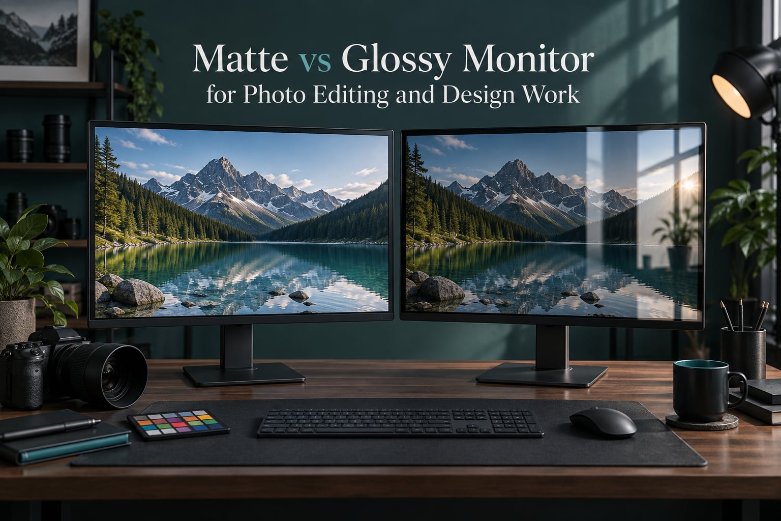
Screen finish changes what your eyes receive before your editing software does. When someone searches matte vs glossy monitor for photo editing and design work, they are really asking one question: can I trust this display in the room I sit in? The answer is shorter than most guides make it sound. Glossy wins in a controlled dark room, matte wins under uncontrolled light, and the finishes in between are worth understanding before you buy.
Over the past few years our team has watched the same argument play out in studios, agency offices, and shared co-working desks. The finish debate is usually framed as a picture quality fight, but it is really a room lighting fight that happens to be settled by the panel surface.
This guide covers how each coating handles light, what it does to color, contrast, and text, how to match a finish to your environment, and what photo editing workflows actually need. It also covers the parts most comparisons skip: color space coverage, calibration limits, and soft proofing.
Table of Contents
- The Direct Answer: Matte vs Glossy for Photo Editing and Design Work
- How Matte and Glossy Finishes Handle Light
- What Screen Finish Does to Color Accuracy, Contrast, and Black Levels
- Text Sharpness, Grain, and the Rainbow Effect
- Matching Your Finish to Your Lighting Environment
- Finish Recommendations by Task
- Color Space Coverage: sRGB, Adobe RGB, and DCI-P3
- OLED Glossy vs IPS Matte for Photo Work
- How Screen Finish Changes a Real Photo Editing Workflow
- What Calibration Does and Does Not Fix
- Hybrid Finishes: Semi-Gloss, Nano-Texture, and Etched Glass
- Eye Strain, Cleaning, and Long-Term Wear
- How to Choose in Five Steps
- Frequently Asked Questions
- Is a glossy monitor better than matte?
- What are the downsides of matte screens?
- Are matte monitors better for eyes?
- Is glossy or matte finish better for photos?
- Does screen finish affect print matching?
- Is anti-glare coating bad for color accuracy?
- How do I reduce glare on a glossy monitor for editing?
- What finish do professional photographers use?
- Conclusion: Pick the Finish Your Room Deserves
The Direct Answer: Matte vs Glossy for Photo Editing and Design Work
For photo editing in a controlled dark room, glossy delivers deeper blacks, higher perceived contrast, and more saturated color. For bright rooms, offices, and on-the-go setups, matte cuts glare and reflections that would otherwise ruin color judgment. There is no universally better finish, because the correct one depends on the light around your desk rather than on the panel inside it.
Most professional color reference displays, including the EIZO, NEC, and BenQ lines that dominated our research, ship with anti-reflective or etched surfaces rather than a plain glossy coating. That tells you something about how the working environment, not the panel, decides the outcome.
Here is the short version of the trade in one place:
| Factor | Matte Finish | Glossy Finish |
|---|---|---|
| Ambient light handling | Diffuse reflection, glare spread out | Specular reflection, mirror-like glare |
| Black level in a lit room | Lifted, grayish blacks | Deep blacks where no glare hits |
| Perceived contrast | Flatter | Higher |
| Color saturation | Slightly muted by scattered light | Vivid, deeper hues |
| Text and fine detail | Softened by surface texture | Maximum clarity |
| Solid light backgrounds | Can look grainy | Clean, but shows smudges |
| Eye comfort in bright rooms | Better | Worse, constant squinting |
| Best for | Bright offices, mobile, print matching | Dark studios, grading, media viewing |
Read that table with your room in mind, not with your taste in mind. The same glossy panel that looks stunning under studio spots can be unusable at a desk facing a window.
How Matte and Glossy Finishes Handle Light
Both finishes send light back at you. The difference is the direction. Glossy surfaces produce specular reflection, meaning light bounces off the glass at a predictable angle and travels straight into your eyes when your head happens to be in the mirror path. Matte surfaces produce diffuse reflection, scattering incoming light across thousands of microscopic facets so nothing arrives as a single bright source.
That micro-textured profile is the entire point of an anti-glare coating. The texture is rough enough at a microscopic level to break up reflections, and rough enough at a visible level to scatter some of the light the panel itself emits before it reaches your retina. That second effect is the hidden cost of matte.
Manufacturers rate this scattering with a haze value. Higher haze means more of the panel’s own light is diffused before it reaches you. A low-haze matte coating keeps most of the light intact; a high-haze coating, common in budget laptops, throws away a noticeable amount of clarity and brightness to buy its glare reduction.
Anti-reflective coatings take a different route. Instead of roughening the surface, they deposit thin layers that interfere with reflected light waves and cancel part of the reflection out. The surface stays smooth, so the panel keeps its clarity while reflection drops. Glossy anti-reflective displays sit between the two extremes.
Key definitions in plain language
- Specular reflection: light bouncing off a smooth surface at a mirror angle, which is what creates glare patches and window reflections.
- Diffuse reflection: light scattering in many directions from a textured surface, which spreads glare into a soft wash.
- Modulation Transfer Function (MTF): a measure of how well a display preserves edge contrast. Texture lowers MTF before it lowers resolution.
- Haze: the percentage of light diffused by the surface. Higher haze means softer text and lower perceived contrast.
The physics matters because it explains why no coating makes a reflection vanish entirely. A matte screen still reflects your room, it just refuses to reflect it in a shape you can point at.
What Screen Finish Does to Color Accuracy, Contrast, and Black Levels
Color accuracy, measured as delta E, is barely affected by the finish itself. A matte panel driven to the right target behaves nearly as accurately as a glossy one. What changes is how accurate you can tell it is, because stray light sitting on top of the image is added to every color you see.
Saturation is where the visual difference concentrates. Under controlled light, glossy panels show deeper, more saturated color because nothing is washing the image out. Matte panels scatter a small share of their own light across the image, which reads as slightly flatter, slightly grayer color. The underlying signal is the same.
Black levels are the harder case. A glossy display in a dark room hits near-zero black and looks fantastic. That same display in a sunlit office with a bright window can reflect enough light to make true black look gray. A matte display in that office keeps blacks dark because the reflected window light gets scattered instead of mirrored.
| Room condition | Matte behavior | Glossy behavior | Better finish |
|---|---|---|---|
| Dark studio, blackout blinds | Blacks look slightly lifted, color reads flat | Deep blacks, strong contrast, vivid color | Glossy |
| Bright office, window behind you or opposite | Glare spread evenly, color judgment holds | Mirror reflection covers part of the image | Matte |
| Mixed lighting, overheads plus daylight | Stable, predictable | Glare patches shift as you move | Matte |
| On the go, coffee shop, travel | Usable in almost any light | Unusable in daylight | Matte |
One problem with matte deserves attention because it causes real mistakes. Scattered light hides backlight bleeding and corner vignetting. A matte panel with uneven brightness looks acceptable, so you may not notice the flaw and assume your files are fine. Glossy panels in a dark room expose every uniformity issue immediately, which is precisely why colorists like that environment.
Print matching deserves its own warning. Photographers posting in r/AskPhotography repeatedly raise the same point: a glossy screen can deliver a print that looks more contrasty on paper than it did on screen, because the added light on the screen makes the image look punchier than the print will be. Fixing that means pulling contrast and saturation down at the export step, a habit that becomes second nature on matte.
Text Sharpness, Grain, and the Rainbow Effect
Text clarity is where matte loses most visibly. The surface texture scatters subpixel light, so edges lose definition and small type looks slightly soft after a full day of reading. Competitive players notice it within minutes, and anyone spending eight hours in a code editor will feel it by the afternoon.
The grainy look on solid light areas is the same effect from a different distance. White document backgrounds, empty Photoshop layers, and light website mockups reveal the texture, because there is no image detail to mask it. Look at a matte screen from a normal distance and it reads clean; lean in from ten inches and the sparkle appears.
At off-axis angles, matte finishes can show a faint iridescent shimmer, commonly called the rainbow effect. Subpixel structure plus micro-texture produce this, and it grows as your viewing angle becomes extreme. It matters on a laptop that gets tilted and on a wide monitor used at an angle, and it barely matters on a straight-on desktop panel.
Glossy panels have their own texture problem: fingerprints and dust smudges are far more visible on a smooth dark surface, and they scatter highlights in exactly the places you are trying to judge detail. Anti-reflective glossy surfaces hide smudges better but not perfectly.
Matching Your Finish to Your Lighting Environment
Your environment decides the answer, and you can assess it in about two minutes. Sit at your normal editing position, look at the screen, and check whether you can see a reflection of a window, a lamp, or a bright wall. If yes, matte wins and no amount of panel quality will compensate. If you see almost nothing but darkness, glossy has room to work.
Desk placement changes the equation more than most people expect. Turning a glossy screen 90 degrees so the window reflects beside it rather than into it costs nothing and removes most of the problem. A monitor hood solves the same issue for a bright office, and reviewers in r/Monitors treat hoods as standard kit for glossy displays in daylight.
Bias lighting is the other half of the answer. A dim, even glow behind the panel lifts the ambient level around the screen so your eyes stop straining between a bright display and a dark wall. For glossy monitors this is close to mandatory, and it also improves the perceived contrast of a matte panel.
For hybrid setups, match the finishes or accept a visual mismatch. Mixed matte and glossy panels sit at different perceived contrast levels, and side by side the same photograph will look like two different exposures. Color-critical work in a two monitor setup is easier when both screens share a finish and a backlight.
Finish Recommendations by Task
Task is the second half of the decision. Photo editing, grading, and design each weigh the finish differently, and the same room can justify different answers for different jobs.
| Task | Recommended finish | Why |
|---|---|---|
| Photo editing, RAW development | Matte or nano-texture | Stable color judgment in any room, closer print match |
| Print matching and soft proofing | Matte | Extra contrast on screen translates to a darker, punchier print |
| Video editing and color grading | Glossy or semi-gloss in a dim suite | Deep blacks and the contrast needed to judge a grade |
| Graphic design and layout work | Matte | Long hours, mixed light, and heavy text use |
| Competitive gaming | Glossy | Maximum clarity and low input lag feedback |
| Casual gaming and media | Glossy in a dark room, matte in a bright one | Pictures look richer, but only without glare |
| Office work, spreadsheets, email | Matte | Fluorescent light is the enemy of a glossy screen |
| Coding and long text sessions | Low-haze matte | Keeps edges readable without mirror glare |
Video grading deserves a nuance. Grading suites are usually dimmed on purpose, which hands glossy its best environment. The trade is reflection management, and a hood plus bias lighting is the standard fix. Several users in our forum research describe exactly this split: matte for photo and print work, glossy for grading.
Office and coding are the reverse case. Fluorescent panels and large windows are common, the work is text heavy, and nobody is judging black levels. Matte wins on practical grounds with no real downside.
Color Space Coverage: sRGB, Adobe RGB, and DCI-P3
Finish does not change which colors a panel can produce. A glossy screen with no gamut coverage is still limited, and a wide-gam matte panel still shows the extra colors. What finish changes is how much of that coverage survives on screen in your room.
For sRGB deliverables, the widest common target, either finish works if the room is controlled. For Adobe RGB print work, a matte panel loses less of the deep saturated range to scattered light, which is why print houses lean matte. For DCI-P3 and HDR grading in a dim suite, glossy holds the highlight and shadow separation that wide-gam work depends on.
In short, coverage decides what is possible and finish decides how much of it you can see. Judge the gamut number first, then pick the finish that protects it in your lighting.
OLED Glossy vs IPS Matte for Photo Work
Panel technology has narrowed the gap but not removed it. Glossy OLED panels deliver genuinely perfect blacks and very high perceived contrast, qualities that matter for grading and for judging shadow detail in dark footage. Matte IPS and IPS-like panels are brighter, more uniform in practice, and far easier to calibrate to a stable white point.
The problem with glossy OLED in a photo workflow is reflection. A perfect black that sits next to a bright window reflection is not a perfect black. Reviewers note that reflection handling on OLED varies a lot by model, so the coating deserves as much attention as the pixel layer.
Matte OLED panels exist and they resolve the glare problem, at the cost of some of the contrast advantage. A chemically etched OLED gives you the deep blacks and a surface that refuses to mirror, which is the closest thing to a finish that suits every room.
How Screen Finish Changes a Real Photo Editing Workflow
Finish shows up in the workflow, not in the settings dialog. Here is how the same session changes on each surface.
RAW processing. On a matte screen, raise the shadows and lower the blacks a touch less than instinct suggests, because scattered light already lifts the black point and the print will land closer. On a glossy screen, dial contrast down slightly before export, since the on-screen punchiness will not survive paper.
Soft proofing. Soft proofing assumes a controlled viewing environment and a known display profile. A glossy screen in a dark room approximates the print viewing condition more closely, and a matte screen in a lit room approximates the office condition more closely. Neither simulates a print under gallery lighting perfectly, so confirm on paper before you commit to a large run.
Exposure and detail checks. Zoom to 100 percent and inspect noise and sharpening. Matte texture can hide fine noise, so push harder than feels right and compare against a proof. Glossy clarity shows noise immediately, which makes it the better surface for judging detail and the worse one for judging overall tone.
Client review and delivery. When you hand off a proof on screen, glossy makes the image look better than the printed result, which flatters your work in the short term and disappoints people at delivery time. Matte is the more honest surface, and honest is the point.
Color space and export. Whichever finish you use, convert to the delivery space in a wide gamut working space and check the converted result on the same screen you calibrated. Switching screens between the check and the export is where mismatches actually originate.
What Calibration Does and Does Not Fix
Hardware calibration, the kind of tool that writes settings into the monitor rather than the operating system profile, is considered close to essential for color work in our forum research regardless of finish. SpyderX, X-Rite i1Display, and Calibrite devices all fit that category.
What calibration fixes is the panel itself. It corrects the gamma curve, the white point, and the gamut mapping so that a neutral image looks neutral and a known color lands on a known value. It also produces a profile for soft proofing.
What calibration cannot fix is the room. No measurement removes a window reflection sitting on top of the image, and no LUT lowers the light the panel scatters across a white document background. On a glossy screen, calibrating while a lamp is reflected in it can bake that lamp into the profile and then spread the correction across every color, which is why calibration happens in a dim, controlled room with the screen covered until the moment of measurement.
Calibration frequency depends on finish and environment. A matte display in a stable office needs checking every few months. A glossy display in a room with shifting daylight needs more frequent passes, because the reflection changes even when the panel does not.
Hybrid Finishes: Semi-Gloss, Nano-Texture, and Etched Glass
The choice is not always binary. Three middle options exist, and each trades a little of one finish’s strength for a little more of the other.
| Finish | Reflection control | Clarity | Best fit |
|---|---|---|---|
| Standard matte | High | Moderate, lower MTF | Bright offices, print work |
| Semi-gloss | Medium | Good | Dim suites that still have a light source |
| Anti-reflective glossy | Medium high | High | Media viewing, mixed light |
| Nano-texture, etched glass | High | Good, minimal grain | Travel, bright rooms, premium work |
Semi-gloss sits between the two and behaves like a matte panel in a lit room and a glossy panel in a dim one, which makes it a reasonable middle ground for a shared studio. Anti-reflective glossy keeps a smooth surface while cancelling much of the reflection, so it suits media viewing more than critical judging.
Nano-texture and chemically etched glass deserve attention. The texture is fine enough that text stays readable and solid colors stay clean, which is exactly where ordinary matte falls short. The premium is real, and the portability is the reason many reviewers on r/Lenovo and r/macbookpro value it: it works in a studio and in a coffee shop without changing anything.
Eye Strain, Cleaning, and Long-Term Wear
Eye strain follows lighting, not finish, and the finish only changes how much light you fight. In a dark room, a glossy screen at full brightness forces constant pupil adjustment between the bright panel and the dim wall behind it. Lowering brightness, adding bias lighting, and using a hood fixes more strain than any coating.
In a bright office, a glossy screen forces you to squint and to tilt your head to find an angle where the window is not in the reflection path. That constant repositioning is the real source of fatigue, and matte removes it.
Cleaning differs more than most guides admit. Glossy surfaces need frequent wiping because smudges and fingerprints are visible, and each wipe risks spreading oils into a fine haze. Matte surfaces hide smudges and wipe clean with any microfiber cloth, though the textured surface traps dust in its micro-facets and looks hazy when dry-wiped. Etched glass behaves like matte for cleaning and gloss for clarity.
For long-term reliability, coatings are rarely the weak point. Panel backlight stability and the coating factory treatment matter more over five years than the finish choice you make today.
How to Choose in Five Steps
- Audit the room at your editing position. Look for window reflections, bright wall behind you, and overhead fixtures. Note where they fall on the screen.
- Decide how color critical the work is. Print matching and client proofs push toward matte or etched glass. Grading and media viewing in a dim suite push toward glossy.
- Check the text load. Long code, layout, and document sessions favor matte. Short bursts with visual work favor glossy.
- Test mobility needs. If you edit away from a controlled room, a portable setup needs a matte or nano-texture finish to stay usable.
- Plan the accessories. Glossy in a bright room needs a monitor hood and bias lighting. Matte in a very dim room needs a calibrated brightness target so it does not look flat.
After those five steps, the finish usually names itself. Glossy for controlled rooms, matte for everything else, and etched glass for the setups that cannot commit to either.
Frequently Asked Questions
Is a glossy monitor better than matte?
For photo editing in a controlled dark room, glossy gives deeper blacks, higher perceived contrast, and more saturated color. In a bright or uncontrolled room, matte wins because it spreads reflections instead of mirroring them. The better finish is the one that matches your lighting.
What are the downsides of matte screens?
Matte coatings scatter light and lower perceived sharpness, so small text can look soft. Solid light areas such as white document backgrounds can look grainy at close range, off-axis angles can show a faint rainbow shimmer, and scattered light hides backlight uniformity issues you would otherwise catch.
Are matte monitors better for eyes?
Matte is usually easier on the eyes in bright rooms because it removes glare and stops you squinting and tilting your head. In a dark room, a glossy screen causes more strain, but brightness, bias lighting, and a hood matter more than the finish itself.
Is glossy or matte finish better for photos?
Matte is better for judging photos in most real rooms and for matching prints, because the extra contrast a glossy screen shows does not survive on paper. Glossy is better for viewing photos in a dim room and for grading work that depends on deep blacks.
Does screen finish affect print matching?
Yes. A glossy screen adds contrast that is not in the print, so images look punchier on screen than on paper and need contrast pulled down at export. Matte screens sit closer to the print and usually need less correction.
Is anti-glare coating bad for color accuracy?
Not in the measurement sense. Color accuracy is barely changed by the coating, but scattered light washes out saturation and lifts blacks, so you perceive less accurate color. A high-haze coating has more of this effect than a low-haze one.
How do I reduce glare on a glossy monitor for editing?
Reposition the screen so windows and lamps reflect beside it rather than into it, add a monitor hood, and place a bias light behind the panel. Lower brightness to match the room rather than fighting it, and recalibrate after any big change in room lighting.
What finish do professional photographers use?
Most professional color reference displays use anti-reflective or etched surfaces, and photographers working on print regularly choose matte or nano-texture. The reasoning is practical: predictable color in whatever room they are in, and fewer surprises between screen and paper.
Conclusion: Pick the Finish Your Room Deserves
Matte vs glossy monitor for photo editing and design work comes down to one test: look at your screen in your room. No reflection means glossy can give you the deeper blacks and sharper detail that color work rewards. Any reflection means matte, or an etched glass panel, will protect your color judgment. Check that first, calibrate second, and the rest of the decision follows.