
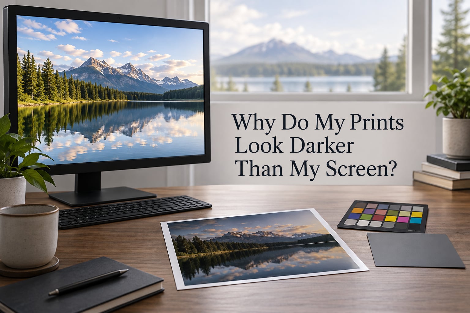
Prints look darker than your screen because a monitor is a light source and a photograph is not. Your display emits its own light, usually well above what paper can ever reflect, so midtones and shadows land lower on paper than they did on screen. The fix is almost never in the printer or the editing software. It is in the brightness of the display, the color management setting in the driver, or the room you are judging the image in.
Last updated: October 2026.
Scope: this guide covers photo printing from a home inkjet, a small-format photo printer, and a professional lab, plus the editing apps most people use alongside them. It applies to printed images, not to inkjet artwork or fabric prints unless noted.
Table of Contents
- The Quick Answer: Your Monitor Is Set Too Bright
- Are You Judging Color on a Phone or Tablet?
- Why Screens and Prints Can Never Truly Match
- Why Do My Prints Look Darker Than My Screen? The 8 Reasons
- The 60-Second Check
- How to Fix It: A Step-by-Step Diagnostic
- Set Your Monitor to the Right Brightness
- Driver and Software Settings That Cause Dark Prints
- Paper, Ink, and Printer Contributions
- Perceptual Tricks: Why Shadows Look Darker Than They Are
- Fixing It in Software Instead, and When That Is the Right Call
- When to Accept the Difference
- Frequently Asked Questions
- Why does my photo print appear darker than my screen?
- Why are my prints coming out too dark?
- Why do my print colors not match my screen?
- How do I calibrate a monitor for photography?
- Should I use Color Matching or No Color Management?
- Why do my shadows look darker in print than on screen?
- How to make pictures print brighter?
- What monitor brightness should I use for printing photos?
- Conclusion: What to Do First
The Quick Answer: Your Monitor Is Set Too Bright
Your monitor is set too bright. A backlit screen pushes light straight at your face, while a print sits on a surface and only bounces light back from whatever lamp is in the room, so the screen is almost always brighter than the paper and the print reads dark. As one r/AskPhotography commenter put it plainly, the screen is backlit, so getting the print you need a lot more brightness. On top of that, most screens ship set well above a printable brightness, which exaggerates the gap before the print ever reaches the printer.
That is the dominant cause, but it is not the only one. Paper type, the printer driver mode, and whether you approved the image on a phone all change the result. Work through them in order rather than guessing.
Are You Judging Color on a Phone or Tablet?
If you approved the image on a phone, a tablet, or a laptop screen, no amount of monitor calibration will fix your expectation. Handheld displays run substantially brighter than a well-set desktop monitor, and most phones and tablets ship with vivid or boost modes that push brightness and saturation well past the calibrated range. A community explanation that circulated widely makes the same point: monitors, and especially phones and iPads, are bright, backlit displays, and even a calibrated screen can be set too bright.
So the first question is not about your printer. It is about which screen you were looking at when you decided the image was finished.
Here is the honest diagnostic. If you judged the image on a phone or tablet, treat that screen as a preview of composition, not of tone. Look at it again on a calibrated monitor at a printable brightness, and expect the whole image to look flatter and darker than it did on the handheld. If you judged it on a desktop monitor, go to the next section on brightness, because that is where the problem is for most people.
Social platforms add a second layer of distortion. Instagram, Facebook, and most messaging apps apply their own tone curve and compression, so a file can look brighter on a friend’s phone than it did in your editor. Judge the export file, not the post.
Why Screens and Prints Can Never Truly Match
A screen and a print cannot be made identical, because they produce light by two opposite mechanisms. A display is emissive: it generates its own light and shines it at you. A print is reflective: it has no light of its own and simply bounces back whatever reaches it from the room. Paper under a normal lamp returns a fraction of the light a monitor emits, which is why the same image always reads darker on paper.
Emissive light is also stable. The screen looks identical in a bright room and a dark one, because it is its own light source. Paper changes with everything around it, which is why the same print can look flat at midday near a window and warm under a bedroom lamp.
Then there is the color model. A monitor uses additive color: it adds red, green, and blue light, and more light means brighter. Ink and paper use subtractive color: cyan, magenta, yellow, and black ink absorb wavelengths and reflect what is left, so more ink means darker. Saturation in particular is expensive in CMYK, because clean saturated blues and greens demand a careful balance of inks that a screen reaches by simply showing you more blue light.
Gamut is the boundary of what each can reproduce. Most monitors cover the sRGB gamut, and good ones approach Adobe RGB, which is a wider space. CMYK cannot hit every color in either one, and converting from a wide space into CMYK without a proper profile clips saturated colors toward muddy. Paper adds its own limit: bright whites reflect a high but finite amount of light, which caps how bright a print can ever get.
So a small difference is normal. A large one is a configuration problem.
Why Do My Prints Look Darker Than My Screen? The 8 Reasons
The causes below are ordered roughly by how often they turn out to be the culprit. Read them as a checklist rather than a lecture, and stop when the symptom matches.
- Your monitor is set too bright. This is the single most common cause, and the most fixable. Confirm it by dropping the brightness slider and looking at the image again. If it now looks too light, your monitor was the problem.
- You approved the image on a phone or tablet. Handheld displays are brighter and narrower in gamut than any calibrated monitor. Confirm it by opening the file on your desktop display instead.
- The printer driver is doing its own color management. Driver modes named Color Matching, Match Screen, Vivid, or Brightness Enhancement add contrast and saturation and can crush shadows. Confirm it by switching the driver to No Color Management or Printer Manages Color.
- No printer profile is applied, or the wrong one is. Without a profile for the exact paper and ink combination, the printer guesses. Confirm it by checking which profile your application is actually feeding the driver.
- Your print is being viewed in the wrong light. A print under a warm lamp or mixed lighting reads darker and more contrasty than the same print under neutral daylight. Confirm it by taking the print to a window or a neutral lamp.
- The paper is uncoated or matte. Ink sinks into the surface instead of sitting on it, which spreads the dot and deepens the tone. Confirm it by comparing a glossy and a matte print of the same file.
- Black point compensation is off. In RGB-to-CMYK conversion, shadow detail can be crushed to solid black. Confirm it by checking whether the deepest shadows in the print show any separation at all.
- The color space mismatch is real. An Adobe RGB file printed as sRGB, or an untagged file handled by guesswork, shifts saturation and density. Confirm it by checking that the file, the working space, and the printer profile all agree.
The 60-Second Check
Before you change anything, run this five-item check in order. It takes about a minute and it eliminates the majority of cases.
- Move to neutral light. Turn off warm lamps and judge near a window or under a neutral light source.
- Drop your monitor brightness. Lower the on-screen brightness slider by half and re-evaluate the image.
- Open the file on the screen you will actually print from. Not your phone, not a second monitor.
- Check the printer driver mode. Find the color management or color matching option in the driver and note what it is set to.
- Check whether a printer profile is attached. If the paper type in the driver does not match the paper in your tray, stop here and fix that first.
If the image still looks obviously too dark after those five steps, the cause is in the deeper sections below.
How to Fix It: A Step-by-Step Diagnostic
Fix the layers in this order, because each one depends on the one before it. Skipping to the printer while the display is still set to 300 cd/m2 guarantees you will keep chasing your tail.
- Control the viewing light. Kill warm ambient lighting. Use daylight or a neutral lamp, and get rid of reflections from the wall behind the monitor. This costs nothing and it changes your perception more than any setting inside your software.
- Set the display brightness for printing. Aim for 80 to 120 cd/m2, D65, with a gamma of 2.2 or the L* perceptual curve. Details are in the next section.
- Calibrate the display for the correct color space. Profile to sRGB unless your entire workflow, including the printer, is built around Adobe RGB. Profile only after the brightness is set.
- Set the driver color management mode. Let a real printer profile handle the conversion, or hand the color management to the application. Never let the driver improvise.
- Attach a printer profile for your exact paper. Paper type in the driver and paper in the tray must match, and the profile must describe that combination.
- Check the paper choice. Start with a glossy or luster photo paper while you are diagnosing. Move to matte only after the pipeline is right.
- Print a small test with a target image. Include a midtone gray patch, a near-white patch, and a deep shadow block. Judge the print against the screen, not against your memory of the screen.
The table below maps each cause to where it lives and how to confirm it, so you can jump straight to the layer you suspect.
| Cause | Where it lives | How to confirm | How to fix |
|---|---|---|---|
| Monitor too bright | Display brightness slider | Image looks lighter after lowering brightness | Set to 80 to 120 cd/m2 and calibrate |
| Judging on a handheld screen | Your approval habit | File looks flatter on the desktop display | Review and approve on the calibrated display |
| Driver color management | Printer driver options | Shadows crush and colors deepen when printed | Set No Color Management or Printer Manages Color |
| Missing or wrong printer profile | Application print dialogue | Profile name does not match the paper in the tray | Load the profile for that paper and ink combo |
| Viewing environment | The room you judge in | Print looks different under daylight | Use neutral lighting near a window |
| Uncoated or matte paper | Paper selection | Gloss and matte prints differ noticeably | Use glossy or luster for a baseline test |
| No black point compensation | Color conversion settings | Shadows print as solid black | Enable black point compensation |
| Color space mismatch | File space vs profile space | Saturation shifts or clips on export | Match the space across file, edit, and profile |
Set Your Monitor to the Right Brightness
Printable monitor brightness is 80 to 120 cd/m2, at D65, with a gamma of 2.2 or the L* curve. Anything brighter than that range guarantees your print will look dark, because you are editing to a white point the paper cannot physically reproduce.
Two definitions first, because these terms get used loosely. Luminance, measured in cd/m2, is how much light a surface returns per square meter; it is the brightness number you set. D65 is the standard daylight illuminant, a slightly cool white defined by the CIE, and it is the reference point both displays and print expectations are built on. Gamma 2.2 is the tone response curve your display should follow so that midtones land where you intended; the L* perceptual curve is a closer approximation of how the eye actually responds, and most current calibration software offers it as an option.
Here is the order of operations, and it matters more than any single step.
- Set the luminance first. Adjust the on-screen brightness slider until the reading is 80 to 120 cd/m2. A colorimeter can do this if you own one. Without a colorimeter, aim low: a screen dim enough that white looks slightly gray in a normally lit room is closer than you think.
- Leave the brightness slider alone afterwards. Many people believe calibration locks the slider. It does not. That slider belongs to you, and the correct level stays where you put it.
- Then profile for color. A profile created on a screen set to 350 cd/m2 is a wrong profile, permanently. Profiling before luminance is set is the most common wasted step.
- Use a hardware colorimeter if you own one. A SpyderX or an X-Rite i1Display will set luminance and generate the profile in one pass. Check the readings after the run, because cheap panels drift.
If you calibrated to 119 cd/m2 and your prints are still dark, the display is not your problem. Check the driver mode, the printer profile, and the paper next. That exact case comes up repeatedly on the dpreview forums, and it is a strong sign your pipeline below the display is the real culprit.
One useful experiment comes straight from the forum community: print the same image at three display brightness settings, around 80, 100, and 120 cd/m2, and keep whichever print sits closest to the screen. It turns an argument into a measurement, and it takes one afternoon.
You will likely notice that a properly set display makes your images look worse at first. The community calls this an expectation reset, and it is real. Screens set to look punchy at the shop have trained your eye to expect more contrast and brightness than the file actually contains, so a calibrated screen strips that exaggeration away. Give it a few sessions before you judge the results.
| Application | Recommended target luminance | Gamma | Notes |
|---|---|---|---|
| Lightroom soft proofing | 100 to 120 cd/m2 | 2.2 or L* | Use Simulate Paper White to preview paper brightness |
| Photoshop proof setup | 100 to 120 cd/m2 | 2.2 or L* | Set proof colors to the printer profile, not to document |
| Dim room or night work | 80 to 100 cd/m2 | 2.2 or L* | Match the room, not the brightest setting |
| Bright daylight room | 110 to 120 cd/m2 | 2.2 or L* | Reduce ambient light instead of raising the target |
Driver and Software Settings That Cause Dark Prints
The printer driver is the most common fixable cause of dark prints, and it is the layer almost nobody explains. Left on its default, a driver will often add contrast, deepen blacks, and boost saturation to make output look punchy, and that is exactly what turns a good file into a dark print.
Three modes matter, and they behave very differently.
| Mode | What it does | Darkness risk | When to use it |
|---|---|---|---|
| Printer Manages Color | The driver profiles and converts the image itself | Medium, depends on the built-in profile matching your paper | Printing from apps with no color management, at the cost of profile control |
| No Color Management | No conversion happens; the tagged data is passed through | Lowest, because the profile does the work | Whenever your application already applies a correct printer profile |
| Color Matching or Match Screen | The driver forces the image to look like it does on screen | Highest, it typically crushes shadows and deepens color | Almost never for photo work |
| Vivid, Vivid Color, Brightness Enhancement | Applies a punchy tone curve and saturation boost | Highest, this is the mode that destroys shadow detail | Never for photography, and never for prints you have already corrected |
For photo work, set the driver to No Color Management or Printer Manages Color, and let the color conversion happen in your application with a real printer profile. Color Matching is tempting precisely because the name sounds helpful, but it makes the print chase a display that is almost always too bright, so it amplifies the exact problem you are trying to fix.
An HP user working in Affinity Photo reported the print coming out darker than either of their monitors, with the driver left on its default ColorMatch setting. Converting the color space in the application did not help, because the driver was still overriding the result on the way out. Switching the driver mode to pass color management through is what fixed it.
Two more settings belong in this section. Turn on black point compensation so shadow detail survives the RGB-to-CMYK conversion instead of crushing to solid black. And check that the color management policy in your application is set to preserve profiles rather than convert them, so your sRGB or Adobe RGB file reaches the printer intact.
Paper, Ink, and Printer Contributions
Paper is the last layer, and it is the one people blame first when it is the one they can feel. The coating on a photo paper determines where the ink sits, and that single fact explains most of the tonal shift between two identical files.
Coated paper keeps ink on the surface in sharp, well-defined dots, which gives cleaner edges, deeper blacks, and more saturated color. Uncoated paper lets ink soak into the fibers, where it spreads. That spread is called dot gain, and a 40 percent dot on uncoated stock can look like a 50 percent dot on coated stock, which is why uncoated prints read darker and softer overall. Matte and satin surfaces take this further because their texture scatters light back and reduces apparent density.
Two related terms get confused constantly. Paper brightness describes how much blue light the paper reflects, which is a physical property of the stock. Paper whiteness describes how neutrally it reflects across all wavelengths, which is a visual impression. A bright paper that is not white can shift your whole image cool; a white paper that is not bright can leave the image dull no matter how good the file is.
Ink behavior matters too. Total ink coverage, usually written TAC, is the ink limit for a given paper, and going past it causes slow drying, muddying, and color shift. Total area coverage checkers in tools like Acrobat read this back for you. Gamut warnings on saturated colors are your printer profile telling you that a color you have on screen cannot be reproduced in CMYK at all, and forcing those colors just produces a darker, duller version of what you wanted.
Print technology changes which of these causes apply.
| Print method | Main darkening causes | Notes |
|---|---|---|
| Home inkjet, dye inks | Brightness, driver mode, matte paper, dot gain | Most driver-dependent, so the driver fix matters most here |
| Home inkjet, pigment inks | Black point compensation, matte paper | Deeper blacks, so shadow handling is the thing to watch |
| Dye sublimation | Monitor brightness, viewing light | No dot gain and no paper profile, so the display is the whole story |
| Dye transfer | Monitor brightness, viewing light | Output is already reflective, so the emissive mismatch dominates |
| Professional lab | Expectation and normalization | Labs apply their own viewing-standard normalization, so matches vary by lab |
Cotton rag and canvas prints shift the problem again. They are matte by definition, they add a warm base tone, and they darken shadows noticeably compared to a gloss print of the same file. Order a small proof on the actual stock before committing to a large run.
Perceptual Tricks: Why Shadows Look Darker Than They Are
Some of the darkness you are seeing is not in the file at all. It is in how your visual system reads an image against its surroundings, and this accounts for a surprising share of the complaints in this area.
Simultaneous contrast is the main effect. A mid gray looks darker when it sits next to something bright, and lighter when it sits next to something dark. Your print is on a wall, often surrounded by white wall, so every midtone in it is being pushed darker by the wall around it. On the screen that same image is surrounded by black or dark gray UI, so it reads lighter. Nothing changed in the pixels.
Magnification does the same thing. Look at a crop of your image filled to the screen and the tones look punchy. Pull back and view the whole image at once, and the same tones look flat. Judge prints the way you judge a gallery print, which is stepped back from, not filling your field of view.
Viewing distance and time both matter. Your eyes adapt to overall brightness as they settle, and a dark image in a bright room darkens further through that adaptation. Judge a print after a minute of looking at it, not in the first five seconds.
Try this test. Put your print on the wall, then look at a reference photo of the same scene on a properly calibrated screen at the same viewing distance, under the same neutral light. Alternate between the two a few times. The first impression that a print is dark usually fades substantially, which tells you how much of the gap was perceptual.
Fixing It in Software Instead, and When That Is the Right Call
Software compensation is a legitimate last step, not a repair. If you raise brightness in your editor, you are changing the file, and the print will match the file you now have, which may be worse than the one you started with. Use it only after the display, driver, and profile are correct.
When you do use it, raise midtones, not the whole image. Dragging a global brightness slider or an exposure value lifts everything at once, so highlights clip first and you lose detail in the brightest parts of the frame. A midtone or midtone-gray adjustment moves the middle of the tonal range where the perceived darkness actually lives, and it leaves your whites and blacks alone.
Per application, roughly:
- Lightroom and Lightroom Classic. Use the midtone gray slider, or a tone curve adjustment that lifts the lower mids without touching the shoulder. Turn on soft proofing against your printer profile and enable Simulate Paper White so the preview shows the paper’s real white point rather than a glowing white.
- Photoshop. Use Curves or Levels and move the midpoint of the curve rather than the whole curve. Watch the histogram clipping indicators on both ends, because a print that is too dark often comes with clipped highlights.
- Affinity Photo. Adjust in the Document Setup, where you can switch the color space and confirm the assigned printer profile. Apply tonal changes with curves, and check the soft-proof separation preview, which shows where the CMYK conversion will crush detail.
- Capture One. Use the Color Correction panel for a targeted midtone lift, and confirm your output color space and ICC profile match the printer before exporting.
Soft proofing is the feature that saves the most time, because it renders a preview of the conversion on your own display. It is only as good as your display and your printer profile, so it cannot rescue an uncalibrated screen, and it will not show you dot gain or paper texture, which still require a real test print.
One expectation to reset: after calibration, previously edited images often look too dark or flat, because they were corrected for a punchy display. Give them a fresh look and adjust rather than assuming something broke.
When to Accept the Difference
Some difference between screen and print is correct and unavoidable. A small, well-controlled gap means your pipeline is working, not failing.
Accept the difference when a print viewed under neutral daylight looks right on its own terms, and when the midtones are separated and the shadows are not blocked up. Judge the print against itself first and against the screen second. If it looks good on the wall in the room it will hang in, it is finished.
Professional labs normalize output to their own viewing standard, and different labs normalize differently. If you order from several labs and expect identical results, that expectation is the problem. If a lab consistently runs dark for you, say so in the order notes and ask for a custom profile built from their printer on your paper. Labs that offer this service will usually build one from a target chart you print yourself.
Give yourself a fair viewing test. Hang the print where it will live, under neutral light, and view it from normal distance for a full minute before deciding anything. A print evaluated for five seconds in a dim room is being judged by a viewing condition you will never actually see it in.
Frequently Asked Questions
Why does my photo print appear darker than my screen?
A monitor is emissive: it makes its own light and pushes it at you. A print is reflective: it only bounces back light from the room, so paper can never return as much light as a screen emits. Most displays also ship set brighter than 120 cd/m2, which exaggerates the gap. Lowering your display to 80 to 120 cd/m2 at D65 is the single biggest fix.
Why are my prints coming out too dark?
The usual causes are a display set too bright, a printer driver left on Color Matching or a vivid mode, a missing or wrong printer profile, viewing the print under warm light, and matte or uncoated paper. Work through the viewing light, then the display brightness, then the driver mode, then the profile, then the paper, in that order.
Why do my print colors not match my screen?
Screens add red, green, and blue light, while ink and paper absorb wavelengths to subtract color, so CMYK cannot reach every color your display can show. Paper also caps how bright a print can get. Expect a small difference even with a perfect setup, and fix a large one by matching display brightness, color space, and printer profile.
How do I calibrate a monitor for photography?
Set the luminance first, to 80 to 120 cd/m2, because a profile made on a brighter screen is permanently wrong. Leave the brightness slider there afterwards. Then profile to sRGB, or Adobe RGB if your whole workflow supports it, at D65 with a gamma of 2.2 or the L* curve. A hardware colorimeter handles both steps in one run.
Should I use Color Matching or No Color Management?
For photo printing, use No Color Management or Printer Manages Color. Color Matching makes the driver force your image to look like it does on screen, and since a screen is usually far too bright, it deepens the print and crushes shadow detail. Let your application apply a correct printer profile and pass the tagged data straight through the driver.
Why do my shadows look darker in print than on screen?
Two things are working against you. CMYK has less shadow separation than an RGB display, and black point compensation is often off, which crushes deep shadows to solid black in the conversion. Turn black point compensation on in your print settings, and check that your printer profile is actually being applied.
How to make pictures print brighter?
Fix the pipeline before the file. Lower your display to 80 to 120 cd/m2, set the driver to No Color Management, load the correct printer profile, and use glossy paper. If you must adjust the image, raise midtones with a midtone or tone curve adjustment instead of a global brightness slider, so your highlights keep their detail.
What monitor brightness should I use for printing photos?
Use 80 to 120 cd/m2, with 100 to 120 for soft proofing and 80 to 100 in a dim room. Match the room rather than the maximum. If you cannot measure it, dim the slider until white looks slightly gray in normal light, which is usually closer to the right level than instinct suggests.
Conclusion: What to Do First
Prints look darker than your screen because the screen is a light source and the print is not. Ninety percent of that gap is display brightness, driver settings, and viewing light, not the printer and not your editing skills.
So here is the whole answer in five moves. Set neutral viewing light. Drop your monitor to 80 to 120 cd/m2 and profile it afterwards, not before. Turn the printer driver to No Color Management and load the correct printer profile for your paper. Judge your work on a calibrated display rather than a phone. And only then, if a print is still too dark, lift the midtones rather than the brightness.
Run the 60-second check first, since it costs nothing and it tells you which layer to work on. Once the display is set and the driver is behaving, the difference you are left with is the part that was always going to be there, and it is small enough to enjoy.