
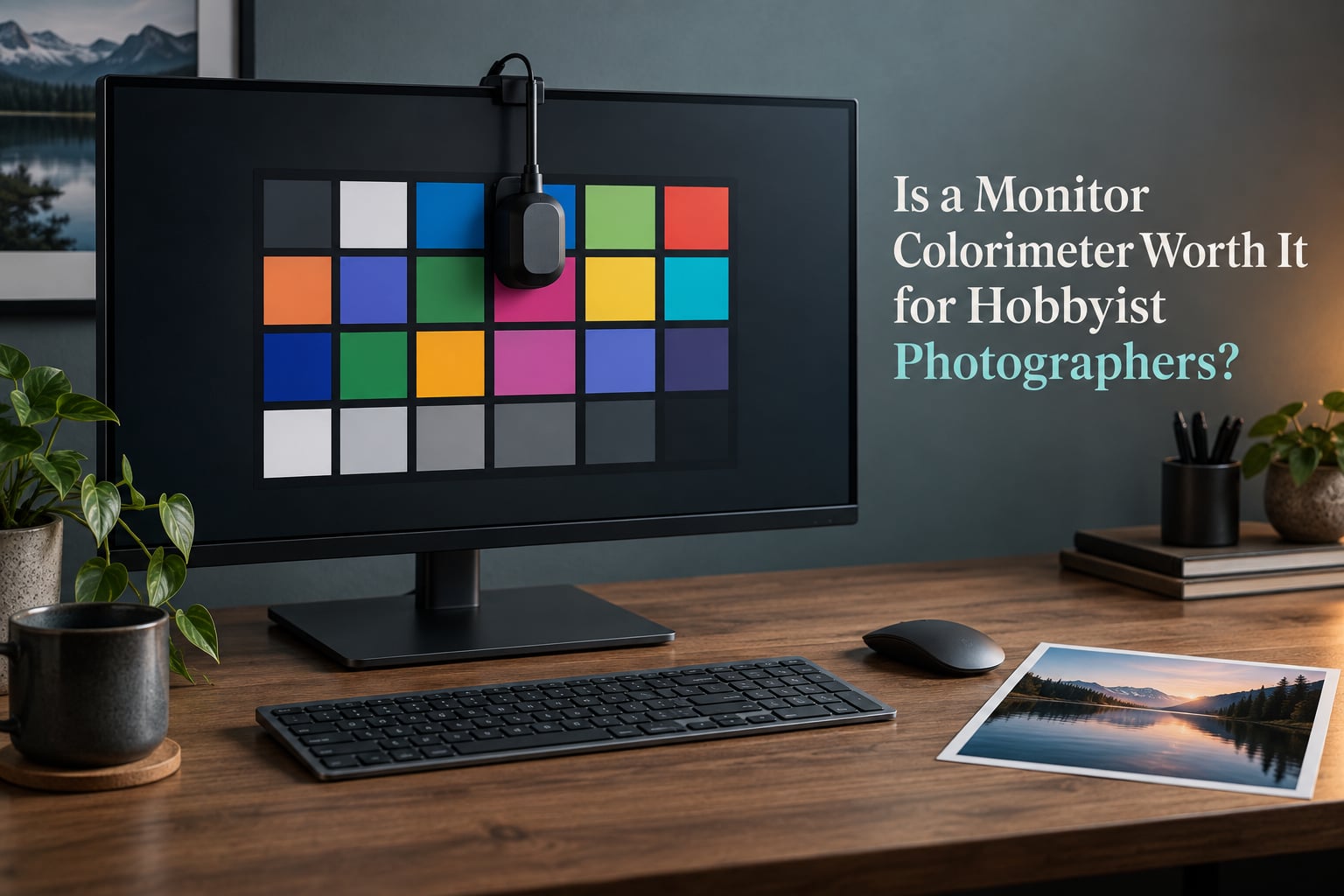
Short answer: yes for a hobbyist photographer whose images leave the screen, and no for one who only posts to Instagram on a factory sRGB monitor. If you print at home, order from a lab, deliver paid work, or edit on two mismatched monitors, a colorimeter earns its cost in the first year. If you edit for the web on a single modern display, the sRGB preset plus a fixed room gets you most of the way there for nothing. The deciding factor is not skill level. It is whether anyone other than you ever sees your colors on a different device.
I have spent years watching photographers with expensive cameras and cheap panels wonder why their prints come back wrong. Almost none of them needed a better camera. They needed a measurement instead of a guess, and most of them could have started for free. Here is how I break the decision down, what the device actually measures, and where it stops helping.
Table of Contents
- Do You Need a Colorimeter? The Decision in One Table
- What a Colorimeter Actually Does (Measuring Instead of Guessing)
- Why Factory Calibration and a MacBook Are Not Substitutes
- What a Colorimeter Cannot Fix
- The Free Alternatives Ladder: Do This Before You Buy
- How to Calibrate Your Monitor Step by Step
- Recalibration Cadence: How Often Do You Actually Need It
- If You Decide It Is Worth It: Which Tier to Buy
- Software: PROFILER, DisplayCAL, and HCFR
- Matching Your Screen to Your Prints
- Frequently Asked Questions
- Is a colorimeter worth it?
- Can I use my phone as a colorimeter?
- Do I need a colorimeter to print photos?
- Is a cheap colorimeter as good as a professional one?
- What is the best monitor calibration tool for a photographer?
- Which monitor is best for color accurate photo editing?
- Is Calibrite PROFILER good?
- How often should I calibrate my monitor for photo editing?
- What brightness should my monitor be for photo editing?
- Is a factory calibrated monitor good enough for editing photos?
- Bottom Line
Do You Need a Colorimeter? The Decision in One Table
The fastest way to answer the question is to find your row. Read the right-hand column first, because that is the honest verdict for that profile.
| What you actually do with your photos | Is a colorimeter worth it? |
|---|---|
| You print at home on your own inkjet | Yes. Screen-to-print matching is the single strongest case, and the one where guessing goes wrong most often. |
| You order prints from an online lab | Yes, but for a different reason. The lab prints your file, not your screen, so the real win is a correct ICC profile for a screen you can trust while you grade. |
| You deliver paid client work | Yes. Once someone else judges your output, guesswork has a cost attached to it. |
| You use two or more monitors | Yes. Matching two displays by eye is close to impossible, and this is the most common trigger event I see. |
| You do landscape or portrait retouching where skin and sky tones matter | Yes. These tones are where an uncorrected cast shows up most clearly. |
| You edit only for Instagram, web, and social | Probably not yet. A factory-calibrated sRGB mode plus a fixed editing routine covers most of this. |
| You mostly game and use the PC for general desktop work | No. Most games and much of the Windows desktop ignore your ICC profile entirely. |
| You shoot on a phone and share straight from it | No. The phone’s own rendering is what your audience sees, so there is no second opinion to reconcile. |
| You grade HDR video or work above 1000 nits | Yes, but only a high-luminance sensor model. A cheap device cannot measure a bright panel accurately. |
| You are on a strict budget with a known-dim budget panel | No, not yet. Spend the money on a better monitor first. |
There is also a trigger-event version of this table, and it is more useful than a personality profile. Three moments reliably tell a hobbyist it is time. The first is a print that arrives noticeably darker or more saturated than the file looked. The second is your first paid job, however small. The third is the day you add a second monitor, or replace a laptop screen with a desktop panel.
There is a simple test that costs nothing, and I recommend it to anyone still undecided. Order one print you care about, hang it in a neutral room next to your monitor, and look at them together. If you can see the difference and it bothers you, you have your answer. If you genuinely cannot tell, a colorimeter will not change that, and you should save the money. On the pixls.us forum, the recurring point in favour of buying is exactly this one: it is very hard to estimate the right display brightness and color temperature by eyesight alone.
What a Colorimeter Actually Does (Measuring Instead of Guessing)
A monitor colorimeter is a small hardware sensor that physically measures the colors and brightness your display actually produces, then builds an ICC profile that corrects those errors automatically in color-managed software. That profile is a lookup table your operating system and your editing application read every time they send color to that display.
The workflow underneath it is short. Calibration software flashes a series of known color patches across the screen. The colorimeter measures each patch with its optical sensor and records the difference from the target values. The software then compiles all of those differences into a display-specific profile that your computer applies from that moment on. What you see afterwards is corrected output, not corrected hardware. The panel is still wrong. Your software is now lying about it in a useful, documented way.
Why your phone and your monitor never agree
This is the complaint that comes up most often in photography forums, and it is not a bug. Both devices are rendering accurately to their own assumptions, and their assumptions differ. Your laptop may be running an sRGB profile with a white point near 6500K, while your phone is applying a manufacturer tuning that pushes saturation and contrast for a glossy screen outdoors. Two different targets, two different results.
A colorimeter does not make them agree either. What it does is give you one display that you know precisely what it is doing, so you can make an informed decision about which one you trust. That is a smaller claim than people expect, and it is the honest one.
Delta E, D65, luminance, gamma: the four terms you will meet
You do not need to know these to use a colorimeter, but you will meet them in every software screen, so here is the short version.
- D65 white point. The color temperature of daylight, roughly 6500K, that almost every photo and print standard assumes. It is the default target for photo work and you should leave it alone unless you have a specific reason.
- Luminance. How bright the screen is, measured in nits or cd/m2. This is the setting most hobbyists get wrong by eye, because your eyes adapt and stop reporting brightness accurately.
- Gamma. How the display maps input values to light output, usually 2.2 for photo editing. Pure white and pure black on screen are never physically white or black, and gamma describes the curve between them.
- Delta E. A single number for how far a measured color is from its target. Under 2 is generally considered indistinguishable, and most good hardware reaches an average delta under 1 on a decent panel.
None of this changes the underlying reason to buy one. Displays drift as they age, and factory calibration is accurate on day one, in one preset, under specific conditions. The dpreview forum threads show a common pattern among experienced photographers: people who had shot for well over a decade and calibrated only recently, and then described the difference as dramatic.
Why Factory Calibration and a MacBook Are Not Substitutes
Factory calibration is a real thing, and it is also routinely oversold. A factory-calibrated display has been measured once, at the factory, at a specific brightness, in a controlled room, in one color mode. That is a genuine starting point and it beats nothing.
What it is not is a guarantee about your display today. Panel production tolerances mean two identical models ship with visibly different characteristics. Backlight output drops as the panel ages. Many monitors ship in a wide-gamut mode with oversaturated reds and greens, and the calibration is only valid once you switch into the sRGB mode with brightness set to a specific reference level. If you never found that setting, you are looking at an uncalibrated wide-gamut image and calling it accurate.
The Mac argument deserves a direct answer, because it comes up constantly. A Mac manages color, which is genuinely useful, and its built-in ColorSync workflow will generate a basic profile. That is not the same as measuring your panel. A MacBook also ships with True Tone, Night Shift, and auto-brightness enabled by default, and all three change the output continuously based on ambient light and time of day. A display that changes while you work cannot be characterized by a single static profile.
On the r/photography subreddit, a recurring sub-question is whether owning a Mac removes the need for a colorimeter. The practical answer is that it removes the need to understand color management, not the need to measure. Turn off the adaptive brightness features, commit to an editing preset, and the Mac becomes a good environment for calibration. Leave them on and your profile is wrong within a week.
There is one more myth worth clearing up directly: calibration is not just a settings change. If all you need is the sRGB clamp on a wide-gamut monitor, that is a free fix in your monitor menu and takes thirty seconds. Calibration is a separate and more involved process that builds a hardware-characterized profile for the specific display you own.
What a Colorimeter Cannot Fix
This is the section that most often persuades people not to buy, and it should come before any buying advice. A colorimeter corrects errors it can measure. Several of the things people want it to solve are outside that scope entirely.
| Problem you can see | Can a colorimeter fix it? |
|---|---|
| Wide gamut showing oversaturated reds and greens | Partly. It profiles the display correctly, but if your editing app is not color-managed it will still ignore the profile. |
| Backlight bleed around the edges | No. This is a hardware defect, and no software corrects uneven light output. |
| Non-uniformity, where the corners differ from the center | No. A profile describes the display as a whole and cannot fix variation across its surface. |
| Oversaturation in games, video players, and parts of the desktop | No. These applications commonly ignore ICC profiles completely. |
| A display that is simply too dim to edit on | No. Calibration sets brightness; it cannot add light the backlight does not produce. |
| A bad panel that fails a uniformity check badly | No. This is the signal to return the monitor or buy a different one. |
That last row leads to a useful check you can do before spending anything. Display a mid-gray image and look carefully at the four corners and the center. If the corners are visibly different from the center, and you can see it with your eyes in a normal room, no ICC profile will hide that. In that case the honest advice is to return the monitor and buy a better panel, because calibration cannot make a non-uniform screen uniform.
There is a crossover point worth naming. A colorimeter makes a good monitor better, and it cannot make a poor monitor good. If your display is a budget unit with a narrow gamut and visible corner shading, the money is usually better spent on the display itself, and the colorimeter purchase waits until after. The PixInsight forum discussion reaches a related conclusion from the other direction: even when edits are driven by aesthetic judgment rather than technical accuracy, some form of reference or calibration workflow is still treated as necessary, because without one there is nothing to check your judgment against.
The Free Alternatives Ladder: Do This Before You Buy
Start at rung one and move down only if the step above stops being enough. Most hobbyists never get past rung three and never notice.
Rung 1: Use the right preset and stop touching the menu
Switch the display into its sRGB mode if it has one, and leave every color control at factory default. This is free and it fixes the single most common problem, which is a wide-gamut panel showing oversaturated color. On a wide-gamut display, sRGB mode clamps the gamut to the standard rather than trying to correct it, and for most web-focused work that is exactly what you want.
Rung 2: Set brightness by eye, using print paper as your reference
Hold a blank sheet of the same paper you print on up against the screen with a mid-gray image displayed. Adjust brightness until the paper and the screen appear the same brightness in a normally lit room. This technique comes from professional print-matching practice and it is more accurate than adjusting until white looks right, because your eyes are bad at judging absolute brightness and decent at judging two things side by side.
Rung 3: Check your panel with free test pages
Lagom LCD test pages are the standard free diagnostic. They check gamma, contrast, color gamut, and uniformity with a set of reference images you compare visually against descriptions. No hardware required, and they will tell you quickly whether your panel has a serious problem worth solving. If a wide-gamut panel fails the color gamut page in its default mode, that is your sRGB-mode reminder.
Rung 4: Use DisplayCAL or a similar free profiling tool
DisplayCAL is free, open source, and still useful. Paired with a low-cost or borrowed colorimeter, it can produce a legitimate profile. On Windows, your system color management is also doing more than most people realize, and modern Auto Color Management features help in color-managed applications. The honest limitation is that free software does not always include the panel correction libraries that vendor tools ship with, so results on wide-gamut and unusual backlight types can be less accurate.
Rung 5: Use your phone as a rough reference, not a measuring device
Your phone cannot function as a colorimeter for calibration. It has no calibration certificate, its sensor is not designed to report absolute color, and the screen you would be measuring with has its own profile. What a phone is genuinely good for is checking whether an image looks plausible on a typical device after you export it, which is a different task. Treat it as a sanity check on your export, never as a measurement.
If you finish this ladder and still cannot get a screen you trust, that is the point where a colorimeter stops being an upgrade and starts being the cheapest available fix.
How to Calibrate Your Monitor Step by Step
The whole process takes about fifteen minutes once the display has been warm for half an hour. The warm-up is not optional, and skipping it is the most common cause of a profile that looks great on the calibration day and drifts afterward.
Step 1: Warm the display for 30 minutes. Panels brighten as they reach operating temperature and the output shifts measurably during the first half hour. Plug the monitor into a proper power source rather than a USB hub, and leave it alone.
Step 2: Turn off every adaptive feature. On macOS, disable True Tone and Night Shift. On Windows, turn off auto-brightness and any night light or eye comfort mode. On the monitor itself, disable any dynamic contrast, auto color temperature, or eco brightness mode. A display whose brightness moves on its own cannot be profiled.
Step 3: Set up the room. Aim for neutral surroundings, moderate ambient light, and a wall behind the display that is a neutral mid-gray rather than a strong color. Brightness and ambient light both feed into the target you set in the next step.
Step 4: Set the color mode. Choose sRGB for general photo editing, or the wide-gamut mode if you are working in AdobeRGB or ProPhoto RGB and your software supports it. Do not calibrate the wide-gamut mode and then work in sRGB, because the profile will not match your working space.
Step 5: Set brightness by eye, then let the software refine it. A rough target for a normally lit editing room is somewhere around 100 to 120 cd/m2, and lower for a darkened room. Do not chase an exact number with a device you do not own yet. Set it so the display is comfortably bright without glaring, and let the calibration software measure and record the actual luminance in its report.
Step 6: Fix white point to D65 and run the profile. Leave gamma at its default, run the measurement, and let the software generate the profile. A larger patch set takes longer and generally produces a smoother result, so use the largest set you are willing to wait for.
Step 7: Validate before you trust it. Most software will show you a before-and-after delta report, and some will let you re-measure to confirm the result. If your average delta is above 2, something in steps 2 through 5 was not right, and re-running with the adaptive features genuinely disabled usually fixes it.
Step 8: Keep your room consistent. A profile is a description of one display under specific conditions. Changing your room lighting without recalibrating partly defeats it, which is why professionals use controlled rooms.
Recalibration Cadence: How Often Do You Actually Need It
For a hobbyist, monthly is a comfortable default and once a quarter is defensible if your display is stable. Recalibrate immediately whenever something changes: a new monitor, a new room, a new editing space, a display firmware update, or a warm-up period after the display has been off for weeks.
The honest answer for most hobbyists is event-driven rather than calendar-driven. Calibrate before a print session you care about, before delivering client work, and roughly once a month if you edit most days. Recalibrating weekly accomplishes nothing on a panel that has not drifted.
Displays drift slowly, and the drift is mostly in brightness rather than color. That is why a once-a-month habit keeps people happy and a never-calibrated habit is what eventually causes the frustrated print. A useful middle ground is to validate rather than fully profile: a quick measurement pass costs a couple of minutes and tells you whether a real profile is due. Several forum discussions converge on the same advice, and the recurring recommendation is to calibrate before a big project rather than on a rigid schedule.
If You Decide It Is Worth It: Which Tier to Buy
Colorimeters fall into three practical tiers, and the tier that fits you is determined almost entirely by the brightness of the display you own, not by how seriously you take photography.
| Tier | What it covers | Best fit for |
|---|---|---|
| Entry level | Standard sensor, typically rated for displays up to roughly 300 to 500 nits | Editing on a standard sRGB or moderately bright monitor, home printing, web delivery |
| Mid tier with high-luminance sensor | Rated well above 1000 nits, usually 1000 to 2000 | The serious hobbyist and most working photographers, and any HDR-capable display |
| Premium | High-luminance sensing plus larger patch sets, multi-display workflows, and projector’s 3D LUT workflows | Studios, grading work above 1000 nits, multi-monitor matching at scale |
The high-luminance distinction is the one that actually causes returns, so it is worth stating plainly. If you own an OLED laptop, a modern mini-LED desktop panel, or any display rated above 1000 nits, a standard sensor cannot read it accurately. It will report clipped or inconsistent readings, and the resulting profile will be wrong in exactly the bright tones you care about. Buy the high-luminance model or buy a different monitor.
Display types also bring their own quirks. WOLED and QD-OLED panels have very wide primaries that push saturated reds and greens far outside sRGB, and QD-OLED panels in particular are known for desaturating highly saturated colors near peak brightness. A colorimeter with spectral correction handles some of this, but the more reliable fix for a saturated modern panel is to work in a clamped sRGB mode and accept the gamut. Check your display’s gamut coverage before assuming the extra range is usable.
Multi-monitor support is worth paying for only if you actually have multiple displays to match. It is a differentiator on mid-tier units and it is the feature that makes the tool useful for the second-monitor trigger event described earlier.
Software: PROFILER, DisplayCAL, and HCFR
The sensor is the easy part. The bundled software is where hobbyists most often get a disappointing result, because the quality of the correction depends on whether the tool has a panel correction profile for your display type.
Vendor suites such as Calibrite PROFILER and the Datacolor Spyder software ship with a library of panel correction profiles. The software uses the detected backlight type and measured characteristics to correct the profile for the specific display technology, which is why a corrected profile from a good vendor tool usually beats an uncorrected free profile. Both major ecosystems handle the standard photo workflow well, and the differences for a hobbyist are smaller than the marketing suggests.
DisplayCAL and HCFR remain useful for two reasons. They are free or very low cost, and they expose settings that vendor tools hide, including custom white point and gamma targets and advanced curve options. Neither includes the same depth of panel correction library, so on wide-gamut and unusual backlight types expect less accuracy.
On Windows, one setting deserves attention. Profiles come in two flavors, ICC v2 and ICC v4, and the v4 version is stricter about what it will apply to. In some applications, a v2 profile loads where a v4 profile is rejected or mishandled, which shows up as odd rendering in the most color-managed app on the system. If colors look wrong only in one application, the profile version is the first thing to check. The Windows 11 learning curve is a real frustration point in photography forums, and most of it comes from this and from applications that are not color-managed at all.
Matching Your Screen to Your Prints
Even a perfectly calibrated screen will not predict a print, because the print is made under different light and on a different surface. This is where hobbyists most often conclude calibration did not work, when in fact the calibration worked and the comparison conditions were wrong.
Control the room first. A print viewed under warm evening light next to a bright screen will look darker and more contrasty than the same print in a neutral room. Grey or white walls matter, as does eliminating strong colored light sources near your desk. A window behind the screen is the most common mistake, because it silently changes the ambient light your eyes are adapting to.
Use the blank paper method for the brightness comparison itself. Open your print file on the calibrated screen, hold a blank sheet of the actual print paper beside it, and match brightness in a normally lit room. This is far more reliable than trusting the luminance number alone, because your eyes are comparing two objects under the same conditions.
For lab printing, remember that your screen never reaches the print. The lab applies its own profile to your file, and a good lab asks for a specific space and a soft-proofed file rather than a JPEG straight from your editor. The calibration still matters, because a graded image depends on a display you can trust, but the final step is soft proofing against the lab’s target, not squinting at your monitor and hoping.
If you want a workflow to compare, the visual habit that helps most is priming with ten to twenty images you already know well, and viewing them after your eyes have adapted to the room rather than immediately after looking out a window. Over time this improves your judgment far more than a second hardware purchase will.
Frequently Asked Questions
Is a colorimeter worth it?
For a hobbyist photographer, yes when your images leave the screen: home printing, lab orders, paid client work, or editing on two monitors. Usually not when you only post to Instagram or the web from a single factory-calibrated sRGB display, because the sRGB preset plus a fixed room covers most of that work.
Can I use my phone as a colorimeter?
No. A phone has no calibration certificate, its sensor does not report absolute color, and its own screen carries a manufacturer profile. It is useful as a rough check on how an exported image will look on a typical device, but it cannot measure your monitor or generate a trustworthy ICC profile.
Do I need a colorimeter to print photos?
It is the strongest case for buying one. Matching screen output to a home printer by eye is unreliable, and the blank print paper brightness comparison works better than either eye alone. For lab printing, the lab prints your file rather than your screen, so the benefit is a display you can trust while you grade.
Is a cheap colorimeter as good as a professional one?
On a standard display under 500 nits, an entry-level device is genuinely close and will get you most of the accuracy. The gap opens above that: a standard sensor cannot accurately read a panel rated above roughly 1000 nits, which is where high-luminance models and premium hardware become necessary.
What is the best monitor calibration tool for a photographer?
For most hobbyists, a high-luminance colorimeter from a major vendor is the practical choice, since it covers both standard and bright HDR-capable displays. If you are on a tight budget and own a dimmer display, a free tool such as DisplayCAL paired with an entry-level sensor is a reasonable first step.
Which monitor is best for color accurate photo editing?
The best editing display is one with a wide gamut, good factory calibration, an sRGB mode that is properly clamped, a matte anti-glare coating, and even brightness across the whole panel. Uniformity matters more than any specification, because a colorimeter cannot correct corner shading or backlight bleed.
Is Calibrite PROFILER good?
Yes for the standard photo workflow. It measures reliably, guides you through the profiling run, validates the result, and includes a library of panel correction profiles that improve accuracy on wide-gamut and unusual backlight types. Its advantage over free tools is that panel correction, not the measuring hardware.
How often should I calibrate my monitor for photo editing?
Monthly is a comfortable default, and once a quarter is reasonable on a stable display. Calibrate immediately after a monitor change, a new editing space, a firmware update, or a long period of being powered off, and always before a print session or client delivery you care about.
What brightness should my monitor be for photo editing?
Around 100 to 120 cd/m2 in a normally lit room, and lower in a darkened room. Set it roughly by eye, then let the calibration software measure and record the actual luminance. Brightness by eye alone is unreliable because your eyes adapt and stop reporting absolute brightness.
Is a factory calibrated monitor good enough for editing photos?
For web and social work, often yes. Switch it into sRGB mode, fix the brightness, turn off any adaptive brightness or night mode features, and leave the color controls at factory defaults. Once you print, deliver client work, or use a second monitor, measurement becomes worth doing.
Bottom Line
So, is a monitor colorimeter worth it for hobbyist photographers? It is worth it when your photographs leave the screen: a print you hung on a wall, a file you sent to a lab, an image a client paid you for, or a second monitor that does not match the first. In those cases the device replaces guesswork with measurement, and the cost is small relative to a single reprint or one project that goes out the door correctly.
It is not worth it when you edit for the web on one decent display, when the work is mostly gaming, or when your panel has corner shading and backlight bleed that no profile can address. Before buying anything, walk the free ladder: sRGB mode, brightness matched to print paper, Lagom test pages, and DisplayCAL if you want to go further. Most of the value sits in those four steps and costs nothing.
The one piece of advice I would give any hobbyist undecided on this is to start with a trigger rather than a spec sheet. Order one print you care about, look at it next to your screen, and let that comparison make the decision for you.