
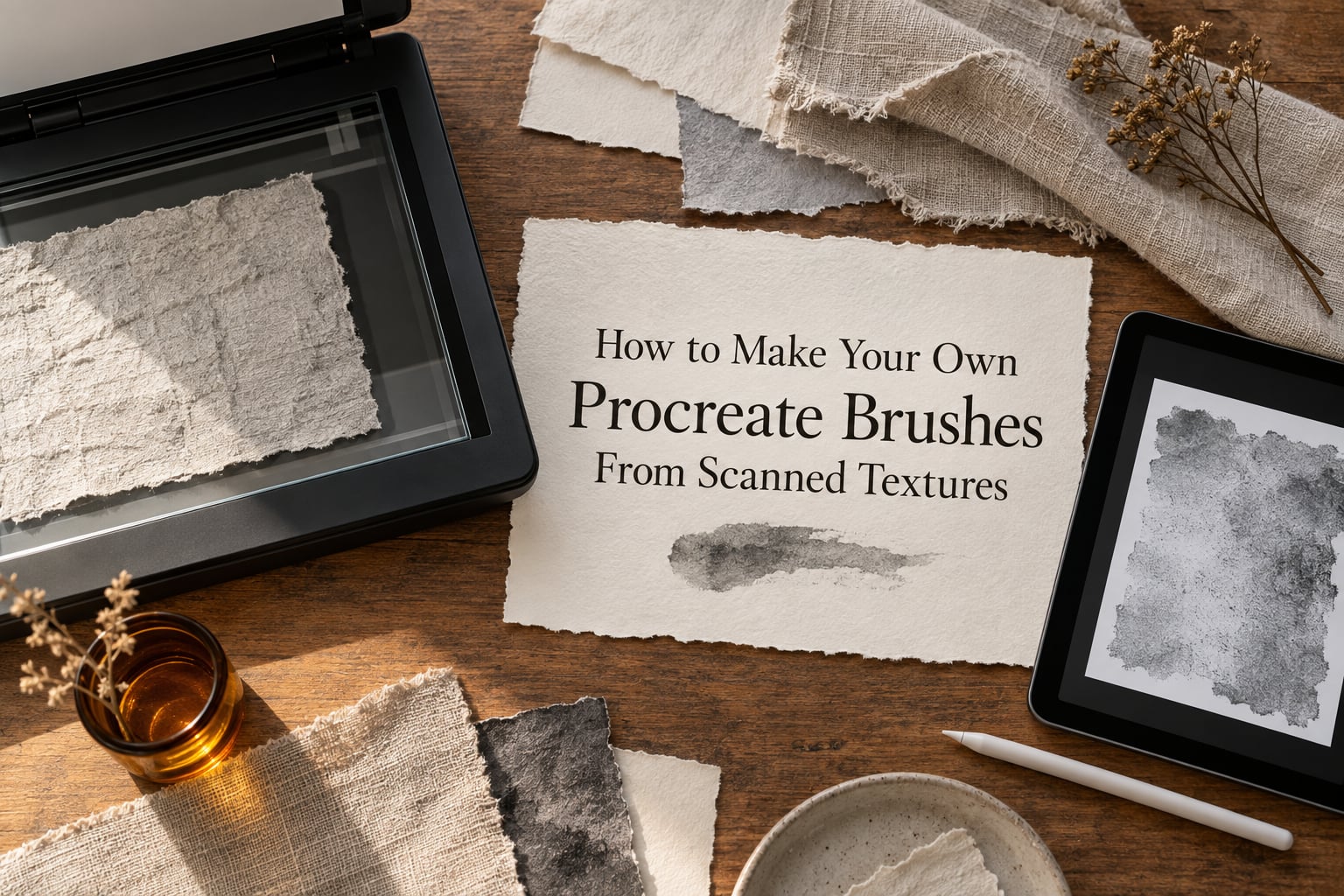
Learning how to make Procreate brushes from scanned textures is the fastest way to get real paper tooth, concrete grit and canvas weave into your work instead of another generic texture pack. I have built grain brushes for my own studio work this way for a few years now, and the pipeline has not really changed since Procreate 5, though I re-tested every step again in 2026. The good news is that a flatbed scanner is optional: an iPad held directly over the material, lit by one soft source, produces grain that works in almost every brush. Below is the full pipeline, the settings I actually start from, and a symptom-to-cause table for the two failures that frustrate beginners most, namely grain that never shows up and grain that turns to mush at large sizes.
This guide covers capture, cleanup, tileability, the Brush Studio grain import, dynamics, and saving a .brushset. It also covers why your scan looks muddy, and what to do about it. Budget about twenty minutes per material once you have the workflow down, and your first brush will take closer to an hour because you will be reading menus for the first time.
Table of Contents
- How to Make Your Own Procreate Brushes From Scanned Textures
- Before You Start: What You Need and How to Capture
- Step 1 – Capture the Texture (Scanning or Photographing)
- Step 2 – Clean Up the Scan So Procreate Reads It Correctly
- Step 3 – Make the Scan Tileable (Optional but Recommended)
- Step 4 – Build the Brush in Brush Studio
- Step 5 – Tune the Dynamics So the Brush Feels Right
- Step 6 – Test, Save and Share Your Brush
- Procreate Brush Tuning Cheat Sheet
- Troubleshooting: Symptom, Cause, Fix
- Per-Material Scan Recipes
- Frequently Asked Questions
- How to make a Procreate brush from a photo?
- How to make a texture brush in Procreate?
- Do I need a scanner to make Procreate brushes?
- Why do my Procreate brushes look so pixelated?
- How do I create a grain effect in Procreate?
- What are the Grunge brushes in Procreate?
- How to make a Procreate brush set and share it?
- Why is my grain invisible or the brush looks like a plain round dab?
- How do I make a scanned texture tile without visible edges?
- How do I paint over a scanned texture so it does not look pasted on?
- Conclusion
How to Make Your Own Procreate Brushes From Scanned Textures
A Procreate brush is two things working together: a Shape, which is the stamp dragged repeatedly along your stroke, and a Grain, which is a texture image that multiplies the opacity of every stamp. Dark areas of the grain print heavy, light areas print faintly or not at all, and mid-tones print as a broken, speckled version of the stamp. That is the whole engine. Dynamics sit on top and change size, angle, opacity and flow as the stroke travels.
Here is the single rule that explains almost every grain problem: Procreate reads luminance. Pure black in your grain image is fully opaque, pure white is fully transparent, and everything between is partial coverage. If your scan is a washed-out grey with soft edges everywhere, your brush will look like a weak, blurry round dab instead of a textured stamp.
Scanning your own material beats a texture pack for one reason: the pattern comes from something you physically own, so nobody else’s file has that exact tooth. Artists who sell brush packs publicly credit their traditional supplies, paper, ink impressions, cement, plaster and sand, as the source of the grain in those sets. Procreate’s own Grunge brushes are built the same way, from real material rather than drawn noise.
There is a second, quieter benefit. Forum threads on Procreate communities keep returning to the same complaint, that clean, flat, vector-smooth digital work looks synthetic. A low-opacity grain pass over flat colour, with the grain on its own layer in Multiply, is the standard fix, and it only works if the grain is authentic. Synthetic noise gets repetitive after two hundred strokes. A real scanned surface does not.
One more practical note before you start. The Eraser, Smudge and Fill tools all use the shape and grain of the currently selected brush, so a custom grain brush quietly changes how those tools behave too. Build one and you will find yourself using it as much for erasing soft texture as for painting with it.
Before You Start: What You Need and How to Capture
You need three things: a physical surface with visible tooth, one even light source, and an image file you captured or scanned yourself. A scanner is genuinely optional. Comparing the four capture routes side by side shows why.
| Capture method | Cost | Lighting evenness | Usable resolution | Best for |
|---|---|---|---|---|
| Flatbed scanner | Hardware purchase | Excellent, lid light is built in | Up to 1200 dpi on most models | Flat paper, fabric, thin wood veneer, ink impressions |
| iPad camera, overhead | None, you already have it | Very good with one soft source | Around 12 MP, plenty for grain | Everything, including thick or irregular material |
| Phone camera | None | Good if you move away from a window | Highest raw file of the three | Fine detail like gravel or fibre if the iPad struggles |
| Free scanner app on iPad | None | Depends on your light | Full camera resolution | Quick jobs without opening the Camera app |
Whichever route you take, run through this capture checklist before you shoot.
- Light it flat and evenly. One source, large and soft, positioned directly overhead. A lamp bounced off a sheet of white card works well. Never use a bare point light, because it rakes across the surface and bakes a lighting gradient into your grain.
- Shoot straight down, perpendicular. Hold the camera or iPad flat and parallel to the material. Any tilt squashes the texture into trapezoids and no amount of cleanup fully recovers it.
- Lock focus and exposure. In the Camera app, press and hold on the material to lock focus and exposure, then move the device to your shooting position. Autofocus will hunt for the rest of the session otherwise.
- Frame with overlap to spare. The material should fill well over half the frame. You will crop and square it later, and every extra millimetre of coverage is extra grain you do not have to invent.
- Capture more than you think you need. Shoot a tight detail, a mid-range area and a wide view of the same surface. Different brush sizes need different scales of detail, and one photo rarely serves all three.
- Keep the raw file un-edited as your master. Do the desaturation and levels work on a copy in Procreate. One day you will want the colour version and you will be glad the original survived.
- Flatten anything that is not already flat. Tape heavy material down at the edges. Air bubbles under a curled sheet become huge bright blobs in the final grain.
Step 1 – Capture the Texture (Scanning or Photographing)
With a flatbed scanner, place the material face down, lift the lid if the platen is too dark for thick material, and scan at 600 dpi in greyscale or 24-bit colour. 600 dpi is the sweet spot: higher adds file size without adding grain that survives the brush engine. Scan slightly larger than you think you need and crop after the fact.
With an iPad or phone, set the material on a flat surface, turn off the room lights, and use one soft light directly overhead. Hold the device a hand’s width above the material so its shadow never falls across the frame. Take three or four shots and pick the one with the flattest lighting, which you can tell instantly by looking for a diagonal shadow or a bright corner.
Two capture details separate a usable scan from a frustrating one. First, cast shadow is the enemy, so move the light rather than the material, and if your material is glossy, shoot at a slight angle and let a white card on the same side fill the reflection with grey. Second, take one deliberately underexposed shot as insurance, because underexposed noise is far easier to stretch in Curves than a blown-out highlight that has already clipped to pure white.
Step 2 – Clean Up the Scan So Procreate Reads It Correctly
This is the step that separates a professional grain from a muddy one, and it is the one most walkthroughs skip. The goal is a greyscale square where the darkest tooth sits at pure black and the brightest gap sits at pure white, with no lighting gradient left across the frame.
Start on a square canvas at 2048 by 2048 pixels and 300 DPI. Procreate rescales imported images, and a grain file that is 4032 by 3024 gets squeezed into a square and softened on the way in. Working in a square canvas from the start means you never resample, so you never lose grain detail. Insert your photo with Actions, then Add, then Insert Photo, and scale it to fill before you adjust anything.
Desaturate. Open Adjustments, then Hue, Saturation, Brightness, and set Saturation to 0. Procreate only reads luminance anyway, so the colour is dead weight that makes the Curves step harder to judge.
Kill the lighting gradient with Curves. Open Adjustments, then Curves. Look at the histogram: if the mid-tones are bunched to one side, drag a new point from the centre of the curve up or down until the histogram spreads across the full width. A gradient that runs dark-bottom-left to light-top-right is the single most common reason a home-scanned texture reads as a flat overlay pasted onto the artwork, and stretching the curve is what pulls that shadow out. Spend five minutes here before touching anything else.
Force pure blacks and pure whites with Levels. Drag the black input slider until the darkest tooth reads 0, then the white input slider until the brightest gap reads 255. Do not drag the output sliders to create contrast, because that clips real detail and gives you a harsher grain than you wanted. Push it gently, check on a test stroke, and repeat.
When the result looks right, flatten the layer so the adjustments bake in. Procreate reads the composited pixels of your image, and a flattened, un-clipped scan is one fewer thing to go wrong later.
Step 3 – Make the Scan Tileable (Optional but Recommended)
You only need this if you plan to place your scan as a fill pattern or a reference layer rather than as grain. For grain specifically, a tiled image is not required, because Randomize and jitter break the repeat up across stamps anyway.
To make it tileable, duplicate the layer, go to Actions, then Transform, then Offset, set the offset to 50 percent horizontally and 50 percent vertically, and apply. That splits the image into four quarters with the seams through the middle. Move the quarters so the cut edges meet, heal the joins with a soft brush, and check the result over a checkerboard pattern. Once it reads as continuous, add a Hue, Saturation, Brightness adjustment to restore the greyscale if the healing brush shifted the tone.
The grain version of your scan does not need this step at all, which is why it is optional.
Step 4 – Build the Brush in Brush Studio
Building the brush takes about five minutes once your image is ready. Open the Brush Library, find a simple round or flat brush you already like, and swipe it across to Duplicate. Tap your duplicate to select it, then tap it again to open Brush Studio.
On the Shape tab, pick a basic round or flat stamp and set its Size. Keep the shape plain, because the grain is doing the work and a complicated tip shape fights the texture. A slightly soft-edged round stamp breaks up more naturally under grain than a hard-edged one.
On the Grain tab, tap Import Image and choose your cleaned-up scan. Set Scale to 100 percent for the first pass, which means the grain image is mapped across the stamp at its native proportions. Raise Spacing to roughly 10 to 20 percent so consecutive stamps overlap, then set Randomize to a modest value, around 20 to 30 percent, so the grain does not sit in the same position on every single stamp.
That is the working version. If the grain is invisible, the most common cause is that your scan has no pure black in it, which sends you back to Levels in Step 2. If it is visible but harsh, the fix is almost always a lower Opacity on the Grain tab rather than more work on the image.
Step 5 – Tune the Dynamics So the Brush Feels Right
Dynamics are what separate a grain brush that feels like a real tool from one that feels like a filter. Start conservative, because the same scan behaves very differently at 20 pixels and at 400.
Set Opacity to around 80 to 100 percent and Flow lower, around 50 to 70 percent, so overlapping stamps build density without going flat. Add a modest Size Jitter of 10 to 20 percent for a natural hand-made variance, and an Angle Jitter of 100 percent if you want the grain to rotate freely, which is what prevents a repeating pattern from becoming visible in a long stroke.
Under Pressure, map Size and Opacity up from about 10 percent, so light pressure gives a broken dry texture and full pressure gives a solid mark. That single mapping is most of what makes a grain brush feel like charcoal or chalk instead of a digital round brush. Add Tilt only if your scanned material has direction, such as wood grain or brushed metal, since tilt responds to pencil angle rather than pressure.
StreamLine is a stabiliser that smooths the path before the stamps land. Leave it off while you are first testing so you can see the raw spacing, then raise it slightly if strokes feel wobbly. The rule of thumb for Spacing is simple: low Spacing gives an even wash, and high Spacing plus grain gives a dry-brush or broken-media texture.
Pressure behaviour only shows up with an Apple Pencil or a supported stylus, so test with one if you plan to rely on it. Without pressure input, the entire Pressure section is ignored and your brush draws at a constant size, which is worth knowing before you spend an hour wondering why the dynamics tab did nothing.
Step 6 – Test, Save and Share Your Brush
Test before you commit. Make a scratch document, add a flat mid-tone colour, then draw the same stroke at three sizes and three pressures on a fresh layer each time. A grain that looks good at 40 pixels can break apart at 300, and a grain that reads well large can disappear at small sizes.
Name the brush for its material and finish, not its size, because you will adjust size on the canvas anyway. Then swipe the brush across the Brush Library to Share and choose Create a .brushset, which bundles it into a single file. That file installs in one tap on another iPad, which makes a personal grain set trivial to move between devices or hand to a collaborator.
If you want the texture to affect Smudge and Eraser as well, just select the brush. Those tools use the active brush, so a textured grain brush makes for a soft, broken eraser that no standard eraser matches.
Procreate Brush Tuning Cheat Sheet
These are the starting values I use for a scanned grain brush before any refinement. The table works as a baseline, not a fixed recipe, and every value here assumes a cleaned greyscale scan with pure blacks and pure whites.
| Setting | What it controls | Start value for a grain brush | Notes |
|---|---|---|---|
| Grain Scale | How much of the grain image maps onto each stamp | 100 percent | Drop to 50 percent for finer texture, raise it if grain looks blocky |
| Grain Opacity | Strength of the texture effect | 60 to 80 percent | Lower this before re-editing your image |
| Spacing | Distance between stamps | 10 to 20 percent | Low is an even wash, high is dry broken texture |
| Randomize | Variation in grain position per stamp | 20 to 30 percent | Hides repetition, do not max it out |
| Opacity | Maximum opacity of the stamp | 80 to 100 percent | Lower for a chalky feel |
| Flow | Rate colour builds within one stamp | 50 to 70 percent | Below Opacity so layers build gradually |
| Size Jitter | Random size change per stamp | 10 to 20 percent | Keeps a hand-made stroke from looking mechanical |
| Angle Jitter | Random rotation per stamp | 100 percent | Essential for directional grain like wood |
| Pressure to Size | Size response to stylus pressure | On, starting near 10 percent | Ignored without a pressure-capable stylus |
| Pressure to Opacity | Opacity response to stylus pressure | On, starting near 10 percent | Turns light pressure into broken dry texture |
| StreamLine | Path smoothing before stamping | Off while testing | Raise slightly once the spacing feels right |
Troubleshooting: Symptom, Cause, Fix
Nearly every failure in this workflow falls into one of the rows below, and two of them, invisible grain and pixelated grain, are the questions that come up most often in Procreate communities. Work down the table from the symptom you actually see.
| Symptom | Likely cause | Fix |
|---|---|---|
| Grain is invisible and the brush looks like a plain round dab | Your scan has no pure black, so the darkest tooth never reaches full opacity | Reopen it in Procreate, run Levels, and pull the black input slider until the darkest grain reads 0 |
| Grain looks pixelated, blocky or mosaic-like | The grain image is smaller than the stamp it is being stretched across, usually at 200 pixels or more | Lower Grain Scale, or capture at higher resolution, or keep your working canvas at 2048 by 2048 instead of shrinking below it |
| Grain looks blurry rather than crisp | You resampled, or the image was imported at a size that forced Procreate to scale it down and back up | Work on a square canvas that matches the source aspect ratio, and avoid any Transform before flattening |
| Grain is so strong it obliterates your colour | Grain Opacity is high and Flow is close to Opacity | Drop Grain Opacity to about 60 percent and lower Flow to 50 to 70 percent |
| A visible repeating pattern or grid appears in a long stroke | Angle Jitter is at zero and Randomize is very low, so every stamp lands the same way | Set Angle Jitter to 100 percent and Randomize to 25 percent, then re-test |
| Brush lags or strokes stutter | Spacing is very low, so Procreate is stamping hundreds of times per stroke, or a huge canvas with many layers is open | Raise Spacing to 15 percent or more and test on a small document |
| Grain breaks apart at large brush sizes but looks fine small | Not enough detail in the source image at that magnification | Use the wide capture you shot in Step 1, or lower the maximum Size on the Shape tab |
| The scan looks flat and pasted-on, or one corner is much darker | A lighting gradient was baked into the image during capture | Fix it in Curves by spreading the histogram across the full width, then flatten |
| Texture overlays your art as a visible rectangle | The scan was placed as a layer instead of loaded as Grain | Use it as grain in Brush Studio, or as a separate layer on Multiply below Alpha Lock |
| Nothing changes when you adjust pressure | You are drawing with a finger or a stylus that reports no pressure | Use an Apple Pencil or a pressure-capable stylus and check the tool settings |
One honest note on the “is bilinear or bicubic better” question that comes up alongside this topic. Procreate does not expose a resampling choice for grain import, so that setting is really about the Transform tool, not about grain quality. If your grain looks soft, the cause is resolution and canvas size, not the interpolation mode.
Per-Material Scan Recipes
Different surfaces fail in different ways, and the fix is usually a change of angle or a single Curves adjustment. Use the table as a starting point, then adjust to taste.
| Material | Capture angle and lighting | Post-processing tweak | Brush it suits |
|---|---|---|---|
| Watercolour paper | Flat down, soft overhead light, tooth facing the lens | Strong Levels contrast so the valleys between fibres hit black | Dry-brush texture, painterly backgrounds |
| Canvas | Slightly raking light to reveal the weave, then flatten with Curves | Levels hard, and drop Scale to about 50 percent | Painting overlays, matching an existing background |
| Concrete or cement | Overhead, but expect pits that read as huge black holes | Raise the black point carefully so pits stop swallowing the stamp | Grunge, distressed edges, urban backgrounds |
| Sand | Raking light across the surface to define each grain | Curves, then high Randomize, because sand repeats visibly | Beach and desert ground, speckled fills |
| Wood | Along the grain direction, not across it | Leave some mid-tone, and set Angle Jitter to 100 percent | Directional surfaces, planks, distressed frames |
| Fabric or linen | Flat, with the weave filling the frame edge to edge | High contrast, low Scale, to keep the weave threads separate | Clothing texture, mixed-media collages |
| Foliage | Photograph against a plain background, then isolate the leaf shapes | Hard Levels to separate leaf from gap | Broken organic marks, stippled foliage clusters |
A note on concrete, sand and anything with deep pits. Deep shadow areas read as solid black to the brush engine, so the stamp lands as a hard dot instead of a texture. Pull the black point up until the pits become dark grey rather than pure black, and let the bulk of the surface carry the mid-tones.
On fabric and canvas, the opposite problem is normal: the weave is too fine for the stamp, so everything blurs into a flat grey. The fix is resolution rather than contrast. Capture tighter, keep Scale at 50 percent, and raise Size Jitter slightly so individual threads land in different places.
Frequently Asked Questions
How to make a Procreate brush from a photo?
Open Actions, then Add, then Insert Photo, scale the image to fill a square 2048 by 2048 pixel canvas, desaturate it, and stretch it with Curves and Levels so blacks are pure black and whites are pure white. Then open the Brush Library, duplicate a simple round brush, tap into Brush Studio, go to the Grain tab, tap Import Image, choose your scan, set Scale to 100 percent and Spacing to 10 to 20 percent.
How to make a texture brush in Procreate?
A texture brush is a normal brush with an image loaded into its Grain tab. Duplicate any brush from the Brush Library, open Brush Studio, go to Grain, tap Import Image and select a greyscale image. Adjust Grain Opacity, Randomize and Spacing until the texture reads without overpowering the colour, then test at three brush sizes before saving.
Do I need a scanner to make Procreate brushes?
No. An iPad or phone held directly overhead in one soft, even light produces grain that works in almost every brush. A flatbed scanner gives you more even lighting and higher resolution, which matters for very fine material like paper tooth, but for concrete, sand, fabric and canvas a photograph is genuinely enough. The thing that matters far more than hardware is removing the lighting gradient in Curves.
Why do my Procreate brushes look so pixelated?
The grain image is smaller than the area of the stamp it is being stretched across, which usually happens above about 200 pixels. Lower the Grain Scale setting, capture at higher resolution, or keep your working canvas at 2048 by 2048 instead of importing into something smaller. Also check that you never transformed the image before flattening it, because that resamples and softens the grain.
How do I create a grain effect in Procreate?
Convert an image to greyscale, force pure blacks and pure whites with Levels, then load it into the Grain tab of a duplicated brush. Start Spacing at 10 to 20 percent, Randomize around 25 percent, and Grain Opacity between 60 and 80 percent. If you would rather not build a brush, the same image placed on its own layer in Multiply under Alpha Lock gives a similar result.
What are the Grunge brushes in Procreate?
The Grunge set is a group of stock Procreate brushes built to add worn, distressed and broken-up texture to strokes. Several of them are made from scans of real material rather than drawn noise, which is why their grain has an irregular, hand-made quality. They are a good reference while you build your own scanned grain brush, and you can study their Spacing and Randomize values to see how dry-media texture is set up.
How to make a Procreate brush set and share it?
Build and save your brushes, then swipe across the top of the Brush Library to select them, and swipe across again to tap Share. Choose Create a .brushset, which bundles the selected brushes into one file. AirDrop or email that file to another iPad and it installs in a single tap, and the same file works for sharing a grain library with collaborators.
Why is my grain invisible or the brush looks like a plain round dab?
Your scan has no pure black in it, so the darkest tooth never reaches full opacity and the grain barely modulates the stamp. Reopen the image in Procreate, open Levels, and drag the black input slider until the darkest grain reads 0. If it is still faint, drop Grain Opacity on the Brush Studio Grain tab before you edit the image again.
How do I make a scanned texture tile without visible edges?
Duplicate the layer, go to Actions, then Transform, then Offset, and set 50 percent horizontal and 50 percent vertical. That splits the image into quarters with the cut through the middle. Move the quarters so the cut edges meet, heal the joins, and check over a checkerboard. For grain specifically this step is optional, because Randomize and jitter break the repeat up anyway.
How do I paint over a scanned texture so it does not look pasted on?
Put the texture on its own layer rather than painting with it directly. Set that layer to Multiply, lock its alpha, then paint your colour on the layers above so the grain shows through in the thin areas. A low-opacity grain pass at 30 to 50 percent under the artwork, combined with a Clipping Mask, keeps the texture reading as part of the surface instead of a rectangle sitting on top.
Conclusion
To make Procreate brushes from scanned textures, capture a surface in flat, even light from directly above, clean it to pure black and pure white greyscale with Curves and Levels, and load it into the Grain tab of a duplicated brush at 100 percent Scale with Spacing around 15 percent. Tune Randomize, Angle Jitter and pressure until the mark feels like the material, then test at three sizes before you save it into a .brushset.
Build three to five brushes rather than thirty. A small personal grain set, your own paper, canvas, concrete, sand and one piece of wood, covers almost every background and texture job you will run into, and each one is far easier to tune and reuse than a large pack of brushes you never fully understand.