
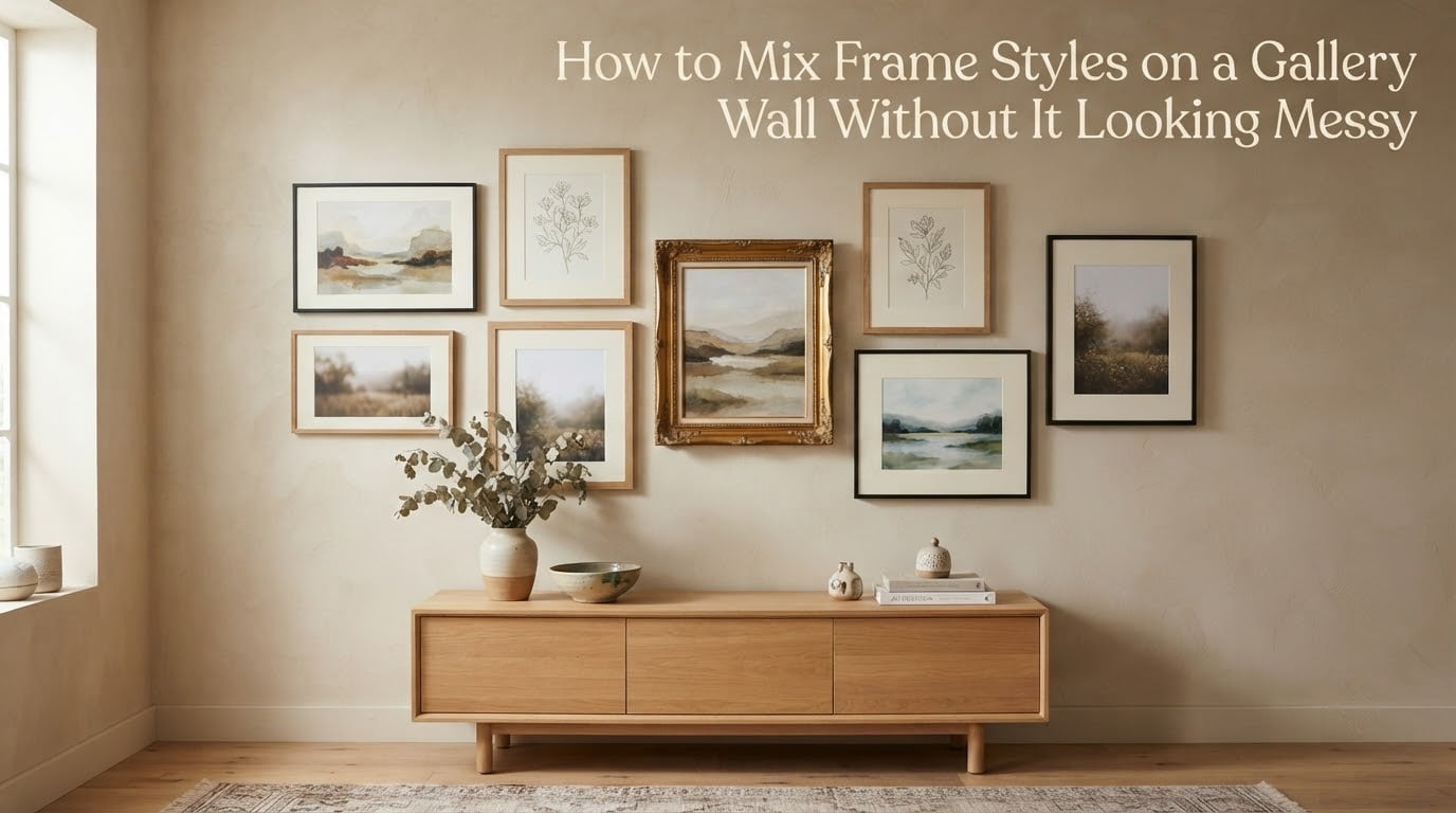
No, frames on a gallery wall do not have to match. Mix up to three frame styles, repeat each style at least twice so nothing looks like a mistake, and tie the arrangement together with one unifying thread — a shared color palette, one mat board color, or one repeated material. Then hold the layout together with even 2-3 inch spacing and set the center of the whole group at 57-60 inches from the floor.
That is the whole trick. Variety is what makes a gallery wall feel collected rather than catalog-bought. Structure is what keeps that variety from turning into visual noise.
I have rebuilt the same hallway wall more times than I care to admit, and the pattern is consistent every time. The walls that people read as “collected over time” are rarely the ones with the most styles. They are the ones with a cap on styles, a repeated element, and honest measurements. The walls that look messy almost always fail on the same three counts: too many styles, one frame that appears exactly once, and gaps that are too wide.
Below is the full process — the frame style cap, the repetition rule, a pairing table showing which frame styles actually go together, a measurement cheat sheet, and a rescue sequence for walls that are already up and already bothering you.
Table of Contents
- How to Mix Frame Styles on a Gallery Wall Without It Looking Messy
- Do the Frames Have to Match? The Two Meanings Everyone Mixes Up
- The Three Frame Styles Rule
- The Repetition Rule
- Which Frame Styles Actually Go Together
- Choose One Unifying Thread
- The Measurements That Make It Look Intentional
- Grid or Organic Layout
- Making a Gallery Wall With Mismatched Frames You Already Own
- How to Hang It Without Regretting It
- Fixing a Gallery Wall That Already Looks Messy
- Five Common Gallery Wall Mistakes (and the Fix)
- Are Gallery Walls Out of Style in 2026?
- Frequently Asked Questions
- How many frame styles can you mix on a gallery wall?
- Should frames match on a gallery wall?
- How far apart should frames be on a gallery wall?
- What is the 2/3 rule for wall art?
- How high should I hang a gallery wall above a sofa?
- What are the most common gallery wall mistakes?
- How do you make a gallery wall with mismatched frames?
- How do you hang a gallery wall without holes in the wall?
- How to Mix Frame Styles on a Gallery Wall: What to Do Next
How to Mix Frame Styles on a Gallery Wall Without It Looking Messy
Mixing frame styles is a sequence, not a shopping decision. Work through it in this order and the wall assembles itself.
- Cap the wall at three distinct frame styles. Write the three down before you hang anything. A fourth style needs a reason, and “I found it at a market” is not a reason.
- Repeat every style at least twice. One frame in a different style reads as an error. Two or three read as a choice.
- Choose one unifying thread. A color palette, one mat board color, or one repeated material such as brass hardware across every frame.
- Place the anchor piece first. The largest piece goes up slightly off-center, not dead center, so the wall has somewhere to travel.
- Mix orientation but keep one shared line. Run at least one common top edge or common bottom edge across the whole arrangement.
- Work in an odd number of pieces. Five or seven reads as considered. Four or six reads as a package deal.
- Hold the gaps even at 2-3 inches. Use 2.5 inches as your default and change it only for a reason.
- Set the center of the whole arrangement at 57-60 inches from the floor. Not the center of each frame — the center of the entire grouped shape.
- Prototype on the floor, then transfer with a paper template. Photograph the finished layout, scale it onto kraft paper, tape the template to the wall, and hang into the marks.
Steps 1 through 3 are the mixing rules. Steps 4 through 9 are the layout rules. Most messy walls are not a mixing problem at all — they are a spacing problem wearing a mixing costume.
Do the Frames Have to Match? The Two Meanings Everyone Mixes Up
Most of the confusion around this topic comes from the word “matching” doing two different jobs. Sort them out and the decision becomes obvious.
Matching frame color
This is the decorative choice. Do all the frames need to be the same color? No. Identical frame color across every piece is the fastest route to a flat, forgettable wall, and it is the one approach that makes inherited frames impossible to use without replacing them.
Matching art style
This is the harder constraint, and it is the one that actually causes a wall to feel incoherent. A wall of black-and-white photographs next to a wall of saturated oil paintings will read as two walls no matter what the frames do. If the art varies wildly in tone, unify the art with a mat board before you worry about the frames.
So the rule is: match the art tone, loosen the frame color. Every frame can be a different finish as long as the artwork underneath is talking in a similar register.
Matching frame size or moulding width
Also not required. Identical moulding widths on every frame force you into matching artwork sizes, which is how people end up buying four prints in the same dimensions instead of four pieces they actually love.
The Three Frame Styles Rule
Three styles is the ceiling for a single wall, and two is completely fine. The reason the number matters is that each style you add splits your attention further while the viewer only registers one arrangement, not a set of pairs.
A worked example that works almost every time: two modern frames plus one ornate frame.
- Modern, repeated twice: a thin black metal frame and a thin natural oak frame, both clean-lined with square corners.
- Ornate, used once or twice: a carved gilt or gold moulding with a profile. This is your accent, so keep it to the smallest or the most personal piece.
- Unifying thread: a single mat board color in every piece, or a shared warm tone in the artwork itself.
The accent frame carries the personality, the two modern frames carry the rhythm. If you swap the ratio and hang three ornate frames next to one thin black one, the wall turns into a costume. That is the same arrangement with the weighting reversed.
Distribution matters as much as count. Spread the two modern frames apart rather than stacking them, so the eye travels between styles instead of reading two groups. Clustering identical frames into one block is the most common way a mixed wall still ends up looking accidental.
The Repetition Rule
One outlier reads as a mistake. Two or three read as intentional.
That single line solves the majority of the questions I get asked about inherited frames. You almost never need to replace anything. You need to make sure no style appears exactly once, because a lone frame in a different finish is the only thing on the wall that the eye cannot place.
Two practical applications:
- If a style appears once, either add a second piece in that style or re-home the single piece on a different wall.
- If the wall already has too many styles, remove the least common one and move its piece to a frame that already exists on the wall.
Rule of odds applies here too. An odd number of pieces reads as a decision an individual made, while an even number reads as a set that was assembled from a catalog page. Five or seven pieces on a medium wall gives you room for three styles with each one repeated at least twice.
Which Frame Styles Actually Go Together
Frame pairings are not a matter of taste alone. Moulding profile, depth, and finish reflectivity decide whether two frames can sit two inches apart without fighting.
| Frame style | Works with | Risky with | Avoid with |
|---|---|---|---|
| Thin black metal | Natural oak, white frames, dark walnut, most art | Heavy ornate gold next to glossy art | Bright white plastic, fluorescent color |
| Thin white frame | Black metal, natural wood, photography, prints on bright paper | Very dark walls in dim rooms, where it disappears | Multiple ornate mouldings of different whites |
| Natural or light wood | Black, white, brass hardware, earthy artwork | Two pale woods with very different grain and tone | Cool gray or blue metal, which reads as a clash |
| Dark walnut or stained wood | Black metal, cream, brass, botanical and vintage art | Very pale blond wood in equal visual weight | Two different dark stains at similar sizes |
| Ornate gilt or gold | Thin black, cream, dark wood, portraits, botanical prints | Shiny metal, which doubles the reflection | A second ornate frame, and a third |
| Painted or colored molding | Neutral wood, white, black, black-and-white art | Two different painted colors of similar depth | Bright colors next to saturated artwork |
| Shadow box or deep float mount | Flat frames set to the outer edge, object art, textiles | Large walls where depth adds visual drag | Small grids where the depth variation reads as sloppy |
| Textile or tapestry hanging | Anything, because it is not a frame at all | Very tight grids, where it breaks the rhythm | Narrow hallways, where it adds bulk |
Two rules of thumb from that table. Depth variation is the most common problem: shadow boxes and float mounts sit much deeper than flat frames, so a consistent outer-edge measurement still produces an uneven visual gap. And reflectivity fights reflectivity, so keep glossy glass and high-gloss mouldings apart unless the wall is dim.
Wall color changes the answer. On a dark painted wall, light frames advance and dark frames vanish, so push your contrast in that direction. In a room with direct sun, gloss frames and glass fight the light all day, and matte finishes plus a mat board read far calmer.
Choose One Unifying Thread
The unifying thread is the single element every frame shares. Pick one, and pick only one, because two half-hearted threads is the same as none.
| Thread | How to apply it | Strongest when | Weakest when |
|---|---|---|---|
| Color palette | Limit artwork to two or three tones and repeat them across pieces | You are choosing art yourself | You have inherited art you will not replace |
| One mat board color | Same mat in every piece, including a small window on unframed work | Frames cannot be changed | Pieces are too small to mat without losing the image |
| One repeated material | Brass hardware, black metal hooks, or a consistent glazing type | Frames are inherited and mismatched | Frames are already ornate and busy |
| Consistent orientation mix | At least one horizontal and one vertical, spaced consistently | Frames are all similar in tone | The wall is very small or very low |
What about the piece you love that sits outside the palette? Hang it anyway, but set it apart. Give it the only mat in a different color, or move it to its own small cluster on a nearby wall, and let it be the deliberate exception. A single acknowledged outlier reads as confidence. A single unexplained one reads as an error.
The Measurements That Make It Look Intentional
The 2/3 rule says the gallery wall should be roughly two-thirds as wide as the furniture beneath it. A 90 inch sofa gets a 60 inch arrangement, with the center of the arrangement landing at 57-60 inches from the floor.
| What to measure | Exact figure | Why it matters | Applies when |
|---|---|---|---|
| Gap between frames | 2-3 inches, 2.5 as the default | Even gaps make varied frames read as one object | Every wall, without exception |
| Center of the arrangement | 57-60 inches from the floor | Eye-level center; individual frames can sit higher or lower | Living rooms, hallways, dining rooms |
| Clearance above furniture | 4-8 inches | Visually ties the wall to the sofa or console | Walls hung over a sofa, sideboard, or console |
| Clearance above a headboard | 6-10 inches | Prevents art from crowding the bed | Bedroom walls |
| Width relative to furniture | About two-thirds of the furniture width | Anchors the wall instead of floating | Any wall with furniture below |
| Outer breathing room | At least double the internal gap | Keeps the arrangement from bleeding into the wall | Organic layouts especially |
| Staircase spacing | About 2 inches, stepped with the rise | Keeps the wall reading as a slope | Stair and hallway walls |
One measurement detail that changes everything: measure the visual gap between mouldings, not the gap between outer edges. Frame depth varies, so a deep shadow box and a flat frame sitting 2.5 inches apart edge-to-edge can look like 4 inches of daylight. Tape a paper spacer to the wall, step around the whole arrangement, and judge the gaps by eye at the end.
Too much space is the single most common complaint I hear, and it comes up repeatedly in decorating forums. Widening a gap from 2.5 inches to 6 inches is the difference between an arrangement and a collection of separate pictures. Tightening the gaps is also the fastest fix available for a wall that already looks scattered, and you can do it without touching a single frame.
Grid or Organic Layout
Grid layout
Even rows, even columns, identical gaps. A grid is forgiving because the structure does the visual work, which makes it the right choice for narrow hallways, low ceilings, and any wall smaller than about 4 feet across. Mixing frame styles in a grid is harder to get wrong, since the grid holds the pieces together even when the finishes differ.
The catch: grids want similar sizes. A grid of wildly varied frame dimensions looks like a broken spreadsheet. If your pieces are all different shapes, use an organic layout instead.
Organic layout
Asymmetrical, more negative space, no two gaps identical as long as they read even. This is the layout that suits inherited frames, oversized art, and anything you want to look collected over time. It needs more planning and one shared alignment line to hold it together, usually a common top edge or a common bottom edge.
Pick your layout by wall shape. Straight wall, mixed pieces, anything you did not buy as a set: organic. Narrow wall, straight-on view, similar pieces: grid. Staircase: organic, stepped, with a consistent 2 inch gap.
Making a Gallery Wall With Mismatched Frames You Already Own
Most people arrive at this question with a box of frames, not a shortlist. Here is the workflow that works on a collection you already have.
- Empty every frame. Note the art, the size, and the orientation of each piece on the back. You are inventorying art, not frames.
- Sort the art into two or three tone groups. Neutral, warm, and dark usually works. This becomes your palette thread.
- Pull every frame and sort by finish. Black, white, wood, gold, other. Count each group.
- Drop the weakest frame in each group. Damaged glass, faded moulding, mismatched color. This is usually where the style cap starts to fall into place.
- Match art to frames by size and tone. Let the dominant finish take the medium and large pieces, and give the accent finish the smallest or most personal piece.
- Check every piece for a mat. Where art is close in tone to the frame, a mat board is the cheapest cohesion tool you have.
- Swap mouldings only where it matters. Reframing the two or three worst offenders is usually enough. Re-mat everything if the art is wildly varied in tone.
- Count the repeats before you hang. Any style appearing once either gains a companion or loses its piece.
Measure the outer width and the outer height of every frame, plus its depth, and write them on the back in pencil. Deep and shallow frames in the same arrangement are the reason visual spacing drifts, and you cannot fix what you have not measured.
How to Hang It Without Regretting It
The order matters more than the precision. Prototyping costs an afternoon and saves a wall full of holes.
- Mark the wall first. Lightly mark the center at 57-60 inches and the overall width you need at two-thirds of the furniture.
- Lay the arrangement out on the floor. Move pieces until the gaps read even. Step back several paces and again from the doorway.
- Photograph the finished layout. A straight-on phone photo becomes your reference when the floor version gets nudged.
- Scale it onto paper. Draw the layout on graph paper at a known scale, or trace the frames onto kraft paper. Include the glass, the mat, and the frame moulding.
- Tape the template to the wall. Tape it flat over the pencil marks, step back, and check it from the position you will actually sit or stand in.
- Mark nail points through the template. Level every line before you drive anything. A 2 degree drift across a 5 foot wall is visible.
- Hang from the heaviest anchor outward. Then hang the rest, checking the visual gap as you go rather than trusting the paper.
- Add the non-frame pieces last. Mirrors, textiles, and small objects set the final rhythm.
Renting, or you refuse to touch the wall: adhesive strips work reliably on flat, smooth, painted plaster with lighter framed pieces. Use the strips rated for the total weight of frame plus glass, and follow the strip instructions exactly on the wait time before hanging.
On brick, textured plaster, or old uneven walls: adhesive strips fail. Textured surfaces give the strip almost no continuous contact, and on bumpy historic plaster the bond shears and the frame comes down. Use masonry or plaster-appropriate anchors, or a French cleat on a stud, and accept the patching afterwards. Given the risk, mark every position first.
Picture rails and dado rails cut the usable wall height in half. When one runs behind the sofa, the arrangement either has to stay above it or below it, and a 57-60 inch centerline may be impossible. Plan for the wall you have, not the wall in the tutorial.
Fixing a Gallery Wall That Already Looks Messy
If your wall is already up and already bothering you, work in this sequence. The first two steps solve most cases and involve no tools beyond a tape measure.
- Tighten the gaps. Move pieces closer until the space between mouldings sits at 2.5 inches everywhere. Users in decorating forums consistently describe this as the fastest fix for a wall that reads as scattered.
- Find the outlier. Look for the one piece that does not repeat. Remove it, reframe it in a style already on the wall, or pair it with a second piece in its style.
- Check the anchor. If no piece is clearly the largest and most visually weighted, the wall has no focal point. Enlarge the largest piece or remove the weakest one.
- Add the shared line. Align the tops of the row, or the bottoms, and let everything else hang off that line.
- Trim the count. Odd numbers and fewer pieces almost always improve a crowded wall. Remove two before you add anything.
- Re-level the height. Measure the center of the whole arrangement. If it sits below 57 inches, the whole group moves up together, not piece by piece.
- Add one unifying element. One mat board color installed in every frame, or brass hardware, changes more than any re-hang.
- Add or move lighting. A picture light or sconce above the arrangement fixes both visibility and the washed-out look of bare bulbs.
If you get to step 8 and the wall still looks wrong, the honest answer is usually that the pieces do not belong together tonally. No amount of spacing will fix a tonal mismatch. In that case, split the wall into two groupings on the same surface, each with its own thread, rather than forcing one arrangement.
Five Common Gallery Wall Mistakes (and the Fix)
- Too many frame styles. Four or more finishes on one wall. Fix: cap at three and re-home the pieces that do not fit.
- A style that appears exactly once. One gold frame in a wall of black. Fix: repeat the style twice, or move that piece elsewhere.
- Gaps that are too wide. The arrangement reads as separate pictures. Fix: bring every gap to 2.5 inches.
- No anchor piece. Everything is medium-sized and the eye has nowhere to land. Fix: make the largest piece the focal point and place it slightly off-center.
- Hanging each frame at eye level instead of the whole arrangement. Each frame ends up at the same height and the wall looks like a row of waiting rooms. Fix: set the center of the entire group at 57-60 inches and let individual frames vary.
Are Gallery Walls Out of Style in 2026?
No, but the sprawling maximalist version has lost ground. Curated arrangements of five to seven pieces, tighter spacing, and a clear anchor are what the current crop of rooms actually shows. Mixing frame styles is more current than ever, because it is the technique that lets a small set of pieces look intentional without buying a matching set.
There is also a fair counter-argument worth naming. Some people find multi-frame walls fussy, and a single strong piece above a console is a perfectly good answer. If your wall is under three feet wide, one large frame usually beats a cluster.
Frequently Asked Questions
How many frame styles can you mix on a gallery wall?
Three distinct frame styles is the practical maximum for a single wall, and two is fine. Beyond three, the viewer reads separate groups instead of one arrangement. Repeat each style at least twice so no frame appears as a lone outlier.
Should frames match on a gallery wall?
No. Matching frame color is not required, and matching every frame makes a flat, forgettable wall. The thing that should stay consistent is the tone of the artwork, unified by a color palette, one mat board color, or one repeated material.
How far apart should frames be on a gallery wall?
Two to three inches, with 2.5 inches as the best default. Measure the visual gap between frame mouldings rather than outer edge to outer edge, because deep shadow boxes and flat frames make edge measurements unreliable.
What is the 2/3 rule for wall art?
The arrangement should be about two-thirds as wide as the furniture beneath it. A 90 inch sofa gets a 60 inch gallery wall, with the center of the whole arrangement hanging at 57-60 inches from the floor.
How high should I hang a gallery wall above a sofa?
Leave 4-8 inches between the top of the sofa and the bottom edge of the arrangement, and set the center of the whole grouping at 57-60 inches from the floor. Individual frames inside the arrangement can sit higher or lower than that center.
What are the most common gallery wall mistakes?
More than three frame styles, a style that appears exactly once, gaps that are too wide, no clear anchor piece, and hanging each frame at eye level instead of setting the center of the whole arrangement at 57-60 inches. All five are fixable without buying new frames.
How do you make a gallery wall with mismatched frames?
Inventory the art first and sort it into two or three tone groups, then sort the frames by finish. Drop the weakest frame in each finish group, match art to frames by size, repeat every style at least twice, and unify the group with one mat board color.
How do you hang a gallery wall without holes in the wall?
Use weight-rated adhesive strips on flat, smooth painted walls with lighter framed pieces, and follow the wait time on the instructions. They fail on textured or bumpy plaster and on brick, where you need proper anchors or a French cleat on a stud.
How to Mix Frame Styles on a Gallery Wall: What to Do Next
To mix frame styles on a gallery wall without it looking messy, cap the wall at three styles, repeat each one at least twice, pick a single unifying thread, and hold the layout with even 2.5 inch gaps, one shared alignment line, and a 57-60 inch centerline for the whole arrangement.
If you want a starting point today, take a photo of the wall and of the frames you already own, then sort the frames by finish before anything else. The count of each group tells you your style cap in about five minutes, and the group with only one piece in it tells you which frame needs a companion first.