
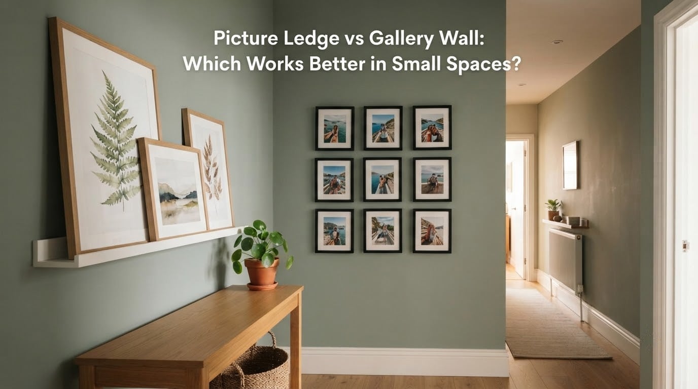
Two walls, two very different approaches. A picture ledge gives you one narrow shelf where frames lean against each other. A gallery wall hangs a dozen frames directly on the plaster in a curated arrangement. Both fill an empty wall in a small apartment, both photograph well, and both go wrong in completely different ways.
This guide settles the picture ledge vs gallery wall question for anyone working with a short wall, a narrow hallway, a rental, or a collection that keeps changing. You will get a straight verdict first, then a 12-point side-by-side comparison, layout rules for each method, renter-friendly install steps, and a decision framework that maps your specific wall to the right choice.
One pattern keeps repeating after weeks of helping people arrange art in rooms under 200 square feet. The right method is not a style question. It is a constraint question, and small spaces have fewer usable constraints than most guides admit.
Table of Contents
- Quick answer: which one wins in a small space?
- What is the difference between a picture ledge and a gallery wall?
- Why a picture ledge works in small spaces
- Why a gallery wall works in small spaces
- Picture ledge vs gallery wall: the side-by-side comparison
- How to choose: a decision framework by space type
- Renter-friendly installation for both methods
- Small space optimization tips for each method
- Frequently Asked Questions
- Conclusion
Quick answer: which one wins in a small space?
A picture ledge wins in most small spaces, and a gallery wall wins in a few specific ones.
Choose a picture ledge when your wall is narrow, when you rent, when your art rotates, or when your frame count exceeds what the wall can hold comfortably. A ledge is one mounting job, holds more pieces per inch of wall, and can be restyled in minutes.
Choose a gallery wall when the wall is wide and blank, the arrangement is settled, and you want the arrangement itself to be the feature. A gallery wall reads as one composed object, which is exactly what a picture ledge deliberately avoids.
- Narrow hallway, 24 to 36 inches of wall: picture ledge, stacked in two tiers if you have the height.
- Above a sofa or console on a wide wall: gallery wall when the art is permanent, picture ledge when you swap it often.
- Rental, any size: picture ledge. It is one fixable row of mounting points instead of fifteen holes to patch.
- Corner or awkward angle: picture ledge. A slim ledge adds depth to a flat surface, and a corner gallery usually ends up fighting the corner seam.
- More than eight pieces you care about: picture ledge. Gallery walls get visually expensive above that count on a small wall.
- A wall you want to leave completely unmarked: picture ledge with adhesive strips, or a leaning floor arrangement with no wall hardware at all.
What is the difference between a picture ledge and a gallery wall?
The difference is where the art sits. A picture ledge is a shallow floating shelf, typically 1 to 2.5 inches deep, mounted once on the wall. Frames lean back against the plaster and stand on the ledge. Nothing is individually attached to the wall, so swapping a piece is a lift, slide, and lean.
A gallery wall is a composed arrangement of frames hung directly on the wall, each piece on its own nail, hook, or adhesive strip. Spacing, alignment, and balance are fixed once the pieces are placed, which is what gives a gallery wall its polished look.
Here are the working definitions the rest of this guide uses:
- Picture ledge: a shallow shelf that holds leaning frames in a single row or tier.
- Gallery wall: a planned grouping of individually hung frames with deliberate spacing.
- Adhesive strips: damage-free mounting strips rated for a stated weight, used for the ledge or individual frames.
- The 2/3 rule: art or ledge should span roughly two-thirds of the width of the furniture beneath it.
- Eye level: roughly 57 to 60 inches from the floor to the center of the arrangement.
- Visual weight: how heavy or light an arrangement feels, driven by frame count, frame size, and mat color.
Those last two numbers matter more than people expect. A ledge hung at 70 inches reads as furniture. The same ledge at eye level reads as art, and the difference is a few inches of measurement.
Why a picture ledge works in small spaces
The core advantage is density. A 36-inch ledge can hold five or six frames overlapping slightly, where the same 36 inches of wall might hold three hung frames before the arrangement starts to look crowded. Overlapping is what makes a ledge feel generous in a tight space.
A second advantage is that the whole system lives at one height. You are not solving the problem of how a 4×6 portrait and a 5×7 landscape relate to each other, because the ledge shelf handles depth and you handle only horizontal order.
The third advantage is renter math. One row of mounting points means two or four strip applications, not a grid of holes across the wall. When you move out, you are patching one line instead of fifteen separate spots, which is the difference between a conversation and a deduction.
Picture ledge strengths
- Highest piece count per inch of wall.
- One mounting job, easy to remove.
- Frames can overlap for depth without looking wrong.
- Restyling takes minutes, not an evening with a level and a stud finder.
- Add a second ledge later and the wall gains a whole tier without new planning.
- Reflective and mirrored pieces lean well, which hangs poorly with hardware.
How to style it well
Layer the back row first. Larger or taller pieces sit at the back, smaller frames lean in front at the opposite angle, and the overlap reads as depth rather than crowding. Keep a single mat or frame finish repeated across at least half the pieces so the row holds together.
Use an odd number. Three frames or five frames look considered. Two or four look like a starting point you never finished.
Paint the ledge the same color as the wall if the shelf finish fights the room. A ledge that matches the plaster disappears, the frames appear to float, and the wall gains a few inches of apparent width.
Stack two ledges in a tall narrow space. Two tiers of two and three frames beats one tier of five, because the vertical arrangement fills a hallway wall that a single row cannot.
Lean one object that is not a frame. A small plant, a ceramic piece, or a single candle breaks the repetition and softens the row. Just keep it low and to one side so it does not compete with the art.
Leave negative space at the ends. A ledge with an inch of empty shelf at each end looks edited. One crammed edge to the corner looks accidental.
Where a picture ledge falls short
A ledge shows the edges of your frames, so mismatched backs and cheap cardboard mats are visible. It also reads as furniture, not art, which matters if you want a single dramatic statement. And a ledge needs clear wall in front of it, so it does not work in front of an outlet, a switch plate, or a radiator.
Why a gallery wall works in small spaces
A gallery wall works because it behaves like one large piece. When spacing, mat color, and frame finish are consistent, a viewer stops seeing individual frames and sees a single composed surface. On a wide, blank wall above a sofa, that effect is genuinely striking and a ledge cannot replicate it.
The advantage is scale. You can span 60 inches of wall with a grid that reads as one artwork, using frames that would be too small to notice individually. A ledge in the same location reads as a shelf, because the shelf line is always visible.
The gallery wall also handles vertical space better than most people expect. A tall stack in a narrow hallway can climb 40 inches upward and use almost no width, which is the same trick a stacked ledge uses but with more pieces.
Gallery wall layout rules
Hang to eye level first, then move. The center of the arrangement belongs near 57 to 60 inches from the floor. Most crooked-looking gallery walls are actually hung too high, because people measure to the top of the frame instead of the center.
Keep spacing consistent. Two to three inches between frames is the range that reads as deliberate. Anything tighter looks accidental, and anything wider breaks the single-object effect you were aiming for.
Limit coverage. Covering roughly 60 to 70 percent of the available wall is the ceiling for a small room. Push past that and the wall reads as cluttered no matter how good the spacing is.
Repeat one finish. Matching all frame mouldings is the easiest route to cohesion. Mixing finishes is fine if you repeat a single colour or material, such as three black frames among lighter ones, so the eye has something to hold.
Anchor with one large piece. A single larger frame or a small mirror at the center gives the arrangement a focal point and stops it drifting into wallpaper.
Plan on the floor before the wall. Tape paper templates of each frame, cut them out, and lay them on the floor or tape them to the wall with painter’s tape. Move them until you like it, mark the corners with a pencil, then hang. This is the single most recommended habit in renter and decorating communities, and it is the cheapest insurance against a wall full of misplaced holes.
Use two hooks per frame where the weight allows. One hook is the reason so many frames sit crooked. D-rings on the back corners cost nothing extra and fix the tilt.
Common gallery wall mistakes
- Measuring to the top of the frames instead of the center, which pushes the whole arrangement too high.
- Mixing eight frame finishes and five mat colours with no repeated element.
- Spacing that changes frame to frame, so the grid never quite lines up.
- Even numbers of pieces, which read as unfinished.
- Using a large wall with a small arrangement, leaving a wide empty band above the sofa.
- Letting one oversized frame sit beside six tiny ones with nothing balancing it.
- Starting at the wall edges and working inward instead of anchoring the largest piece first.
Picture ledge vs gallery wall: the side-by-side comparison
This is the table most searches are really asking for. Twelve criteria, with the winner called out on each row.
| Criterion | Picture ledge | Gallery wall | Better in a small space |
|---|---|---|---|
| Pieces per inch of wall | High, frames overlap | Medium, frames need gaps | Picture ledge |
| Flexibility of arrangement | Change in minutes | Each move means a new hole | Picture ledge |
| Wall damage when installed | One row of mounting points | One hole per frame | Picture ledge |
| Reversibility for renters | Fully reversible | Patch and paint required | Picture ledge |
| Visual impact as a single object | Low, the shelf line stays visible | High, reads as one composition | Gallery wall |
| Use on a narrow hallway wall | Good, especially stacked | Workable but tight | Picture ledge |
| Use on a wide blank wall | Good, can look like furniture | Excellent | Gallery wall |
| Seasonal rotation effort | Lift, slide, lean | Unhang, rehang, repatch | Picture ledge |
| Adding pieces later | Slide the row along | Re-space the whole grid | Picture ledge |
| Skill required to look good | Low, one row of choices | High, layout and spacing judgement | Picture ledge |
| Best with mirrors and metallic frames | Good, they lean securely | Poor, hardware can slip | Picture ledge |
| Result on a rental you leave soon | One line to patch | Many small holes to patch | Picture ledge |
Read across the final column and the pattern is clear. A picture ledge takes nine of the twelve criteria, and it wins every row that involves flexibility, damage, or effort. A gallery wall wins on visual impact and on wide blank walls, and those are the only two situations where its effort is worth spending.
How to choose: a decision framework by space type
Map your wall to the closest row below. Where two answers feel equal, the tiebreaker is this: will the arrangement still be right in six months? If yes, hang a gallery wall. If you already know you will be rotating art, moving out, or changing the furniture, use a ledge.
Studio apartment. One open room means one big blank wall that most people try to fill completely. A gallery wall on the longest wall gives you the single strongest visual element a small room can have. If that wall is where your sofa sits, a ledge above it keeps the furniture line clean and stops frames from crowding the cushions.
One bedroom apartment. Usually a narrow wall beside a bed or a short wall in the entry. A picture ledge, or a vertical stack, handles these better than a grid because there is not enough width to hold three columns with even gaps. In the hallway, stack two ledges rather than trying to force five frames into 30 inches.
Narrow hallway. Picture ledge, vertical orientation. Line the art up along one side rather than centering it, so the wall reads as a runner and the walkway stays visually clear. Keep the lowest point of the arrangement above shoulder height if the hall is a traffic route.
Entryway or foyer. A ledge is more practical because entryway art absorbs a lot of coats, bags, and damp air. Swap the contents often and the ledge keeps up. If the entry is wide and the arrangement will never change, a gallery wall gives the first impression more weight.
Corner or awkward wall. Picture ledge. A slim ledge turns a flat corner surface into a layered one, and it is far more forgiving than a grid that has to negotiate a corner seam or a slanted ceiling. Stack vertically in a shallow corner, and angle the frames slightly toward the room.
Rental. Picture ledge, mounted with adhesive strips rated above your actual weight. If the ledge is wider than the strip rating allows, use two sets spaced toward each end. Alternatively, place a large frame and a small one on the floor leaning against the wall, which uses no wall hardware at all.
Owned home with a blank wall you will keep. Gallery wall, if the wall is at least 60 inches wide and the art is settled. This is the one case where the layout itself is worth the planning time.
Renter-friendly installation for both methods
Adhesive strips work for ledges and single frames, and the rule is the same for both: check the weight rating, add more strips than the total load requires, and wait the full set time before you lean anything on it. Fresh paint needs longer than bare drywall, and textured walls need a different product entirely.
Installing a picture ledge with adhesive strips
Step 1. Mark the wall. Hold the ledge where you want it and mark the ends with a pencil. Check for studs anyway, because if a stud is behind the mount point you can use a screw and save all the adhesive rating concerns.
Step 2. Check the wall surface. Painted drywall takes strips well. Textured or freshly painted walls often do not, and on a fresh coat, wait a few weeks before sticking anything.
Step 3. Size the strips. Total the weight of the ledge plus every frame that will lean on it, then choose strips rated comfortably above that number. Attach two sets, one near each end.
Step 4. Set and wait. Press the ledge firmly in place for the full time listed on the strip packaging, then leave it alone before loading it.
Step 5. Style the row. Start at the back with your largest frames, then lean the smaller ones forward. Keep the row balanced rather than centered, leaving a hand’s width of empty shelf at one end.
Installing a gallery wall without permanent holes
Step 1. Build templates. Trace each frame onto kraft paper or plain printer paper and cut it out. For eight frames this takes about fifteen minutes.
Step 2. Test the layout. Tape the templates to the wall with painter’s tape at eye level, or lay them on the floor and photograph the arrangement. Adjust until the spacing is even and the block feels balanced.
Step 3. Mark and level. Once you are happy, trace the outer corners lightly, remove the templates, and draw a level line across the wall where the top row sits.
Step 4. Hang with two points. Use adhesive hooks rated for the frame weight, and use two per frame wherever possible. A single hook is the most common cause of a crooked gallery wall.
Step 5. Patch on the way out. Keep the removed hooks with your deposit paperwork, and fill any residue with a paint-safe eraser before you do anything else to the wall.
Adhesive is not magic. Heavy frames, textured walls, and high humidity all reduce what a strip can hold, and any of those situations means screws into studs or a freestanding arrangement instead.
Small space optimization tips for each method
For a picture ledge, keep the row to one clear idea. All black and white photography, or all family snapshots, or one palette of mats. A ledge has no internal grid to add structure, so the styling has to come from the pieces themselves.
For a picture ledge, match the ledge colour to the wall when the shelf finish is visually loud. Same-colour walls make the shelf disappear and the frames read as a single composition floating in the plaster.
For a gallery wall, cap the frame count and match the mat colour rather than the frame colour. A consistent mat across mismatched frames does more for cohesion than matching mouldings ever will.
For a gallery wall, use a dark frame colour to add weight to a small room and a light one to make the wall feel larger. The same layout with black frames feels denser and closer; the same layout in pale frames reads as airier and further away.
For either method, decide your spacing once and reuse it. If you like a three inch gap on the ledge, use three inches between leaning frames. If you used two inches in the gallery wall, keep the number when you add to it next year.
For either method, plan the seasonal swap before you need it. A ledge makes this a five minute job. A gallery wall needs a full layout session, so schedule it, and keep the paper templates from the install so you are not measuring from scratch.
For either method, dust the pieces where they sit. Gallery wall frames collect dust on their top edges and are annoying to clean one at a time. A ledge lets you bring the whole row down at once, which is easier than it sounds.
Frequently Asked Questions
Are picture ledges still in style?
Yes. The shallow floating ledge has stayed a steady small-space staple rather than a fading trend, largely because it solves the same problem every time: too much art for too little wall. Designers now lean into it with layered frames, matching wall paint, and stacked pairs rather than a single long row.
Are gallery walls outdated?
No, but the loose salon hang is less dominant than it was. What reads as current is a tighter arrangement with consistent mat color, even two to three inch spacing, and a single anchor piece. A gallery wall that is evenly spaced and centered on one mat color still looks current; a random cluster of mismatched frames reads as dated.
What is the 2/3 rule for wall art?
The art or ledge above a piece of furniture should span about two-thirds of that furniture’s width. It is a guideline for proportion, not a measurement requirement. A wider piece can work on a long wall, but on a small wall the two-thirds mark keeps the arrangement from looking cramped or lost.
What are common gallery wall mistakes?
The most frequent errors are measuring to the top of the frames instead of the center, using inconsistent spacing, mixing too many frame finishes and mat colors, hanging above eye level, and covering more than about 70 percent of the wall. Testing the layout with paper templates on the floor prevents most of them before any holes go in.
What to do instead of a gallery wall?
Use a picture ledge for leaning art, lean a large frame directly against the wall, hang one oversized statement piece, group a few similar frames in a tight cluster, or use a floating shelf where objects and art share the same surface. Each option trades the multi-frame grid for a simpler, more flexible arrangement that suits narrow walls better.
What is the rule for gallery walls?
Center the arrangement near 57 to 60 inches from the floor, keep spacing consistent at two to three inches, repeat one frame or mat finish across the group, use an odd number of pieces, and keep one piece larger than the rest to act as an anchor. Cover no more than roughly 60 to 70 percent of the available wall.
Which is easier, a picture ledge or a gallery wall?
A picture ledge is easier. It is a single mounting job with one row of decisions, and restyling takes minutes. A gallery wall requires planning spacing, alignment, and balance across many separate pieces, plus a new hole for every frame you ever move.
Conclusion
For most small spaces, a picture ledge beats a gallery wall. It holds more art per inch, changes in minutes, and leaves a rental wall with one line to patch instead of fifteen holes.
Pick the gallery wall only when you have a wide blank wall, a settled arrangement, and no plans to move. Measure to the center of the layout, keep the spacing even, and cap the coverage at about two-thirds of the wall. Start with paper templates, because rearranging paper takes a minute and rearranging nails takes an afternoon.