
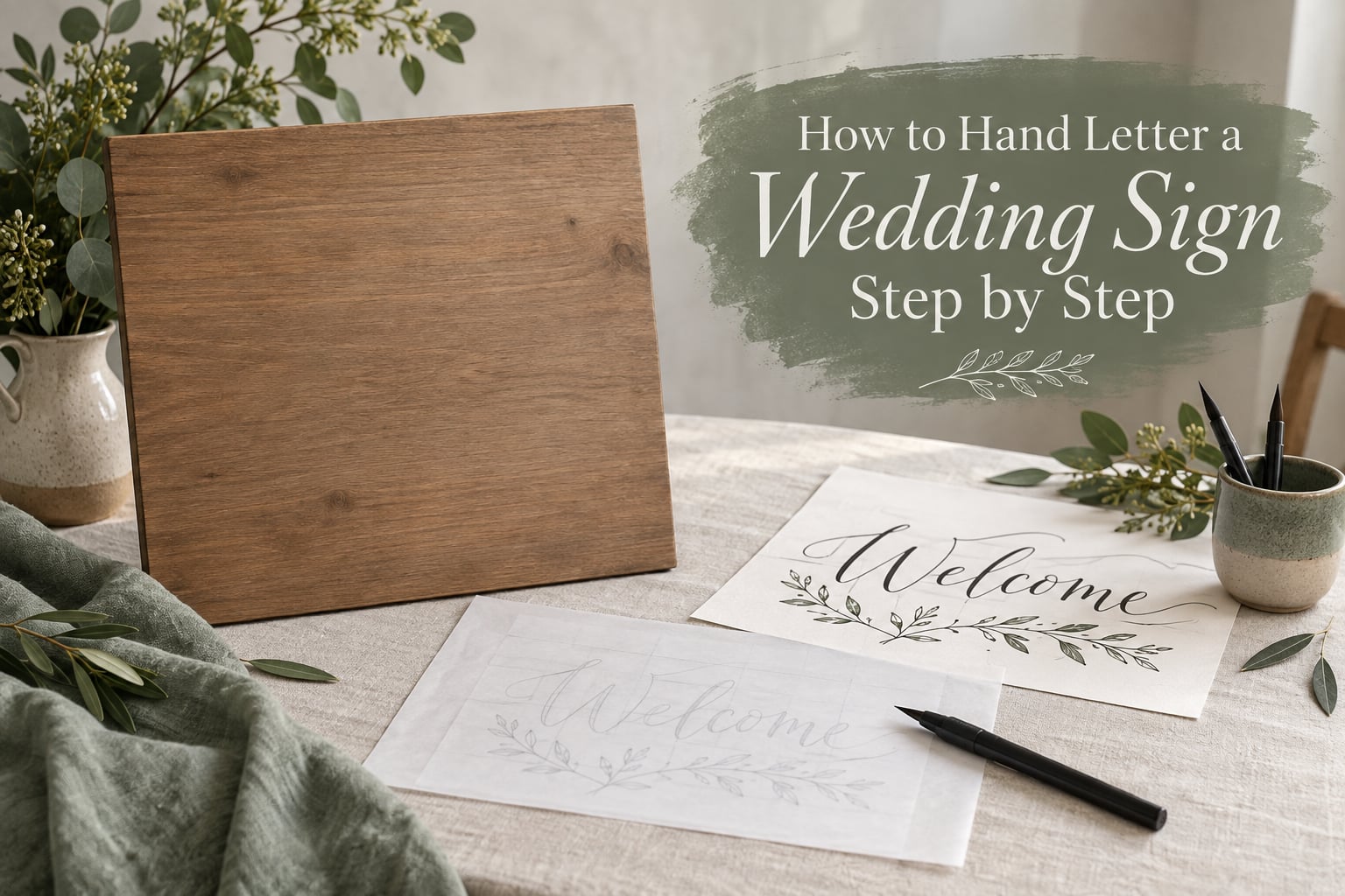
Hand lettering a wedding sign means drawing every letter by hand, usually with a brush pen or a dip pen, instead of printing the words or cutting them from vinyl. It is slower than printing and harder to undo, and the finished board is the piece of wedding decor most guests photograph before they walk through the door.
This guide walks through the whole job, from an empty sheet of paper to a mounted sign that survives the drive to the venue. If you have never lettered before, the honest version is that the sign itself takes about an hour once your hand knows the strokes, and the practice before it takes considerably longer. Plan for that in the section on timing.
Here is the whole process in order, condensed:
- Decide your sign size and work out how large the letters should be.
- Write the phrase and lay out your lines.
- Draw your baseline and slant guidelines.
- Practise the basic strokes: overturn, underturn, compound curve.
- Pencil the whole phrase in one continuous pass.
- Ink the lettering with steady pressure on every downstroke.
- Check and fix the spacing, x-height and baseline.
- Seal, back and mount the sign.
We have lettered signs for enough weddings to know where first attempts go wrong, and almost all of it happens in the first two steps rather than the lettering itself.
Table of Contents
- What You Need Before You Start
- How to Hand Letter a Wedding Sign Step by Step
- Step 1: Decide Your Sign Size and Work Out the Letter Size
- Step 2: Write the Phrase and Lay Out the Lines
- Step 3: Draw Your Baseline and Slant Guidelines
- Step 4: Practise the Basic Strokes
- Step 5: Pencil the Whole Phrase in One Continuous Pass
- Step 6: Ink the Lettering With Steady Pressure
- Step 7: Check and Fix Spacing, X-Height and Baseline
- Step 8: Finish, Seal and Mount the Sign
- What to Write on a Wedding Welcome Sign
- Hand Lettering Rules That Make Your Sign Look Pro
- Common Mistakes and How to Fix Them
- Hand Lettering vs Calligraphy vs Printed Vinyl
- How Long Does Hand Lettering a Wedding Sign Take?
- Frequently Asked Questions
- How to hand lettering for beginners?
- How do you space letters for a sign?
- How to do lettering step by step?
- What are some hand lettering projects for beginners?
- What font is best for a wedding welcome sign?
- What to write on a wedding welcome sign?
- What are the general rules for lettering?
- What is the recommended line spacing for calligraphy?
- Conclusion
What You Need Before You Start
You need far less than a craft shop wants you to buy. Here is the working set for one sign, with a note on what each item is actually for.
- Bleedproof or mixed media paper for practising, plus a heavier card or board for the final piece. Standard copy paper lets a wet brush pen bleed through within seconds.
- A mechanical pencil at about 0.5mm. A wooden pencil smudges into your guidelines and drags the eraser crumbs across the letters later.
- A kneaded or vinyl eraser for lifting graphite. A rubber eraser leaves a film that grabs ink and turns your first stroke grey.
- A brush pen with a flexible tip, or a nib holder and nib with calligraphy ink. Either produces thick-to-thin strokes through pressure alone.
- A metal ruler for the slant lines. Hold it against the paper and mark along it, or trace around it.
- A scrap sheet or a lightbox if you want to transfer a sketch you drew separately.
- A clean lint-free cloth to wipe the nib. Paper towels leave fibres on the tip and make it skip.
- A sealer or fixative plus an easel back or foam board mount for the finished piece.
Paper and pen have to agree with each other. A brush pen wants smooth bleedproof paper, and a marker wants mixed media paper with some tooth to hold the ink. Pairing a felt-tip marker with copy paper gives you a fuzzy, skipping line that no amount of care will fix.
How to Hand Letter a Wedding Sign Step by Step
Step 1: Decide Your Sign Size and Work Out the Letter Size
Buy or cut the board first, then measure it. The most common mistake is lettering for a phrase and only afterwards discovering the board is too narrow, and it forces a squeezed second line.
A workable rule: a single word should fill roughly 60 to 70 percent of the board width, leaving a comfortable margin on both sides. A multi-line block needs about one letter width of breathing room between lines. For the letter height, pick an x-height of roughly one tenth of the board width. If your board is 30cm across, that gives you an x-height near 3cm, which is a comfortable size for a beginner to control.
Sketch the phrase in ordinary writing at that size on scrap paper first and check it fits before you draw anything on the real board.
Step 2: Write the Phrase and Lay Out the Lines
Decide the exact words, including capitalisation, and the order of the lines before touching the board. The usual welcome sign stacks in three parts: a short opening word, the couple’s names, and a line underneath with the date or location.
Work out how many lines you have and how much vertical room each gets. Count descenders too, because a line with three of them in g, y or p needs more space below than a line of capitals. As a starting point, the gap between the baseline of one line and the cap height of the next is about one x-height.
Write the phrase in your normal handwriting on scrap paper at the size you calculated. This is a fit check, not a final piece, and it takes under a minute.
Step 3: Draw Your Baseline and Slant Guidelines
These faint pencil lines are the reason lettering looks deliberate rather than wonky, and they are the single biggest difference between a beginner’s first attempt and their tenth.
Draw a horizontal baseline across the board, then a second line above it at x-height. A third line at cap height above that gives tall letters a ceiling, and a light waistline halfway between baseline and x-height keeps the middle of your letters aligned.
Now add slant lines. Copperplate sits at about 55 degrees, Spencerian at about 52 degrees, and modern brush lettering runs far more upright at roughly 75 to 85 degrees. Draw three or four of them, evenly spaced, straight up the page. Beginner letterers do best with the modern brush angle because the strokes are wider and easier to place.
Keep the guideline pressure light enough to erase completely at the end.
Step 4: Practise the Basic Strokes
Do not skip this, even if you feel ready. Modern calligraphy is built from a small number of strokes, and if those strokes are shaky, every letter built from them is shaky too.
Three drills cover most of the alphabet. The overturn is the undercurve of a, c, d, g, o and s, drawn upward and over. The underturn is the lower curve of m, n, h, r and u, drawn upward and under. The compound curve is the shallow S-shape that joins the two into letters like a, g and y.
Fill two x-heights of paper with each, keeping your downstrokes the same thickness. When you finish, turn the sheet upside down and look at it. Letterers consistently credit this trick with spotting errors the eye misses at normal orientation.
Twenty minutes of this saves you an hour of inked corrections later.
Step 5: Pencil the Whole Phrase in One Continuous Pass
Now pencil the actual wording lightly onto the board, inside your guidelines. Light means light: you should be able to erase every line afterwards without leaving a grey shadow across the finish.
Work left to right across the whole phrase without stopping to fix a letter you are unhappy with. Consistency across the line matters more than any single beautiful letter, and stopping mid-word is what makes the spacing drift.
Leave a small gap, roughly a quarter of a letter width, between letters at this stage. You will fine-tune it in Step 7, and it is much easier to close a gap than to invent one that is already too wide.
Then step back a metre. If a word reads wrong from that distance, the letterform is wrong, not the spacing.
Step 6: Ink the Lettering With Steady Pressure
Hold the pen at roughly 40 degrees, with the nib touching the paper and dragging behind it as you move. Thick strokes come from downstrokes, thin strokes from upstrokes, and the whole effect of modern calligraphy comes from how firmly you press.
Load a brush pen by dabbing the tip into a puddle of ink on the edge of your paper, then blot. Too little ink and the line goes thin and scratchy halfway through a letter. Too much and ink pools in the corners of a, e and o, which is where mistakes hide.
Ink one line at a time and let it sit before starting the next. Ink over every downstroke at the same pressure as the last, and keep your hand moving at a steady speed. Slow and heavy is fine, slow and light is not.
Keep a scrap sheet beside the board and test the ink load there, never on the lettering itself.
Step 7: Check and Fix Spacing, X-Height and Baseline
Let the ink dry fully, then look at the sign again. Most problems are spacing, and spacing is easy to judge once you know the rule: the space inside a letter should be about the same as the space between letters.
Look at the space between every pair and ask whether it matches the counter of an o or the gap in an n. Adjust the pair that looks tight by nudging one letter or adding a hairline. You cannot fix spacing by only closing gaps, because some pairs need to open up instead.
Give a little extra room after a, c, d, g and q, because those letters end with a curve that pulls the eye outward, and give a, b, d, h, k, l and t extra room before them. Then check that every letter without a descender is sitting on the baseline and that your x-heights match.
Erase the guidelines last, with light pressure, and blow the crumbs away rather than brushing them across the wet ink.
Step 8: Finish, Seal and Mount the Sign
Once everything is dry and you are happy with it, decide whether the sign is a single sheet of card or a wooden board. If it is card, mount it onto foam board with a thin layer of craft glue, working from the centre outwards so you do not push the ink around.
Seal the finished surface with a clear acrylic sealer or a workable fixative, following the label directions for drying time. This is the step that stops a thumb print turning into a permanent smudge on the morning of the wedding.
Add an easel back or a saw-tooth hanger on the reverse so it stands up on its own at the venue, and test it on a table at home first. A sign that leans is a sign that gets photographed badly.
Transport it flat, inside a clean sheet of card, with tissue over the face of the lettering. Never roll it, and never put it in a car boot under other boxes.
What to Write on a Wedding Welcome Sign
Keep the wording short. A welcome sign is read from two to three metres away, and every extra word forces the letters smaller. Pick from these structures rather than writing your own sentence.
- Classic: “Welcome to the wedding of” above the names, with the date underneath.
- Warm: “We are so glad you are here” with the names and the venue name below.
- Minimal: the two names, the ampersand between them, and the date. Nothing else.
- Playful: a short instruction such as “Find your seat, then find the cake” with the names beneath.
- Flowers and botanicals: names in lowercase surrounded by simple leaf shapes rather than a full wreath, which is far easier to letter cleanly.
For the names, the standard trick is small caps: one large capital letter followed by smaller capitals that all share the same x-height. It reads formal, suits a sign viewed from a distance, and avoids the difficulty of hand-lettering lowercase letters you are still learning.
If you are adding other pieces, keep the wording consistent across a seating chart, place cards and a hashtag sign so the set reads as one set. Matching the same x-height and the same slant across all of them does more for cohesion than matching the style itself.
Hand Lettering Rules That Make Your Sign Look Pro
Professional letterers judge their work on four things, and the same four things explain almost every complaint beginners have about their own alphabet.
- Stroke width. Every downstroke the same thickness across the whole sign. Thin patches appear when pressure drops mid-letter, so rest your forearm rather than your wrist.
- Size. The same x-height on every letter, and similar forms the same height. An o, c and e at the same size read as intentional; at three different sizes they read as a mistake.
- Slant. Every letter leaning at the same angle. Mix 55 degrees with 70 degrees and the word stops looking like one word.
- Spacing. Even space between letters, adjusted for the shapes involved.
Add two supporting rules and your sign will look considered. Set the space inside each letter equal to the space between letters, and give letters with a right-hand curve slightly more room after them than letters that end on a straight stem.
You do not need cursive. Most welcome signs are not written in a connected hand at all, and modern brush lettering uses no joined letters.
Common Mistakes and How to Fix Them
These are the problems letterers raise most often, with the cause behind each one.
- Letters drift upward across the line. Your arm is resting on the paper and rising as you move right. Push the page away slightly or rest your hand further along, so the movement comes from the elbow.
- Curved letters like C and S look weak. The overturn and underturn drills were skipped or rushed. Practise those two shapes alone until they are consistent before lettering again.
- Spacing looks cramped in some places and gaping in others. The gaps were not adjusted for the letter shapes. Work pair by pair, opening after a, c, d, g and q and closing before them.
- One line is heavier than the others. Pressure rose as you got tired. Stop for two minutes, reload the pen, and do a practice line on scrap paper before the next real line.
- Ink pools in the corners of a, e and o. The pen was too wet or you paused mid-letter. Load less ink and keep moving through curves.
- Smudges the next morning. The sign was sealed too early or never sealed. Give the ink a full drying period, then seal, then leave the sealer to cure.
- The word reads fine up close but not from a distance. The letters are too small or too light. Increase the x-height rather than adding more words.
Hand Lettering vs Calligraphy vs Printed Vinyl
Hand lettering is the one most people mean when they picture a wedding welcome sign, and it is the most forgiving of the three. True calligraphy requires consistent pressure and a broad-edge or pointed nib, which takes longer to learn. Printed vinyl is a machine-cut face or script font applied to the board, and it looks clean but has none of the handmade detail.
Hand lettering wins on keepsake value. Letterers in craft communities note that the couple tends to value the handmade piece far more than guests comment on it, which is worth remembering if you are worried about perfection.
If lettering is not going to happen, there is no failure here. Print your wording at a large script size, mount it on board, and spend the saved hours on the rest of your signage. Guests want signage that helps them find their seat, the bar and the ceremony. A clear printed sign does that job just as well as a beautiful one.
How Long Does Hand Lettering a Wedding Sign Take?
Here is the honest breakdown. Practising the basic strokes until they are consistent takes several sessions of about 20 minutes each, spread over a couple of weeks. That is the part first-timers underestimate.
Sketching and inking the sign itself takes roughly 60 to 90 minutes for a three-line welcome sign, plus another 30 minutes for drying, sealing and mounting. A five-line seating chart is a much bigger job, and we would plan half a day plus practice for that.
Work backwards from the wedding. Twelve weeks out is comfortable for a single sign and gives room for two attempts. Six weeks is enough for one welcome sign if you practise from the start. Inside four weeks, build in the chance that the first board gets binned.
Never make the good board your first attempt. Letter the full phrase twice on cheap paper, keep the better one, and only then transfer the final piece.
Frequently Asked Questions
How to hand lettering for beginners?
Start with three strokes, not with letters. Practise the overturn, the underturn and the compound curve for 20 minutes at a time until the downstrokes match each other. Then alphabet in lowercase on gridded paper, using a baseline, an x-height line and slant lines at about 75 degrees. Letterers credit guide sheets and turning the page upside down as the two habits that most improve their work fastest.
How do you space letters for a sign?
Make the space between two letters match the space inside a letter. Then adjust for shape: leave slightly more room after a, c, d, g and q because the curve pulls outward, and more room before b, p and h because the pen has further to travel. Judge the whole line from a metre away rather than close up, and change one pair at a time.
How to do lettering step by step?
Eight steps cover it: pick the sign size and work out the letter size, lay out the phrase, draw baseline and slant guidelines, practise the basic strokes, pencil the phrase in one continuous pass, ink it with steady pressure, check the spacing and x-height, then seal and mount. Most of the time goes on steps 1 to 3, and rushing them is what makes the inking go wrong.
What are some hand lettering projects for beginners?
Practise on the alphabet before any project. After that, try single names in small caps, a simple leaf or branch, a framed phrase of two to four words, place cards, a hashtag sign, or table numbers. Short names in one line give beginners the fastest route to a finished piece, and the same stroke drills carry over to every other project.
What font is best for a wedding welcome sign?
For a handwritten sign, choose a style that matches the tool you have. Modern brush lettering suits a flexible brush pen and gives thick-to-thin strokes. A broad-edge pen gives formal italic calligraphy. If you are printing rather than lettering, a high-contrast script with generous spacing reads better from a distance than a plain serif at small sizes.
What to write on a wedding welcome sign?
Keep it to three lines and no more. A short opening line such as Welcome to the wedding of, the couple’s names, and the date or venue underneath. Minimal versions use just the names and date. Longer instructions work as separate seating or direction signs, where guests can stop and read rather than glance past.
What are the general rules for lettering?
Four rules cover most of it: consistent stroke width on every downstroke, consistent size and x-height, one slant angle across the whole piece, and even letter spacing adjusted for the shapes involved. Add two supporting rules: keep the space inside a letter equal to the space between letters, and leave extra room after letters ending in a curve.
What is the recommended line spacing for calligraphy?
Leave roughly one x-height between the baseline of one line and the cap height of the next. Lines containing descenders need more, and lines of all capitals can sit slightly tighter. If you are unsure, measure the gap against the x-height you already drew on your guidelines and keep that gap identical on every line.
Conclusion
To hand letter a wedding sign well, the lettering is the easy half. The board size, the fit of the phrase, the guidelines and the spacing decisions are what separate a sign that looks professional from one that does not, and every one of them happens before a drop of ink.
Measure your board, pick an x-height of about one tenth of its width, pencil the phrase in one pass, and ink the downstrokes at one consistent pressure. Practise the strokes first, leave a full drying period before sealing, and set your start date twelve weeks out. Then put your name on it and let it sit there as the first thing your guests read.