
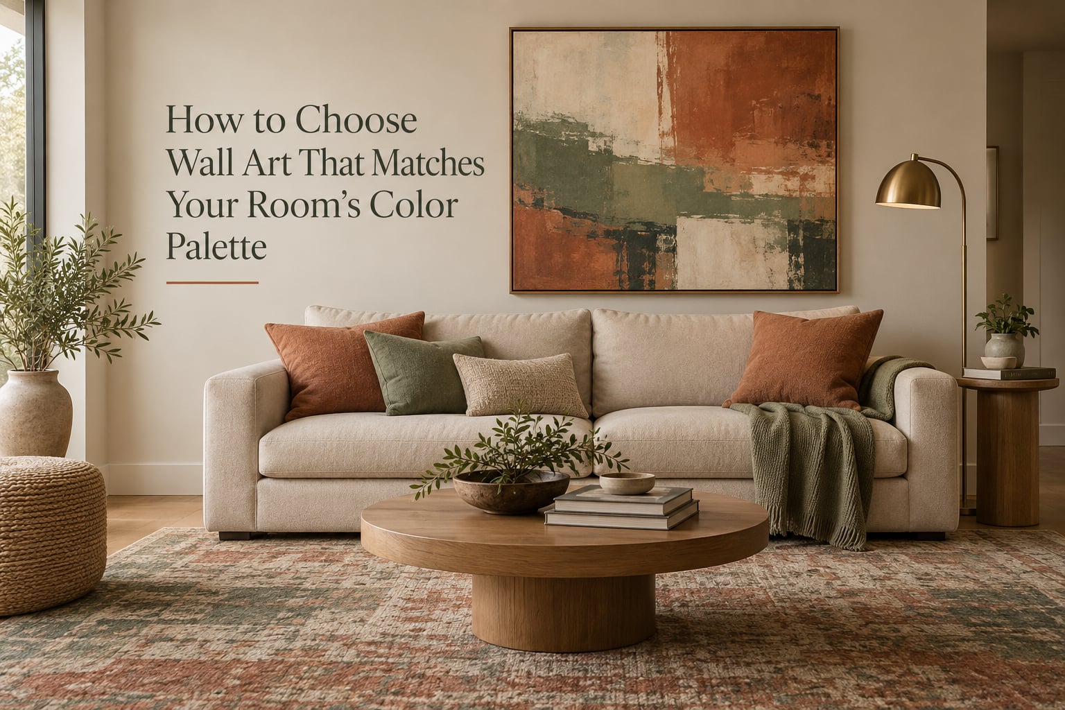
Most people buying wall art are not designing a room from scratch. They already have the sofa, the rug, the curtains, the paint, and the wood floors, and those pieces are staying. The question is how to choose wall art that matches your room’s color palette without turning the space into a hotel lobby.
That is a different job from the one most paint and art websites describe. They tend to argue you should pick the artwork first and build the room around it, which is fine if you are renovating from an empty shell. If the room is already furnished, you are working backwards, reading a palette that already exists and finding something that belongs in it.
This guide is built for that second situation. It is a repeatable five-step system for reading your room, classifying its colors, choosing a color relationship, sizing the piece correctly, and testing it under real lighting before you commit. It also covers the cases people rarely write about: rooms you cannot repaint, furniture you will not replace, and a room that is already full of color.
Updated for 2026.
Table of Contents
- The 5-Step System at a Glance
- Why Matching Wall Art to a Room’s Colors Is Harder Than It Sounds
- Step 1 – Read Your Room’s Existing Color Palette
- Step 2 – Classify Your Palette as Warm, Cool, or Neutral
- Step 3 – Choose a Color Relationship From the Color Wheel
- Step 4 – Apply the 60-30-10 Rule With Art as Your Accent
- Step 5 – Check the Piece in Your Actual Lighting Before You Buy
- How to Pull Colors Out of an Artwork You Already Own
- The Color-Matching Matrix: What Art Colors Work With What Room Colors
- Room-by-Room Color Matching Guide
- The 2/3 Rule for Sizing Art Over Furniture
- Black and White Art: The Universal Safe Choice
- Matching Art in a Gallery Wall
- Frame, Mat, and Hardware: The Part Most People Skip
- What to Do If You Cannot Repaint or Replace the Sofa
- Common Mistakes That Make Art Look Wrong in a Room
- Frequently Asked Questions
- What is the 2/3 rule for wall art?
- What is the 70/30 rule in art?
- What is the 3-color rule in interior design?
- What is the 3-5-7 rule in decorating?
- What colors should I use in my 60-30-10 color palette?
- What two colors go well together for a room?
- How to match artwork in a room?
- Should art match the colors in your room?
- What is the best size wall art for a living room?
- How do I make colors flow from room to room?
- Are gallery walls out of style in 2026?
- What is the in-colour for 2026 living rooms?
- Conclusion
The 5-Step System at a Glance
Learning how to choose wall art that matches your room’s color palette takes about twenty minutes once you know what to look at. Here is the whole process before we unpack it.
- Read the room. List every color already on the walls, floor, and large furniture, then name the three that dominate.
- Classify each one. Sort your colors into warm, cool, or neutral by checking the undertone rather than the color name.
- Pick a relationship. Choose how the art will relate to the room: repeat it, complement it, or bridge two colors.
- Size it correctly. Use the two-thirds rule so the piece covers roughly two-thirds of the furniture beneath it.
- Test it in place. Tape a full-size outline on the wall and look at it in daylight and at night before you buy.
Each step below goes into detail, including the specific mistakes that make art look wrong even when the colors are technically right.
Why Matching Wall Art to a Room’s Colors Is Harder Than It Sounds
The difficulty is that two opposite failures look equally bad. Art that repeats your wall and sofa colors exactly reads as themed and cheap, like a promotional poster for the room it hangs in. Art that ignores the room entirely reads as a mistake, because the eye registers a color conflict long as it can name it.
People describe this stall in decorating forums as a silly problem, which is why so many rooms end up with bare walls. The decision feels like it should be instant and it is not, because there is no single correct answer. There is only a relationship between colors, and relationships have to be chosen deliberately.
Our position is simple and it runs through the whole guide: art should harmonize with a room’s color palette, not replicate it. The goal is a room that looks finished, not a room where you can immediately point at the wall and say the art is the same color as the settee.
Color is also the fastest signal a viewer uses to judge a space. Before anyone registers the subject of a painting, they register whether it sits comfortably with everything around it. That judgement happens in about a second, which is why the color decision deserves more care than the subject decision.
Step 1 – Read Your Room’s Existing Color Palette
To read a room’s palette, start at the largest surfaces and work down to the smallest. Walls come first because they hold the most square footage, then floors, then the large upholstered pieces, then window treatments, then wood and metal finishes, and finally the small accessories.
The interior design version of this is called the three-color rule: a room reads as intentional when it is built from roughly three main colors, one of which is a neutral. The three-color rule is not a law, but it is a fast diagnostic. If you cannot name three colors in your room, that is usually why the art feels hard to choose, because you have no palette to relate it to.
Here is a reliable sampling method that people in r/HomeDecorating use repeatedly. Stand in the middle of the room in daylight and photograph the walls, the sofa, the rug, and any large artwork separately. Do not photograph the whole room at once, because the camera averages every color into a muddy middle tone and the result tells you nothing.
Then feed those photos into a free palette extraction tool. Paint brands and design tools will sample the image and return the dominant colors with their proportions, which is far more useful than guessing. A swatch app on your phone can do the same job in a few taps. This step is optional, but it converts a vague feeling into a list you can shop with.
Write your three colors down with a rough sense of how much of each is in the room. That proportion matters later, because the least represented color in the room is usually the best candidate for your art. A color that barely appears anywhere else will read as a deliberate accent rather than a repeat.
Do not skip the fixed finishes. A room with warm oak floors and cool gray walls is not a neutral room, it is a warm-cool split, and art that ignores the split will look pasted on no matter how well the colors technically harmonize.
Step 2 – Classify Your Palette as Warm, Cool, or Neutral
An undertone is the underlying color cast that sits beneath a color’s name, the thing that makes two greiges look like completely different paints. Every color you own has one, and sorting your palette by undertone is more reliable than sorting by the name on the paint tin.
Warm undertones lean red, orange, or yellow. Cool undertones lean blue, green, or violet. Neutrals can go either way, which is exactly why they are so useful and so confusing.
There is a simple test that requires no color vocabulary. Take a pure white sheet of paper and hold it next to the wall in daylight. Now hold a pure white sheet of paper printed with a faint blue or black tint next to the same wall. A warm wall will make the tinted sheet look noticeably duller. A cool wall will make the tinted sheet look cleaner and brighter. Trust whichever paper looks more wrong, because that is the cast your wall is pushing.
Warm colors tend to make a room feel active, social, and visually closer. Cool colors tend to make a room feel restful and visually further away. Neither is better, but a warm piece in a cool room will read as an interruption unless it is repeated somewhere else in the room, and a cool piece in a warm room will do the same thing.
Write the temperature next to each of your three colors. A room listed as warm oak floor, warm off-white wall, and cool slate sofa is not confused, it is layered, and art that pulls from two of those three temperatures will unify the layer instead of arguing with it.
Step 3 – Choose a Color Relationship From the Color Wheel
A color relationship is simply a decision about how the art’s colors will sit in relation to the room’s colors. There are four relationships that cover almost every situation, and you only need one of them per room.
| Relationship | What it means | How it reads in a room | Best for |
|---|---|---|---|
| Analogous | Colors that sit next to each other on the color wheel | Calm and quiet, very low conflict | Bedrooms, home offices, low-traffic rooms |
| Monochromatic | One hue in many tints, tones, and saturations | Polished and tonal, never busy | All-neutral rooms and rented spaces |
| Complementary | Colors directly opposite on the color wheel | Energetic, high contrast, an instant focal point | Living rooms and dining rooms that need a lift |
| Split-complementary | One color plus the two neighbors of its opposite | Contrast without the harshness of a direct opposite | Rooms with a bold sofa or strong rug |
Analogous colors are neighbors on the wheel. If your room is built on sage green, put art in olive, eucalyptus, and blue-green. The result is quiet and layered, and it is very hard to get wrong.
Complementary colors sit opposite each other. A blue-green room takes a rust or terracotta artwork, and a warm ochre room takes a deep teal or ink blue one. Complementary is the most striking option and the easiest to overdo, which is why the accent proportion in step four matters.
Monochromatic palettes use a single hue across several values. In a beige room, a monochromatic artwork in sand, oat, and warm taupe will look expensive and finished. In a room that already has three competing colors, a monochromatic piece is often the fastest way to calm it down.
Split-complementary is the compromise most people land on without knowing the name. You take the room’s dominant color and pull the two colors beside its opposite, which keeps the energy of contrast but softens the clash.
One heuristic comes up again and again in forum threads and it is the single most useful shortcut here: pick the least-represented color already in the room. If your sofa is green, your rug is cream, and your walls are white, a piece built on terracotta, ochre, or clay will look like it was chosen deliberately because nothing else in the room is competing for those tones.
What to avoid is the literal match. Hanging a blue-green artwork on a blue-green wall removes the boundary between the two, and the piece stops reading as an object and starts reading as a patch of paint. Give the art its own ground, usually a mat or a frame with visible width, and the colors can echo as much as you like without collapsing.
Step 4 – Apply the 60-30-10 Rule With Art as Your Accent
The 60-30-10 rule divides a room’s colors into proportions: roughly 60 percent your dominant color, 30 percent a secondary color, and 10 percent an accent color that appears in only a few small places. In the 60-30-10 rule, art sits firmly in the 10 percent accent slot.
This is why a single bright artwork can pull a beige room together. The room is 60 percent warm off-white, maybe 30 percent oak and linen, and the artwork supplies the 10 percent of color that the rest of the room is missing. The proportion is what makes the piece read as an accent rather than a mistake.
If your room is already carrying strong color, the calculation inverts. A colorful sofa plus a patterned rug plus colorful curtains can easily overshoot 30 percent, and adding a 10 percent piece of loud art tips the room into chaos. In that case the art should be the 60 percent, meaning a large, low-contrast, mostly neutral work that lets the furniture keep the color story.
Two practical numbers help. A single artwork generally works if it covers about 10 percent of the visible wall area in the room’s accent color, and a small object somewhere else in the room repeating that accent color makes the artwork feel chosen rather than placed.
Step 5 – Check the Piece in Your Actual Lighting Before You Buy
Color that looks correct in a shop can look completely different in your room, and this is the most common reason art comes home and immediately feels wrong. Store lighting is bright, cool, and even. Home lighting is directional, warm, and uneven, and those two environments will not agree.
Light bulb temperature is measured in kelvin, and the number tells you how the light will shift your colors. Lower numbers are warmer and more orange. Higher numbers are cooler and closer to daylight.
| Light source | What it does to colors on the wall | How the art changes |
|---|---|---|
| Daylight through a south or west window | Warmest, most saturated rendering | Greens and blues look richest; art appears most vivid |
| Overcast or north-facing daylight | Cool, flat, slightly gray | Warm art colors look muted and grayer than expected |
| Warm bulbs around 2700K | Pushes everything toward red, orange, and yellow | Blues and greens go dull; reds and ochres glow |
| Cool bulbs at 4000K and above | Pushes everything toward blue and white | Warm terracotta and rust look gray; blues sharpen |
The test protocol is simple and it costs nothing. Once you have narrowed your choice down, ask the shop for a printed image or a digital mockup at full size, then tape a life-size outline of the artwork onto the actual wall with painter’s tape. Look at the outline in the morning, in the afternoon, and with the lamps on at night.
Look at the outline rather than the artwork itself, because the shape of the piece on the wall is what you will live with every day. If the outline feels too small in the evening or too large in the morning, adjust the scale before you commit.
Many people also photograph the taped wall on a phone and run it through a palette tool, which gives them the wall’s true colors in that light rather than a memory of them. It is the closest thing to a color test for art that exists.
How to Pull Colors Out of an Artwork You Already Own
Sometimes the art came first. If you already own a piece you love and the room needs to catch up, the same process runs in reverse and gives you a room palette for free.
- Photograph the artwork flat and evenly lit, with no shadow from the frame.
- Run the image through a free palette generator from a paint brand or design tool, which returns the dominant colors plus their proportions.
- Note which color occupies the largest share, usually the background or negative space.
- Note the one or two accent colors that occupy the smallest share.
- Use the largest color for your wall, the accent colors for cushions, curtains, or a rug, and repeat the smallest color somewhere in the frame or a nearby object.
Reading an artwork in three layers is the useful part of this. Every piece has a dominant color, a supporting or accent color, and a background or negative space. The negative space is usually the color you should treat as your wall color, because it is the color the artist assumed would sit behind the work.
One warning. Painting a wall the exact color of an artwork’s dominant color is a common instinct and it usually flattens the piece, because the boundary between image and wall disappears. If you want to see more of that color, wallpaper, a colored mat board, or a colored frame wall achieves the effect while keeping the edge intact.
The Color-Matching Matrix: What Art Colors Work With What Room Colors
Below is the reference table we wish every art and paint guide published. Find your dominant room color in the left column, then read across to the art colors that reliably work and the verdict explaining why.
| Your room’s dominant color | Art colors that work | Relationship | Watch out for |
|---|---|---|---|
| Warm off-white, beige, or greige | Terracotta, ochre, sage, muted teal, dusty rose | Complementary or split-complementary | Pale art on a pale wall; use a contrasting frame |
| Cool gray or blue-gray | Warm wood tones, rust, brass gold, soft terracotta | Complementary | A second cool gray piece disappears into the wall |
| Green or sage | Clay, cream, dusty blue, deep navy | Analogous or complementary | Green-on-green flattens; add a warm mat |
| Blue or navy | Warm white, camel, ochre, coral, brass | Complementary | Too much blue reads cold; keep the art under 10 percent |
| Bold or patterned room | Monochromatic neutral, or black and white photography | Monochromatic | A second pattern competes directly with the first |
| All-neutral room | Any single strong accent, used once | Complementary | Multiple accent colors split the focal point |
| Warm wood-heavy room | Cool blue, deep green, soft black, stone | Temperature contrast | More warm-on-warm art reads muddy at night |
| Low light or north-facing room | High-contrast pieces, lighter backgrounds, fewer mid-tones | Value contrast | Subtle muted art vanishes in flat light |
Two colors that go well together almost anywhere are a warm neutral and a single saturated accent. Beige with terracotta, cream with deep green, warm gray with rust, and soft white with ink blue all hold up in almost any room, which is why they are the safest answers to the question of which two colors to pair.
If your room is all-neutral, you have more freedom than you think, and you should use it. One strong accent piece will do more for a beige room than three cautious ones, because a room with a single point of contrast reads as composed and a room with three reads as undecided.
Room-by-Room Color Matching Guide
The rules change with the room’s function, because the job of art changes too. Art in a bedroom is atmosphere, art in a dining room is energy, and art in a hallway is a first impression.
Living room
The living room is where you can afford the most contrast, because the room has to work for conversation and the art is competing with the sofa for attention. Take your accent from the least represented color in the room and let the piece be genuinely saturated. If your sofa is the color event, keep the art quieter.
Bedroom
Analogous or monochromatic palettes work best here. The art sits at eye level while you are lying down, so low contrast and muted tones are easier to live with than something vivid. Blues, greens, and dusty roses tend to read as restful; deep saturated reds tend to read as energetic even in low light.
Home office
Pick a color you will not get tired of, because you will look at it daily. Analogous schemes in a single hue family keep the eye calm during long sessions. A dark, high-contrast piece above a desk can also work, provided it does not sit in the glare from a monitor.
Dining room
Dining rooms handle more visual weight than any other room in the house, so complementary pairing is at its best here. Warm wood and brass are near universal in dining rooms, which means cool blues and greens give the room the contrast it needs. Hang art large enough to be seen from a seated position across the table.
Nursery and kids’ rooms
Start from the bedding, since that is the largest fixed color, and pull a second and third color from it. A wall print with a large, simple subject in muted tones ages better than a piece with many small busy details. Kids’ rooms also need value contrast so the art stays visible as the room gets darker at bedtime.
Bathroom
Bathrooms are typically small and often tile-dominated, so let the art carry all the color. One saturated piece in a small room is easy to absorb. Match the artwork to the tile rather than the wall paint, since the tile is the larger, more fixed color in the room.
Entryway and hallway
Art in an entryway is the first thing visitors see, so it can carry the room’s color story by itself. A single well-lit piece in a corridor with no other color needs almost nothing else. If the hallway connects two rooms, repeat one color from the art in the next room to make the colors flow from space to space.
Low-light or north-facing room
Rooms that get indirect or cool light need pieces with strong internal contrast and lighter backgrounds, because mid-tones flatten and dark areas disappear. Warm art colors look grayer than you expect in north light, which is a common reason buyers are disappointed by warm abstracts in these rooms. Check these specific rooms carefully before buying.
The 2/3 Rule for Sizing Art Over Furniture
The two-thirds rule states that art hung above a sofa, console, or bed should span about two-thirds of the width of that furniture, or sit between two-thirds and three-quarters of its width. A 90 inch sofa takes roughly 60 inches of art. A queen bed takes a piece about 45 to 60 inches wide. The measurement is a starting point, not a law, but scale is the fastest way to make a perfect color match look wrong.
A piece that is too small reads as an afterthought, even if its colors are ideal. A piece that is too large crowds the wall and flattens the furniture beneath it. When you are choosing between two artworks with the same palette, choose the larger one.
Some people also apply a 70/30 rule, which frames the same idea in reverse: the art is roughly 30 percent of the visual mass of the wall or furniture grouping it hangs over, and the room supplies the remaining 70 percent. Both versions are describing proportion, and both matter as much as color for how a room feels finished.
For a living room, if the wall is wider than the sofa, the general best size for a single statement piece is between two-thirds of the sofa width and the full sofa width, centered with six to eight inches of space above the back of the sofa. For a two-sofa or sectional arrangement, either one very large piece spanning both or two pieces of equal size placed above each sofa both work. Two unequal sizes in a symmetric arrangement look accidental.
Black and White Art: The Universal Safe Choice
Black and white art works in almost any room because it removes the color decision entirely and replaces it with a value decision. That makes it the standard recommendation in decorating forums for anyone with a room they cannot change, a room already full of color, or a rental where the art has to carry the whole scheme.
Black and white art also has a practical advantage over muted color art in low-light rooms. Value contrast survives dim lighting far better than hue contrast, so a monochrome photograph still reads clearly in a north-facing bedroom where a soft pastel landscape would fade into the wall.
The one caution is that the black in the frame and the black in the image are not the same black. Match the frame’s black to a soft charcoal and the image’s deepest black will look heavier. And if your room is already warm and layered, pure black can feel cold against wood and brass, so a slightly warm-toned black is usually safer.
Matching Art in a Gallery Wall
A gallery wall is a single artwork made of many, and the color rules are stricter. The palette has to be consistent across the frames, not across the subjects, because viewers read the group as one object.
The simplest method is to choose one dominant color and one accent color, then vary only the subject matter and scale within that palette. Black and white photography, sepia-toned landscapes, and one muted color print make a coherent wall. Three completely different color schemes rarely do, no matter how well each piece works alone.
Mat board is the most powerful tool for pulling a gallery wall together. Repeating the same mat color in every frame does more for cohesion than any selection of images, and you can mix prints from different artists without anyone noticing the mismatch.
For leaving a gap between the frames, match the wall color. Standard practice in gallery walls is to space every frame by the same measurement and to leave the vertical gap above the furniture slightly larger than the horizontal gaps between frames, which creates a natural optical center. As for whether gallery walls are out of style, they have settled into a quieter phase where fewer frames are hung in a looser, more irregular arrangement, but the palette discipline matters more than the layout.
Frame, Mat, and Hardware: The Part Most People Skip
The frame is part of the color decision, not an accessory. A dark frame adds visual weight and a light frame makes the art feel like a smaller, lighter object, so the same print can be made to fit a room by changing the frame alone.
On light walls, a dark frame gives definition. On dark or deeply colored walls, a light or metallic frame keeps the piece from disappearing. When you cannot decide, match the frame to one of the room’s other lines, such as a window frame, a mirror, or the metal on a lamp, and the whole room reads as considered.
Mat board works as a color tool. If the art is loud, a wide mat in a wall-adjacent tone calms it and creates breathing room. If the art is too pale for the wall, a deeper mat gives it a border and stops the wall from eating the image. A mat also solves the matching problem directly, because the art can echo the room exactly while the mat supplies the contrast.
Two more decisions belong in the same conversation. Mat thickness should relate to frame width, with a thin frame and thin mat looking more delicate and a wide frame and wide mat looking more substantial. And lighting matters: a warm picture light at around 2700K will make a cool-toned print look muddy, so match the bulb temperature to the art’s palette rather than to the room.
What to Do If You Cannot Repaint or Replace the Sofa
Most advice on this topic quietly assumes you own the room and can change it. Renters, people in the middle of a renovation, and anyone who loves their furniture but is stuck with a color they did not choose all need a different path.
Start with the least-represented color heuristic. The color that appears least in the room is the one with the most room to be an accent, and it does not require you to change anything you already own. Pull a five-color palette from the artwork, then match three of those colors to things you can swap cheaply, such as cushion covers, throw blankets, or a lampshade.
Repeating the art’s accent color in three small objects elsewhere in the room is the standard interior design move, and it costs almost nothing compared with changing the sofa. The rug is usually the second highest-impact item you can change, and it carries more square footage than any other textile.
If the room is rented and nothing can be changed, let the art do all the work. A large piece, a considered frame, and a good picture light can completely change how a fixed room feels without touching the paint. When you cannot repaint, you are not limited, you are just working with a smaller set of variables, and the color system still applies to every variable you do control.
Common Mistakes That Make Art Look Wrong in a Room
- The literal match. Art in the exact color of the wall or sofa has no boundary and reads as a patch. Fix it with a mat, a contrasting frame, or a shifted hue in the same family.
- Wrong scale. This is the most common and the least color-related. A perfectly matched piece hung too small still looks wrong. Use the two-thirds rule before you change a single color.
- Two competing focal points. A bold artwork directly above a boldly patterned rug or a striking sofa creates a fight. Either let the furniture lead and keep the art quiet, or let the art lead and calm everything else.
- Buying for the store. Cool, even retail light makes almost everything look better than it will at home. Test in place, at your actual bulb temperature, in daylight and at night.
- Forgetting the frame color. A thin, cheap frame in a mismatched tone undoes good color work every time. Decide the frame before you commit to the print.
- Painting the wall in the art’s dominant color. It flattens the piece by removing the edge. Use wallpaper, a colored mat, or a colored frame instead.
None of these mistakes are about taste. They are about proportion, boundary, and light, which is reassuring, because all three are fixable.
Frequently Asked Questions
What is the 2/3 rule for wall art?
The two-thirds rule says that artwork hung above a sofa, console, or bed should span roughly two-thirds of the width of the furniture beneath it. A 90 inch sofa takes about 60 inches of art. The rule matters as much as color because a perfectly matched piece that is too small still reads as an afterthought.
What is the 70/30 rule in art?
The 70/30 rule frames the same proportion from the other direction: the artwork supplies roughly 30 percent of the visual mass in a wall or furniture grouping, and the room supplies the remaining 70 percent. It is a useful check when a piece feels too dominant or too timid, because it tells you to adjust size rather than color.
What is the 3-color rule in interior design?
The three-color rule says a room reads as intentional when it is built from about three main colors, one of which is a neutral. It is a diagnostic rather than a law. If you cannot name three colors in your room, that is usually why choosing art feels difficult, because there is no palette for the art to relate to.
What is the 3-5-7 rule in decorating?
The three-five-seven rule is an accessory guideline rather than a color rule: group decor in odd numbers of three, five, or seven per surface. Odd numbers look natural and collected, while even numbers look paired and staged. It is worth knowing because it is often confused with the color-based three-color rule, which serves a completely different purpose.
What colors should I use in my 60-30-10 color palette?
Choose one dominant color at about 60 percent, a secondary color at about 30 percent, and one accent color at about 10 percent. In that scheme wall art belongs in the 10 percent accent slot, which is why a single saturated artwork can finish a beige room. If your room is already full of color, invert it and let a large, quiet art piece supply the 60 percent.
What two colors go well together for a room?
A warm neutral paired with a single saturated accent is the most reliable combination in almost any room. Beige with terracotta, cream with deep green, warm gray with rust, and soft white with ink blue all hold up across a wide range of furniture and wood tones. The second color should appear in small amounts so the room does not read as themed.
How to match artwork in a room?
Read your room’s three dominant colors, sort them into warm, cool, or neutral, then pick a relationship: analogous, monochromatic, complementary, or split-complementary. Take the art’s accent from the least represented color already in the room, size the piece to two-thirds of the furniture below it, and tape a full-size outline on the wall to check it in your own lighting before buying.
Should art match the colors in your room?
Art should harmonize with the room’s color palette, not replicate it. Repeating a room color exactly removes the boundary between the art and the wall, so the piece stops reading as an object. Echoing a room color in a different value, or pairing it with the color opposite on the wheel, keeps the connection without the matchy-matchy result.
What is the best size wall art for a living room?
For a single statement piece, aim for about two-thirds to three-quarters of the sofa width, centered with six to eight inches of clearance above the back of the sofa. For a sectional or two-sofa arrangement, use either one very large piece spanning both or two equal pieces, one above each sofa. Unequal sizes in a symmetric arrangement read as accidental.
How do I make colors flow from room to room?
Repeat one color from each room’s dominant or accent color in the next space, and keep a shared neutral across all of them. In a gallery wall, use the same mat color in every frame to unify pieces from different sources. Connected rooms that share two or three colors read as one home even when the furnishings are completely different.
Are gallery walls out of style in 2026?
Gallery walls have not disappeared, but the trend has shifted toward fewer, larger pieces hung with more irregular spacing. The color discipline matters more than the layout: choose one dominant color and one accent, vary only subject and scale, and repeat the same mat color in every frame. A tighter, color-constrained group of six frames will look more current than a crowded wall of twelve unrelated prints.
What is the in-colour for 2026 living rooms?
Rather than chase a single trend color, treat the living room accent as the one color the room is missing. Warm clay and rust tones continue to work as complements to cool gray and blue-green rooms, while deep forest green and ink blue give a warm neutral room a settled focal point. The color that suits your specific walls, sofa, and lighting will outlast a trend color that fights the room.
Conclusion
Knowing how to choose wall art that matches your room’s color palette comes down to five decisions: read the three colors already in the room, sort them by undertone, choose a color relationship, place the art in the accent proportion, and check it under your own lighting. That process works whether the room is a freshly painted empty shell or a furnished space with a sofa you have no intention of replacing.
Your next step takes twenty minutes. Photograph your walls, sofa, rug, and curtains separately in daylight, sample the dominant colors, and write down the one color that appears least. That single note is usually the answer, and it is the art palette you should start shopping from.
Updated for 2026.