
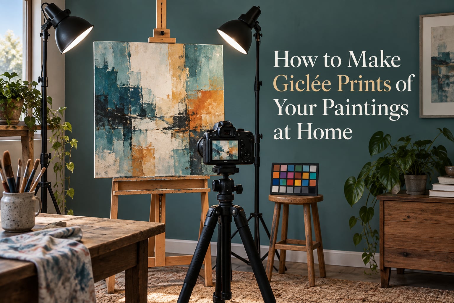
Yes, you can make giclée prints of your own paintings at home, and most painters get excellent results from a wide-format inkjet, a decent flatbed or camera, and archival cotton rag paper. The word giclée simply means an inkjet reproduction made with archival pigment inks on acid-free paper, and nothing about that process requires a professional studio. What separates a print that looks like the original from one that looks muddy is the file you hand the printer, so the work is really about capture, resolution and color management.
I have watched a lot of people do this well and a lot of people do it badly, and the failures are almost always the same three things: a glossy reflection across the varnish, a file too small for the final size, and a color corrected on a screen nobody calibrated. Fix those and the rest is ordinary practice. This guide walks the whole pipeline in the order you need to work in it, including the parts most guides skip, like printer setup and what to do when your sheet is larger than your printer.
Last updated: October 2026
Table of Contents
- Key Takeaways
- What Is a Giclée Print?
- Can You Actually Make Giclée Prints at Home?
- Giclée vs Inkjet vs Dye Ink Print vs Screenprint
- The 8-Step Home Giclée Workflow
- Step 1 – Prepare Your Painting for Capture
- Step 2 – Scan or Photograph Your Painting
- Step 3 – Lighting and Camera Setup
- Step 4 – Resolution and File Format
- Step 5 – Color Management and Retouching
- Step 6 – Set Up Your Printer
- Step 7 – Print a Test Proof and Judge It
- Step 8 – Print the Final, Border, Sign and Number
- Print Size and Resolution Cheat Sheet
- Paper and Substrate Guide
- Framing, Matting and UV Protection
- What It Actually Costs to Print at Home
- Printing Larger Than Your Printer Can Print
- Printer Maintenance and Ink Care
- Common Problems and Fixes
- When Home Printing Stops Making Sense
- Frequently Asked Questions
- Can I make giclée prints at home?
- Is giclée the same as inkjet?
- What is the best printer for giclée prints?
- Do I need to scan or photograph my painting?
- Which color profile is best for printing?
- What resolution do I need for a 24×36 print?
- Do I have to varnish my painting before scanning it?
- How long do giclée prints last?
- Conclusion
Key Takeaways
- A giclée print is a digital, plate-free inkjet reproduction using archival pigment inks on acid-free paper. The term describes the process, not a brand.
- Any modern printer with 8 or more ink channels, a 13 inch or wider maximum sheet, and a manufacturer ICC profile can produce exhibition-grade prints.
- Capture at 300 pixels per inch of the final print size, in 16-bit, as an uncompressed TIFF.
- Capture in a wide-gamut RGB space and convert to printer color at output time. The old advice to work in CMYK from the start throws away color.
- Never varnish a painting before you capture it. Varnish goes on after the final print is made.
- Always print one test proof and judge it under daylight-balanced light before committing to a run.
What Is a Giclée Print?
A giclée print is a high-quality digital reproduction made by an inkjet printer using archival pigment inks on acid-free, museum-grade paper. Because there is no plate or screen, the printer lays down microscopic dots of ink in a stable pattern, which lets it hold subtle tonal gradations and fine detail more faithfully than a dye-ink office print, a screenprint or a lithograph.
The word was coined in 1991 and was never a certification. It is not a brand or a guarantee of permanence, which means anyone can use the word on a bad print. What determines whether a print is archival is the ink, the substrate, the profile and the light, so check the manufacturer spec sheet rather than the seller’s label.
Can You Actually Make Giclée Prints at Home?
Yes, and for most painters the home route is faster, cheaper per copy and far more flexible than sending a file to a lab. The threshold is hardware. You need a printer built for fine art, meaning one with at least 8 ink channels including a dedicated matte black, a maximum sheet size at least as wide as the largest print you plan to make, and a published ICC profile for every paper you intend to use.
A consumer photo printer with dye inks and a glossy-only feed can produce a decent image, but it will not hold neutral blacks or survive a decade on a wall. A dedicated pigment printer at 13 by 19 inches is the sweet spot for a home studio. Going wider, 17 by 22 or 24 by 36 inches, only pays off if you regularly make large work, because the ink and printhead running costs scale with area.
The other half of the answer is time. Capturing and prepping one painting properly takes a few hours including the proof. Once you have a repeatable workflow, a second print of the same file takes minutes, and that is where home printing beats a lab on every axis except colorimetric accuracy on difficult originals.
Giclée vs Inkjet vs Dye Ink Print vs Screenprint
The word giclée sits inside the inkjet family, not beside it. The differences that matter to you are ink chemistry and lightfastness, not the machine.
| Print type | Ink | Typical paper | Archival life | Best for |
|---|---|---|---|---|
| Giclée (archival pigment) | Pigment, 8 to 12 channels, matte and chromatic inks | Cotton rag matte, lustre, canvas | Decades under normal display | Reproductions, editions, originals on paper |
| Standard inkjet photo | Dye, 3 to 6 channels | Glossy photo paper | Years, sometimes much less in strong light | Drafts, reference prints, social media images |
| Office inkjet | Dye, tri-color | Standard copy paper | Not archival | Nothing you intend to keep |
| Screenprint | Thick opaque ink pushed through a mesh | Heavy paper or board | Varies, usually good | Flat bold color, large runs, hard-edged spot color |
If a listing says giclée but names no ink type, no paper and no lightfastness figure, treat it as an ordinary inkjet print until proven otherwise.
The 8-Step Home Giclée Workflow
- Let the painting cure, clean the surface, and keep it unvarnished.
- Scan it flat or photograph it under even, glare-free light.
- Capture at 300 pixels per inch of final size, in 16-bit RAW or TIFF.
- Correct perspective, dust and color in a wide-gamut RGB workspace.
- Calibrate your monitor and build or download an ICC profile.
- Configure the printer driver for the exact paper and print borderless or bordered.
- Print one test proof and judge it under daylight-balanced light.
- Print the final, add a border, sign it, and number the edition.
Step 1 – Prepare Your Painting for Capture
Wait until the paint is fully cured before you capture it. Oil needs weeks to months depending on thickness, and capturing wet paint locks in a surface that will never match the dry painting.
Clean the surface with a soft brush or dry microfiber cloth, and rake a light across it first to catch dust and pet hair. Those specks become several pixels across in the file, so each one reads as a permanent white dot once you clean them up in software. Check the edges too, because a curled corner or a dented stretcher bar becomes a shadow you cannot retouch away.
Step 2 – Scan or Photograph Your Painting
Scan works for small, flat, matte work. Photograph works for anything large, textured, framed, or on any surface a platen will not accept.
| Situation | Better option | Why |
|---|---|---|
| Watercolor or gouache on paper, up to flatbed size | Flatbed scan | No lens, no perspective, no lighting to solve |
| Oil or acrylic on stretched canvas | Photograph | Texture and impasto read as depth, not as artifacts |
| Works larger than your scanner lid | Photograph | Stitching multiple scans misaligns and doubles the retouching |
| Glossy varnish already applied | Photograph with cross-polarization | A polarizing filter on lens and lights kills specular glare |
| Works with thick impasto highlights | Photograph with raking cross-light | Side light reveals surface relief the scanner flattens |
Medium-specific notes worth knowing. Watercolor paper grain needs a scan or a raking light to record tooth, otherwise the paper reads as flat white. Pastel and charcoal carry loose dust that will speckle the file, so capture with a light breeze across the surface and clean before you shoot. Graphite and charcoal have a sheen that shifts with angle, so shoot under even light rather than any directional source. Acrylic skins over within days, so it can be captured early, unlike oil.
A phone camera is genuinely usable for small work in good light. It is not usable where texture and color accuracy matter, because a phone applies aggressive noise reduction and shadow smoothing that flattens surface detail permanently.
Step 3 – Lighting and Camera Setup
Lighting decides whether the print is worth making. Put two identical lamps at roughly 45 degrees to the painting, one at the 4 o’clock position and one at 8 o’clock, at equal distance and equal power. This is the single most important thing in the whole process, and uneven light produces a color cast that no amount of editing fully removes.
Mount the camera on a tripod, dead level with the center of the painting, and as far back as you can while still filling the frame. Distance reduces perspective distortion; shooting a 36 inch canvas from two feet away guarantees keystoning no matter how good the lens is. Use a remote release or the two-second timer.
Set the camera manually: ISO 100 to 200, aperture between f/8 and f/11, manual focus, manual white balance. Shoot RAW so you have a 16-bit file to work from. Put an X-Rite color checker in one frame and crop it out afterward, and you can build a profile for the exact lighting you used.
Step 4 – Resolution and File Format
Resolution is simple arithmetic. Multiply final print width in inches by 300 to get required pixels. A 24 by 36 inch print needs 7200 by 10800 pixels, which is why a 24 megapixel camera is fine for 16 by 20 but marginal at 24 by 36.
| Print size (inches) | Pixels needed at 300 PPI | Megapixels |
|---|---|---|
| 8 x 10 | 2400 x 3000 | 7.2 MP |
| 11 x 14 | 3300 x 4200 | 13.9 MP |
| 13 x 19 | 3900 x 5700 | 22.2 MP |
| 16 x 20 | 4800 x 6000 | 28.8 MP |
| 24 x 36 | 7200 x 10800 | 77.8 MP |
Save as 16-bit uncompressed TIFF. At 8 bits you have only 256 tonal levels per channel, which is exactly where banding becomes visible in smooth skies and skin tones. At 16 bits you get 65536 levels per channel, and the headroom gives you room to correct exposure without posterizing. A JPEG at high quality still stores 8 bits; the quality setting does not change the bit depth.
One term is worth getting right, because it gets confused constantly. PPI describes the density already inside your file, 300 pixels per inch of intended print size. DPI describes the density of ink dots the printer lays down, 300 dots per inch on a good fine art printer. They are set independently, and no DPI setting can rescue an undersized file, because no setting invents detail that was never captured.
Step 5 – Color Management and Retouching
Capture in a wide-gamut RGB space, Adobe RGB or ProPhoto RGB, and let the software convert to printer color at output time using the printer’s ICC profile. Some older guides tell you to set CMYK at scan time, and that advice is obsolete. It forces a conversion before you have any idea what the printer or the paper can do, and it clips saturated colors that the device could have rendered fine.
What an ICC profile does is describe the actual behavior of one printer with one ink set on one paper. It is a translation table between your file’s numbers and the ink combinations that produce the color you see, and without one the driver guesses, which is the source of most disappointing prints.
Retouch in this order, and do not skip the first three for small works. First, correct perspective with a transform so the painting sits square in the file. Second, spot out dust and any scan or sensor defects. Third, set white point and black point on levels so the paper white reads as paper white. Then, and only then, adjust color with curves. If you start adjusting color before fixing geometry and levels, you are compensating for problems that should have been corrected structurally.
Do your color work on a calibrated wide-gamut monitor and judge output under daylight-balanced viewing light around 5000K. Artists on r/ArtistLounge and r/graphic_design describe calibration as the most time-consuming and frustrating part of the process, and it is, but it is also the only part that makes every other step matter.
Expect the print to look darker and slightly less saturated than your screen, especially on matte paper. That is normal. Glossy paper holds more specular reflection and will always look punchier on screen, and matte pigment inks sit on the surface rather than sinking into it. Judge the print, not the monitor, and if the difference is severe your profile is likely mismatched to the paper you loaded.
Step 6 – Set Up Your Printer
This is the part almost every guide skips, and the part that decides whether your settings do anything at all. Install the manufacturer’s ICC profiles from the driver that came with the machine, or download the current set from the support page. A profile that is not installed is a profile your software will never find.
In the print dialog, choose color management as “Printer Manages Color” or its equivalent, then pick the exact media type matching the paper in the feeder. The wrong media setting changes ink dot behavior, black handling and the drying profile, and no amount of editing compensates for it. If the driver offers a matte black for cotton rag, use it. A composite black from cyan, magenta and yellow produces a slightly warm, less dense neutral.
Decide bordered or borderless. Borderless means the image runs to the paper edge, which requires bleed in the file and a handling path that will not crease the border. Bordered leaves a white edge, which is more forgiving and usually what you want for a piece that will be matted.
Feeding the paper matters more than the settings. I have watched people lose a full run to paper that had been sitting in a damp room, and it is entirely avoidable. Let sheets acclimate in the room for a day, load them consistently, and if you are printing a full run make sure you have enough of the identical paper for the whole run. Switching mid-run is where color drift shows up, because the driver re-profiles for the new stock.
Step 7 – Print a Test Proof and Judge It
Print one test proof at the final size, or at a smaller size with the same scaling and the same paper, before you print anything else. A proof is not a draft, it is the test of your color pipeline, and an artist proof is one you keep as a record of the edition.
Judge it under daylight-balanced light, not under warm household bulbs and not on the back of a monitor. Check the three things that break most often: are the whites neutral, are the shadows a true neutral, and are the smooth gradients clean. Correct the specific fault, print a second proof, and only then start the run.
As practitioners on r/fineartprinting point out, a proof only tells you something if it comes from the same printer with the same ink and the same paper.
Step 8 – Print the Final, Border, Sign and Number
Once the proof is right, print the final run. Decide before you start whether this is an open edition, which means unlimited copies from the same file, or a limited edition, which means a fixed number with the remaining sheets destroyed or archived. Limited editions carry more value and require a number on every print.
Mark each print in pencil on the back, never with a marker that can bleed through: title, year, medium, edition size, and your signature. A simple fraction notation like 7/25 or AP for an artist proof is the standard. Keeping a written log of the edition size, the printer, the paper, the ink set and the profile used is what lets you reprint or verify a piece years later.
Print Size and Resolution Cheat Sheet
Use this table to check your capture before you edit anything. If your file is smaller than the target, you have three honest options: print smaller, print at a lower effective resolution, or recapture at a higher resolution.
| Print size (inches) | Required pixels at 300 PPI | Typical camera class that reaches it |
|---|---|---|
| 8 x 10 | 2400 x 3000 | Any modern phone, any camera |
| 11 x 14 | 3300 x 4200 | 24 MP camera or larger |
| 13 x 19 | 3900 x 5700 | 24 MP camera or larger |
| 16 x 20 | 4800 x 6000 | 33 MP camera or larger |
| 24 x 36 | 7200 x 10800 | Medium format or stitched panels |
Two caveats on the arithmetic. Always calculate from your largest print size, because a session that is fine at 8 by 10 becomes soft at 16 by 20. And if a source is already short on detail, as old printed material often is, upscaling adds size but never adds information, and the softness shows most in faces and fine linework.
Paper and Substrate Guide
Match the paper surface to the original medium, because the texture is part of what you are reproducing. A thick impasto oil painting wants matte cotton rag, whose tooth absorbs ink and mutes the highlight reflections that glossy paper would exaggerate. A smooth acrylic or a detailed pen drawing suits a luster or satin finish, which holds more detail without the mirror effect of gloss.
Cotton rag, often sold under names like Photo Rag, is the default for giclée work. It is matte, acid-free with a neutral pH, and usually rated for a long display life in normal indoor conditions. Lustre and satin papers are resin-coated, so they are glossier and handle ink differently; they are less forgiving of fingerprints and are not usually sold as archival. Canvas prints give you texture but add a fixed color cast from the weave, so expect to correct it.
Check three things before you buy. Ask whether the sheet is acid-free and what its pH is. Ask for a lightfastness figure on the ink set you will pair with it, not on the paper alone. And check the maximum sheet size your printer’s manual feed actually accepts, because manufacturer listings often quote a maximum that only applies to a specific tray or borderless mode.
Framing, Matting and UV Protection
Frame under glass or acrylic with UV filtering, and leave an air gap between the glazing and the print. A mat keeps the image plane off the glass, which prevents the print from touching a surface that can hold moisture and off-gassing particles.
Use an archival, acid-buffered mat board rather than a standard white mat, which can yellow over time. Float mounting gives a clean contemporary look and keeps dust out of the image area. Avoid hanging pigment prints in direct sunlight or above a radiator, since heat and UV are what actually shorten a print’s life.
What It Actually Costs to Print at Home
Most guides never put a number on what a print costs to make at home, so here is the arithmetic rather than a guess. The dominant variable is area, because ink consumption scales with coverage and a 13 by 19 sheet has roughly three times the surface area of an 8 by 10. A small-format pigment ink set typically yields a few hundred small full-coverage prints before a cartridge or tank change, and a wide-format set yields proportionally fewer large ones.
Paper is the second line and it is predictable. Cotton rag at 13 by 19 costs several times per sheet what standard photo paper does, so a heavy-handed full-bleed run of fifty sheets on a full-coverage painting is a real expense. Planning borderless prints on smaller sheets, then matting them for framing, cuts both ink and paper use noticeably.
The break-even question is volume, not price. If you expect fewer than roughly 30 to 50 prints a year, a lab’s per-print charge plus their color-managed pipeline will usually cost you less in total than a dedicated fine art printer with its ink and printhead overhead. Commercial print shops treat 36 inch pigment devices as the professional tier precisely because the ink and printhead cost premium is substantial at that width.
So the honest calculation is annual print count times your per-print cost at home, compared against the same count quoted by a lab. If you are selling editions, hosting shows, or producing more than a few large pieces a year, home printing wins. If this is one painting for your own wall, the lab probably wins and you should spend the time saved on the next painting.
Printing Larger Than Your Printer Can Print
Most home fine art printers top out at 13 by 19 or 17 by 22 inches, so a 24 by 36 painting needs either a bigger machine or panel printing. Print the image in sections, each sized to your sheet, with a deliberate overlap of a quarter inch to half inch between neighbouring panels so the seam has room to be aligned.
Assemble the panels on a flat surface, match the overlap with a straightedge, trim the seam with a sharp blade and a metal ruler, and tape the joins from behind with archival tape. That is how a lot of very large exhibition prints have been made for decades.
Canvas is the other route to size. With a gallery wrap, the image continues around the stretcher edges, and the wrap itself hides small alignment problems a flat paper seam would expose. Expect to correct a color cast from the canvas weave, and expect the wrap to crop a few percent of your image, so compose with extra width and height.
Printer Maintenance and Ink Care
Pigment inkjets are reliable when used regularly and miserable when left sitting. Ink that sits in the printhead for weeks can dry at the nozzles, and dried ink shows up as banding in smooth areas, which is the single most common complaint on printer forums.
Run a nozzle check pattern on the manufacturer’s schedule, and clean the printhead when you see missing lines rather than waiting for a full clean cycle. If a line is still missing after cleaning, that nozzle may need a purge cycle or a service visit. A printhead replacement is a real cost, so weekly use matters more than aggressive cleaning.
Between sessions, keep cartridges sealed in their packaging and store paper in a closed sleeve in the same room as the printer, not a garage. Print something small every few weeks if the machine is idle, even a test pattern, to keep the ink moving. Buy ink in the same color configuration the printer was designed for, because mixing a matte black set with a photo black set changes both the look and the maintenance profile.
Common Problems and Fixes
| Symptom | Cause | Fix |
|---|---|---|
| Print looks darker and duller than the monitor | Expected on matte paper, or a mismatched profile | Judge the print under 5000K light; verify the printer paper profile is installed and selected |
| Overall color cast, warm or cool | Uneven lighting at capture, or manual white balance left on auto | Re-shoot with two matched lamps; set white balance from the color checker |
| Glare or hot spot across the painting | Glossy varnish or a specular surface reflecting the lamps | Do not varnish before capture; use cross-polarization if varnish is already applied |
| Keystone or leaning edges | Camera angled or tilted instead of leveled | Tripod at the painting’s center height, far back; correct with a perspective transform |
| Banding in skies or skin tones | 8-bit file, or ink delivery problem | Work from 16-bit source; if banding appears only in prints, run a nozzle check and clean |
| Muddy or warm blacks | Composite black used instead of matte black | Select matte black for the matte black ink channel in the driver |
| Printer warns the paper does not match | Media type in the driver is not the stock loaded | Change the media setting to the exact paper, and check the manual feed thickness |
| Dull print on a normally good sheet | Wrong profile, or a different paper than the profile was built for | Use the profile for that exact stock; build a custom profile for unusual papers |
| Visible seam or misalignment on a large print | Panels overlapped too little or not aligned on a flat surface | Overlap a quarter to half inch, align on a flat surface, trim with a blade and ruler |
| Edges look ragged after borderless printing | No bleed in the file, or the sheet curled from handling | Add 0.125 inch bleed on all sides and let the sheet flatten before printing |
When Home Printing Stops Making Sense
Send the job to a lab or a fine art scanning studio when the color accuracy of a specific original matters more than your control, or when the volume justifies it. Studios with transmission or BetterLight style scanning systems handle very dark and very glossy originals far better than any home setup, and they will deliver a profile matched to the paper and ink they actually use.
A second trigger is a deadline. A local camera shop or library scan-and-print service can turn a painting around in a day. Threads on Photography Stack Exchange are full of painters who started by having a local shop digitize a piece, then moved to printing at home once they understood what a good file looks like.
Neither route makes the other wrong. Learning to capture well is valuable even if you never print a sheet yourself, because the file you hand a lab determines most of the result you get back. Many painters scan and prep at home, then order the edition from a lab for larger runs.
Frequently Asked Questions
Can I make giclée prints at home?
Yes. A fine art inkjet with 8 or more ink channels, a sheet at least as wide as your largest print, and manufacturer ICC profiles can produce exhibition-grade giclée prints in your own studio. The harder part is the file, not the machine: capture at 300 pixels per inch of final size, work in 16-bit, and manage color with a profile matched to your paper.
Is giclée the same as inkjet?
A giclée print is a specific kind of inkjet print, not a different technology. Giclée describes an inkjet process that uses archival pigment inks on acid-free paper. An office dye-ink print is also inkjet, but neither the ink nor the paper is archival, and most sellers use the word loosely.
What is the best printer for giclée prints?
Look for a wide-format pigment printer with at least 8 ink channels including a dedicated matte black, a 13 by 19 inch or larger maximum sheet, borderless capability, and published ICC profiles for the papers it supports. A single matte black channel matters more than the total channel count, because composite blacks from color inks produce a warm, less dense neutral.
Do I need to scan or photograph my painting?
Scan small, flat, matte work such as watercolor or gouache on paper, where the flatbed gives perfect geometry. Photograph anything large, textured, framed, or on canvas, where surface relief and impasto are part of the image. If varnish is already glossy, photograph with a polarizing filter on both the lens and the lights.
Which color profile is best for printing?
Use the ICC profile the printer manufacturer publishes for your exact printer, ink set and paper, and let the software convert your file at output time. Capture and edit in a wide-gamut RGB space such as Adobe RGB or ProPhoto RGB. Converting to CMYK during capture, as older guides advise, clips colors the device could have rendered.
What resolution do I need for a 24×36 print?
At 300 pixels per inch a 24 by 36 inch print needs 7200 by 10800 pixels, or about 78 megapixels. A 24 megapixel camera reaches 13 by 19 inches comfortably and 16 by 20 inches marginally. Beyond that, stitch multiple captures or use a medium format camera, and remember that upscaling adds pixels but never adds detail.
Do I have to varnish my painting before scanning it?
No. Varnish should be the last step, applied after your final print is made. Varnish deepens color and adds a specular sheen that creates glare and hotspots in a photograph, and it also yellows over time, which locks that shift into your printed file permanently.
How long do giclée prints last?
A quality pigment ink print on acid-free cotton rag, displayed away from direct sun and heat and framed with UV filtering under glass, is commonly rated for well over a century of indoor life. The rating depends on the ink lightfastness figure, the substrate pH, and the display conditions. Fading accelerates with direct sunlight, heat and high humidity.
Conclusion
Learning how to make giclee prints at home is mostly a matter of doing four things properly: even two-lamp lighting, a capture large enough for the final size, a 16-bit file in a wide-gamut space, and a profile matched to your paper. Everything else is repetition, and repetition is what makes the second print easier than the first.
Start with one painting you already love, take a test proof, and judge it under daylight-balanced light before you commit to a run. If the color fights you, fix the profile and the white balance rather than pushing saturation in the editor, because that is the shortcut that produces a print you regret hanging. For larger work than your machine covers, panel printing or a gallery wrap canvas will take you past the size limit without buying a bigger printer.