
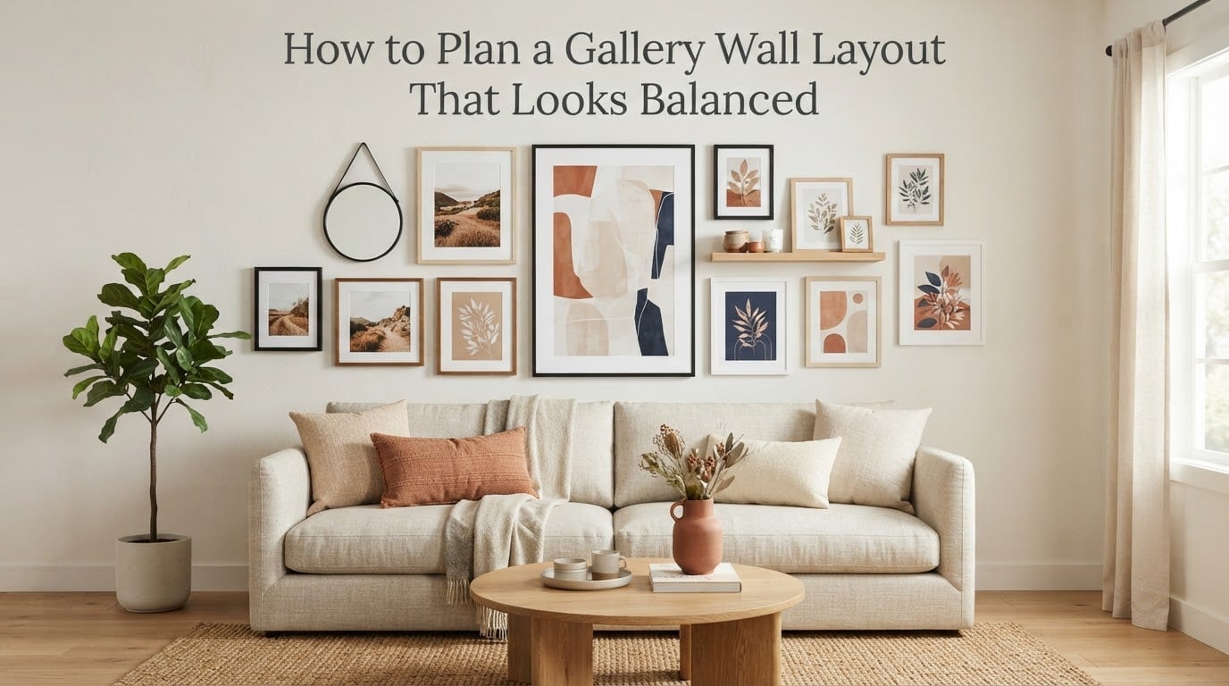
A gallery wall is the fastest way to make a plain wall feel finished, and the fastest way to make a room feel accidental. The difference between the two is planning.
Most people learn this the expensive way. They collect frames for a few months, tape the arrangement onto the floor, then discover that the layout looks completely different once it is vertical. Learning how to plan a gallery wall layout in advance takes about an hour and removes almost all of the risk.
Here is the honest truth about balance. A balanced gallery wall is not one where every frame is the same size or aligned perfectly to a grid. It is one where the visual weight is spread evenly, the spacing is consistent, and one piece clearly leads. Those three things are measurable, which means you can plan them on paper before you touch a hammer.
I have laid out gallery walls in living rooms, stairwells, and narrow hallways, and the same seven steps work every time. Here they are, followed by the measurements, templates, and mistakes that fill in the details.
Table of Contents
- How to Plan a Gallery Wall Layout in 7 Steps
- Step 1 – Choose the Wall and Define What the Wall Is For
- Step 2 – Choose a Layout Type That Matches Your Collection
- Step 3 – Set the Spacing and Alignment Rules Before You Arrange Anything
- Step 4 – Pick an Anchor Piece and Build Outward From the Centre
- Step 5 – Test the Layout on the Wall Before You Make a Hole
- Step 6 – Hang the Wall from the Centre Outward
- Room-by-Room Layout Templates With Measurements
- Height Rules: The 2/3 Rule and Eye Level
- Frame Selection and Colour Palette for a Cohesive Wall
- Mixed Media, Lighting, and Renter-Friendly Hanging
- Common Gallery Wall Mistakes and How to Fix Them
- Frequently Asked Questions
- What is the rule for gallery walls?
- How far apart should gallery wall frames be?
- How high should a gallery wall be hung?
- What is the 2/3 rule for wall art?
- How do I make a gallery wall look cohesive?
- What are the most common gallery wall mistakes?
- Should I use matching frames or mix them?
- How do I hang a gallery wall without nails?
- Is my gallery wall too crowded?
- Are gallery walls still in style?
- Conclusion
How to Plan a Gallery Wall Layout in 7 Steps
- Measure the wall and the furniture below it. Write down the width, the height, and any obstacles such as windows, doors, outlets, or a light switch.
- Pick a theme and a colour palette. Even a loose rule, such as warm tones plus one black frame, prevents the wall from looking chaotic later.
- Choose a layout type. Grid, symmetrical, asymmetrical, salon, or a single statement piece. The layout should match the shape of your wall and the mix of frames you own.
- Decide your spacing number before arranging anything. Two to three inches between frames is the standard gap, scaled up slightly for larger pieces.
- Choose an anchor piece and find the centre line. The largest or most striking frame goes in the middle of the arrangement, not the corner.
- Test the whole layout on the wall with paper templates and tape. Templates at actual size take about fifteen minutes and eliminate the guesswork entirely.
- Hang from the centre outward, one frame at a time. Step back every few frames to check the balance before you commit to more holes.
That is the whole process in brief. The sections below expand on each step with the specific measurements that most guides leave vague.
Step 1 – Choose the Wall and Define What the Wall Is For
Start by understanding what the wall is actually for. A wall above a sofa is a background for conversation, so the art should feel calm enough to sit behind people. A blank wall at the end of a hallway is a spotlight, and it can carry something bold.
Measure the wall twice, in at least two places. Walls are rarely square, and a measurement taken at floor level can be several inches off at the ceiling. Write down three numbers: the wall width, the wall height, and the height of the furniture that sits under it.
Then list the constraints before you shop for anything.
- Any doors, windows, radiators, or vents that reduce usable width
- Wall colour, because a dark wall wants lighter matting and more visible gaps
- Ceiling height, which affects whether a tall narrow arrangement or a wide low one looks right
- Lighting, including whether direct sunlight hits the wall at any point in the day
- How much of the wall is already spoken for by the furniture beneath it
On the theme question, homeowners on decorating forums consistently name colour as the single biggest factor in whether a mixed collection looks curated or messy. You do not need a strict palette. You need one repeated element that ties the wall together.
The cheapest version of a theme is a shared material. All black frames, all natural wood, or all white moulding does the same work as a colour scheme and takes less decision-making.
Step 2 – Choose a Layout Type That Matches Your Collection
There are five layout types that cover almost every wall. The right one depends on whether your frames match, whether your wall is wide or tall, and how much tolerance you have for small shifts in position.
| Layout type | Best when | Strength | Watch out for |
|---|---|---|---|
| Grid | You own four to nine frames of the same size | Instantly tidy, very forgiving of a crooked wall | Looks mechanical if the frames are plain |
| Symmetrical | Your collection mirrors around a centre line | Reads as calm and formal | Fails badly if one side drifts even slightly |
| Asymmetrical | Mixed sizes, portraits and landscapes | Shows off an eclectic collection | Needs consistent gaps to avoid clutter |
| Salon or organic | A large, informal collection over a large wall | Handles any mix of pieces | Easy to overfill; the hardest to plan |
| Single statement | A narrow wall or a small space | Cheapest and quickest to get right | Only one arrangement, so pick carefully |
Use this decision flow when you are stuck: if all your frames are the same size, use a grid. If they mirror each other, use symmetrical. If they differ, use asymmetrical. If you have more than about twelve pieces on one large wall, use salon spacing with a loose theme.
For narrow walls between a door and a window, the single statement approach is underrated. One large piece centred in the space looks more deliberate than five small frames squeezed into the same width.
Anchor piece definition: the anchor piece is the largest, most detailed, or most colourful item in the arrangement. It sets the visual weight that everything else is measured against. In a grid, the anchor can be any frame. In an asymmetrical layout, it should sit on or very near the centre line.
Step 3 – Set the Spacing and Alignment Rules Before You Arrange Anything
Spacing is the rule that separates a balanced wall from a cluttered one, and it is the part people get wrong. The standard gap is two to three inches between frames, and the gap should not vary from frame to frame.
Scale the gap to the pieces rather than using one number for everything.
- Frames under about 8 inches wide: about 2 inches of gap
- Frames between 8 and 16 inches: about 2.5 to 3 inches
- Large frames over 16 inches: about 3 to 4 inches
- Frames with thick moulding: add half an inch to the gap so the edges read as separate
That last point is the one most guides miss. A thick profile eats into the visual gap, so two chunky frames placed 2 inches apart look closer together than two slim frames at the same measurement.
Next, choose your alignment. Edge alignment means the outer edges of the frames line up, which produces a clean rectangular block. Centre alignment means the centres of the frames line up, which gives a looser, more relaxed rhythm and works better with mixed sizes.
For vertical versus horizontal spacing, treat them separately. Horizontal gaps between frames are almost always the same. Vertical gaps are often made slightly smaller, and the space above the top row is often slightly smaller than the space below the bottom row. That single adjustment is what makes a wall look settled rather than drifting.
Two more rules worth committing to memory. Never leave one wide gap on one side to make something fit, and never align a frame to the edge of the sofa or table below unless that piece is the anchor and it is centred on the furniture.
Step 4 – Pick an Anchor Piece and Build Outward From the Centre
Start from the middle of the arrangement and work outward in both directions. Beginners on decorating forums repeat this advice almost word for word, and it works because the centre-out method keeps visual weight even by default.
To find the centre line, mark the midpoint of the wall area you are using with a small pencil cross or a strip of tape. If the anchor piece is off-centre, place its centre on that line, not its edge.
Add the second-largest piece next, diagonally or horizontally adjacent, keeping the same gap. Continue with the pieces you feel most sure about, and save the awkward ones, the small square frames, and the odd sizes for last.
On visual weight: a large dark frame carries more weight than three small pale ones. If one side of your arrangement feels heavier, add a lighter or smaller piece there rather than shifting everything. Moving pieces to fix weight is far more disruptive than adding one.
Stand back ten feet after each addition. At that distance you cannot judge individual frames, only the overall shape, which is exactly the judgement you want to make.
Step 5 – Test the Layout on the Wall Before You Make a Hole
Tape the layout to the wall. This is the single highest-value step in the whole process, and it costs nothing but printer paper and masking tape.
- Trace or measure each frame, including the mat and frame edge.
- Cut a paper template at actual size for every piece.
- Number each template so you know what it is.
- Tape the templates to the wall exactly where you want them.
- Step back, photograph the wall, and look at the photo rather than the wall.
A phone photo flattens perspective the same way your eye does across a room, so it is a surprisingly accurate test. It also catches uneven gaps that you stop noticing after a few minutes of standing there.
Laying the arrangement out on the floor first is a reasonable idea for deciding the composition, but be aware of the limitation people mention most often: a floor layout rarely translates directly to the wall because of the change in viewing angle. Use the floor for shape decisions and the wall for spacing decisions.
Digital gallery wall builder tools are useful when you want to try dozens of arrangements quickly. Forum users regularly recommend them for previewing, and regularly warn that the free versions are limited.
| Tool type | Best use | Strength | Limitation |
|---|---|---|---|
| Online gallery wall builder | Trying layouts with your real frame dimensions | Instant rearrangement, no paper | Free versions often limit the number of frames |
| Room mockup software | Placing art into a photo of your actual room | Shows the wall in context | Steeper learning curve, often paid |
| General design tool | Building a palette and a colour board | Strong for planning colour cohesion | No built-in spacing logic |
| Paper templates and tape | The final check before hanging | Actual size, free, fully reliable | Takes about fifteen minutes per layout |
| Floor arrangement | Deciding overall shape and balance | Fast to rearrange | Perspective differs from the wall |
Use the digital tool to explore and the paper template to confirm. Skipping the paper step is the most common shortcut that leads to a second round of holes.
Step 6 – Hang the Wall from the Centre Outward
When the layout is confirmed, work from the anchor piece outward. Hanging the centre first means any later adjustment only affects the edges, where small changes are far less noticeable.
- Mark the centre line of the arrangement on the wall with a pencil or a small piece of tape.
- Mark the top edge of the anchor piece at your chosen height, and check the level before drilling.
- Hang the anchor piece and step back to confirm the height reads correctly from across the room.
- Measure from the anchor frame to the next position rather than eyeballing, and use the same gap you tested.
- Use a spirit level on a pencil line across the wall to keep horizontal rows true, especially in older homes where walls bow.
- Hang in pairs, one on each side of the centre, then re-check the balance.
- Fill in the remaining pieces last, working outward and inward as space allows.
- Step back ten feet and photograph the finished wall.
On height, the standard reference is eye level, roughly 57 to 60 inches from the floor to the centre of the arrangement. If you are hanging above furniture, the more useful measurement is the gap between the top of the furniture and the bottom of the lowest frame, which is usually six to eight inches.
For renters, the options have improved a lot. Adhesive picture hangers rated for the weight of each frame, removable strips for light frames, and pressure-release clip frames all work, provided the wall surface is painted drywall rather than plaster or fresh paint. The main failure mode is applying adhesive to a wall that has been recently painted, so wait a few weeks after painting before using anything sticky.
Heavy or valuable pieces should always go into studs or use proper anchors. Adhesive is fine for light frames, not for a large mirror or a heavy frame in a hallway where people brush past it.
Room-by-Room Layout Templates With Measurements
Almost no competitor guide covers the specific scenarios people actually search for. Here are six starting points that already have the proportions worked out. Treat these as baselines and adjust to your own measurements.
Above a sofa
The art should span about two-thirds to three-quarters of the sofa width. Centre the arrangement on the sofa’s midpoint, not the wall’s, since most sofas do not sit centred on the wall. Leave six to eight inches between the sofa back and the bottom frame edge. For a wide wall with a low sofa, a horizontal three-row arrangement works better than a single tall stack.
Above a bed
Aim for art that spans roughly two-thirds of the bed width and keeps a wider gap, around eight to twelve inches, above the headboard so the arrangement does not feel pressed against it. A single wide piece or a horizontal row suits most headboards. Avoid a tall vertical arrangement here, because it competes with the tall headboard.
Hallway
Hallways punish wide arrangements. Keep the total width inside the wall opening by six inches on each side, and use a vertical or staggered column. If the hallway is long, a row of three evenly spaced clusters often looks better than one continuous strip. Keep the centre height consistent down the hall, around 57 inches, so the eye does not bounce.
Staircase
Follow the rise of the stairs. Keep each frame’s bottom edge a consistent distance above the stair nose as you travel upward, and keep the gap between frames small, because the diagonal already provides visual separation. A single row of frames climbing the wall is the most reliable approach for a narrow staircase.
Above a console table
Because a console is a narrow piece, the arrangement can be tight without feeling crowded. Match the art width to roughly the console width or go slightly wider, up to about a third beyond each side. Keep six to eight inches above the surface, and a low horizontal arrangement usually looks best here.
Small or awkward walls
When the wall is narrow or interrupted by a door, a window, or a thermostat, work with the constraint instead of fighting it. One piece centred in the usable space beats a cramped grid. Two frames stacked vertically in a tall, narrow gap also work well. A small wall does not need more art, it needs better proportion.
Height Rules: The 2/3 Rule and Eye Level
The 2/3 rule states that wall art should be roughly two-thirds the width of the furniture it sits above. It is a starting point, not a law, but it fixes the most common proportion error, which is art that is too small for the furniture beneath it.
In practice, treat it as a range. Art that matches the sofa width exactly can look like an afterthought, while art that stretches nearly the full wall can feel disconnected from the furniture. Somewhere between two-thirds and the full width reads as intentional.
Height works on the same principle. The centre of the arrangement, not its top edge, should sit at eye level, around 57 to 60 inches from the floor. When furniture is involved, the gap rule takes over and eye level becomes less important.
One exception worth knowing: in a room where most people sit rather than stand, hanging slightly lower often looks better because the art relates to where your eyes actually rest while seated. If you are unsure, hang the templates and sit down to check.
Frame Selection and Colour Palette for a Cohesive Wall
Matching frames and mixed frames both work. They just produce different results, and the choice should follow your collection rather than a rule.
Choose matching frames when your art is visually quiet or when the wall itself is busy, such as a patterned wallpaper or a strong wall colour. Uniform frames give the eye one less thing to process and let the artwork lead.
Choose mixed frames when you want texture and the art itself is calm. Mixed mouldings read as a collection rather than a set, and the varying edges create depth. Keep the palette narrow so the mix stays controlled: two wood tones, one metal, one painted frame, for example.
- Wood: warm, forgiving, works with almost any palette
- Metal: crisp and modern, pairs well with white walls
- Acrylic or perspex: the lightest option, easy to clean, less reflective than glass
- Glass: adds depth and formality, but reflects the room and can be visually busy in a bright space
For colour, the simplest cohesive strategy is to pull three colours from the artwork itself and repeat them across the wall. One colour can come from the frames, one from the mats, and one from the artwork. Matting is the underrated tool here, because a consistent mat colour can make frames from completely different collections look related.
For colour by wall: a dark wall benefits from lighter mats and wider visible gaps, while a white or pale wall lets frames recede and the art carry the colour. If the wall is a strong colour, matching frames to it in a flat finish is a clean way to make the arrangement look deliberate.
Mixed Media, Lighting, and Renter-Friendly Hanging
Three things lift a gallery wall from a set of frames into a display with depth.
Mixed media. A mirror, a plate, a small shelf, or a three-dimensional object breaks the flat plane and casts small shadows, which makes the arrangement feel physical. The rules are simple: space three-dimensional pieces more generously than flat frames, usually four inches or more, and keep the total number of objects under about a third of the pieces on the wall so the art stays dominant.
Lighting. Plan light before you hang rather than after, a step people in decorating forums say they most often regret skipping. A picture light above the arrangement or a pair of sconces at either end works well. Keep direct sunlight off artwork if the wall gets strong sun, since fading is slow and permanent. Warm light around 2700K suits wood and paper tones far better than cool overhead lighting.
Renter-friendly mounting. Lightweight frames can hang from removable adhesive hangers rated above the frame’s weight, ideally with two hangers per frame. For slightly heavier pieces, look for hard-wall picture hangers that use a small pin rather than a full nail. Clip-style frames swap the glass for clear perspex, which cuts weight noticeably and reduces reflections. Check the adhesive weight rating every time, and never use adhesive on freshly painted walls.
Common Gallery Wall Mistakes and How to Fix Them
- Art that is too small for the furniture below it. Fix: widen the arrangement to about two-thirds of the sofa, console, or bed width.
- Inconsistent gaps. Fix: pick one spacing number, write it down, and measure every gap instead of eyeballing.
- Hanging too high. Fix: drop the centre of the arrangement to about 57 to 60 inches, or reduce the gap above furniture to six to eight inches.
- Centring on the wall instead of on the furniture. Fix: mark the furniture midpoint and align the arrangement to that, even if the wall is off-centre.
- Skipping the paper template test. Fix: tape full-size paper templates to the wall and photograph them before drilling.
- Mixing frame styles with no shared element. Fix: unify the wall with one repeated colour, either in the frames or in the mats.
- Filling every available inch of wall. Fix: leave clear wall around the arrangement. Empty space around a gallery wall is what makes it read as a designed group rather than a scatter.
- Adjusting one frame to fix the balance. Fix: add a lighter or smaller piece to the heavy side instead of moving several frames.
- Hanging without checking the level across the wall. Fix: draw one pencil line with a spirit level and use it as the reference for the whole row.
- Forgetting light and shadow. Fix: check the wall at different times of day and leave a small gap where a thick frame will cast a shadow.
If your arrangement feels crowded, take one piece off and stand back. If it feels sparse, the answer is usually to add one more item rather than to enlarge every gap.
Frequently Asked Questions
What is the rule for gallery walls?
The core rules are: leave a consistent 2 to 3 inch gap between frames, centre the arrangement on the furniture below rather than the wall, hang the centre of the arrangement at about 57 to 60 inches from the floor, and let the art span roughly two-thirds of the furniture width. One anchor piece should lead the arrangement.
How far apart should gallery wall frames be?
About 2 inches for small frames under 8 inches wide, 2.5 to 3 inches for medium frames, and 3 to 4 inches for large frames over 16 inches. Add roughly half an inch if the frames have thick moulding, since a wide profile makes the gap look tighter than it measures.
How high should a gallery wall be hung?
Aim for the centre of the arrangement at 57 to 60 inches from the floor. Above furniture, the gap between the top of the furniture and the bottom of the lowest frame matters more, and 6 to 8 inches works for most sofas and consoles.
What is the 2/3 rule for wall art?
The 2/3 rule says wall art should be about two-thirds the width of the furniture beneath it. It is a starting point rather than a fixed measurement, and many designers go a little wider, up to three-quarters or the full furniture width, for a more generous look.
How do I make a gallery wall look cohesive?
Pick one repeating element before you hang anything, such as a shared frame colour, a single mat colour, or a narrow palette pulled from the artwork. Cohesion comes from repeated material and consistent spacing rather than from matching every frame.
What are the most common gallery wall mistakes?
The most common errors are art that is too small for the furniture below, inconsistent gaps between frames, hanging the arrangement too high, centring on the wall instead of on the furniture, and skipping the paper template test before drilling holes.
Should I use matching frames or mix them?
Use matching frames when the art is quiet or the wall colour is strong, so the artwork leads. Mix frames when the art is calm and you want texture, and keep the palette narrow, for example two wood tones, one metal, and one painted frame.
How do I hang a gallery wall without nails?
Use adhesive picture hangers rated above the weight of each frame, ideally two per frame, or hard-wall picture hangers that use a small pin. Perspex clip frames cut weight and reduce reflections. Never apply adhesive to freshly painted walls, and check the weight rating every time.
Is my gallery wall too crowded?
Step back ten feet and photograph it. If you cannot identify individual pieces, the wall is overcrowded. Remove one frame and re-check, because the gap is usually around 2 to 3 inches and consistent rather than generous.
Are gallery walls still in style?
Yes, gallery walls remain a standard way to style a wall, and current styling leans looser and less rigidly gridded than earlier versions. The most popular approach mixes frame sizes and materials around one anchor piece with generous empty space around the group.
Conclusion
Knowing how to plan a gallery wall layout comes down to a handful of decisions you can make in one sitting: measure the wall, choose a theme, pick the layout type, commit to one spacing number, and choose an anchor piece for the centre.
The rest is verification. Tape paper templates to the wall, photograph them, adjust until the balance reads right from across the room, and then hang from the centre outward.
Start with the templates this week. Once the pieces are on the wall in the right places, every later adjustment becomes a small, cheap fix instead of a second round of holes.