
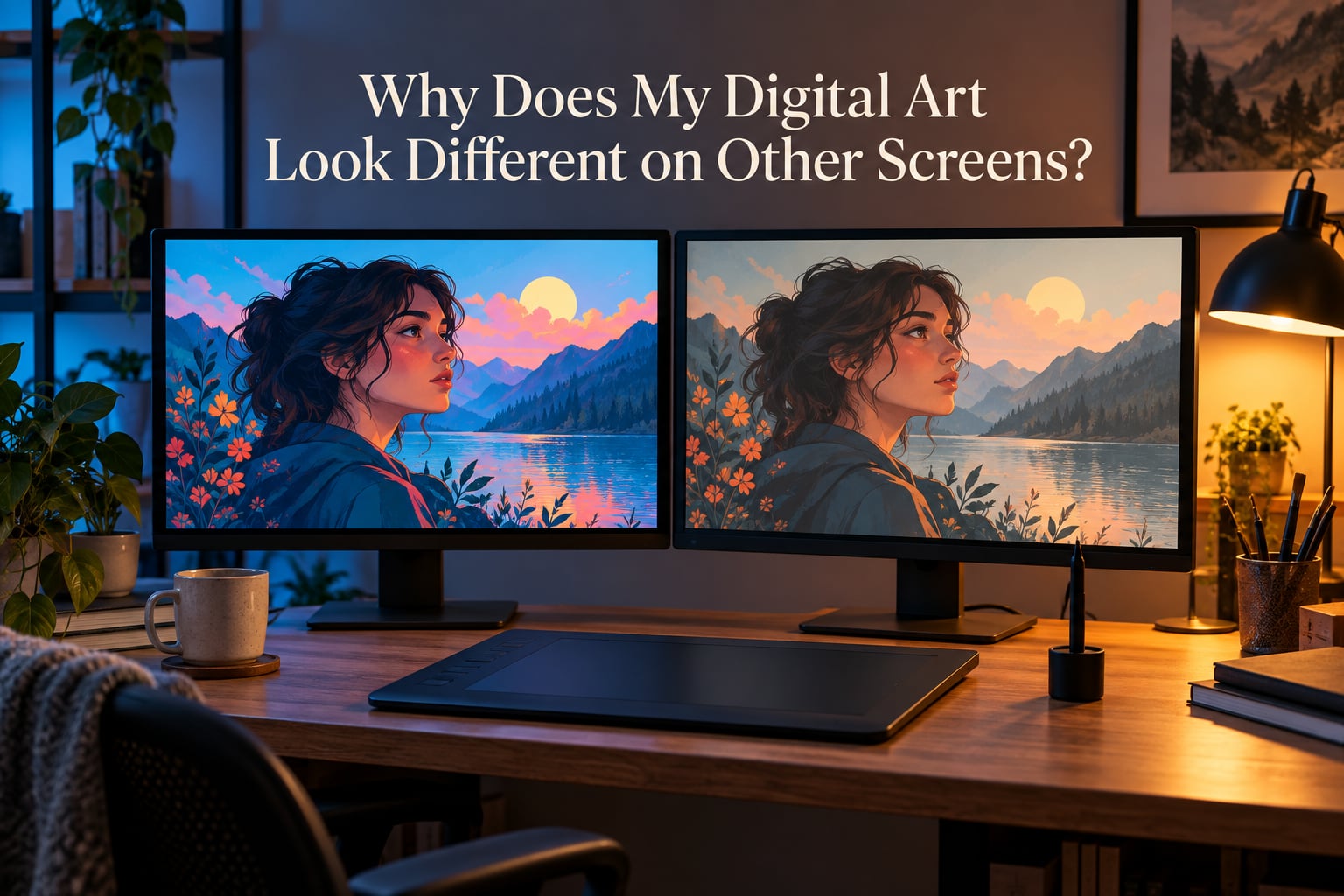
Your digital art looks different on other screens for four reasons: a color space mismatch, a display that is uncalibrated or wide-gamut, a viewer that does not read color profiles, and ambient light or picture settings changing how the image appears. The good news is that your file is almost certainly fine. Screens disagree with each other, not your painting.
I have spent years watching this exact question appear again and again in the same places. A r/DigitalArt thread titled “why does my drawing look different on my tablet.” A graphicdesign.stackexchange question about the same file looking different in the art program than on the internet. A r/Monitors post from someone running Krita across three screens who wrote that they “look completely different in color, and this is frustrating.”
Every one of those threads gets the same short answer, and almost nobody follows it through to a fix. So this guide does the whole job. It explains what a color space actually is in artist language, gives you the exact menu path to check your own screen on Windows, macOS, iPad and Android, walks through the settings in Procreate, Clip Studio Paint, Krita and Photoshop, and tells you what to export so your art survives the trip to Instagram or a client.
If you only read one section, read the four causes below and then the export section. That pair solves most of the problem for most people.
Table of Contents
- Why Does My Digital Art Look Different on Other Screens?
- What a Color Space and a Color Gamut Actually Mean
- sRGB vs Display P3 vs Adobe RGB Compared
- How to Check Your Own Screen’s Color Profile
- How to Fix It in Procreate, Clip Studio Paint, Krita, and Photoshop
- What to Export and Upload So Your Art Looks Consistent Online
- Why Your Phone and Tablet Show Something Else
- Matching Two Monitors Side by Side
- Monitor Calibration on a Hobbyist Budget
- Why Line Art and Flat Colors Shift the Most
- Does the Difference Actually Matter? A Triage Guide
- Glossary: Color Management Terms in Plain English
- Frequently Asked Questions
- Why do the colors on my two monitors look different?
- How do you know if your monitor is calibrated correctly?
- How do you color calibrate two different monitors?
- Is 95% sRGB good?
- Is sRGB mode the most color accurate?
- Why does my digital line art look so bad on other screens?
- Why do my print colors not match my screen?
- What color space should I export digital art in?
- Conclusion
Why Does My Digital Art Look Different on Other Screens?
There are four root causes, and they stack on top of each other. Work through them in order because each one makes the next harder to judge.
1. The file, the software, and the screen disagree on the color space
A JPEG, PNG or PSD carries a label saying which color space its numbers belong to. When the app that opens the file and the screen showing it agree on that label, you see what you intended. When they disagree, the same numbers get pushed through a different set of primaries and the image shifts hue and saturation.
This is the most common cause and the least visible to beginners, because nothing errors out. The image just looks off. As the r/Monitors explanation that repeats across those threads puts it, a wide-gamut screen “can display more colours than sRGB, so gives oversaturated images if there’s no colour correction.” That oversaturation is the file being read with the wrong rulebook.
2. The display is uncalibrated, or wider-gamut than you assumed
Most panels are not accurate out of the box. A factory-calibrated screen still shifts as it warms up, and an uncalibrated one can have a green or magenta cast that you stop noticing within a day. Meanwhile a wide-gamut laptop or tablet screen is genuinely more saturated than the sRGB monitor you have been working on for years, so your art reads as garish the moment it leaves your desk.
3. The viewer is not color-managed
Color-managed software reads the monitor profile and converts the image into that screen’s space. A lot of software is not. The same saved file can look different in your drawing app, in a browser, in a stock photo viewer, and in a chat app, purely because those four programs handle color differently.
4. Ambient light and device picture settings shift the result
True Tone, Night Shift, adaptive brightness, auto white balance, and a dim room versus a bright window all change perceived color without touching a single pixel value. This cause feels random because the same device can change its behavior between Tuesday morning and Tuesday evening.
The r/ClipStudio search result surfaced in this research carried a thread titled “HELP: My colors look different on other screens,” which is the most concise description of the whole problem that exists anywhere. You are not doing anything wrong. Several independent variables are all adjusting at once.
What a Color Space and a Color Gamut Actually Mean
A color space is an agreement about what numbers mean. When a file says a pixel is R=200, G=100, B=50, the color space is the document that says those three numbers should look like a specific warm orange. sRGB is that document for the web. Display P3 is the document Apple devices use. Adobe RGB is the document photo and print people use.
A color gamut is the physical set of colors a device can produce. Your monitor has a gamut. Your phone has a bigger one. Your printer has a different one again, and it is usually a slice of your monitor’s. A screen cannot show a color outside its gamut no matter what the file asks for, which is exactly why out-of-gamut art turns into flat blocks of identical color.
Three more terms come up constantly and they are worth getting straight.
- Primaries are the pure colors a device mixes everything else from, usually red, green and blue. Two screens with different primaries disagree on skin tones and saturated reds even when both claim to show the same file correctly.
- White point and D65 describe what the screen shows for pure white. D65 at 6500K is the shared reference. A screen set to a warmer white point will make your whole image look yellow against a cooler screen nearby.
- Delta E is a number describing how far apart two colors are. Under 2 is the threshold most people cannot see; under 1 is what a well-calibrated display delivers on solid patches.
Gamma 2.2 describes how light values translate to brightness, and it is why midtones look muddy on badly set up screens. Luminance, measured in cd/m2, is how bright the screen is overall, and it changes how colors look far more than most artists expect.
sRGB vs Display P3 vs Adobe RGB Compared
Here is the comparison that settles most arguments on art forums. Note the last row, which is the one that actually matters for your work.
| Color space | Gamut coverage | Where you meet it | What it does to your art |
|---|---|---|---|
| sRGB | The baseline every screen covers at minimum | Web browsers, Instagram, ArtStation, DeviantArt, most exports | Shows as intended on essentially every device |
| Display P3 | About 35% wider than sRGB | iPhone, iPad, recent MacBook and iMac displays, many modern laptops | Wide-gamut art looks richer here and oversaturated on older sRGB screens |
| Adobe RGB | Wider still, covering some cyans and greens sRGB cannot reach | Photo monitors, print workflows, Adobe RGB export presets | Flattens and clips on sRGB screens, useful mainly for print |
| ProPhoto RGB | Very wide, requires 16-bit | Advanced photo editing only | Unusable for illustration delivery, banded shadows |
| What to actually use | Work in sRGB and export in sRGB. It is the only space your viewer is guaranteed to be reading correctly. | ||
Two questions come up constantly alongside this table. Is 95% sRGB good? It is fine for illustration and more than most working artists need, though the missing 5% shows up in the deepest saturated blues and greens. Is sRGB mode the most color accurate? On a wide-gamut panel, no, sRGB mode is the least accurate mode available, because it deliberately clips the extra colors the panel can show.
So there is a real trade-off. sRGB mode on a wide-gamut screen means you see true sRGB colors but you cannot see the full gamut. Wide-gamut mode means you see more of the space your file lives in, but anything outside sRGB is only visible to you and invisible to everyone you send it to.
How to Check Your Own Screen’s Color Profile
Before changing anything in your art software, find out what your screen reports. It takes about a minute per device.
On macOS
Open System Settings, then Displays, then the Color profile option next to your display. A built-in MacBook or iMac screen reports a Display P3 profile. An external monitor usually reports a profile installed from the manufacturer, or a generic sRGB profile if nobody ever profiled it. That generic sRGB entry on a wide-gamut panel is a common reason art looks wrong on a Mac desktop setup.
On Windows
Right-click the desktop, choose Display settings, then scroll to Color profile, then Advanced display, then Color management. The active ICC profile appears at the top. If the list only contains sRGB IEC61966-2.1 on a wide-gamut monitor, that monitor has never been profiled and you are working blind.
On iPad and iPhone
There is no profile menu to dig through. The display is a calibrated wide-gamut Display P3 panel, and the operating system converts sRGB content automatically. What you can control is True Tone in Settings, then Accessibility, then Display and Text Size, and Night Shift in Settings, then Display and Brightness. Turn both off before you judge any color decision.
On Android
Behavior varies by manufacturer, which is why the related search “why does my digital art look different on other screens android” keeps circling. Recent flagships run a wide-gamut mode that behaves like Display P3, while mid-range and older panels sit closer to sRGB. Check Settings, then Display, for a screen mode, eye comfort, or color enhancement option, and turn adaptive brightness off before comparing. On some devices the developer options menu also exposes a color mode toggle that switches between sRGB and wide gamut.
Once you know your profile, the free tools worth trying are DisplayCAL with the ArgyllCMS engine for profiling, and browser-based gamut test pages that paint solid patches of pure primaries so you can see immediately whether your panel clips them.
How to Fix It in Procreate, Clip Studio Paint, Krita, and Photoshop
This is the part that artist-specific documentation almost never covers. Each of these programs handles working space and export space differently, and getting them consistent removes most of the guessing.
Procreate
Procreate is Display P3 native on iPad. The setting lives under the Actions gear, then Canvas, where you can see the color profile the document uses. For drawing and for anything you plan to post online, create documents in sRGB. A P3 document on an sRGB laptop screen will look punchier on your tablet and duller everywhere else, which is precisely the mismatch artists complain about when they move between iPad and desktop.
Clip Studio Paint
Go to File, then Preferences, then the General tab, and set the color space to sRGB. The working space and the color profile used for new documents both matter here, and mismatched settings between the two are a quiet source of shifted flats. In the Save dialog, pick sRGB rather than any of the other profile options, and make sure the ICC profile is embedded rather than stripped.
Krita
Open Settings, then Configure Krita, then Color Management. You will see a monitor profile setting and a default image profile setting. Set the monitor profile to your screen’s actual ICC profile, and set the default image profile to sRGB. If the monitor profile field says sRGB but you own a wide-gamut display, Krita is deliberately narrowing everything to sRGB. That is a defensible choice for illustration, but you should make it on purpose rather than by default.
Photoshop
Photoshop is the most color-managed of the four. Open an image, then Image, then Mode, and check the profile shown in the panel. Convert it with Edit, then Convert to Profile, and choose sRGB IEC61966-2.1 as the target. For saving, use File, then Export, then Export As, and set the color profile to sRGB in the export options.
One rule covers all four programs: the working space and the export space should be the same color space unless you have a specific reason. Divergence between them is what produces art that looks right in the app and wrong everywhere else.
What to Export and Upload So Your Art Looks Consistent Online
Export in sRGB, embed the ICC profile in the file, and use 8-bit PNG for line art and flat color. That single combination is what nearly every platform expects, and it removes almost every surprise.
Embedding matters more than most people expect. A file with an embedded sRGB profile can be interpreted correctly by any color-managed viewer. A file stripped of its profile has to be guessed at, and the guess varies by app, which is one more source of the shift you are trying to eliminate.
Here is the part almost no one warns you about. Instagram, X, ArtStation and DeviantArt all re-encode and re-tag uploaded images to sRGB on their end. If you upload a wide-gamut P3 file, the platform converts it for you, usually well but not always gently. Highly saturated colors get clipped, and the conversion happens after you hit upload, so the version on the platform can differ from the version on your hard drive. Exporting sRGB yourself means the platform’s conversion has almost nothing to do, which is why it produces the most predictable result.
A practical export preset that works across all four programs: sRGB color space, embedded profile, 8 bits per channel, no sharpening on export, full dimensions. If the destination is a client deliverable rather than a post, send that same file plus a flattened JPEG as a backup, since some review tools handle one format better than another.
Why Your Phone and Tablet Show Something Else
Most reports of art looking wrong start with the same moment, sending a piece to your phone and watching it change. Three things are happening at once.
Automatic gamut conversion is first. Modern iPhones and many Android flagships display P3 and will render sRGB content slightly more saturated than an sRGB monitor does, even though both are technically correct. The file did not change. The surface it landed on reflects more color.
Adaptive tone and white balance come next. True Tone on iPhones and equivalent eye-comfort modes on Android sample the ambient light and shift the display’s white point and brightness continuously. Hold the same phone in a warm room and in daylight and the same image will look like two different pieces. Night Shift pushes the opposite way, adding a heavy yellow cast that makes digital art look badly off.
Panel contrast is the third factor. AMOLED phones have genuinely black blacks, so flats and line art gain contrast that your monitor does not give them. A dark line that reads as subtle charcoal on your screen can look either heavier or thinner on a phone depending on brightness. Large flat areas also reveal banding on high-contrast displays, which makes smooth gradients look worse than they do on a monitor.
You cannot control what your viewer does with their phone. What you can control is the export, and sRGB with an embedded profile is the version most likely to look like your intent on the widest range of devices.
Matching Two Monitors Side by Side
A pen display next to a main monitor is the setup that causes the most frustration while actually working, because you are looking at both at once. Matching them takes four steps.
- Profile each screen separately. Every display gets its own ICC profile, even two identical models. Do not copy a profile between screens.
- Put both into sRGB mode if they offer a choice. This costs you gamut on wide-gamut panels and buys you agreement, which is the better trade for illustration.
- Set both to the same target brightness and white point. Roughly 120 cd/m2 with the white point at D65 6500K is the usual target, and matching each screen to the same target matters more than matching either one perfectly.
- Turn off adaptive brightness, True Tone and Night Shift on every screen you can. These features are designed to change the picture, and they will fight every setting you make above.
Verify with a neutral gray test image. If the same gray looks different on the two panels while you view them together, your eyes are adapting to the brighter one and the panels are fine. If it looks different when you match them one at a time, the profiles are wrong.
Monitor Calibration on a Hobbyist Budget
Calibration is not all-or-nothing, and the four useful tiers are worth knowing.
| Approach | What you do | What you get | Best for |
|---|---|---|---|
| Nothing but settings | Set sRGB mode, fix brightness, disable night and adaptive modes | Removes the worst errors for no cost at all | Almost everyone should start here |
| Free software | DisplayCAL with ArgyllCMS, or a system visual equalizer | Better profiles, some manual work, gamma and white point on target | Patient hobbyists with good panels |
| Entry colorimeter | A hardware device that measures emitted light and generates a profile | Reliable profiles and repeatable settings, delta E around 2 | Anyone selling work regularly |
| Professional colorimeter | Research-grade hardware with better repeatability | Delta E under 1, plus ambient light measurement | Commissioned and print-heavy work |
Hardware is not about buying a magic box. It is about reading the light your panel is actually emitting, so the profile describes your screen instead of describing an ideal screen that does not exist.
Two preparation steps matter as much as the device. Let the monitor warm up for 20 to 30 minutes before calibrating, because panel output shifts as it heats. Then control the room, close curtains, and aim for dim neutral ambient light. Calibrating in a bright room to compensate for that brightness is a common way to end up with a display that looks correct at night and wrong during the day.
Recalibrate every few months, and immediately if you move the monitor, change rooms, or notice a cast. Budget hardware such as the Spyder5 line or an X-Rite i1Display is the usual entry point that the research surfaced.
Why Line Art and Flat Colors Shift the Most
Line art and flat fills are the least forgiving artwork, which is why they trigger the most complaints. A smooth gradient hides color errors because any error becomes part of the blend. A flat fill and a one-pixel stroke have nowhere to hide.
Three specific effects stack up. Pure black is interpreted differently by every device, since a screen that cannot reach true black lifts it to a dark gray, so your crispest line becomes a soft one. Thin lines get resampled when a viewer scales an image down, and a 1px stroke at reduced size blends into the background, which is the resampling artifact behind the “why does my digital line art look so bad” question. Out-of-gamut flat colors clip to the nearest achievable value, so two different colors in your palette render as one identical block.
The fixes are unglamorous. Keep line art on a non-pure black unless you have checked the output. Export at a size close to how it will be displayed so downscaling stays minimal. Keep your palette inside sRGB. And check the piece on a phone, where the pixel density difference is largest.
Does the Difference Actually Matter? A Triage Guide
Not always. A little shift is the price of viewing on hardware you do not control, and chasing perfect agreement across every device is not a realistic goal for an illustrator.
| Symptom you see | Most likely cause | What to do |
|---|---|---|
| Oversaturated on one screen, dull on another | One screen is wide-gamut, the file is sRGB, one app is not color-managed | Set both screens to sRGB mode, export sRGB, embed the profile |
| Washed out everywhere except your monitor | Viewing app ignores the profile, or the file was saved untagged | Embed the ICC profile on export, open the file in a color-managed viewer |
| Everything has a yellow or green cast | Night Shift, True Tone, or an uncalibrated panel with a pushed white point | Disable night and adaptive modes, recalibrate to D65 |
| Fine detail and thin lines disappear on a phone | Downscaling and pixel density, not a color problem | Export at display size, keep strokes off pure black |
| Colors differ between your two monitors right now | Different profiles, different brightness, adaptive modes enabled | Profile both, match both to 120 cd/m2 and D65, disable adaptive modes |
Then match effort to stakes. Posting to Instagram or X for fun needs a correct sRGB export and nothing else. Client deliverables need that plus a calibrated screen, because someone will compare it against a brand guide. Print needs a soft proof against the specific paper, because paper white is not screen white and no display setting closes that gap. Game and 3D pipelines need a defined working space and an OCIO configuration, since the mismatch resurfaces inside the engine rather than in a browser.
Reviewers report one more frustration worth naming. Several artists assume an uncalibrated screen corrupts their files. It does not. Calibration changes how the display renders your image, never the data in the file. A flat file saved in sRGB is correct everywhere, whatever your monitor was doing at the time.
Glossary: Color Management Terms in Plain English
- Color space — the agreed numerical definition of a color. sRGB, Display P3 and Adobe RGB are three different definitions of what the same numbers mean.
- Color gamut — the range of colors a display or printer can physically reproduce. Bigger is not automatically more accurate.
- Primaries — the pure colors a device mixes everything from. Different primaries cause different color casts from identical files.
- ICC profile — a file describing one specific device’s actual color behavior, so other software can compensate for it.
- Wide-gamut display — a screen covering more colors than sRGB, typically 90 to 95% Display P3 or around 99% Adobe RGB coverage.
- White point and D65 — the neutral the screen’s white is matched to. D65 at 6500K is the shared reference point.
- Gamma — how light values map to brightness. Gamma 2.2 is the common target.
- Delta E — a number measuring how different two colors are. Under 2 is generally invisible.
- Luminance — screen brightness in cd/m2, with about 120 cd/m2 as a common calibration target.
- Color-managed — software that reads the monitor profile and converts images for that display. Non-managed software guesses.
- Soft proofing — simulating a print or output profile on screen before committing to a final file.
Frequently Asked Questions
Why do the colors on my two monitors look different?
Each monitor has its own color gamut, primaries and white point, and most are not calibrated out of the box. Even two identical models differ slightly. One is usually also wider-gamut than the other, so the same sRGB file is pushed through more saturated primaries on one screen. Adaptive brightness, True Tone and Night Shift add another layer of change. Profile each display separately, set both to sRGB mode, match both to a 120 cd/m2 target at D65 6500K, and disable the automatic brightness and white balance features.
How do you know if your monitor is calibrated correctly?
Check the active ICC profile first: on Windows, right-click the desktop, open Display settings, then Advanced display, then Color management. If the only entry is sRGB IEC61966-2.1 on a wide-gamut panel, it has never been profiled. The real test is measurement, not opinion. A colorimeter reads the light your panel emits and generates a profile, letting you verify a delta E under 2 against your intended target. Eyeballing catches gross errors but cannot measure them.
How do you color calibrate two different monitors?
Profile each display on its own, because two identical monitors still measure differently. Put both into sRGB mode if they offer the choice, since agreeing on a smaller space beats each showing accurate but different colors. Set both to the same brightness target of roughly 120 cd/m2 and the same white point at D65 6500K. Disable True Tone, Night Shift and adaptive brightness on every screen. Verify by viewing a neutral gray test image one screen at a time rather than side by side, since your eyes adapt to whichever panel is brighter.
Is 95% sRGB good?
Yes for digital illustration. The missing 5% sits in the most saturated blues and cyans, which rarely appear in illustration palettes but do matter in photography and in highly saturated commercial work. A 95% sRGB panel with a factory calibration delta E under 2 will serve an artist posting online or delivering to clients perfectly well. A 100% sRGB panel is worth having but should not be the reason to replace a screen that is otherwise accurate and correctly set up.
Is sRGB mode the most color accurate?
No, not on a wide-gamut display. sRGB mode deliberately clips the extra colors the panel can show, which makes it the least accurate of the panel’s available modes, even though it is the most useful one for illustration. Because almost every platform and client views work in sRGB, matching your working space to sRGB means you see what your audience sees. The color-management guides in this research make the same point: an sRGB file on an uncalibrated wide-gamut panel looks oversaturated, which is a profile problem rather than a mode problem.
Why does my digital line art look so bad on other screens?
Line art has no gradients to absorb error, so every color and tone problem shows directly. Pure black is interpreted differently on every device, since screens that cannot reach true black lift it to a dark gray and soften your stroke. Thin lines get resampled when a viewer scales the image down, and a one-pixel stroke blends into the background at reduced size. Keep strokes off pure black, export close to the display size, and check the piece on a phone where pixel density differences are largest.
Why do my print colors not match my screen?
Print and screen use different physics. Paper is a reflective surface lit by the room, so its brightest white is the color of the paper itself, while a screen emits light and can go far brighter than any paper. Ink gamut is narrower than monitor gamut, so saturated colors clip before they reach the sheet. Use a soft proof against the specific paper profile, choose ink by a printed test rather than a monitor preview, and treat the screen as a guide to hue and contrast rather than a preview of final brightness.
What color space should I export digital art in?
Export in sRGB with the ICC profile embedded, using 8-bit PNG for line art and flat color, or 8-bit JPEG for full-illustration posts. Instagram, X, ArtStation and DeviantArt all re-encode uploads to sRGB on their end, so a wide-gamut P3 file gets converted after you upload it, often clipping saturated colors. Exporting sRGB yourself means that automatic conversion has almost nothing left to do, which produces the most predictable result on the widest range of devices.
Conclusion
To answer why does my digital art look different on other screens, the cause is almost never a broken file. It is a color space mismatch, an uncalibrated or wide-gamut display, a viewer that ignores ICC profiles, or ambient light and picture settings, and those four run at the same time on every device you own.
Work through the fixes in this order. Check what profile each screen reports, put any wide-gamut display into sRGB mode, turn off True Tone, Night Shift and adaptive brightness, and match your working space to sRGB in Procreate, Clip Studio Paint, Krita or Photoshop. Then export in sRGB with the profile embedded, and let the platforms convert nothing.
That gets you the overwhelming majority of the consistency you can actually control. Update the profile every few months, and check new work on a phone before you post it, because your audience sees it there first.