
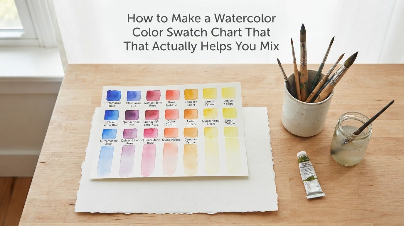
Have you ever squeezed out two beautiful colors, stirred them together, and watched them turn into a flat brown puddle? I have, more times than I would like to admit. After a few muddy disasters, I finally made a real watercolor swatch chart, and my mixing has never been the same.
A watercolor swatch chart is a simple visual reference: you paint each color straight from the pan or tube, add a gradient to show how it dilutes, and mix a small grid of two-color combinations. When you sit down to paint, you flip to your chart instead of guessing. In this guide, I will walk you through exactly how to build one, how to read it, and how to use it to mix colors you actually like.
Table of Contents
- Why You Need a Watercolor Swatch Chart
- Swatch Card vs Full Mixing Grid: Which One Do You Need?
- Supplies and Materials You’ll Need
- How to Make a Watercolor Color Swatch Chart: Step by Step
- How to Read Your Watercolor Color Chart
- Color Mixing Basics for Using the Chart
- Organizing Charts for Different Palettes
- Pro Tips and Common Mistakes to Avoid
- Frequently Asked Questions
- Conclusion
Why You Need a Watercolor Swatch Chart
A swatch chart is the bridge between the color you see in the pan and the color you see on paper. Once you have one, every painting decision gets faster and calmer.
Paint Looks Different in the Pan Than on Paper
Manufacturers design pan colors to look appealing when dry. They are often more saturated, darker, or warmer than the same paint looks once it hits water and paper. A swatch shows you the truth: the actual hue, how dark it goes at full strength, and how it fades as you add water.
How a Chart Saves Time, Paint, and Frustration
Without a chart, you test mixes on your painting, ruin good paper, and waste paint. With a chart, you test once, record it forever, and paint with confidence. Beginners in online watercolor communities consistently say that swatching is the single habit that improved their mixing the fastest.
Swatch Card vs Full Mixing Grid: Which One Do You Need?
There are two popular formats, and they serve slightly different purposes. Most artists end up making both eventually.
A swatch card is a small card or page where you paint each color at full strength, add a gradient strip, and jot down the pigment name. It is portable, fast to make, and perfect for your everyday carry palette. A full mixing grid is a larger chart that shows every two-color combination in your palette. It takes longer, but it answers the question “what happens if I mix these two?” before you even pick up a brush.
If you are short on patience or working with a tiny travel palette, start with a swatch card. If you are building a studio palette from scratch and want to learn color theory deeply, go straight to the mixing grid.
Supplies and Materials You’ll Need
The good news: you probably already have most of these. The list is short and forgiving.
You need watercolor paper (at least 140 lb, cold press is the most common), the paints you want to chart, two or three round brushes (a size 6 or 8 for swatches, a smaller one for details), clean water in two jars, a paper towel, a waterproof pen for labels, and a flat surface to work on. Optional but nice: a ruler for straight grids and a hairdryer to speed drying.
Paper Choices: Hot Press vs Cold Press
Cold press paper has a slight texture that grabs paint and shows granulation beautifully. Hot press is smooth and great for detailed work but tends to flatten washes. For swatching, cold press is my pick because it shows you how each pigment actually behaves.
Paints: Tube vs Pan and Grade Differences
Tube paints give you richer, more saturated swatches because they are concentrated. Pan paints need a few drops of water to activate, but they swatch just fine once you give them a minute. Student-grade paints have more filler and less pigment, so they look chalkier on paper. Artist-grade paints are more transparent and mix more cleanly. Either works for a chart, just label the grade so you remember what you tested.
How to Make a Watercolor Color Swatch Chart: Step by Step
This is the core process. Follow the steps once and you will never skip it again. I will cover the swatch card method first, then show how to expand it into a mixing grid.
Step 1: Plan your layout. Decide how many colors you are charting. A simple grid of 2-inch squares works well. Leave space on the left for labels and below each swatch for a gradient strip.
Step 2: Label everything first. Use a waterproof pen to write the color name and pigment code above each empty square. Once paint hits paper, writing on top gets harder.
Step 3: Activate your paints. For pans, drop a little water on each and wait a minute. For tubes, squeeze a small amount onto your palette. You want a creamy consistency, not watery.
Step 4: Paint a full-strength swatch. Load your brush and fill the top half of the labeled square with the color at its strongest mix. This shows you the pure hue.
Step 5: Rinse and pull a gradient. Rinse your brush, blot it damp, then drag the color down into the empty half of the square in one smooth stroke. You will see the color fade as water dilutes it. This single gradient tells you more about transparency and value than any color name ever will.
Step 6: Note pigment and behavior. Underneath the swatch, write the pigment code (like PB15 for phthalo blue) and any quick notes such as “granulates,” “stains,” or “lifts easily.”
Step 7: Build a mixing grid (optional). Draw a second chart with your colors along the top and down the side. Fill each square with the two colors mixed roughly 50/50. Now you have every possible two-color combination in your palette on one page.
Step 8: Let it dry completely. Watercolor shifts as it dries, sometimes dramatically. Wait at least 30 minutes (or speed it gently with a hairdryer) before you file the chart away or scan it.
How to Read Your Watercolor Color Chart
A finished chart is full of information if you know where to look. Here is how to decode it.
Hue, Value, and Intensity Explained
Hue is the color itself (red, blue, yellow). Value is how light or dark it goes. Intensity is how saturated or muted it feels. On your chart, look at the full-strength swatch for hue, the gradient for value range, and the mixing squares for how intensity holds up when combined with other colors.
Transparency and Granulation on Paper
Transparent colors let light through and glow on the paper. Opaque colors sit on top and look chalky. You can see transparency in your gradient: if the white paper shows through as you dilute, it is transparent. Granulation shows up as small dark specks settling into the paper texture. It is not a flaw, it is a personality trait, and many artists love it.
Color Mixing Basics for Using the Chart
Once you have the chart, you can stop guessing. Use it like a map for every mixing decision.
Warm and Cool Primary Color System
Traditional color theory uses one red, one yellow, one blue. Real paint pigments lean warm or cool. A “warm” primary leans toward orange, yellow, or purple. A “cool” primary leans toward green, violet, or pink. Experienced artists on watercolor forums swear by a limited palette of six: a warm and cool version of each primary. From those six, you can mix almost any color you want without ever buying another tube.
Why Some Mixes Turn Muddy
Mud happens when you combine three or more pigments, especially if they are all close in value or include complements. Blue and orange mix beautifully because they share underlying pigment. Blue, orange, and black do not, because you are layering too many hues at once. Your mixing grid will reveal the culprits fast: any square that looks brown or gray is one to avoid.
Mixing Ratios and Dilution Tricks
Start with more water than you think you need. Add pigment slowly. A useful rule: mix on the palette, not on the paper. If your mix looks right in the palette, it will look right on paper. If it looks right only on paper, it will dry wrong. Test every mix on a scrap piece before committing it to your painting.
Organizing Charts for Different Palettes
If you collect more than one set of paints (and most watercolorists do), organization matters. Keep each chart in a clear plastic sleeve or a small binder with a divider labeled by brand or palette name. Add the date you made the chart in one corner, so you know when a paint might need re-swatching. A simple index card on the front listing “Travel Palette: 12 colors, chart on page 4” saves you a lot of flipping later.
Pro Tips and Common Mistakes to Avoid
These are the lessons I learned the hard way, so you do not have to.
Golden Rule of Watercolor
The golden rule of watercolor is simple: add water to pigment, never pigment to water. Drop a little paint into a pool of water on your palette and watch how it blooms. This gives you control, transparency, and time to adjust. Slapping wet pigment onto dry paper is how muddy, uneven washes happen.
Mistakes That Make Charts Useless
Skipping labels is the biggest one. You will not remember which swatch was which within a week. Using too much water in the swatch gives you a weak, washed-out sample that does not represent the paint’s true strength. Forgetting to dry the chart before storing it smears the labels and wrecks adjacent pages. Comparing one brand to another on the same page without noting which is which will confuse you later.
A final tip: re-swatch any new tube or pan immediately. Paint manufacturers reformulate colors quietly, and a single pigment code can shift in look between batches. Your chart should be a living document, not a one-time project.
Frequently Asked Questions
How to make a watercolor color mixing chart?
Draw a grid with each color along the top and side, then paint a 50/50 mix in each square. Let it dry, label the mixes, and you have a permanent record of every two-color combination in your palette.
Can you provide a guide to mixing colors in watercolor?
Start with a limited palette of warm and cool primaries. Mix on a palette with more water than pigment, add color drop by drop, and test on scrap paper. Use your swatch chart to predict mixes before you commit them to a painting.
How to make a watercolor color swatch?
Label a square, fill the top half with full-strength paint, then rinse your brush and pull a gradient down into the bottom half. Note the pigment code and any quirks like granulation or staining underneath.
What is the golden rule of watercolor?
Add water to pigment, never pigment to water. Drop small amounts of paint into a wet pool on your palette so you keep control over transparency, value, and mix consistency.
Conclusion
A watercolor swatch chart is the most useful 30 minutes you will spend in your studio. It turns the messy guesswork of mixing into a calm, repeatable process and makes every painting afterward go smoother. Make your first one today, label everything, store it somewhere dry, and update it whenever you buy new paint. Once you start using a real chart, you will never go back to mixing in the dark.